


A 3D tilted image grid with alternating rows scrolling infinitely in both directions.
The craft behind world-class interfaces.
Wensity UI is a React and Next.js component library of animated components, UI primitives, blocks and templates for Tailwind CSS. Ship anything from a premium landing page to a production web app.
Used by people working at
Featured components and blocks
A taste of the library.
Six live cuts from our hand-built component library, rendered from the same previews as their detail pages.
A glassy WebGL sphere with a prism ribbon sweeping a full spectrum through it.
A closed MacBook that hinges open and powers on when you hover, in ten finishes.
A 3D Earth lit day and night from the real sun position, wrapped in a soft atmosphere, with smooth drag-to-orbit controls.
A floating label that trails the cursor across your hover targets with an elastic pop-in and a soft spring settle.
Diagonal glass stripes refract a slow, glowing light that follows your pointer.
The island becomes Siri.
A React iPhone mockup whose Dynamic Island swells into the Siri orb. Tap it and the pill rounds out into a smoked glass sphere with three strands of colored light folding through it, each carrying its own spectrum, drawn live by a single WebGL shader.
- Custom GLSL shader
- three.js
- Chassis finishes
- 4
- Frames drawn at rest
- 0
Install with the CLI, Keep the source.
Wensity drops real files into your app, then leaves you with the code, folders, and terminal workflow you already know.
Wensity CLI terminal transcript
Command: npx wensity@latest init
Output:
- Creating wensity.json
- Detected Next.js + Tailwind v4
- Ready. Your project can now install Wensity source.
Command: wensity list
Output:
- liquid-multimodal-input, Free, Agentic AI
- animated-code-diff, Pro, Show Off
- voice-aurora-wave, Pro, Cinematic
- metric-sparkline-card, Free, SaaS
Command: wensity add animated-code-diff
Output:
- Fetching registry metadata
- Resolving dependencies: framer-motion, @tabler/icons-react
- Installed components/wensity/animated-code-diff.tsx
Command: wensity whoami
Output:
- Authenticated with Wensity token
- Name: Parth Sharma
- Plan: Pro
- Private source access enabled
Let your agent install it.
Ask your AI coding agent for a component and it installs the real thing. The Wensity MCP server lets it search every component, primitive and block, check your project, show you a plan, and write the source straight into your codebase, the same way the CLI does.
- Ready to install
- 240+
- No account needed
- Free
- Updated in minutes
- Live
- Claude Code
- Cursor
- VS Code
- Codex
Full sites, ready to own.
Production-ready templates with real source, clean structure, and enough room to make the product feel fully yours.
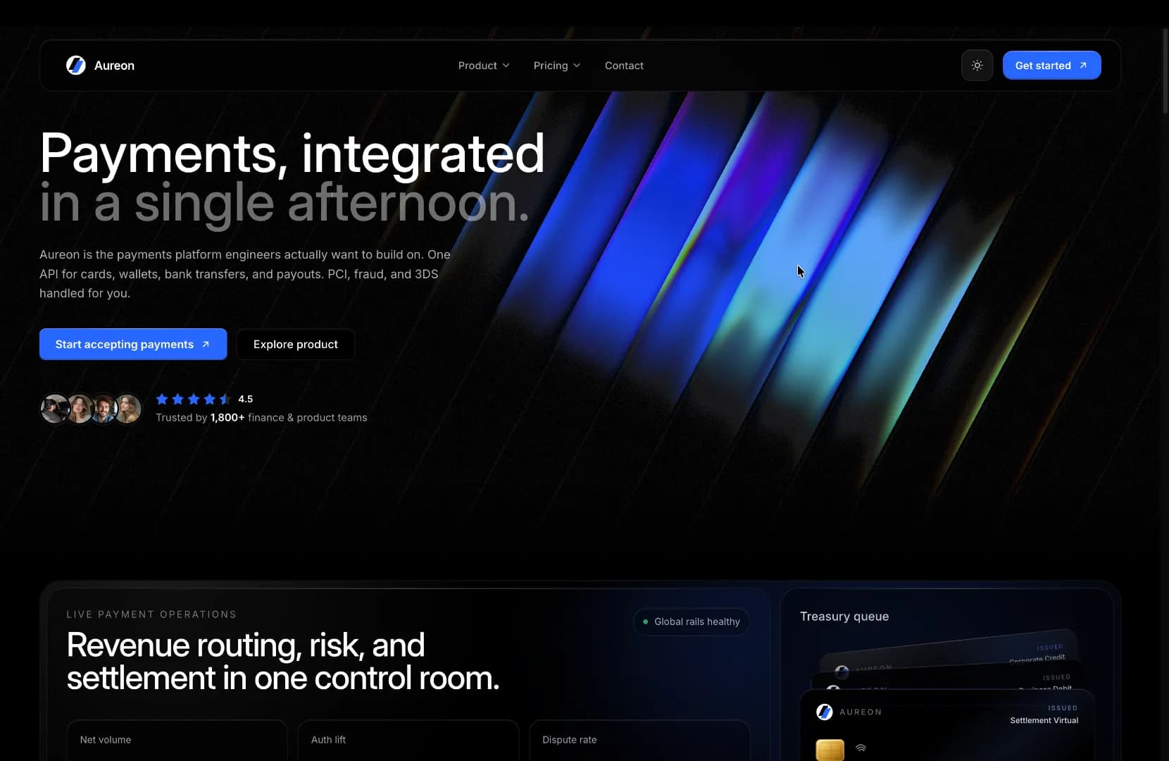
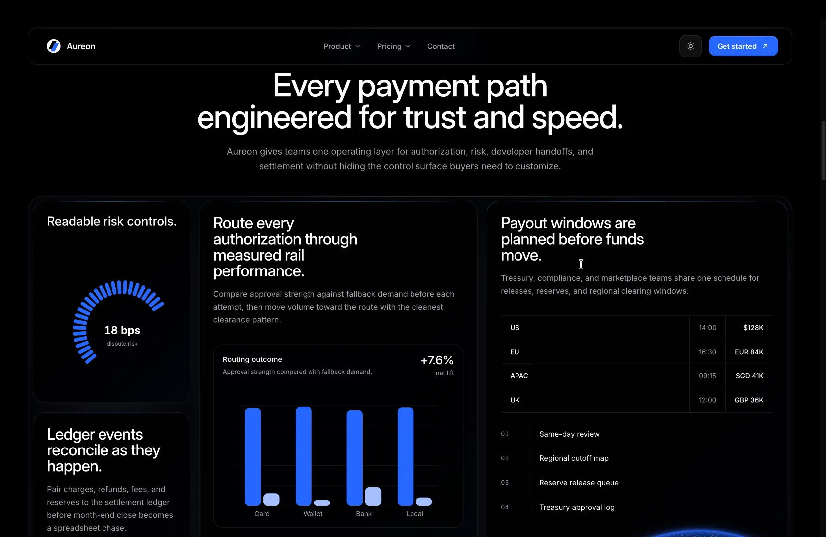
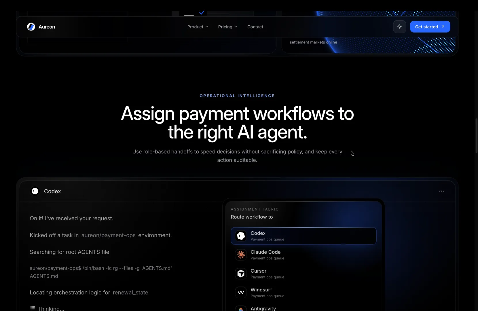
Fintech Template
RSC-first fintech template with pricing, FAQ, trust sections, and conversion-focused product storytelling. Built on Next 16 + Tailwind v4.
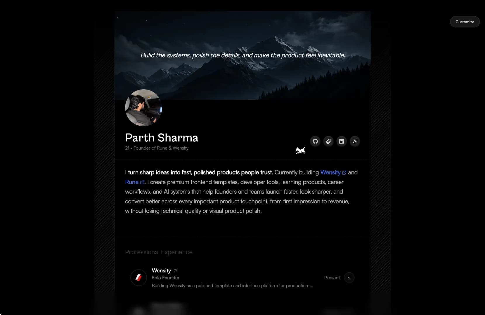
Minimalistic Portfolio
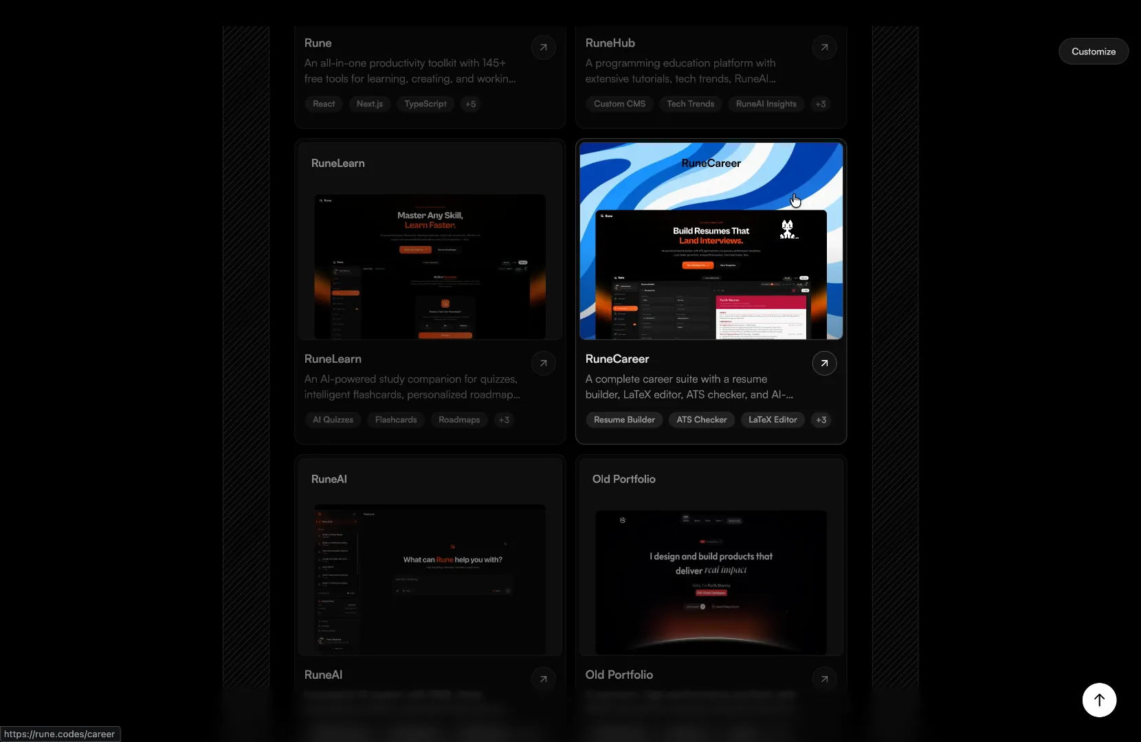
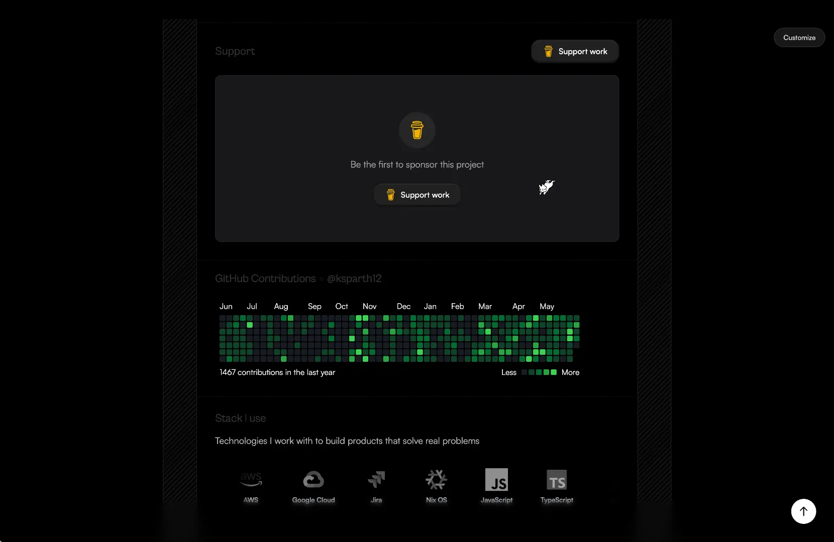
A calm, single-page personal portfolio with a banner quote, story, projects, blog, sponsors, GitHub contributions, tech stack and contact. Customize every field live with the in-page editor pill.
The last UI library you'll install.
Components, blocks, and source-first workflows designed to stay in your codebase instead of becoming another dependency to manage.
ChatGPT Orb
Fractal noise blooming white ink inside a soft circular mask.
Fan Hover Card Stack
Hover a stacked profile deck and the cards fan out in sequence.
Bento Grid Layout
FLIP-animated grid tiles that expand and reflow with spring physics.
161+ components. All source. Zero lock-in.
Browse all →What developers say about Wensity UI.
Real posts from developers on X and Reddit about Wensity UI's React and Next.js components, each linked to the original.

Suraj Sharma
@suraj_sharma14
This is the kind of kit you open and immediately want to drop into a side project.

Shreya
@Shreyacodess20
wtf is this crazyy com library 😍🔥

Elara AI
@ElaraAiLab
Finally React components that actually feel different to use

aloha | hopup intern
@alohaproxy
This looks dope 👀

Asmit
@coolcoder56
The one who created the ui deserves appreciation

QuietPsychonaut
r/vibecoding
Congratulations, OP. This is pretty cool and I can see myself using your project. Thanks for sharing

Lakshya
@Its_lakshya_ai
Damn thisss ui library 😭😭📈 !!!!

Alice The Ai Expert
@AliceInfoAi
Wensity UI looks gorgeous. Interfaces that feel different is exactly what we need more of. Big congrats on the launch!

ZenithAi
@ZenithAiLab
These components look absolutely stunning great work team
e8e8_
r/vibecoding
BRO TYSM I LOVE U I LOVE U BRO MAY GOD BLESS U !!!

vansh patel
@vanshdevx
saving this fr, wensity is crazy clean

Dhairya 🧋
@dhairyadarji786
i like the ui going to definately use in next project 🤝🏻

Aksh
@akshdeeps_001
The ui is goated man
Booldog911
r/vibecoding
Looks sick, I am likely going to use it!

Aina Ai | Tools & Updates
@AinaAiTech
Gorgeous work. Wensity UI looks stunning and refreshingly different

𝐾𝑟𝑖𝑡𝑖𝑖 🎀
@Kritiisayss
My fav comp library too ❤️

SCHURRE PHYSICIST
@SCHURREPHYSICI1
Excited to use it for my vibecoded website!! :)

Zara Tech & Tools
@AskZaratech
This looks gorgeous, love that you’re making interfaces feel different

HamoodMehmood
r/vibecoding
Man it looks sick

Aayushiii
@stfu_aayushiii
Frontend devs would be always grateful to you parth!!

Anshit Gupta ☄️
@AnshitGupta7x7
Attention to detail in these components 🤌
Frequently asked questions
What developers ask about Wensity UI before they install a component or buy Pro.
Wensity UI is a React component library built with Tailwind CSS, for Next.js and any React app. It has 104 React components, 57 UI primitives such as forms, dialogs, menus and date pickers, 82 full page blocks for landing pages and SaaS apps, and 3 Next.js templates. Every install copies typed .tsx source into your project, so you own the code and there is no runtime package to keep updated.
The core is. 35 free React components and all 57 UI primitives are MIT licensed and install with no account or card. Wensity Pro unlocks the other 69 premium components and all 82 blocks for $169 a year, or $199 once as a lifetime license with every future update. Components you have already installed keep working if a yearly plan ends.
Choose Wensity UI when you want one library for both your marketing pages and your product UI, with source code you own. Its 104 components, 57 primitives and 82 blocks all install the same way, as typed .tsx files in your repo with no runtime package and no license check, so nothing breaks if a yearly plan ends. Components never import each other, and each one lists its own npm dependencies. Most animated components show a finished state when a visitor prefers reduced motion, and interactive primitives such as dialogs, menus and selects are built on Base UI, which handles focus, keyboard navigation and ARIA roles. You can build with the free set before you pay anything. The full case is on why teams choose Wensity UI.
Yes. Free components and primitives are MIT licensed. Pro components and blocks come with the Wensity UI Commercial License, which covers unlimited personal, commercial, SaaS and client projects for one developer per license, and you can change the source however you like. What it does not allow is passing the source on as a component library, template, UI kit or public repository. Teams with more than one developer can ask for a seat based plan.
Yes. The components run in Next.js (App Router or Pages Router), Vite, Remix and Astro, and need React 18.2 or newer, TypeScript 5 or newer and Tailwind CSS v4. The free Tailwind CSS components and primitives install from the shadcn registry with npx shadcn@latest add @wensity/<slug>, so they sit next to the shadcn components you already have. Pro components and blocks install with the Wensity CLI: npx wensity@latest add <slug> after npx wensity login, with --type block for a block.
Yes. Wensity has its own MCP server, published on npm as @wensity/mcp, for Claude Code, Cursor, VS Code and Codex. Your agent can search the catalog, check your project, show an install plan and write the files once you approve it. Free items need no account. For Pro, run npx wensity login once in a terminal and the server reads that login, so no API token ever passes through the model.
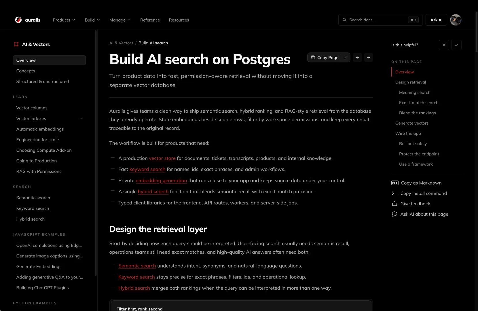
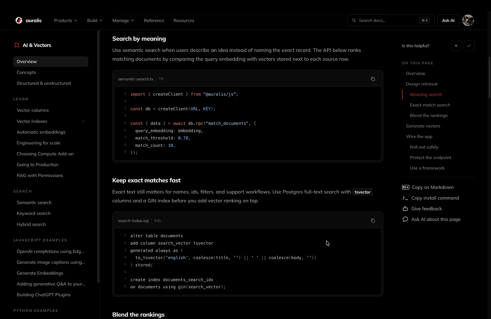
Yes. Three standalone Next.js templates built with Tailwind CSS are sold one at a time, outside the component plans: Fintech Template ($99), Docs Site ($59) and Minimalistic Portfolio ($59). Each is a complete website you download and deploy, with lifetime updates, and you can open a live preview of every one before you buy. All purchases are final.
Parth
Founder, Wensity
Still have a question?
Ask about plans, licensing, or templates and you will hear back from me directly.
Email hey@wensity.comShip interfaces that feel expensive.
Drop in a component, theme it, own the source. Or hand the whole build to the studio behind it.
Comparing libraries? Why teams choose Wensity UI