Building Beautiful SaaS Dashboards with Next.js and Tailwind CSS
A practical guide to designing and building modern SaaS dashboards with Next.js, Tailwind CSS, responsive layouts, reusable components, data states, and production-ready UX patterns.
A beautiful SaaS dashboard is not just a grid of cards. It is a working surface where users scan business health, compare numbers, investigate changes, and take action without fighting the interface.
Next.js and Tailwind CSS are a strong pairing for this kind of product UI. Next.js handles route architecture, server rendering, metadata, streaming, and data boundaries. Tailwind gives you a compact language for spacing, color, typography, layout, and responsive behavior. Together they let you keep the dashboard fast, componentized, and visually consistent as the product grows.
A dashboard should make the next decision easier. Visual polish matters, but hierarchy, density, loading states, empty states, and data trust matter more.
Start with the dashboard job
Before opening Figma or writing a component, define the job of the dashboard. Most SaaS dashboards fall into one of five patterns, and the design should follow the job rather than a generic card grid.
| Dashboard type | Primary job | Common modules |
|---|---|---|
| Executive overview | Show product or revenue health quickly. | KPI cards, trend lines, alerts, conversion summaries. |
| Operations dashboard | Help teams monitor work and resolve issues. | Queues, statuses, tables, filters, activity feeds. |
| Analytics dashboard | Help users investigate behavior over time. | Charts, cohorts, funnels, comparisons, segments. |
| Admin dashboard | Manage users, billing, access, and settings. | Data tables, forms, roles, logs, audit trails. |
| Product dashboard | Guide one user toward the next action. | Onboarding, usage, recommendations, shortcuts. |
An executive dashboard needs speed and hierarchy. An operations dashboard needs density and durability. An analytics dashboard needs comparison tools. An admin dashboard needs clarity, permissions, and safe actions. Pick the pattern first, then design the modules that serve it.
Design the information hierarchy first
A clean SaaS dashboard usually has three visual layers. Do not start by designing cards. Start by deciding what the user should see first, second, and third.
Global chrome
Navigation, account switcher, search, and primary actions live here. This layer should feel stable across every dashboard route so users always know where they are and how to move.
Page context
Title, date range, filters, tabs, and summary copy belong in this layer. Keep the page title and date or filter controls near each other so the user understands what data they are looking at before they read any numbers.
Work surface
KPIs, charts, tables, alerts, and detail panels fill this layer. Keep primary KPIs above detailed charts and tables. Show trend direction next to the number, not hidden in a tooltip. Use one primary action per page when possible, and keep destructive or account-level actions away from routine analytics.
Good hierarchy makes a dashboard feel calmer even when it shows a lot of data.
Use a shell that can scale
A SaaS dashboard needs a durable layout shell. Sidebars, topbars, breadcrumbs, filters, and content regions should not be rebuilt per page.
export default function DashboardLayout({children,}: {children: React.ReactNode;}) {return (<div className="min-h-screen bg-background text-foreground"><DashboardSidebar /><div className="lg:pl-64"><DashboardTopbar /><main className="mx-auto w-full max-w-7xl px-4 py-6 sm:px-6 lg:px-8">{children}</main></div></div>);}
This gives every dashboard route the same page rhythm. New pages can focus on data and interaction instead of layout plumbing.
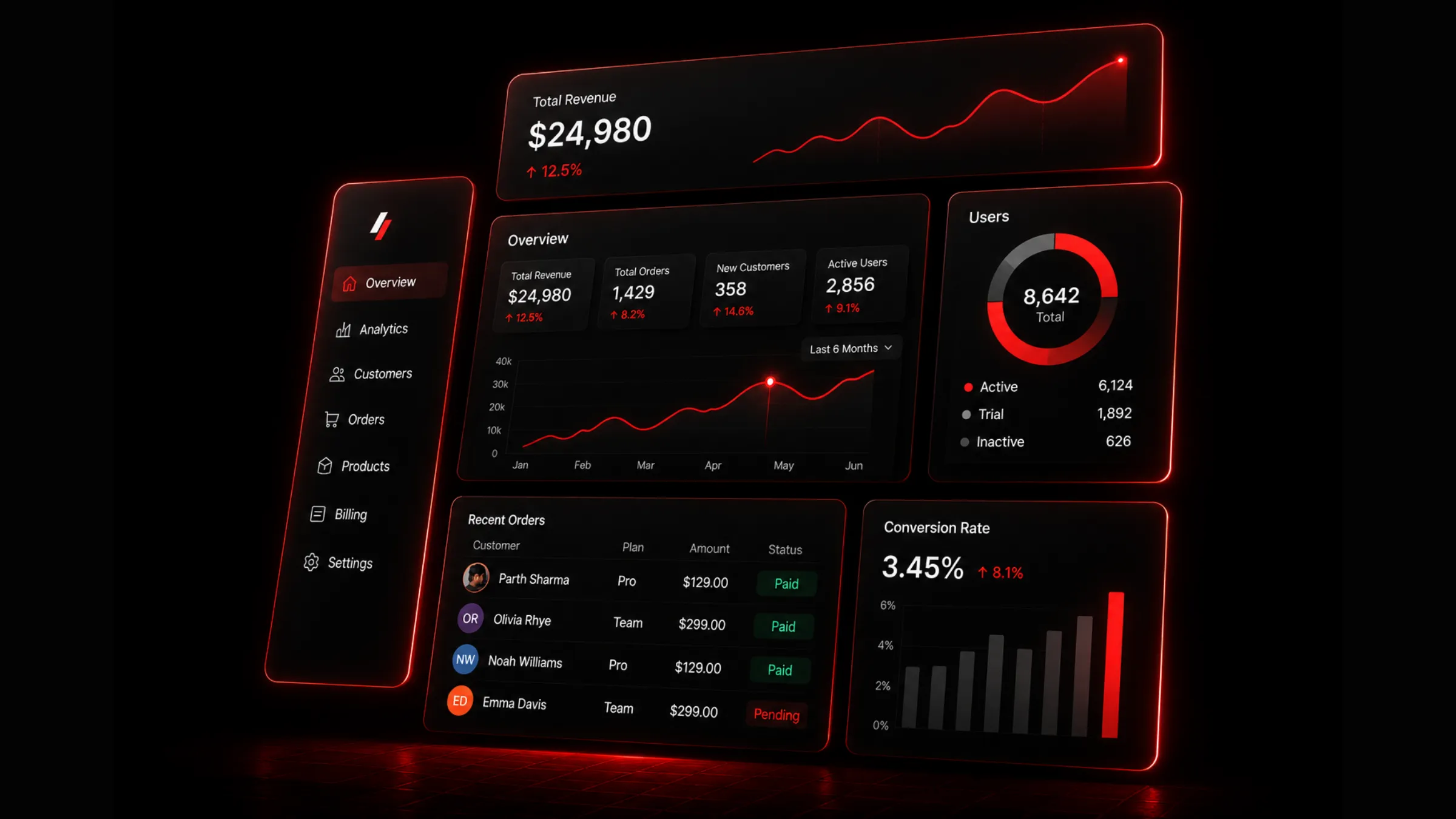
SaaS dashboard layout built with Next.js and Tailwind CSS
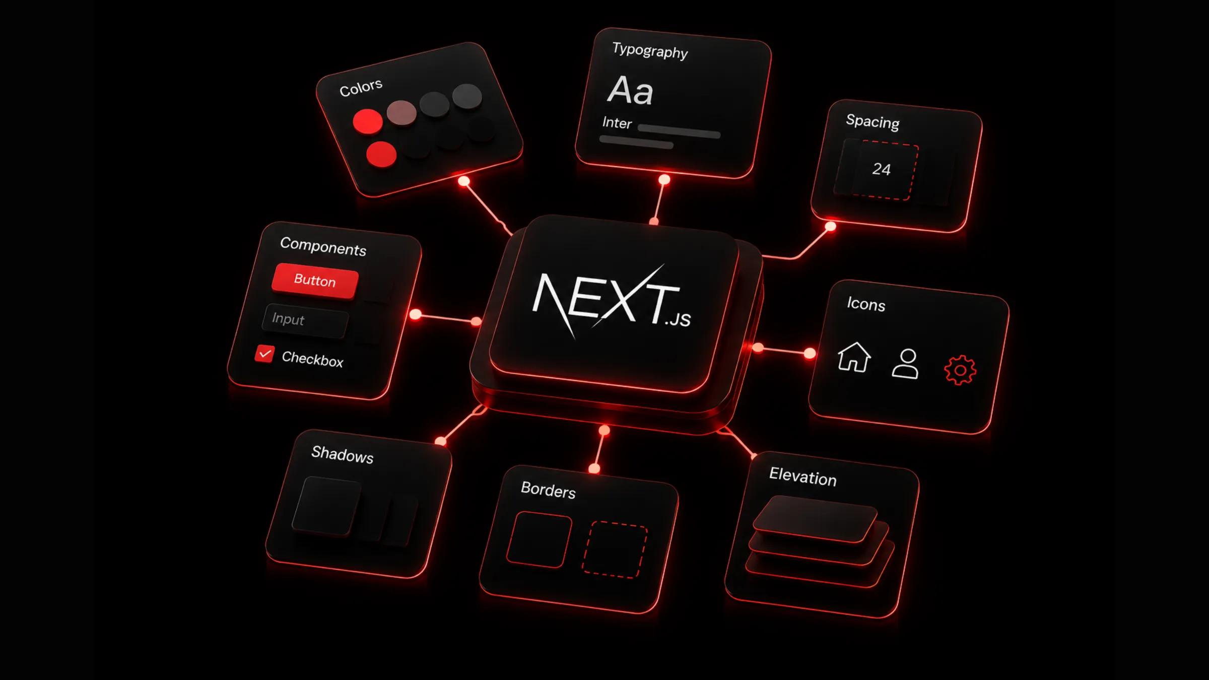
Build cards from tokens, not one-off styles
Dashboard UI gets messy when every KPI card has a slightly different border, shadow, radius, or heading style. Tailwind is fast, but it still needs discipline. Create a small set of shared card primitives and build every module from the same surface language: KPI cards, chart panels, table containers, empty states, upgrade prompts, audit log panels, and billing summaries.
import { cn } from "@/lib/utils";export function DashboardCard({className,children,}: {className?: string;children: React.ReactNode;}) {return (<sectionclassName={cn("rounded-2xl border border-[var(--border)] bg-[var(--surface)] p-5","[box-shadow:0_1px_2px_rgba(0,0,0,.08),0_12px_28px_-22px_rgba(0,0,0,.35)]",className)}>{children}</section>);}
Reusable primitives make the interface feel intentional instead of assembled.
Make KPI cards scannable
KPI cards are the first thing many users read. Keep them compact and consistent. A useful KPI card includes a label, the current value, a comparison period, change direction, a small contextual sparkline or icon, and an optional warning state when the number needs attention.
export function MetricCard({label,value,delta,trend,}: {label: string;value: string;delta: string;trend: "up" | "down" | "flat";}) {const positive = trend === "up";return (<DashboardCard><p className="text-sm font-medium text-muted-foreground">{label}</p><div className="mt-3 flex items-end justify-between gap-4"><p className="font-display text-3xl font-bold tracking-tight">{value}</p><spanclassName={positive? "text-sm font-semibold text-emerald-500": "text-sm font-semibold text-red-500"}>{delta}</span></div></DashboardCard>);}
Avoid turning KPI cards into miniature reports. The job is scanning. Put deeper explanation in charts, tables, or detail pages.
Use charts with restraint
Charts are easy to overuse. A dashboard does not become more useful because every card has a graph. Use the chart type that matches the question being asked.
| Question | Better chart |
|---|---|
| How is this changing over time? | Line chart or area chart |
| Which category is largest? | Bar chart |
| What is the share of a whole? | Donut chart only when categories are few |
| Where do users drop off? | Funnel |
| How do segments compare? | Grouped bar or small multiples |
Do not rely only on color. Use labels, legends, visible values, and tooltips. Users should still understand the dashboard if the accent color is removed.
Build responsive dashboards deliberately
Responsive dashboard design is not just stacking every card vertically. Mobile dashboard users often need summaries, alerts, and quick actions more than dense tables. Keep global navigation accessible but collapsed, keep the page title and primary action visible, stack KPI cards in a single column on small screens, collapse dense charts into simpler summaries when needed, and turn wide tables into cards, horizontal scroll regions, or focused detail pages. Preserve filter state across viewport changes so resizing does not reset the user's context.
<section className="grid gap-4 sm:grid-cols-2 xl:grid-cols-4"><MetricCard label="Revenue" value="$24,980" delta="+12.5%" trend="up" /><MetricCard label="Orders" value="1,429" delta="+8.2%" trend="up" /><MetricCard label="Customers" value="358" delta="+14.6%" trend="up" /><MetricCard label="Active users" value="2,856" delta="+9.1%" trend="up" /></section>
Every breakpoint should preserve meaning, not just fit content.
Handle loading, empty, and error states
Production dashboards spend a lot of time outside the perfect data state. If loading and empty states are weak, the dashboard feels unfinished no matter how polished the happy path looks.
Plan for loading skeletons, empty data, zero results after filtering, failed requests, partial outages, permission denied, trial or locked features, and fresh accounts without history. Skeletons should reserve the same space as the final component to avoid layout shift. Empty states should explain what happened and what to do next.
export function MetricCardSkeleton() {return (<DashboardCard><div className="h-4 w-24 rounded bg-[var(--surface-muted)]" /><div className="mt-4 h-8 w-32 rounded bg-[var(--surface-muted)]" /><div className="mt-5 h-2 w-full rounded bg-[var(--surface-muted)]" /></DashboardCard>);}
A dashboard with no data should still feel helpful. Tell the user why the view is empty and give them a clear next step.
Keep server and client boundaries clean
In a Next.js dashboard, do as much as possible on the server. Fetch initial data in Server Components, render navigation and the page shell on the server, and render static tables and summaries before hydration. Reserve Client Components for filters, menus, modals, charts, and live controls. Stream slow panels behind Suspense so the summary arrives first.
import { Suspense } from "react";export default async function DashboardPage() {const summary = await getDashboardSummary();return (<><MetricGrid summary={summary} /><Suspense fallback={<RevenueChartSkeleton />}><RevenueChartPanel /></Suspense><Suspense fallback={<RecentOrdersSkeleton />}><RecentOrdersTable /></Suspense></>);}
This keeps first paint fast and avoids shipping the entire dashboard as client JavaScript.
Make tables usable, not just styled
SaaS dashboards often live or die by their tables. A beautiful table that cannot filter, sort, scan, or recover from empty states is not production-ready.
Good dashboard tables have clear column labels, stable row height, sort controls where sorting is useful, filters for high-volume datasets, search for user-facing entities, row actions grouped in a menu, status badges with text and not color alone, pagination or infinite loading with clear boundaries, and dedicated empty and error states. Keep row actions predictable. Users should not have to hunt for edit, export, refund, archive, or invite actions across different table patterns.
Use Tailwind for consistency, not decoration
Tailwind makes it easy to move fast, but a dashboard should not become a wall of arbitrary values. Use Tailwind classes to express system decisions: spacing scale, type scale, border radius scale, surface tokens, accent colors, responsive grid rules, and state variants. Avoid one-off values unless the design system genuinely needs them. The more arbitrary values you use, the harder it becomes to keep the dashboard coherent as the app grows.
Design for trust
Dashboards show numbers that drive decisions. Users need to trust those numbers. Add context where it matters: time range labels, last updated timestamp, data source labels, comparison period, time zone, filter summary, pending or delayed data warnings, and clear definitions for calculated metrics.
For example, "Revenue" is vague. "Net revenue, last 30 days, UTC" is a decision-ready metric.
The SaaS dashboard checklist
Before shipping a Next.js and Tailwind CSS dashboard, walk through this list. It covers architecture, rendering, data presentation, and the trust signals that separate a demo from a product.
The build workflow in four steps
If you want a repeatable process rather than a flat list of techniques, this is the order I follow on real dashboard projects.
Define the job and hierarchy
Pick the dashboard pattern (executive, operations, analytics, admin, or product). Map the three visual layers: global chrome, page context, and work surface. Decide what the user sees first, second, and third before designing any cards.
Build the shell and primitives
Create a reusable layout shell with sidebar, topbar, and content region. Extract shared card primitives from tokens, not one-off Tailwind values. Build KPI cards, chart panels, and table containers from the same surface language.
Wire data with clean boundaries
Fetch initial data in Server Components. Stream slow panels behind Suspense. Reserve Client Components for filters, charts, modals, and live controls. Plan loading, empty, error, and permission states from the start.
Validate trust and responsiveness
Add time range labels, comparison periods, and metric definitions. Make tables filterable, sortable, and recoverable from empty states. Test every breakpoint for meaning, not just fit. Run the checklist above before shipping.
Beautiful SaaS dashboards come from restraint. The best ones are polished enough to feel premium and quiet enough to let the data speak.

Author Parth Sharma
Full-Stack Developer, Freelancer, & Founder. Obsessed with crafting pixel-perfect, high-performance web experiences that feel alive.
Enjoyed this article?
Related articles
The Blueprint for a Scalable Design System
A practical blueprint for building a scalable design system with React, Tailwind CSS, design tokens, reusable components, accessibility rules, documentation, and governance.
Read article
How to optimize a Next.js app in 2026
A complete Next.js performance optimization guide for App Router teams: Core Web Vitals, bundle size, Server Components, images, fonts, scripts, caching, streaming, React Compiler, and SEO.
Read article