
The Blueprint for a Scalable Design System
A practical blueprint for building a scalable design system with React, Tailwind CSS, design tokens, reusable components, accessibility rules, documentation, and governance.
A scalable design system is not a folder of buttons. It is the agreement between product design, engineering, accessibility, brand, and release quality. It defines how interfaces are composed, how components behave, how tokens map to visual decisions, and how a product keeps moving without turning into visual debt.
React and Tailwind CSS can make a design system fast to build, but speed only helps if the system has structure. Without tokens, component contracts, documentation, and governance, a component library becomes another source of inconsistency.
A design system should reduce decisions without reducing quality. It should make common product work faster and make unusual product work safer.
Start with principles, not components
Before building a component library, define what the system optimizes for. A fintech dashboard, developer tool, marketing site, and AI workspace should not all share the same visual philosophy.
Useful principles are specific: dense but readable for operational tools, motion only when it clarifies state, accessible contrast before brand drama, fewer variants with stronger defaults, components that survive real content length, and tokens that describe intent rather than raw color names.
Weak principles sound nice but do not help a team decide anything. "Clean and modern" will not tell you whether a card should have a shadow, whether a modal needs a footer, or how many button variants are allowed. Write principles that resolve real disagreements.
Build the token foundation
Design tokens are the raw material of a scalable UI system. They turn visual choices into named values that components can reuse.
| Token group | Examples | Why it matters |
|---|---|---|
| Color | background, surface, foreground, muted, border, danger, success | Keeps themes and states consistent. |
| Typography | font family, size, weight, line height | Keeps hierarchy predictable. |
| Spacing | 2, 4, 6, 8, 12, 16, 24, 32 | Makes layout rhythm repeatable. |
| Radius | none, sm, md, lg, full | Prevents random component shapes. |
| Shadow | card, popover, modal, focus | Controls depth and elevation. |
| Motion | duration, easing, reduced-motion rules | Keeps animation intentional. |
| Z-index | dropdown, sticky, modal, toast | Avoids layering bugs. |
Use semantic tokens instead of raw visual names when possible:
:root {--background: #fafafa;--foreground: #0a0a0a;--surface: #ffffff;--surface-muted: #f4f4f5;--border: rgba(10, 10, 10, 0.08);--border-strong: rgba(10, 10, 10, 0.16);}.dark {--background: #0a0a0b;--foreground: #f5f5f6;--surface: #111113;--surface-muted: #18181b;--border: rgba(255, 255, 255, 0.08);--border-strong: rgba(255, 255, 255, 0.14);}
Semantic tokens let the same component work in light mode, dark mode, and brand themes without rewriting every class.
Connect Tailwind to the token system
Tailwind should express your system, not bypass it. The goal is not to avoid utility classes. The goal is to make utilities resolve to consistent design decisions.
@theme inline {--color-background: var(--background);--color-foreground: var(--foreground);--color-surface: var(--surface);--color-surface-muted: var(--surface-muted);--color-border: var(--border);--color-border-strong: var(--border-strong);}
Then components can use system language:
export function SurfaceCard({ children }: { children: React.ReactNode }) {return (<section className="rounded-2xl border border-[var(--border)] bg-[var(--surface)] p-6 text-foreground">{children}</section>);}
This keeps Tailwind fast while preserving product consistency.
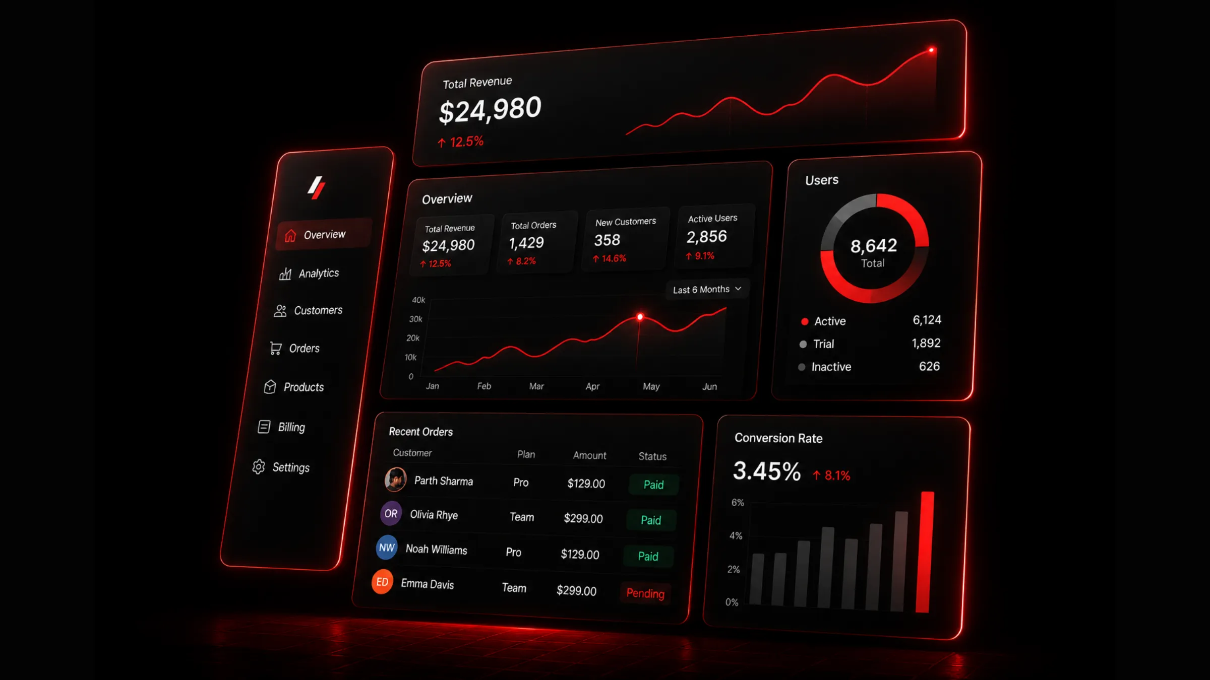
Scalable design system blueprint with tokens, components, and governance
Define component anatomy
Every reusable component needs a clear anatomy. Without anatomy, variants become random class strings and design review turns into a debate about class names.
For a button, define the root element, label, optional leading and trailing icons, loading state, disabled state, focus ring, size variants, tone variants, and interaction rules. For a card, define the outer surface, header, title, description, body, footer, actions, and empty state. Component anatomy makes design review easier because everyone can discuss the same parts.
Design component APIs like product contracts
React components need APIs that are flexible enough for product work and strict enough to prevent visual drift.
type ButtonVariant = "primary" | "secondary" | "ghost";type ButtonSize = "sm" | "md" | "lg";type ButtonProps = React.ButtonHTMLAttributes<HTMLButtonElement> & {variant?: ButtonVariant;size?: ButtonSize;leadingIcon?: React.ReactNode;trailingIcon?: React.ReactNode;loading?: boolean;};
Good component APIs use named variants instead of raw class overrides for core visuals. They support className only where composition needs it, keep sizes predictable, make loading and disabled states first-class, include accessible names when icons can stand alone, and avoid exposing every internal part as a prop. Too many props can be as damaging as too few. A component should encode product decisions, not outsource every decision to each call site.
Separate primitives, patterns, and product blocks
A scalable design system usually has three layers. Do not force everything into the primitive layer.
| Layer | Examples | Responsibility |
|---|---|---|
| Primitives | Button, Input, Select, Dialog, Tooltip | Accessible low-level controls. |
| Patterns | Search bar, filter row, data table, pricing card | Reusable product behavior. |
| Blocks | Dashboard shell, checkout form, onboarding stepper | Larger composed sections. |
A data table is not just a primitive. It includes sorting, filtering, pagination, empty states, density, and row actions. Treat it as a pattern or block so the behavior stays consistent across every product surface that needs tabular data.
Make accessibility non-negotiable
Accessibility should not be a late QA task. It belongs inside the component contract from the first commit.
Every interactive element needs a keyboard path. Focus states must be visible. Color cannot be the only state indicator. Inputs need labels or accessible names. Dialogs trap focus and restore it on close. Menus use correct ARIA behavior. Icon buttons include aria-label. Disabled and loading states communicate status. Motion respects reduced-motion settings.
For complex primitives, use proven accessible foundations when possible. The design system should spend its uniqueness budget on product expression, not rebuilding fragile keyboard behavior.
Document usage, not just props
A component page that only lists props is incomplete. Teams need to know when and why to use a component.
Good documentation covers purpose, anatomy, props, variants, examples, do and don't guidance, accessibility notes, responsive behavior, content rules, related components, and migration notes. For example, a toast component should document when to use a toast versus an inline alert, how long it remains visible, how many can stack, and how screen readers are notified.
Build governance before the system grows
Design systems fail when nobody owns change. Governance does not need to be heavy, but it must exist.
Define who can add a component, what qualifies as a variant, how breaking changes are handled, how deprecated components are marked, how accessibility is reviewed, how visual changes are approved, how tokens are changed, and how release notes are written. Without governance, every urgent product request becomes a new exception. Enough exceptions become a second design system.
Version the system like product infrastructure
Treat component changes as product infrastructure. A small visual tweak can affect dozens of screens.
Use release discipline: changelog entries for component and token changes, visual review for high-impact surfaces, migration notes for renamed props, deprecation windows for old variants, tests for accessibility and behavior where possible, and screenshots or previews for important states. Even internal systems need release notes. Future engineers should know why a variant exists before they copy it.
Keep content length realistic
Many design systems look good only with perfect placeholder text. Real products have long names, missing avatars, translated copy, empty values, large numbers, narrow screens, and awkward edge cases.
Run components through long labels, missing optional fields, very large numbers, empty arrays, loading states, error messages, translated text, mobile widths, and high contrast settings. A scalable design system is not scalable until it survives real content.
Use motion as a system
Motion should have tokens and rules too. Otherwise every component invents its own speed and easing.
Define a fast duration for small feedback, a medium duration for popovers, tabs, and state transitions, a slow duration for page-level movement, easing for entrance, exit, and spring-like motion, and reduced-motion behavior that respects user preferences. Motion should clarify cause and effect. If animation makes a dashboard harder to scan or a form slower to complete, remove it.
The scalable design system checklist
Before calling a design system production-ready, walk through this list. It covers the foundation, component quality, and the governance that keeps the system from fragmenting over time.
The build workflow in four steps
If you want a repeatable process rather than a flat list of techniques, this is the order I follow when standing up or scaling a design system.
Define principles and tokens
Write principles that resolve real disagreements, not vague adjectives. Build semantic token groups for color, typography, spacing, radius, shadow, motion, and z-index. Connect Tailwind to those tokens so utilities express system decisions.
Design components with clear contracts
Define anatomy for every reusable component. Write APIs with named variants, first-class states, and accessible defaults. Separate primitives, patterns, and blocks so each layer has the right scope.
Document usage and test with real content
Document when and why to use each component, not just its props. Test with long labels, empty states, translated copy, large numbers, and narrow screens. Build accessibility into primitives from the start.
Govern changes like product infrastructure
Define who can add components and variants. Version releases with changelogs and migration notes. Deprecate old patterns with a clear removal path. Run the checklist above before calling the system production-ready.
A design system is scalable when it improves the speed and quality of every product decision after it. The goal is not to control every pixel forever. The goal is to create a foundation strong enough that teams can build faster without making the product feel fragmented.

Author Parth Sharma
Full-Stack Developer, Freelancer, & Founder. Obsessed with crafting pixel-perfect, high-performance web experiences that feel alive.
Enjoyed this article?
Related articles
Building Beautiful SaaS Dashboards with Next.js and Tailwind CSS
A practical guide to designing and building modern SaaS dashboards with Next.js, Tailwind CSS, responsive layouts, reusable components, data states, and production-ready UX patterns.
Read article
How to optimize a Next.js app in 2026
A complete Next.js performance optimization guide for App Router teams: Core Web Vitals, bundle size, Server Components, images, fonts, scripts, caching, streaming, React Compiler, and SEO.
Read article