A 3D tilted image grid with alternating rows scrolling infinitely in both directions.
The craft behind theworld-class interfaces
Production-ready React components, UI blocks, and interaction primitives delivered through the Wensity CLI, with premium templates available separately.
Featured components and blocks
A taste of the library.
Six live cuts from our hand-built component library, rendered from the same previews as their detail pages.
A glassy WebGL sphere with a prism ribbon sweeping a full spectrum through it.
A closed MacBook that hinges open and powers on when you hover, in ten finishes.
A photo-real Earth carrying animated avatar pins, a soft atmosphere shader, and smooth drag-to-orbit controls.
A floating label that trails the cursor across your hover targets with an elastic pop-in and a soft spring settle.
A tactile archive folder that peels open on click and fans its documents out while the flap hinges away in 3D.
Glass that reflects the real screen.
A React iPhone mockup whose Dynamic Island expands into a live WebGL glass surface. Tap it and the shader resamples a canvas composite of the wallpaper, status bar, widgets and home icons on every frame, so the reflection tracks whatever the screen is actually showing instead of a baked texture.
- Custom GLSL shader
- three.js
- Chassis finishes
- 4
- Frames drawn at rest
- 0
Install with the CLI, Keep the source.
Wensity drops real files into your app, then leaves you with the code, folders, and terminal workflow you already know.
Wensity CLI terminal transcript
Command: npx wensity@latest init
Output:
- Creating wensity.json
- Detected Next.js + Tailwind v4
- Ready. Your project can now install Wensity source.
Command: wensity list
Output:
- liquid-multimodal-input, Free, Agentic AI
- animated-code-diff, Pro, Show Off
- voice-aurora-wave, Pro, Cinematic
- metric-sparkline-card, Free, SaaS
Command: wensity add animated-code-diff
Output:
- Fetching registry metadata
- Resolving dependencies: framer-motion, @tabler/icons-react
- Installed components/wensity/animated-code-diff.tsx
Command: wensity whoami
Output:
- Authenticated with Wensity token
- Name: Parth Sharma
- Plan: Pro
- Private source access enabled
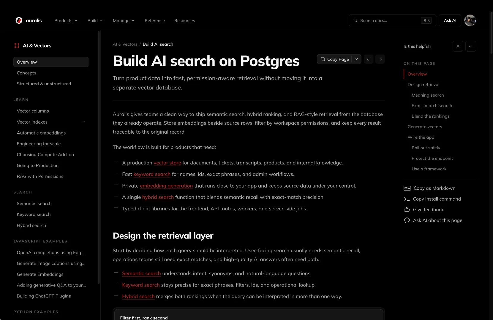
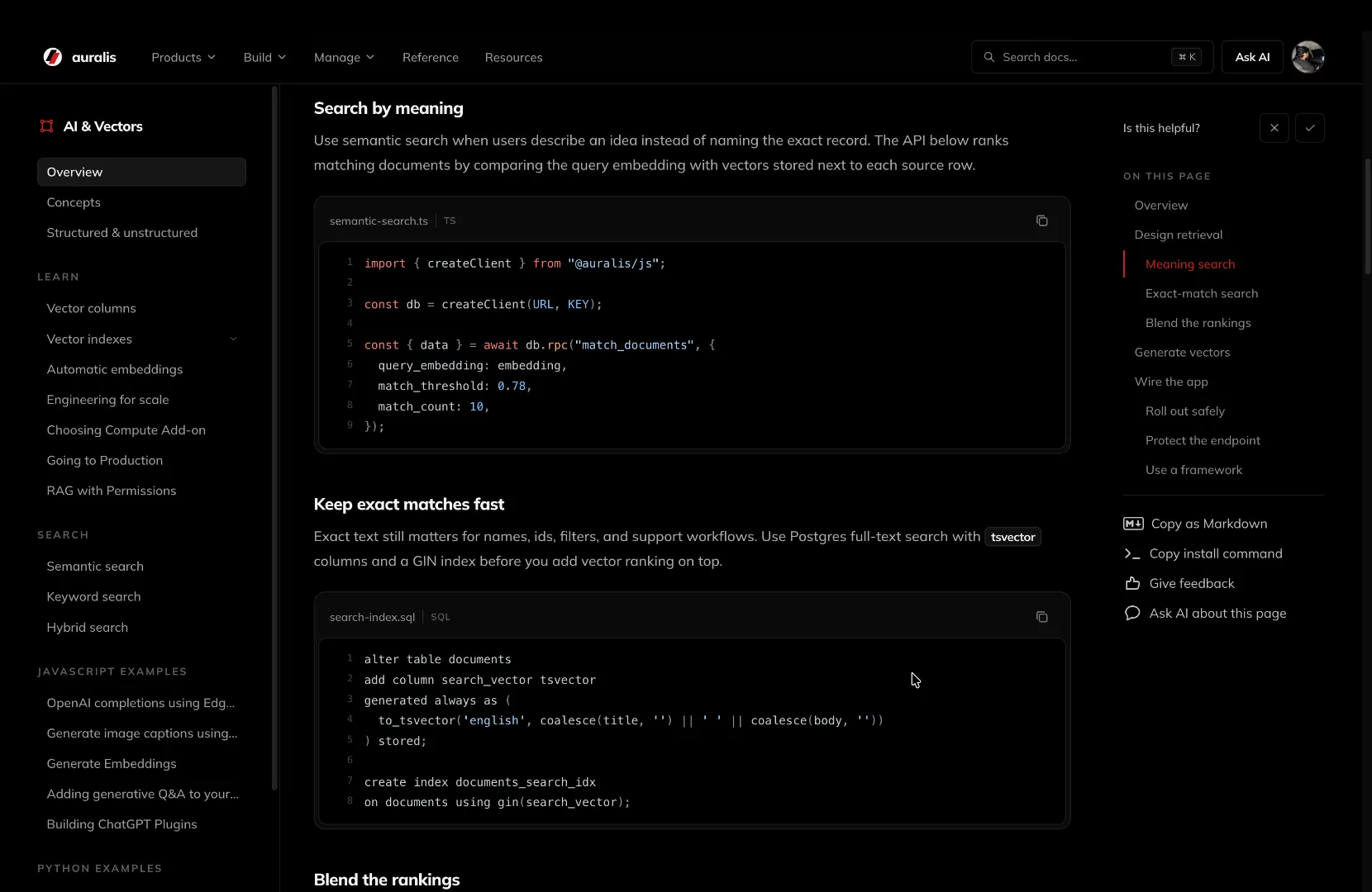
Full sites, ready to own.
Production-ready templates with real source, clean structure, and enough room to make the product feel fully yours.
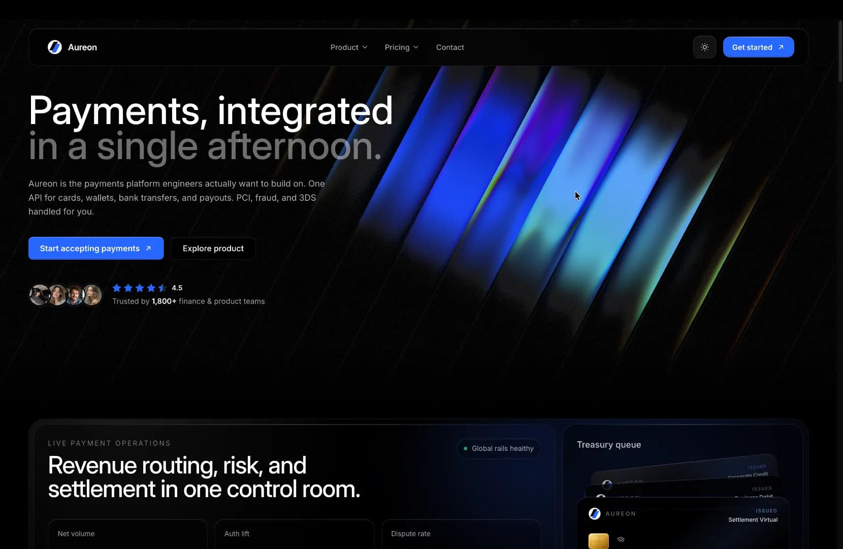
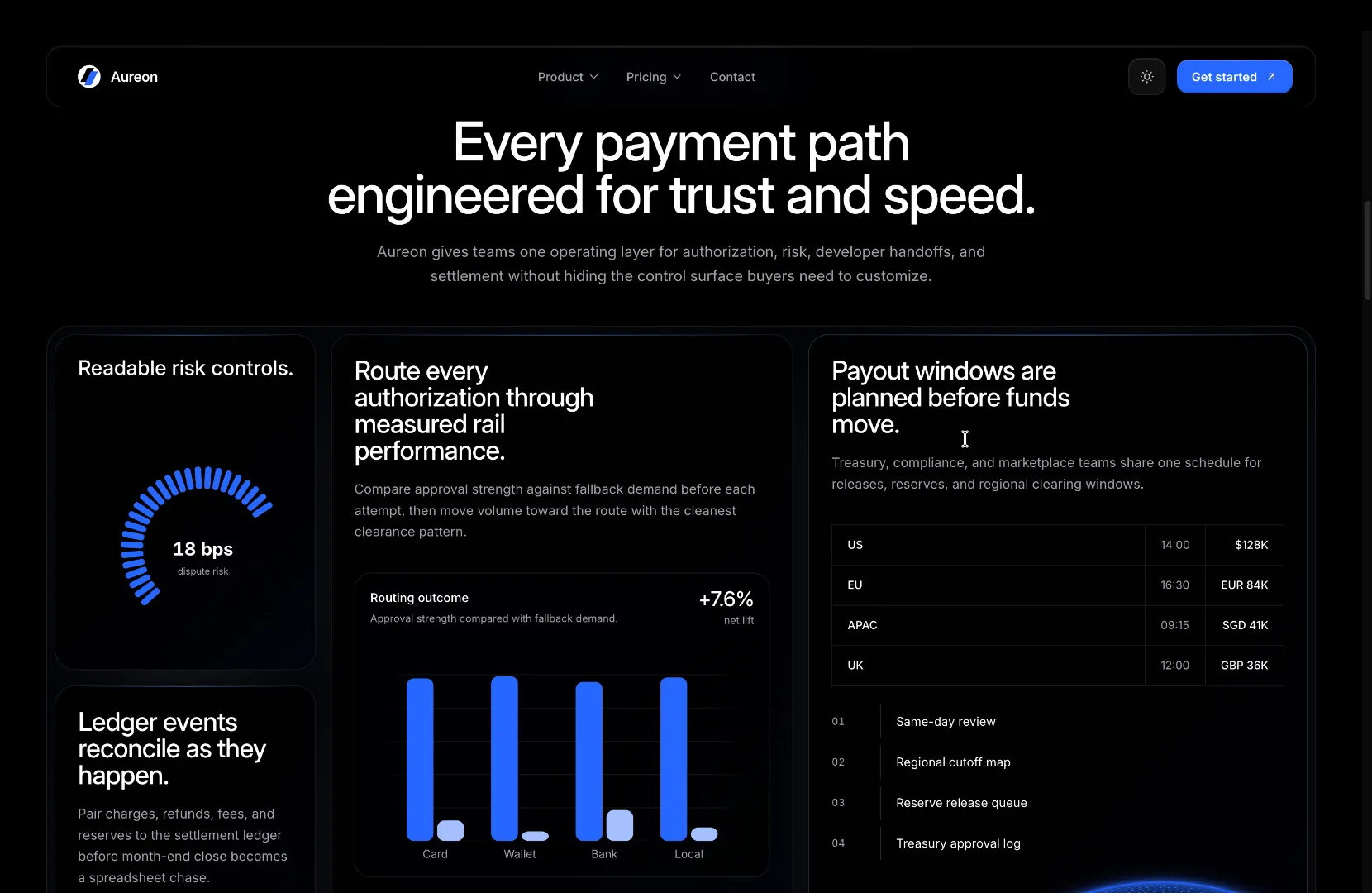
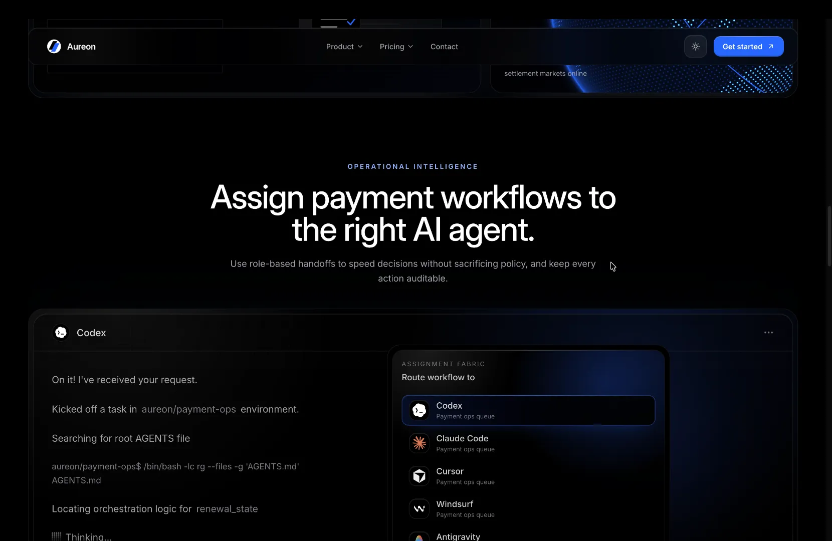
Fintech Template
RSC-first fintech template with pricing, FAQ, trust sections, and conversion-focused product storytelling. Built on Next 16 + Tailwind v4.
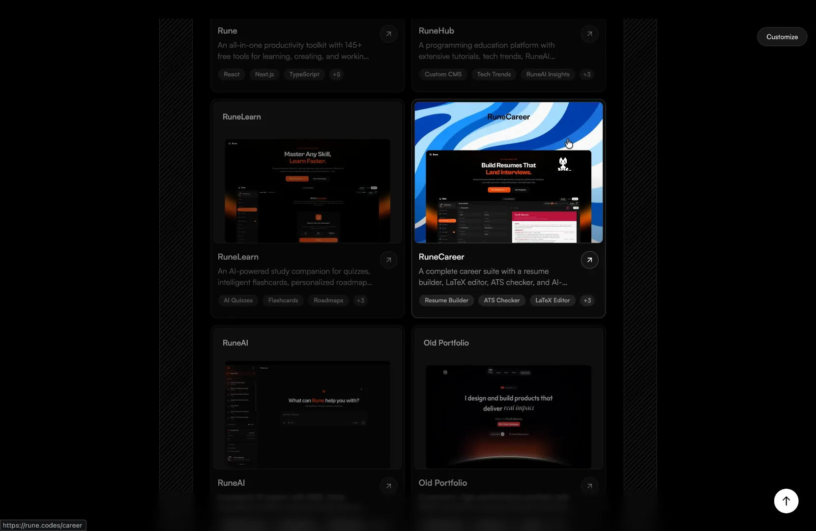
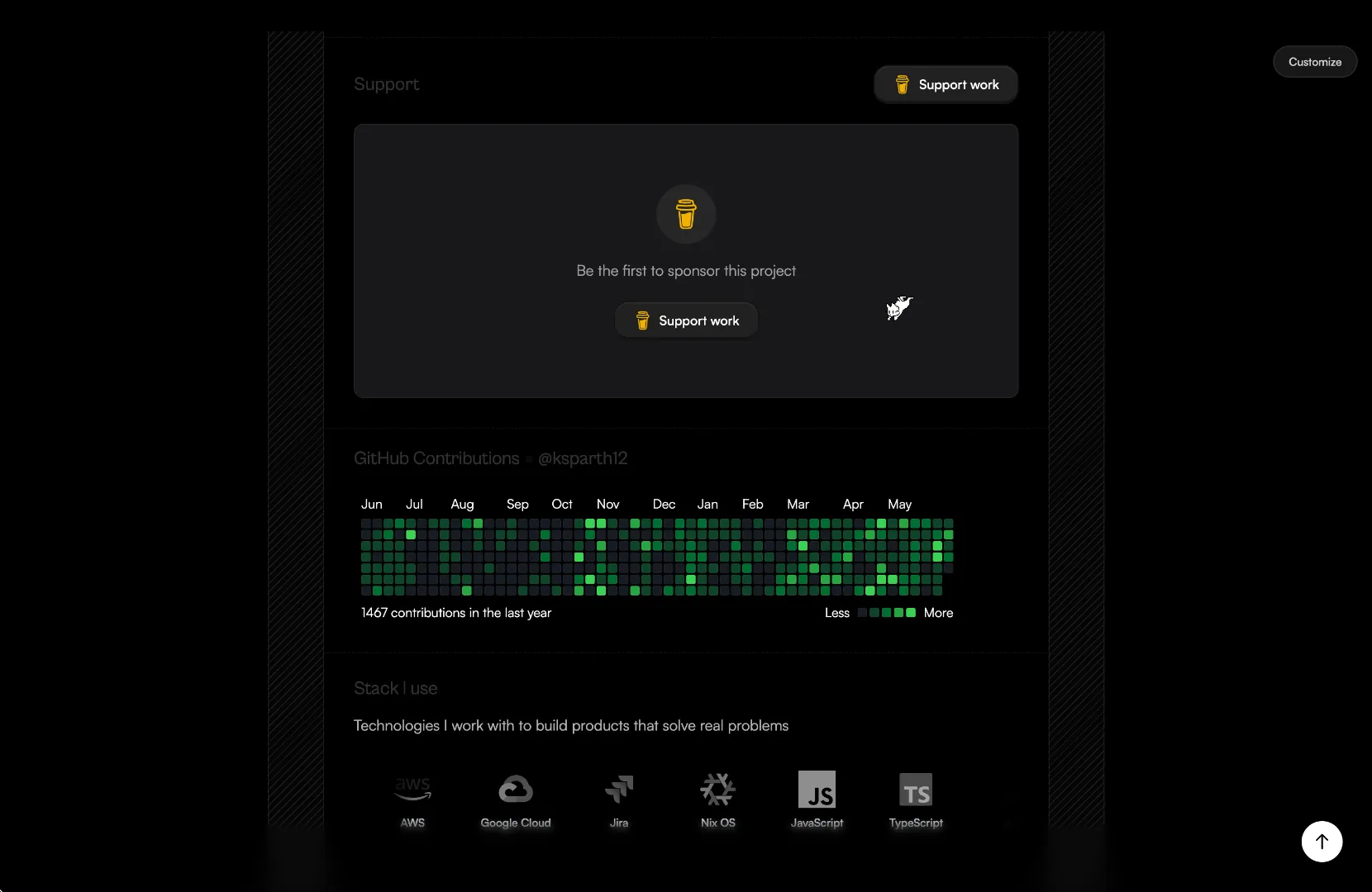
Minimalistic Portfolio
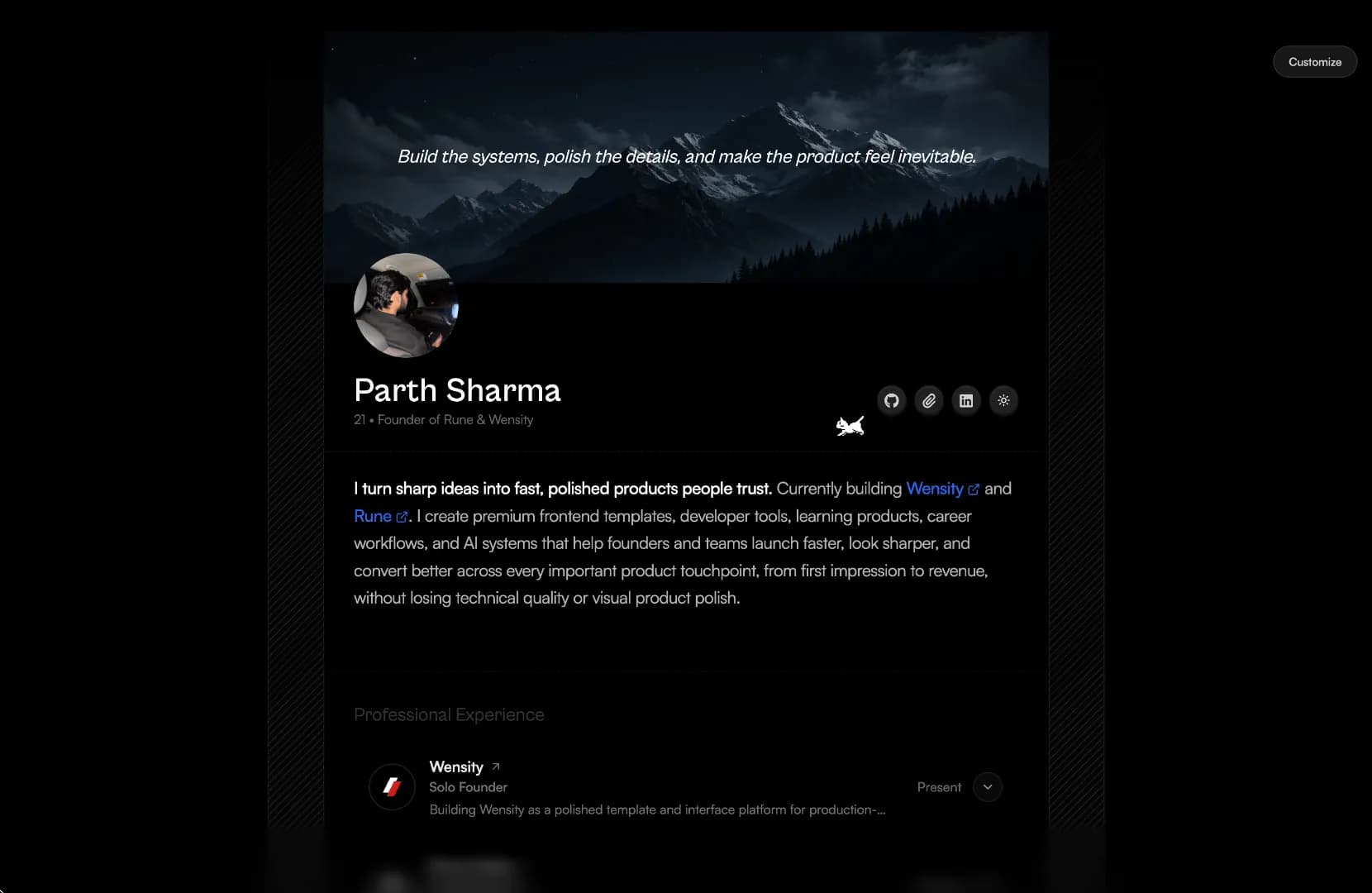
A calm, single-page personal portfolio with a banner quote, story, projects, blog, sponsors, GitHub contributions, tech stack and contact. Customize every field live with the in-page editor pill.
The last UI library you'll install.
Components, blocks, and source-first workflows designed to stay in your codebase instead of becoming another dependency to manage.
ChatGPT Orb
Fractal noise blooming white ink inside a soft circular mask.
Fan Hover Card Stack
Hover a stacked profile deck and the cards fan out in sequence.
Bento Box Grid
FLIP-animated grid tiles that expand and reflow with spring physics.
134+ components. All source. Zero lock-in.
Browse all →Ship interfaces that feel expensive.
Drop in a component, theme it, own the source. Or hand the whole build to the studio behind it.