Bento Box Grid Layout
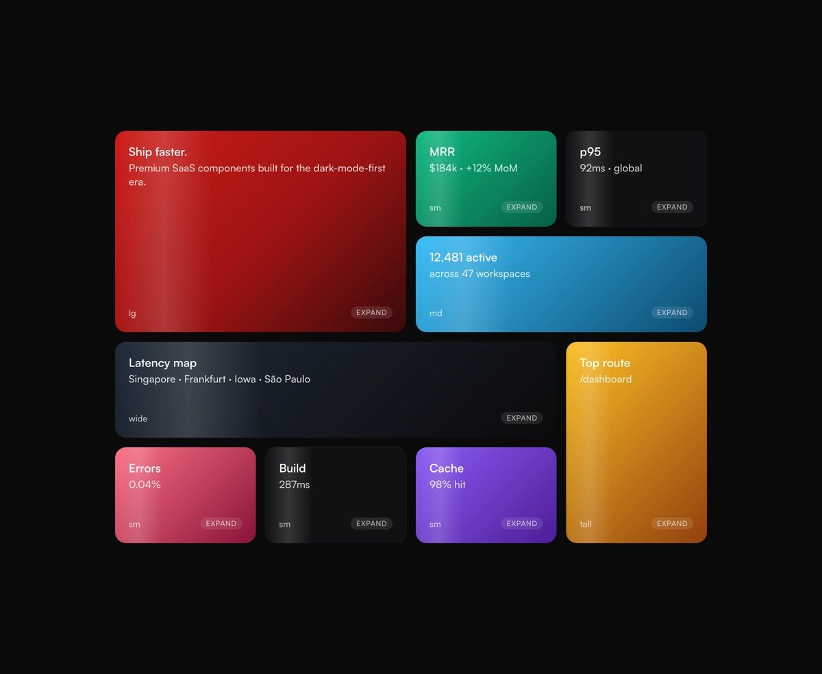
ProResponsive dashboard tiles with a click-to-expand focus mode that re-composes the grid around whatever you promote.
show offbentoboxgridframer motion
Installation
Run the following command
~/your-project
pnpm dlx wensity@latest add bento-box-grid
Usage
Import BentoBoxGrid from @/components/wensity/bento-box-grid and render it anywhere in your React or Next.js app. The source lands in your own repo, so every prop, class and animation below is yours to edit.
app/example.tsx
import {BentoBoxGrid,type BentoTile,} from "@/components/wensity/bento-box-grid";const tiles: BentoTile[] = [{ id: "hero", size: "lg", accent: "chili", title: "Ship faster.", description: "Premium SaaS components." },{ id: "metric", size: "sm", title: "MRR", description: "$184k · +12% MoM" },{ id: "users", size: "md", accent: "graphite", title: "12,481 active",description: "across 47 workspaces" },{ id: "wide", size: "wide", accent: "sky", title: "Latency map", description: "Singapore · Frankfurt · Iowa" },{ id: "tall", size: "tall", accent: "amber", title: "Top route", description: "/dashboard" },];export default function Example() {return <BentoBoxGrid tiles={tiles} />;}
Props
| Prop | Type | Default | Description |
|---|---|---|---|
tiles | BentoTile[] | - | Responsive dashboard tiles with size and optional accent. |
expandable | boolean | true | Allow click-to-expand a tile into the focus slot. |
gap | number | 14 | Gap between tiles in pixels. |