Progressive Image Loading
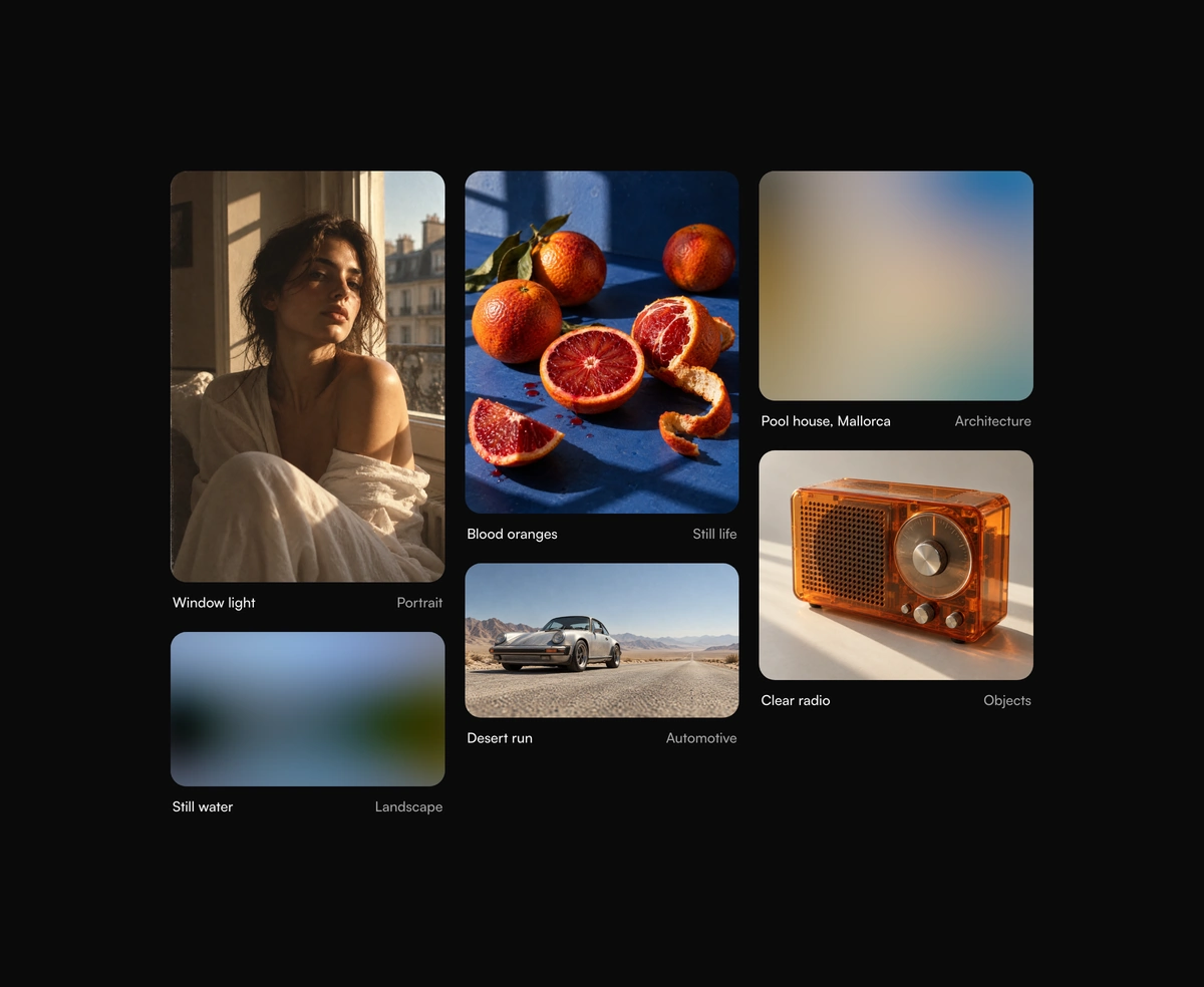
Images that develop from a blur, color, or shimmer placeholder, without layout shift.
Overview
Progressive Image Loading is a free React and Tailwind CSS image component that shows a placeholder until the photo arrives, in Next.js or any React app, with no dependencies. Use a BlurHash or tiny preview that blurs up into the image, a fill in its main color, or a shimmer. The frame holds the aspect ratio, so nothing shifts as it lands, and the photo develops from a soft blur to full sharpness. Cached images appear at once, failures show the alt text, and reduced motion uses a short fade. Pass as={Image} to render through next/image.
Installation
Run the following command
pnpm dlx wensity@latest add progressive-image-loading
Usage
Import ProgressiveImageLoading from @/components/wensity/progressive-image-loading and render it anywhere in your React or Next.js app. The source lands in your own repo, so every prop, class and animation below is yours to edit.
import { ProgressiveImageLoading } from "@/components/wensity/progressive-image-loading";export default function Example() {return (<ProgressiveImageLoadingsrc="https://assets.wensity.com/photos/landscape/alpine-lake-reflection.webp"alt="Mountains reflected in a still lake"width={1672}height={941}blurhash="LVBE5lkYR3Rk.AtRWAa$.Aoznhog"className="max-w-xl rounded-2xl"/>);}
Props
| Prop | Type | Default | Description |
|---|---|---|---|
src | string | - | Image url. While it is missing the placeholder stays up, for urls that arrive later. |
alt | string | - | Alternative text, required. Also shown in the error state. |
ratio | number | - | Width over height, such as 4 / 3. Reserves the space before the image loads. |
width / height | number | - | Intrinsic size. Sets the ratio when ratio is omitted, and is passed on to next/image. |
placeholder | "blur" | "color" | "shimmer" | - | Which placeholder to show. Defaults to blur with a BlurHash or preview, else color with a color, else shimmer. |
blurhash | string | - | BlurHash string for the blur placeholder, and the source of the main color. Decoded in the component. |
blurDataURL | string | - | Tiny preview image for the blur placeholder, such as a 20px wide data URL. |
color | string | - | Main color of the photo, for the color placeholder. |
duration | number | 700 | Length of the develop animation, in milliseconds. |
loading | "lazy" | "eager" | "lazy" | Native lazy loading. |
as | React.ElementType | "img" | Render the image through another component, such as next/image. |
imageProps | object | - | Extra props for the image element, such as priority, or fill for next/image when only ratio is set. |
imageClassName | string | - | Classes for the image itself, such as object-position. |