Orbital Image Carousel
ProDrag a cylindrical photo rail with snapped inertia, keyboard stepping, and depth-aware parallax on every face.
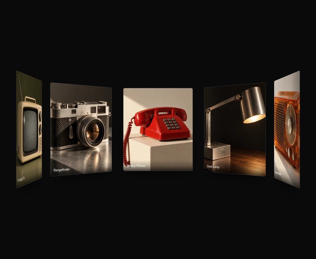
Overview
Orbital Image Carousel is a React and Tailwind CSS 3D image carousel that wraps photos around a rotating cylinder, in Next.js or any React app, built on Framer Motion. Drag to spin it with inertia that snaps to the nearest card, or step with the arrow keys, while each face shifts in parallax by its depth. Cards take a source, alt text, label, and object position, and the others dim while one is hovered. Radius, perspective, and card size are props. Reduced motion turns off dragging and the staggered entrance, so the arrow keys become the way to rotate it.
Installation
Run the following command
pnpm dlx wensity@latest add orbital-image-carousel
Usage
Import OrbitalImageCarousel from @/components/wensity/orbital-image-carousel and render it anywhere in your React or Next.js app. The source lands in your own repo, so every prop, class and animation below is yours to edit.
import {OrbitalImageCarousel,type OrbitalImage,} from "@/components/wensity/orbital-image-carousel";const images: OrbitalImage[] = [{src: "https://assets.wensity.com/photos/portrait/white-peaks-fog.webp",alt: "Fogbound white mountain range at dawn",label: "White Peaks",},{src: "https://assets.wensity.com/photos/portrait/golden-meadow-path.webp",alt: "A stone path through a golden mountain meadow",label: "Meadow Path",},{src: "https://assets.wensity.com/photos/portrait/desert-dunes-gold.webp",alt: "Golden sand dunes at sunset",label: "Desert Dunes",},];export default function Example() {return (<OrbitalImageCarouselimages={images}cardWidth={280}cardHeight={372}radius={460}/>);}
Props
| Prop | Type | Default | Description |
|---|---|---|---|
images | (string | OrbitalImage)[] | - | Image URLs or structured image objects with src, alt, label, and objectPosition. |
cardWidth | number | 320 | Width of each orbiting image panel in pixels. |
cardHeight | number | 392 | Height of each orbiting image panel in pixels. |
radius | number | 470 | Depth radius of the cylinder. |
perspective | number | 1700 | CSS perspective applied to the carousel stage. |
initialRotation | number | 0 | Initial Y-axis rotation in degrees. |
draggable | boolean | true | Enable pointer drag rotation when motion is allowed. |
snapToCard | boolean | true | Snap inertia targets to the nearest image angle. |
inactiveOpacity | number | 0.42 | Opacity used for non-hovered panels while another panel is hovered. |
Featured in React carousel components.