
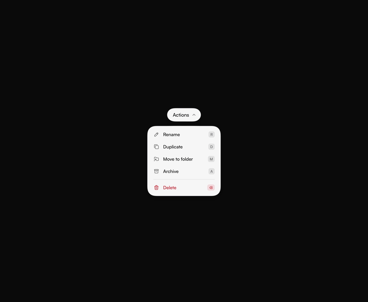
Gooey Dropdown Menu
A capsule trigger drips a menu out of its underside. Arrow keys, live shortcuts, and a clear Delete row come built in.
Tools share one liquid panel. It pours out of the icon you click, stretches to the next one, then drains back in.
Gooey Floating Toolbar is a React and Tailwind CSS toolbar with a gooey effect, in Next.js or any React app, where every tool shares one liquid panel above the pill. Clicking a tool pours its panel out of the icon, picking another stretches a neck across while the panel reshapes, and closing drains it back in. Arrow keys move between tools while it is open, Escape or an outside press closes it, and the tool and open state can be controlled. Each panel also renders once, hidden, to measure its size, so keep data fetching out of panel components.
Run the following command
pnpm dlx wensity@latest add gooey-toolbar
npx wensity@latest add gooey-toolbar
yarn dlx wensity@latest add gooey-toolbar
bunx wensity@latest add gooey-toolbar
Import GooeyToolbar from @/components/wensity/gooey-toolbar and render it anywhere in your React or Next.js app. The source lands in your own repo, so every prop, class and animation below is yours to edit.
import { IconMessageCircle, IconPlus, IconSearch } from "@tabler/icons-react";import { GooeyToolbar } from "@/components/wensity/gooey-toolbar";export default function Example() {return (<GooeyToolbaritems={[{id: "insert",label: "Insert",icon: <IconPlus size={20} stroke={1.75} />,panel: <div className="w-64 p-4 text-[14px] font-medium">Text, image, shape</div>,},{id: "search",label: "Search",icon: <IconSearch size={20} stroke={1.75} />,panel: <div className="w-80 p-4 text-[14px] font-medium">Jump to a layer</div>,},{id: "comments",label: "Comments",icon: <IconMessageCircle size={20} stroke={1.75} />,badge: true,panel: <div className="w-72 p-4 text-[14px] font-medium">2 new comments</div>,},]}/>);}
| Prop | Type | Default | Description |
|---|---|---|---|
items | GooeyToolbarItem[] | 5 canvas tools | Tools in order. Each needs an id, a label, an icon, and the panel shown while it is selected. badge adds an unread dot. |
defaultValue | string | first tool | Tool id selected on first render when value is not set. |
value | string | - | Controlled selected tool id. Pair it with onValueChange. |
onValueChange | (id: string) => void | - | Called with the next tool id after a click, or an arrow key while the panel is open. |
defaultOpen | boolean | true | Whether the panel starts poured out. |
open | boolean | - | Controlled open state. Pair it with onOpenChange. |
onOpenChange | (open: boolean) => void | - | Called when a click on the open tool, Escape, or an outside press opens or closes the panel. |
viscosity | number | 7 | How far the blend spreads while the panel pours or switches. 0 keeps hard edges. |
fill | string | theme foreground | Color of the pill and the panel. Leave it unset and they follow the active theme. |
ink | string | theme background | Icon and text color. Leave it unset and the type uses the inverse theme color. |
A capsule trigger drips a menu out of its underside. Arrow keys, live shortcuts, and a clear Delete row come built in.
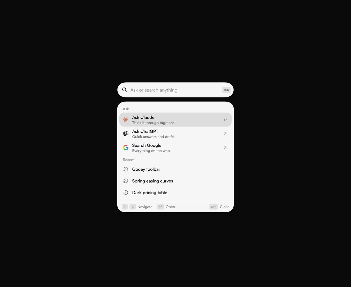
A search circle stretches into a field, and results drip out below it. Ask Claude, ChatGPT, or Google in one keystroke.
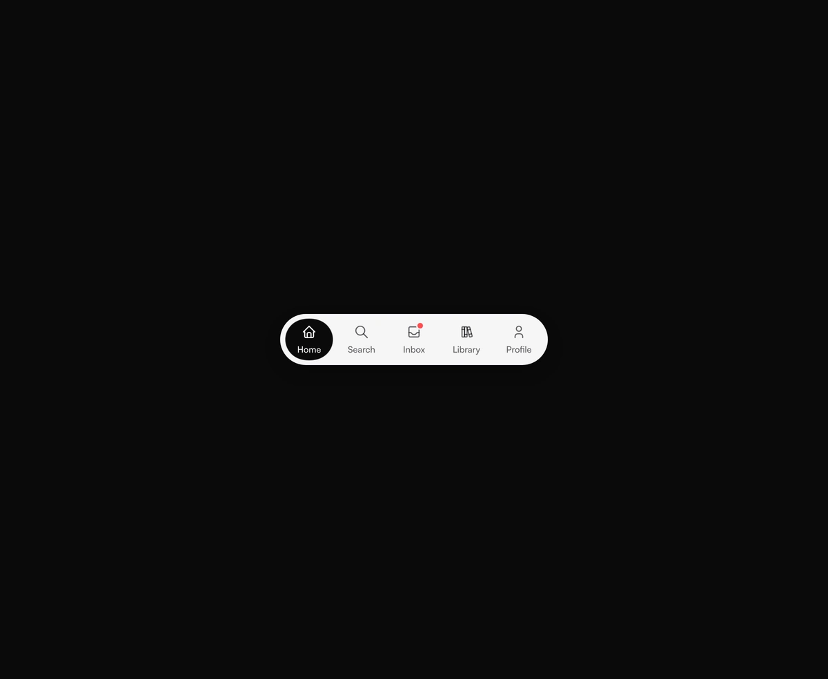
A dock of icons in a solid pill. The active capsule stretches to the item you pick and flips its icon and label inside.
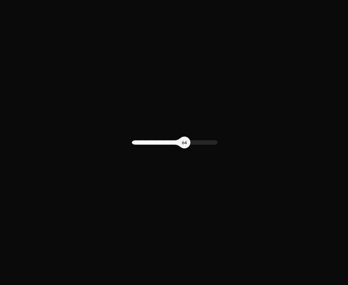
Drag the thumb and the filled track stretches with it, then the thumb contracts into a circle when you let go.