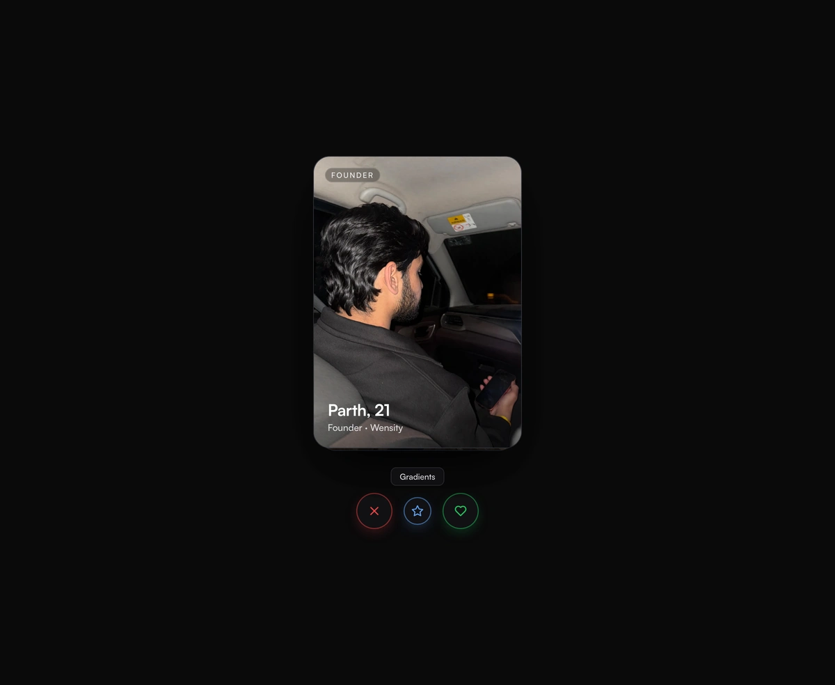
Stacked Tinder-Swipe Cards
ProA real deck where the top card flicks off under your thumb and the one underneath physically rises in real time.
carousel
Installation
Run the following command
~/your-project
pnpm dlx wensity@latest add stacked-swipe-deck
Usage
Import StackedSwipeDeck from @/components/wensity/stacked-swipe-deck and render it anywhere in your React or Next.js app. The source lands in your own repo, so every prop, class and animation below is yours to edit.
app/example.tsx
import {StackedSwipeDeck,type SwipeCardItem,} from "@/components/wensity/stacked-swipe-deck";const cards: SwipeCardItem[] = [{ id: "ada", title: "Ada, 27", subtitle: "Designer · SF",gradient: "linear-gradient(135deg, #ff8a73, #cd1c18)" },{ id: "ren", title: "Ren, 31", subtitle: "DJ · Tokyo",gradient: "linear-gradient(135deg, #1f2937, #0a0a0b)" },{ id: "kai", title: "Kai, 24", subtitle: "Photographer · Berlin",gradient: "linear-gradient(135deg, #ffa896, #cd1c18)" },];export default function Example() {return (<StackedSwipeDeckcards={cards}width={320}height={440}onSwipe={(id, dir) => console.log(id, dir)}/>);}
Props
| Prop | Type | Default | Description |
|---|---|---|---|
cards | SwipeCardItem[] | - | Cards in the swipe deck. |
visibleCount | number | 3 | Visible cards in the stack. |
width | number | 320 | Width of each card in pixels. |
height | number | 440 | Height of each card in pixels. |
showActions | boolean | true | Show the action button row (Pass / Super-like / Like). |
betweenActions | React.ReactNode | - | Optional content rendered between the card stack and action controls. |
loop | boolean | true | Re-cycle swiped cards back onto the bottom of the deck. |
onSwipe | (id: string, direction: SwipeDirection) => void | - | Fired after a card is swiped away. |