
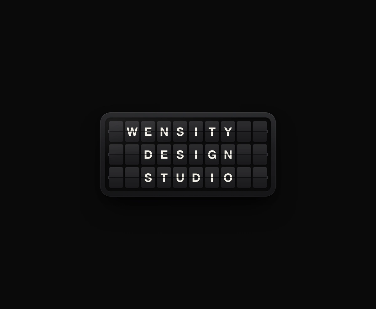
Split-Flap Display
A ceramic and graphite split-flap device that ripples each flap into your message.
Hover a card in the fanned artwork row and it rises to the front, showing a colored pill with that card's title.
Hover Image Gallery is a React and Tailwind CSS fanned image gallery for portfolios and artwork, in Next.js or any React app, animated with Framer Motion. Rounded cards overlap in a shallow arc, and hovering or focusing one lifts it to the front while a colored speech bubble pill with its title fades in above. Each card is a button in a labelled list, arrow keys move between them, and reduced motion swaps poses instantly. cardWidth, spread, and lift shape the fan. Every item needs an image, alt text, a title, and a pill color.
Run the following command
pnpm dlx wensity@latest add hover-image-gallery
npx wensity@latest add hover-image-gallery
yarn dlx wensity@latest add hover-image-gallery
bunx wensity@latest add hover-image-gallery
Import HoverImageGallery from @/components/wensity/hover-image-gallery and render it anywhere in your React or Next.js app. The source lands in your own repo, so every prop, class and animation below is yours to edit.
import { HoverImageGallery } from "@/components/wensity/hover-image-gallery";export default function Example() {return (<HoverImageGalleryitems={[{id: "collage",image: "https://assets.wensity.com/photos/posters-graphic-design/brutalist-collage-tall.webp",alt: "Brutalist collage poster",title: "North",pill: "#3b82f6",},]}/>);}
| Prop | Type | Default | Description |
|---|---|---|---|
items | ArtworkCreditCard[] | 7 artworks | Cards from left to right. Each one needs an image, alt text, a title for the pill, and a pill color. |
cardWidth | number | 220 | Card width in pixels. Height follows at a slightly tall ratio. |
spread | number | 136 | Horizontal distance between card centers. Lower values overlap more. |
lift | number | 64 | How far the hovered or focused card rises, in pixels. |
A ceramic and graphite split-flap device that ripples each flap into your message.
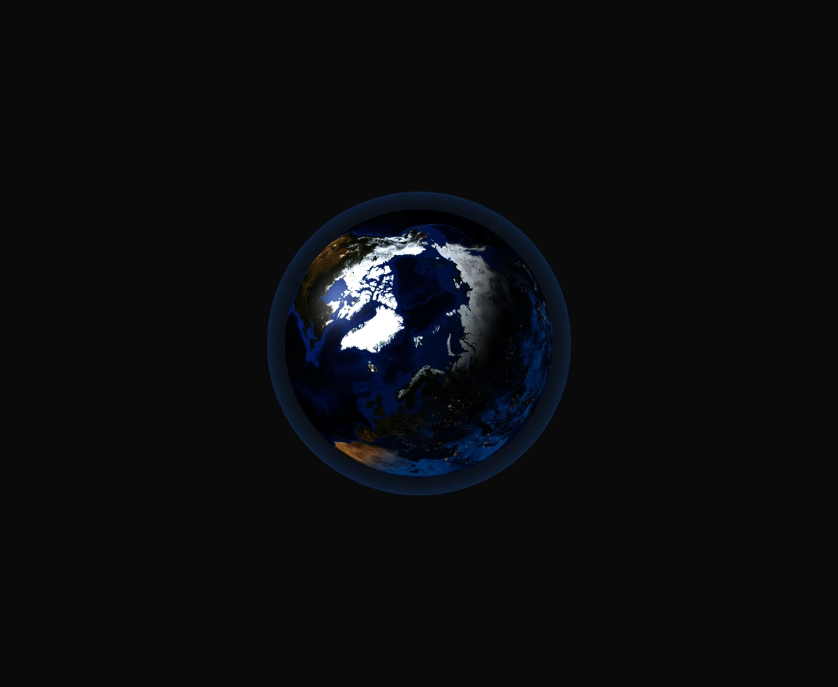
A 3D Earth lit day and night from the real sun position, wrapped in a soft atmosphere, with smooth drag-to-orbit controls.
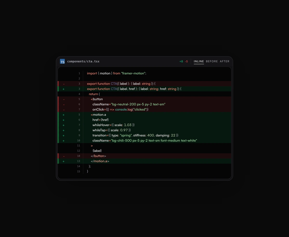
Inline or toggled code diffs rendered inside the same polished code block frame, flipping between before and after.
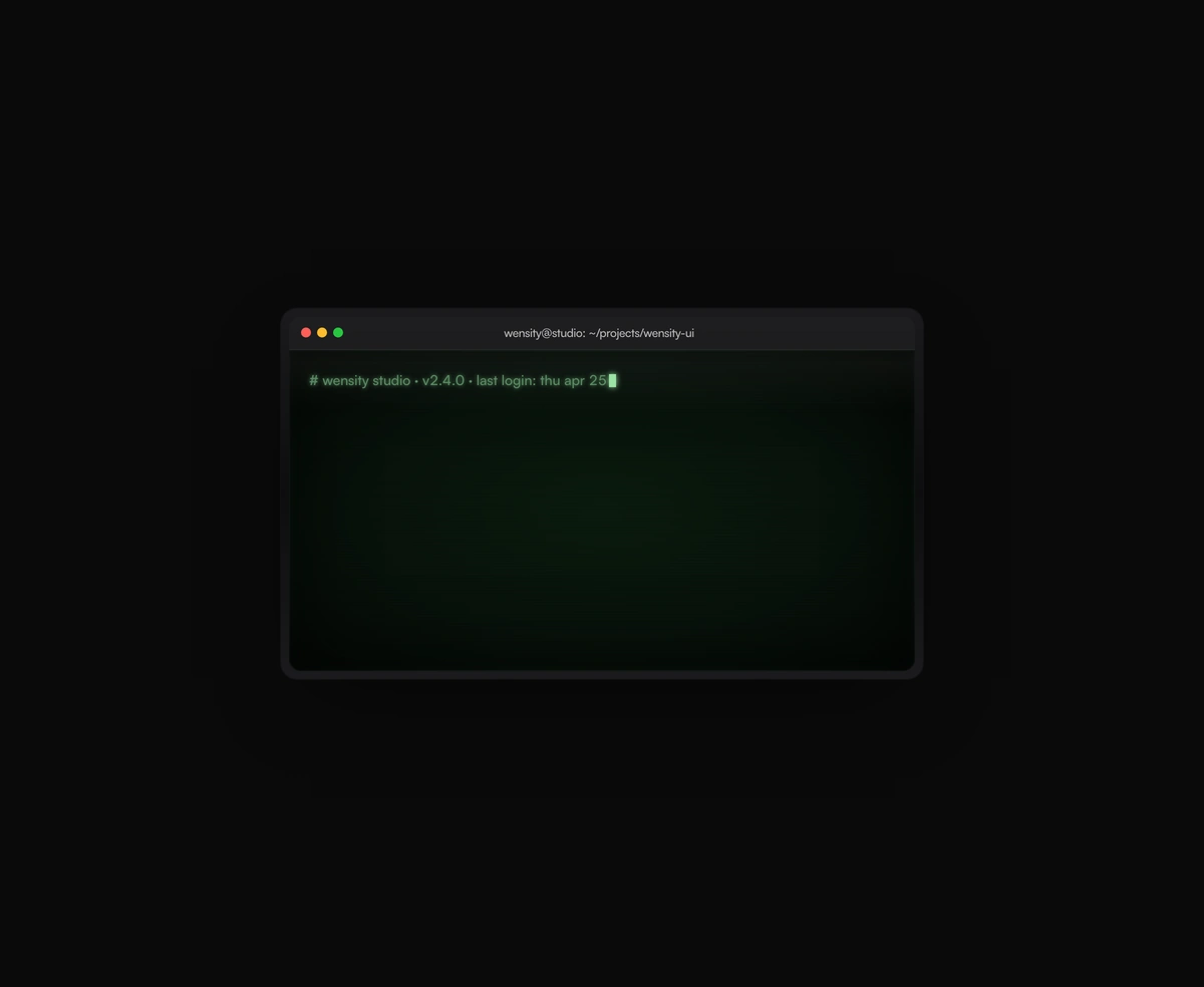
A terminal UI with self-typing commands, CRT phosphor glow and scanlines, streaming output that never re-renders a line.