FAQ Sections
FAQ accordion sections with split layouts, numbered rows, illustrations, stacked question cards, dashed grid pills, booking cards, team support cards, plus and close icons, and accessible question lists for React and Next.js.
Every FAQ section here is included with Wensity Pro.
How to choose a FAQ section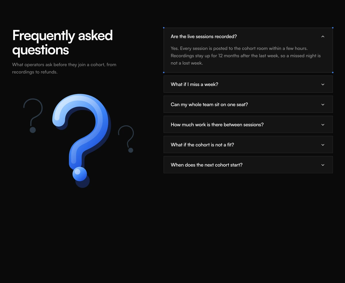
Which FAQ section should I use?
Put a still beside stacked question cards
- FAQ Section With Illustration Accordion
- A question mark illustration sits under the heading. Questions are bordered cards with air between them. Use it when the picture is the FAQ itself.
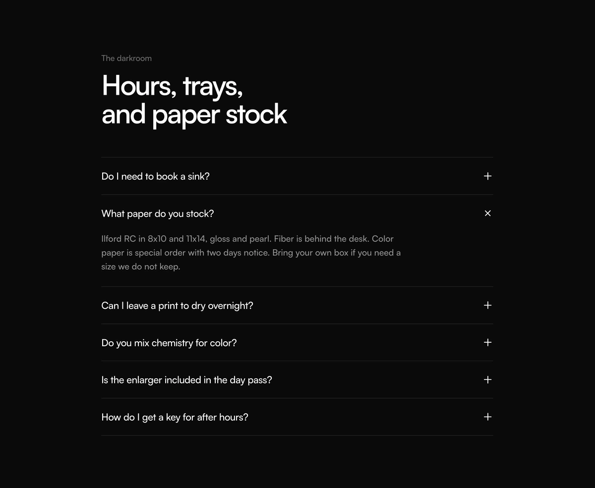
Keep the list as hairlines
- FAQ Section With Split Headline Accordion
- A two-line heading, then questions on hairline rows. Plus turns to a close mark. No booking card. Use it when the product is the FAQ.
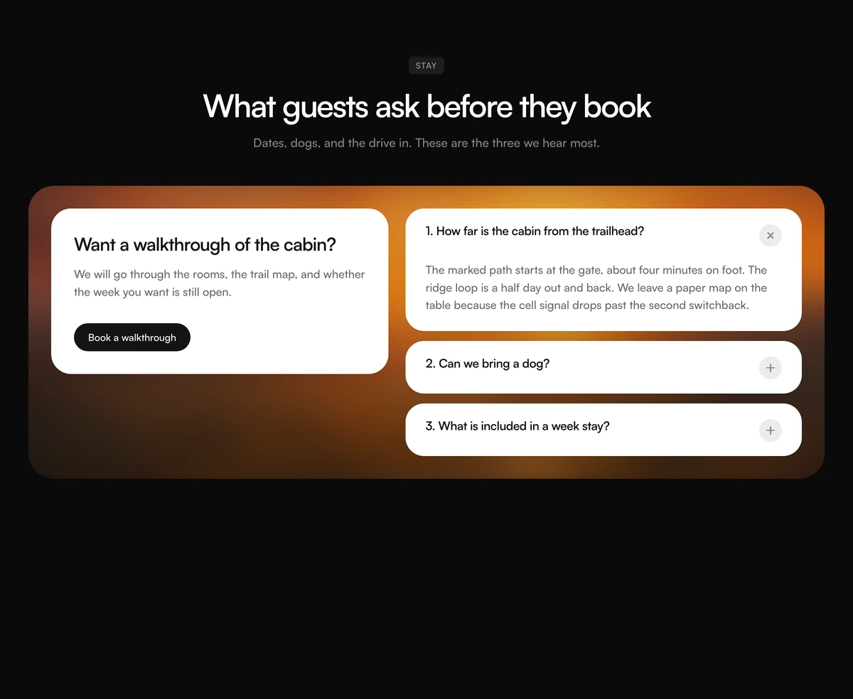
Sit the answers on a blurred still
- FAQ Section With Photo Consult Panel
- A badge and heading stay above a photo panel. The consult card is on the left. Numbered questions open one at a time. Book a Consultation is the black pill.
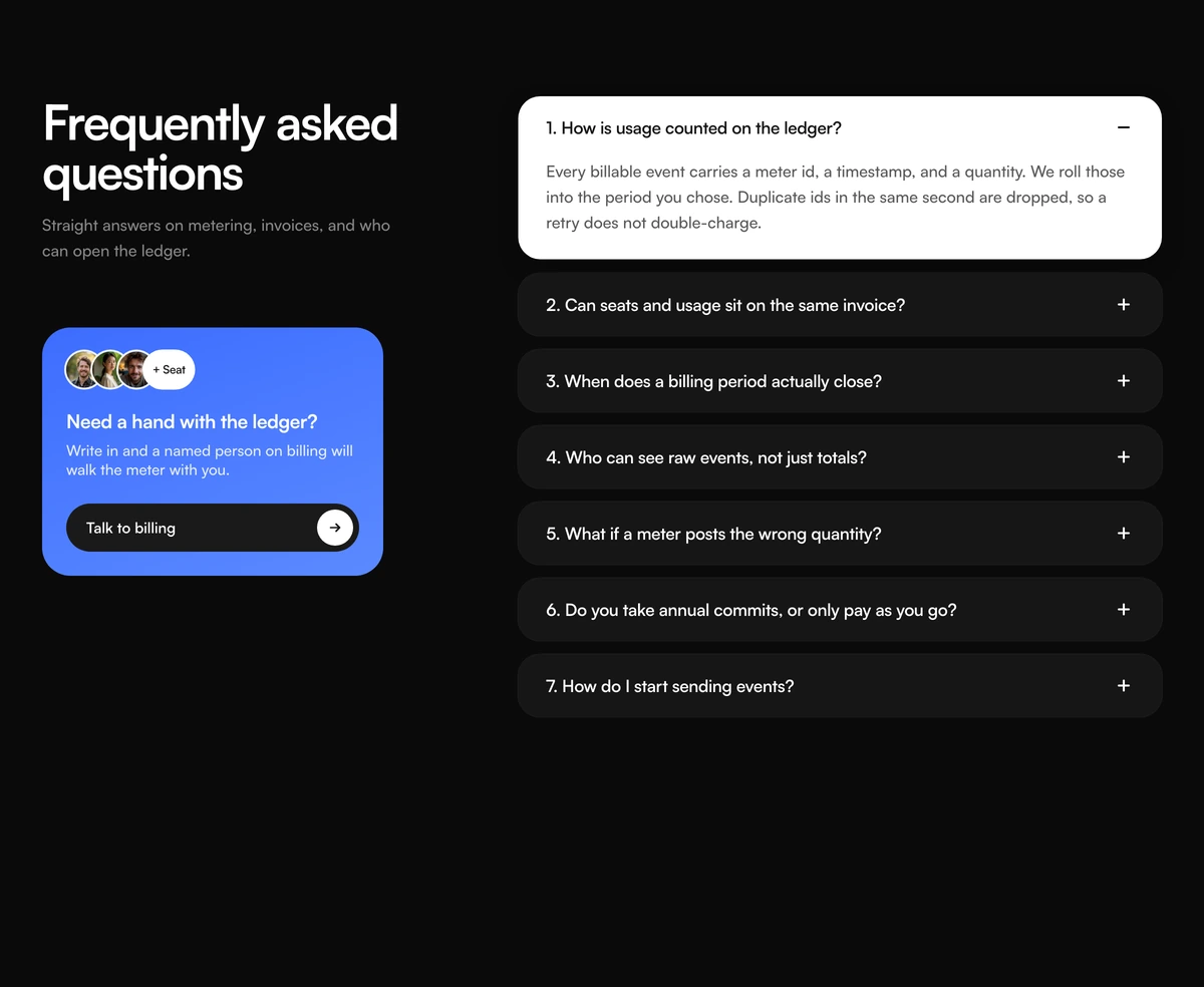
Number the rows and keep a team on the left
- FAQ Section With Numbered Support Card
- Rows are numbered. The open row inverts to charcoal. A blue card stacks faces, a You chip, and Talk to our team.
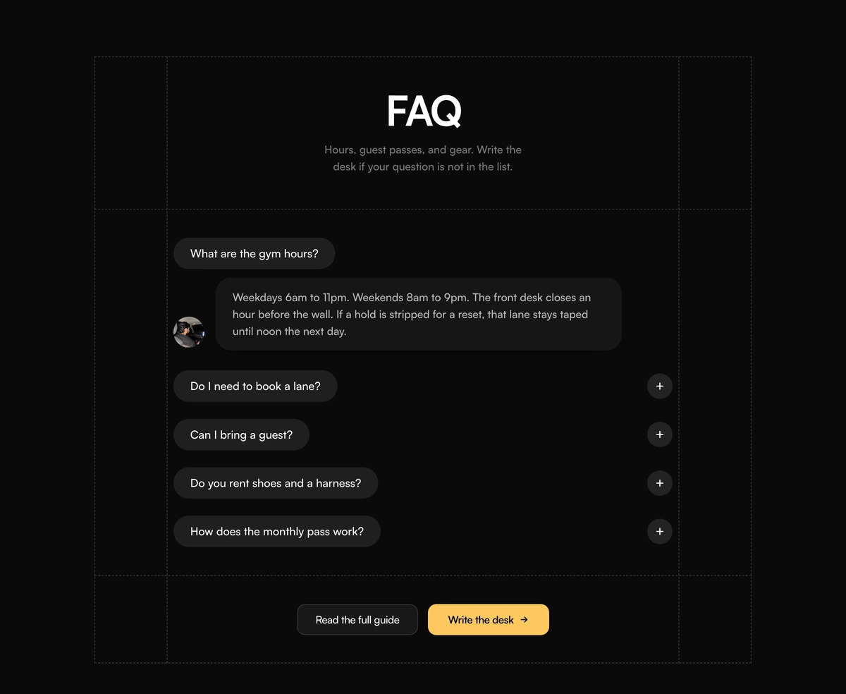
Frame the chat in a dashed grid
- FAQ Section With Dashed Grid Pills
- Charcoal question pills sit in a dashed frame. The open answer has a face. Contact Us is the yellow pill at the bottom.
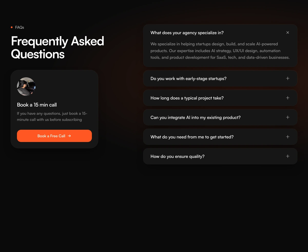
Answer beside a booking card
- FAQ Section With Accordion Call Card
- Questions stack on the right. A 15 minute call card sits on the left. One row opens at a time. Skip a help-center dump.