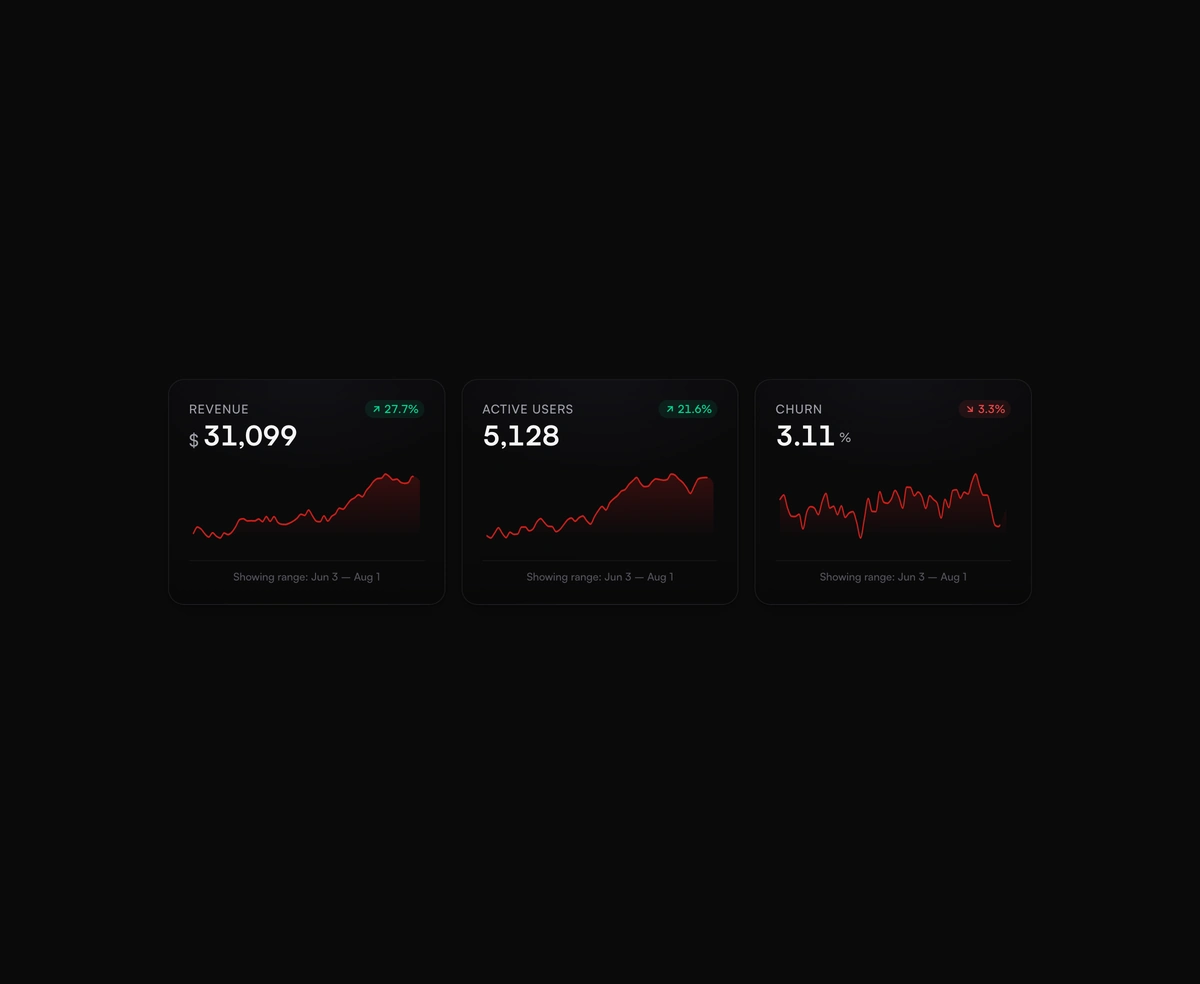
Metric Card with Sparkline
ProDashboard cards with a hand-rolled monotone-cubic SVG line and a glowing dot that snaps to wherever you scrub.
heavy saas blocksmetricsparklinecardframer motiontabler icons react
Installation
Run the following command
~/your-project
pnpm dlx wensity@latest add metric-sparkline-card
Usage
Import MetricSparklineCard from @/components/wensity/metric-sparkline-card and render it anywhere in your React or Next.js app. The source lands in your own repo, so every prop, class and animation below is yours to edit.
app/example.tsx
"use client";import { MetricSparklineCard } from "@/components/wensity/metric-sparkline-card";const revenueData = [24000, 24820, 25104, 24960, 26410, 27120, 28330];export function MetricSparklineCardDemo() {return (<MetricSparklineCardlabel="Revenue"prefix="$"values={revenueData}formatValue={(n) => Math.round(n).toLocaleString()}/>);}
Props
| Prop | Type | Default | Description |
|---|---|---|---|
label | string | - | Metric label shown above the value. |
values | number[] | - | Raw series values. Length should be at least 2. |
formatValue | (n: number) => string | - | Pretty-print the primary value. If omitted, the last data point is shown. |
prefix | string | - | Optional value prefix such as $. |
suffix | string | - | Optional value suffix such as users. |
width | number | 320 | SVG width in pixels. |
height | number | 84 | SVG height in pixels. |
deltaPercent | number | - | Optional explicit delta percentage. When omitted, derived from first vs last. |
stroke | string | - | Stroke color CSS variable or hex. Defaults to chili-500. |
dates | string[] | - | Optional dates corresponding to the values. |
statusLabel | string | - | Optional default footer label when not hovering. |