Split-Flap Vestaboard Display
ProA mechanical character cascade in pure CSS 3D, running 80 cells at a solid 60fps.
css 3d3dcssmechanicalflipboardtypography
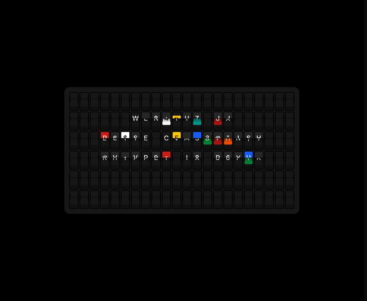
Installation
Run the following command
~/your-project
pnpm dlx wensity@latest add split-flap-display
Usage
Import SplitFlapDisplay from @/components/wensity/split-flap-display and render it anywhere in your React or Next.js app. The source lands in your own repo, so every prop, class and animation below is yours to edit.
app/example.tsx
import { SplitFlapDisplay } from "@/components/wensity/split-flap-display";export default function Example() {return (<SplitFlapDisplaymessages={["WENSITY UI", "SHIP IN 60FPS", "GPU OR GO HOME"]}rowsCount={6}colsCount={22}intervalMs={3500}duration={1.6}theme="dark"/>);}
Props
| Prop | Type | Default | Description |
|---|---|---|---|
text | string | - | Static text wrapped to fit. Use \n for hard line breaks. |
rows | string[] | - | Pre-laid out rows (one per board row). Color codes like {R} are allowed. |
messages | string[] | - | Auto-cycle through these messages. Overrides text/rows when set. |
intervalMs | number | 3500 | Cycle interval in milliseconds when messages is set. |
duration | number | 1.6 | Total flip animation duration in seconds. |
rowsCount | number | 6 | Number of board rows. |
colsCount | number | 22 | Number of board columns. |
theme | "auto" | "dark" | "light" | "chili" | "auto" | Board surround theme. Auto follows light/dark mode. |