
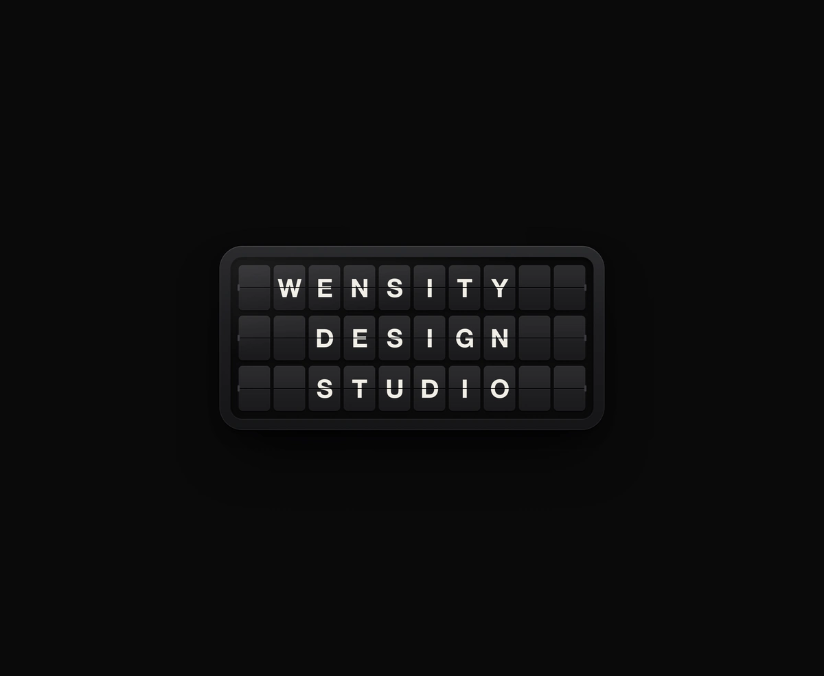
Split-Flap Display
A ceramic and graphite split-flap device that ripples each flap into your message.
Diagonal glass stripes refract a slow, glowing light that follows your pointer.
Glass Stripes is a React and Tailwind CSS animated WebGL background where diagonal glass flutes refract a soft glow that follows the pointer, in Next.js or any React app, built on React Three Fiber and a drei transmission material. Set background, shadow, midtone, and highlight hex colors, and tune flute count, angle, light size, spread, refraction, thickness, blur, and dispersion. Quality presets trade samples and resolution for speed, touch scrolling stays native, and it pauses in hidden tabs and for reduced motion. It defaults to 520px tall, so pass height or use a sized parent.
Run the following command
pnpm dlx wensity@latest add glass-stripes
npx wensity@latest add glass-stripes
yarn dlx wensity@latest add glass-stripes
bunx wensity@latest add glass-stripes
Import GlassStripes from @/components/wensity/glass-stripes and render it anywhere in your React or Next.js app. The source lands in your own repo, so every prop, class and animation below is yours to edit.
import { GlassStripes } from "@/components/wensity/glass-stripes";export default function Example() {return (<GlassStripesheight={560}stripeCount={14}angle={36}colors={{ shadow: "#b5122e", midtone: "#ff6b81", highlight: "#fff1ee" }}glass={{ refraction: 1.5, thickness: 1, blur: 0.35, dispersion: 2.5 }}quality="balanced"><div className="grid h-full place-items-center text-center"><h1 className="text-5xl font-semibold text-white">Your headline</h1></div></GlassStripes>);}
| Prop | Type | Default | Description |
|---|---|---|---|
children | ReactNode | - | Content layered above the glass, such as a hero headline. It fills the container and the light keeps following the cursor across it. |
height | CSSProperties["height"] | 520 | Container height. Use 100% to fill a parent with an explicit height. |
colors | GlassStripesColors | Crimson | Hex colors for background, shadow, midtone, and highlight. Each field is optional. |
stripeCount | number | 14 | Glass flutes across the scene, clamped to 6 to 40. |
angle | number | 36 | Counterclockwise glass rotation in degrees. Zero makes vertical stripes. |
lightScale | number | 1 | Scale of the light behind the glass, clamped to 0.5 to 2. |
spread | number | 0.1 | How far a faint wash of light reaches toward the corners, clamped to 0 to 1. Zero keeps a tight centered glow. |
glass | GlassStripesGlass | See description | Optional refraction (1.5), thickness (1), blur (0.35), dispersion (2.5), and fringe ("spectral"). Set fringe to "tinted" for palettes that mix red and blue, such as purple, so dispersion never splits off red. |
interactive | boolean | true | Let the light drift toward the pointer within this component. Touch scrolling stays native. |
pointerStrength | number | 0.3 | How far the light follows the pointer, clamped to 0 to 1. |
paused | boolean | false | Freeze the light and pointer motion at their current position. Reduced motion also pauses automatically. |
quality | "low" | "balanced" | "high" | "balanced" | Controls refraction samples, render-target resolution, and capped device pixel ratio. |
style | CSSProperties | - | Inline container styles, including border radius or sizing overrides. |
A ceramic and graphite split-flap device that ripples each flap into your message.
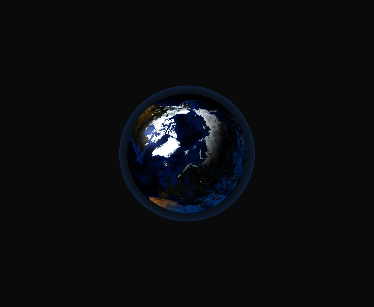
A 3D Earth lit day and night from the real sun position, wrapped in a soft atmosphere, with smooth drag-to-orbit controls.
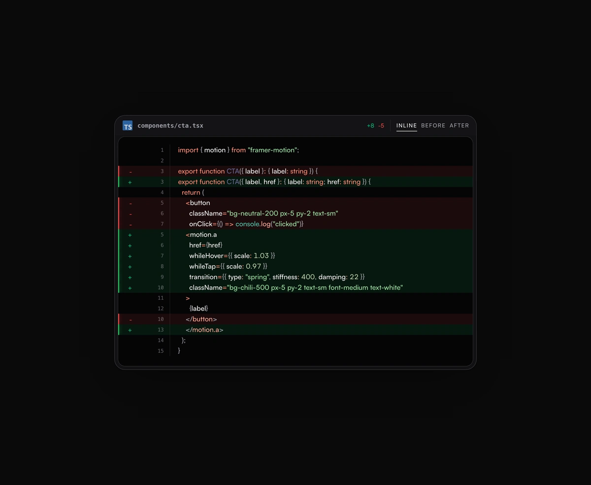
Inline or toggled code diffs rendered inside the same polished code block frame, flipping between before and after.
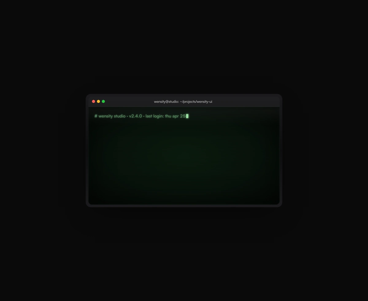
A terminal UI with self-typing commands, CRT phosphor glow and scanlines, streaming output that never re-renders a line.
Featured in React 3D components and React animated backgrounds.