
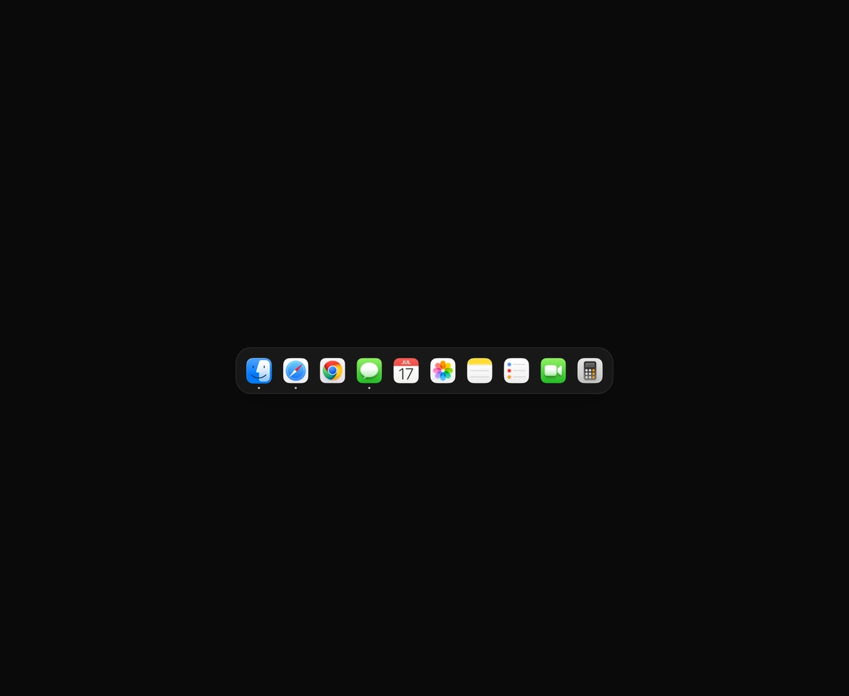
macOS Floating Dock
A magnetic dock where icons inflate near the cursor and push their siblings aside.
Animated theme toggle: day and night switch, sun and moon icons and a circle reveal.
Dark Mode Toggle is a React and Tailwind CSS theme toggle that switches a site between light and dark, in Next.js or any React app. Pick from five shapes: a day and night switch where clouds sink and a cratered moon covers the sun, two sun and moon icons, a Light, System and Dark segmented control, or a menu. The new theme spreads from the button in a circle via the View Transitions API, or switches instantly when unsupported or motion is reduced. Choices persist in localStorage, and a tiny head script from the usage example stops a light flash.
Run the following command
pnpm dlx wensity@latest add dark-mode-toggle
npx wensity@latest add dark-mode-toggle
yarn dlx wensity@latest add dark-mode-toggle
bunx wensity@latest add dark-mode-toggle
Import DarkModeToggle from @/components/wensity/dark-mode-toggle and render it anywhere in your React or Next.js app. The source lands in your own repo, so every prop, class and animation below is yours to edit.
// app/layout.tsx: apply the stored theme before the first paint, so a dark// visitor never sees a light flash. "theme" matches the toggle's default// storageKey; change both together.const themeScript ="(function(){try{var t=localStorage.getItem('theme');" +"if(t!=='light'&&t!=='dark')t=matchMedia('(prefers-color-scheme: dark)').matches?'dark':'light';" +"var r=document.documentElement;r.classList.remove(t==='dark'?'light':'dark');" +"r.classList.add(t);r.style.colorScheme=t}catch(e){}})()";export default function RootLayout({ children }: { children: React.ReactNode }) {return (<html lang="en" suppressHydrationWarning><head><script dangerouslySetInnerHTML={{ __html: themeScript }} /></head><body>{children}</body></html>);}// header.tsximport { DarkModeToggle } from "@/components/wensity/dark-mode-toggle";export function Header() {return <DarkModeToggle variant="eclipse" reveal="circle" />;}
| Prop | Type | Default | Description |
|---|---|---|---|
variant | "eclipse" | "orbit" | "switch" | "segmented" | "menu" | "eclipse" | The shape of the toggle. Segmented and menu add a System choice. |
theme | "light" | "dark" | "system" | - | Controlled theme. Pair it with onThemeChange, for example with next-themes. |
defaultTheme | "light" | "dark" | "system" | "system" | Theme used before a stored choice is found. |
onThemeChange | (theme) => void | - | Called with the chosen theme on every change. |
reveal | "circle" | "fade" | "none" | "circle" | How the new theme appears across the page. Falls back to an instant switch without View Transitions or with reduced motion. |
revealDuration | number | 550 | Length of the page reveal in milliseconds. |
duration | number | 450 | Length of the icon and switch animation in milliseconds. |
size | "sm" | "md" | "lg" | "md" | Button, switch and segment size. |
applyToDocument | boolean | true | Write the theme to the html element. Turn off when another library applies it. |
attribute | "class" | `data-${string}` | "class" | Toggle dark and light classes, or set a data attribute such as data-theme. |
storageKey | string | null | "theme" | localStorage key for the choice. null turns persistence off. |
labels | Partial<Record<Theme, string>> | - | Menu and screen reader labels, for translation. |
A magnetic dock where icons inflate near the cursor and push their siblings aside.
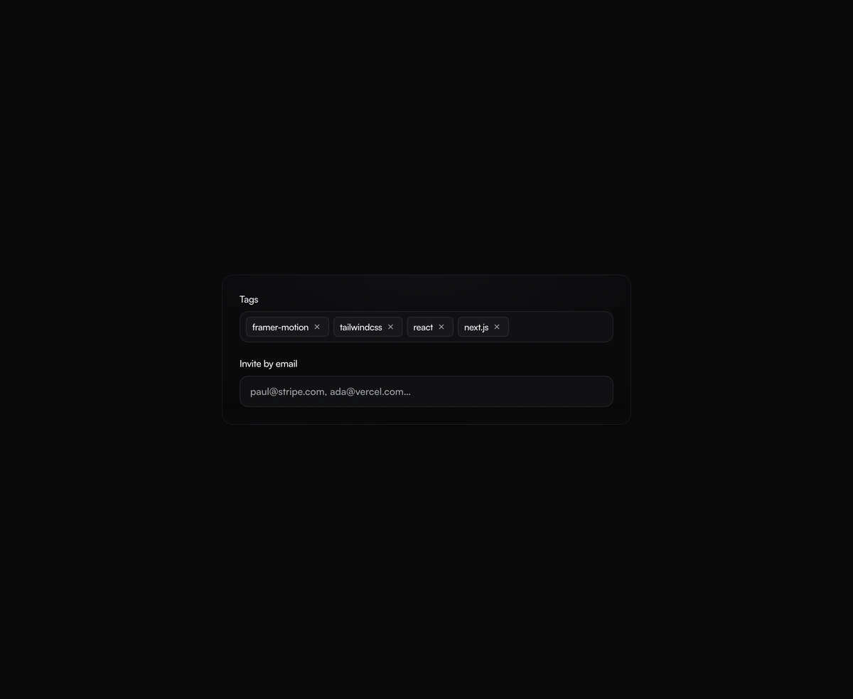
A tag input where pills pop in as you add them and slide out on remove, closing the gap without snapping the layout.
One angled GPU sweep that travels across any placeholder geometry you wrap, never a separate shimmer stuttering per row.
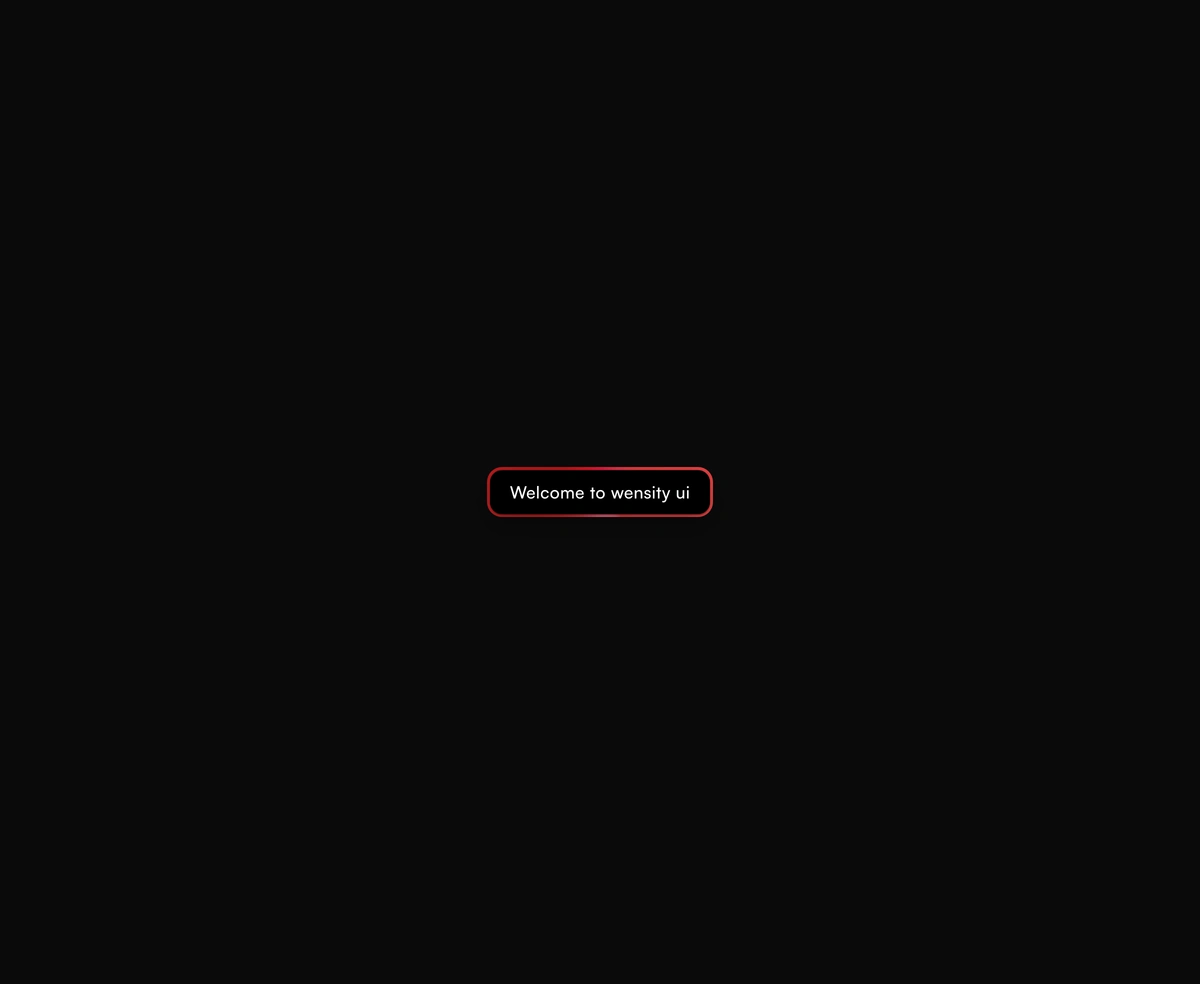
A dual-layer orbit glow that soft-spins around the edge of any button or link you wrap it around, at zero layout cost.