
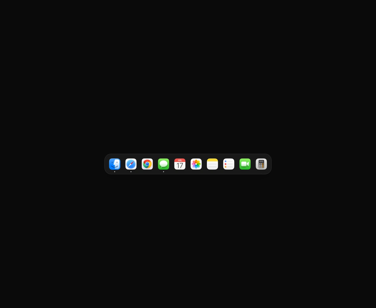
macOS Floating Dock
A magnetic dock where icons inflate near the cursor and push their siblings aside.
React star rating with half stars, drag to rate, and cut stars that catch the light.
Star Rating is a React and Tailwind CSS star rating input with half stars, in Next.js or any React app. The default cut style splits each star into ten facets lit by a light that follows the pointer; classic draws soft rounded stars. One fill level glides along the row, so half stars and read only values like 4.7 render exactly. Hovering lower tints the stars you would drop; on touch, drag to rate. Screen readers get a slider with arrow, Home, End and number keys. Clicking the current rating clears it; set allowClear to false on required fields.
Run the following command
pnpm dlx wensity@latest add star-rating
npx wensity@latest add star-rating
yarn dlx wensity@latest add star-rating
bunx wensity@latest add star-rating
Import StarRating from @/components/wensity/star-rating and render it anywhere in your React or Next.js app. The source lands in your own repo, so every prop, class and animation below is yours to edit.
import { useState } from "react";import { StarRating } from "@/components/wensity/star-rating";export default function Example() {const [rating, setRating] = useState(4.5);return (<StarRatingvalue={rating}onValueChange={setRating}precision={0.5}size={36}/>);}
| Prop | Type | Default | Description |
|---|---|---|---|
value | number | - | Controlled rating. Pair it with onValueChange. |
defaultValue | number | 0 | Initial rating when uncontrolled. |
onValueChange | (value: number) => void | - | Called with the new rating each time one is picked. |
onHoverChange | (value: number | null) => void | - | Called with the rating under the pointer, or null when it leaves. |
max | number | 5 | Number of stars. |
precision | 0.5 | 1 | 1 | Smallest step: whole or half stars. |
size | number | 28 | Star size in pixels. |
variant | "cut" | "classic" | "cut" | Cut draws faceted stars lit by a light that follows the pointer. Classic draws soft rounded stars. |
tone | "gold" | "silver" | "chili" | "rose" | "violet" | "gold" | Material of the lit stars. |
readOnly | boolean | false | Show a rating without letting anyone change it. Any fraction works. |
allowClear | boolean | true | Picking the current rating again clears it. |
name | string | - | Form field name. Adds a hidden input with the rating. |
A magnetic dock where icons inflate near the cursor and push their siblings aside.
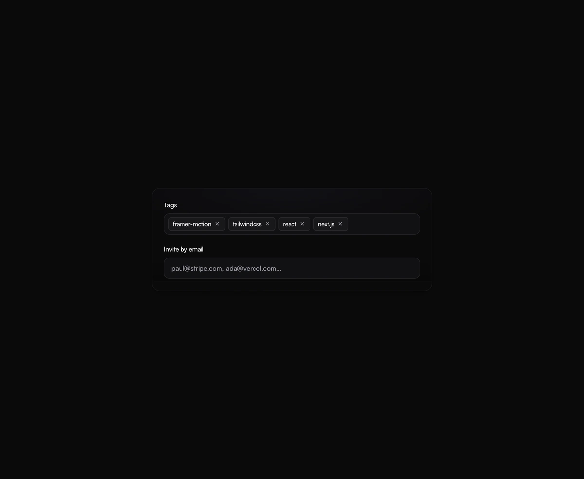
A tag input where pills pop in as you add them and slide out on remove, closing the gap without snapping the layout.
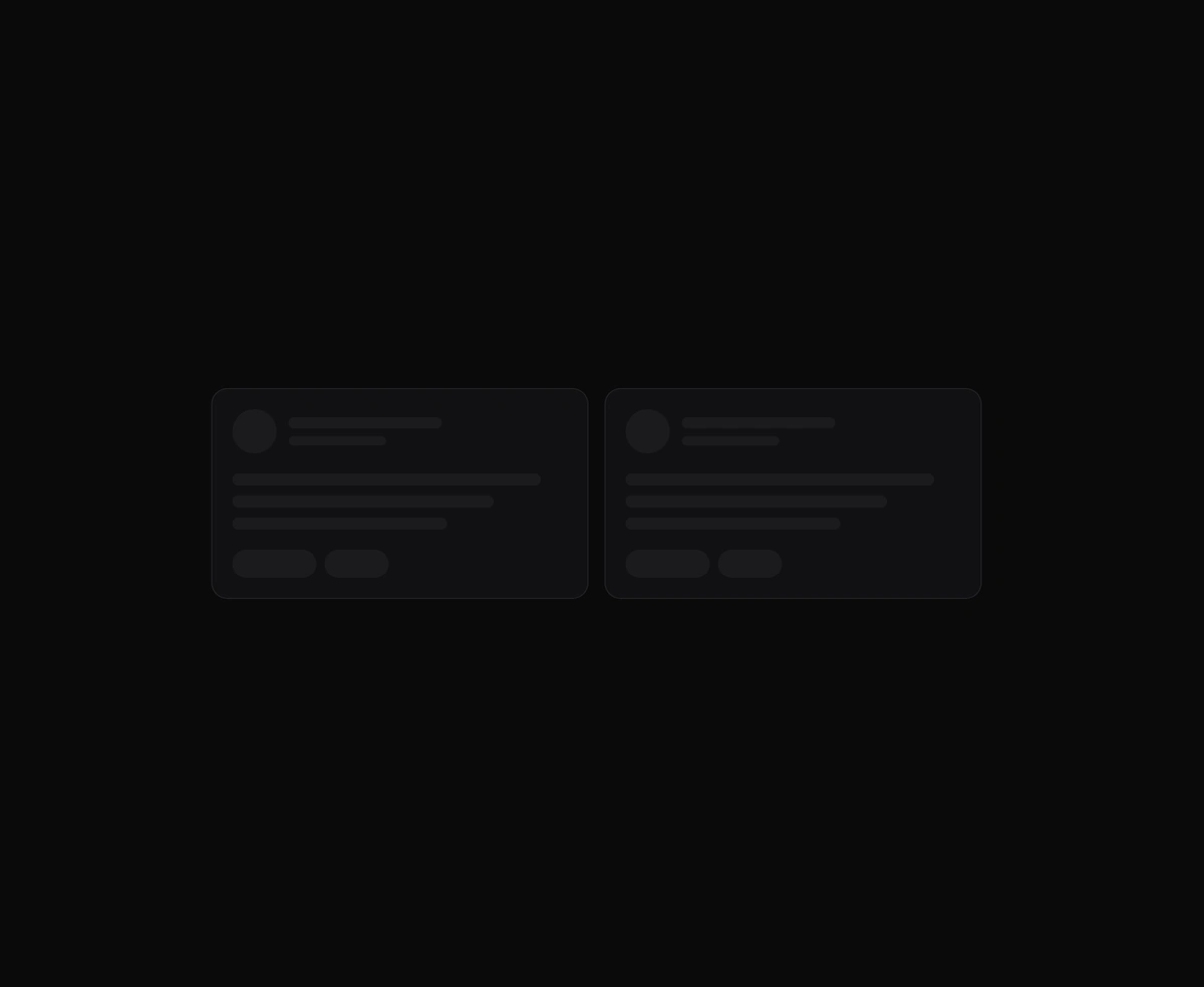
One angled GPU sweep that travels across any placeholder geometry you wrap, never a separate shimmer stuttering per row.
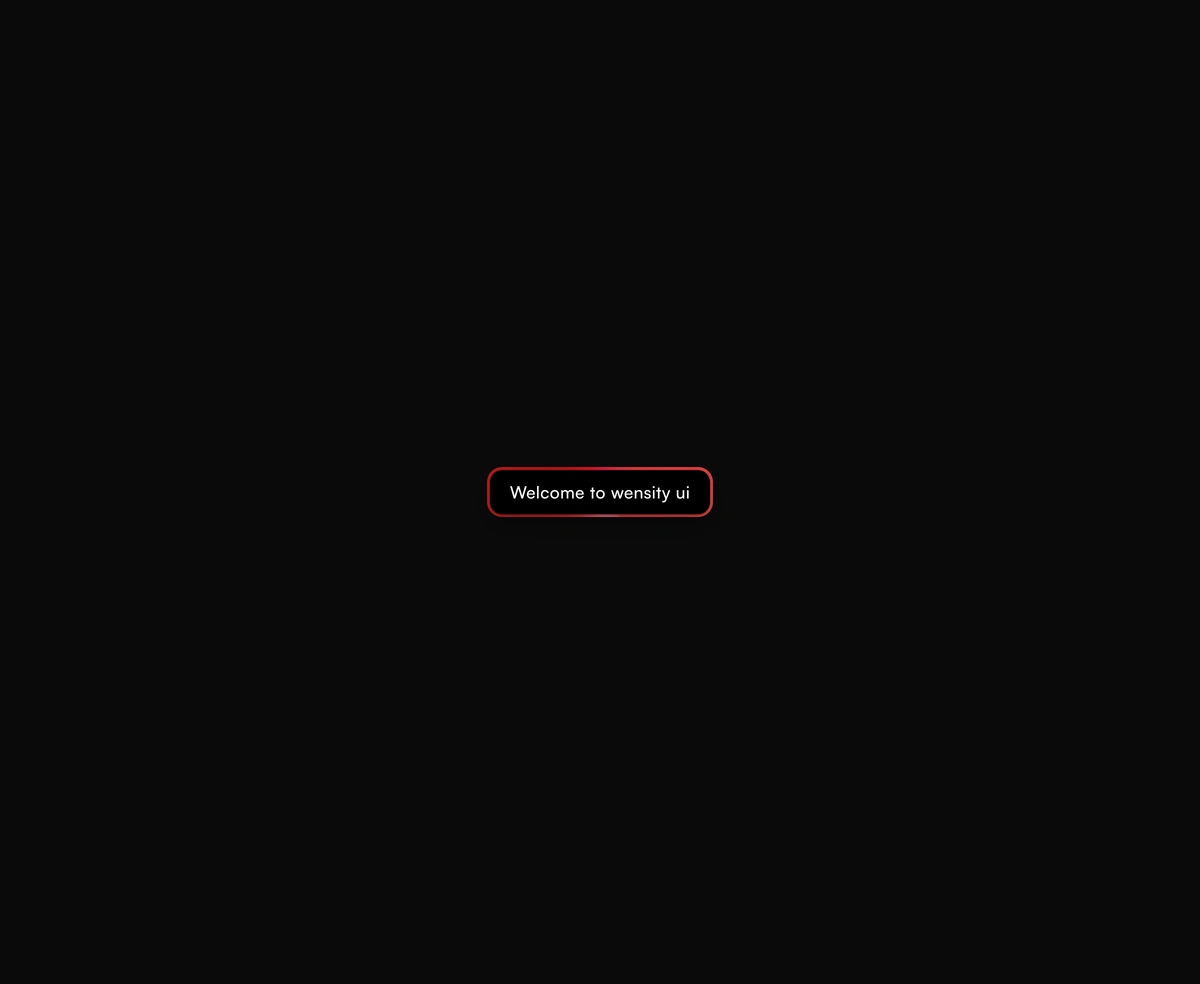
A dual-layer orbit glow that soft-spins around the edge of any button or link you wrap it around, at zero layout cost.