Water Progress Bar
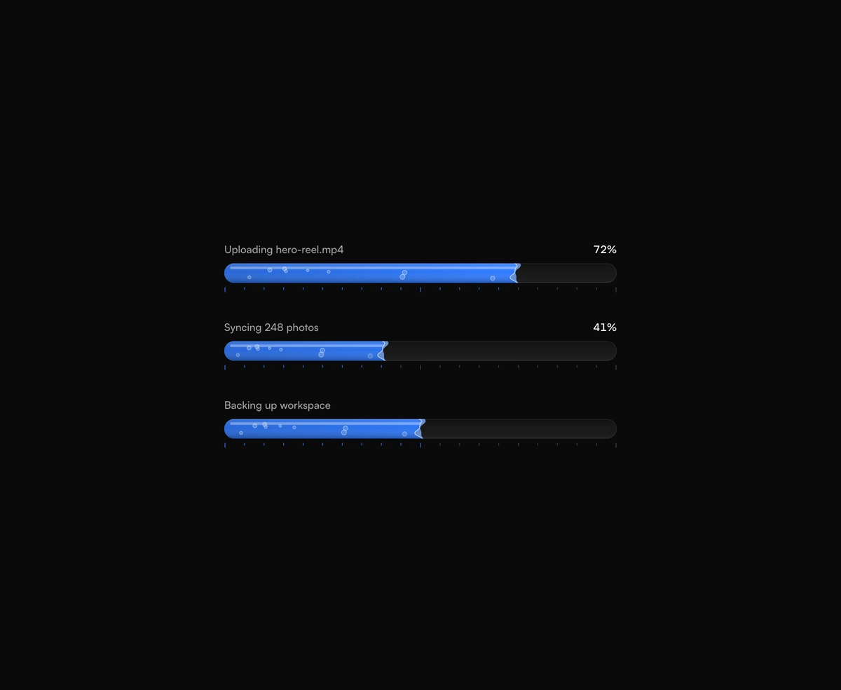
ProA progress bar that fills with water, its rippling front leaning as it runs.
Overview
Water Progress Bar is a React and Tailwind CSS liquid progress bar that fills with water from left to right, in Next.js or any React app. Pass value from 0 to 100 and the water runs there on a critically damped spring without overshoot, its front rippling and leaning forward while it moves, then calming once it stops. A caption and live percentage sit above, and an optional scale below takes the water's color as it passes each tick. Omit value to loop. It draws at its measured pixel width, so the ripples never stretch.
Installation
Run the following command
pnpm dlx wensity@latest add water-progress-bar
Usage
Import WaterProgressBar from @/components/wensity/water-progress-bar and render it anywhere in your React or Next.js app. The source lands in your own repo, so every prop, class and animation below is yours to edit.
import { WaterProgressBar } from "@/components/wensity/water-progress-bar";export default function Example({ progress }: { progress: number }) {return (<div className="w-full max-w-md space-y-8"><WaterProgressBar value={progress} caption="Uploading hero-reel.mp4" size="lg" /><WaterProgressBar caption="Backing up workspace" size="sm" scale={false} /></div>);}
Props
| Prop | Type | Default | Description |
|---|---|---|---|
value | number | - | Progress from 0 to 100. Omit it for an indeterminate bar that rolls back and forth. |
caption | React.ReactNode | - | Text above the bar on the left. The percentage sits on the right. |
color | string | "#2f7bff" | Water color, any CSS color. The scale ticks take it as the level passes them. |
size | "sm" | "md" | "lg" | "md" | Bar thickness: 10, 18, or 28 pixels. |
wave | number | 0.5 | Ripple height on the leading edge, from 0 for a flat front to 1. |
speed | number | 1 | Playback rate of the ripples, bubbles, and indeterminate roll. |
bubbles | boolean | true | Bubbles drifting through the water toward the front. |
scale | boolean | true | Tick scale under the bar, from 0 to 100. |
showValue | boolean | true | Shows the percentage above the bar. Hidden while indeterminate. |
formatValue | (percent: number) => string | - | Formats the percentage. Receives a whole number from 0 to 100. |
label | string | - | Accessible name. Defaults to the caption when it is a string. |