Interactive 3D Book
ProA tactile 3D book cover that opens on click with real matte depth, then turns each page on a weighted hinged flip.
Overview
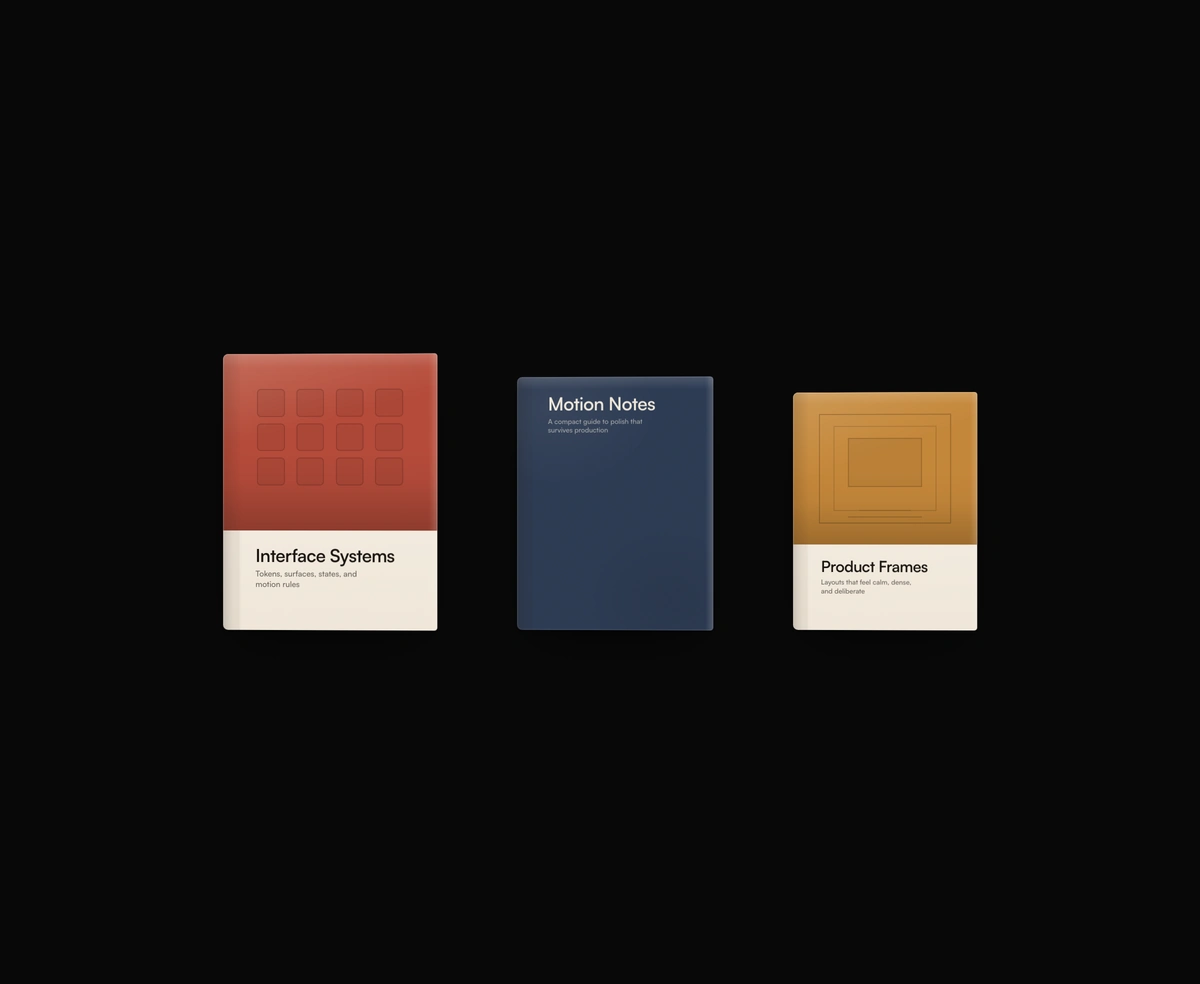
Interactive 3D Book is a React and Tailwind CSS 3D book mockup for ebooks, reports, and portfolios, in Next.js or any React app, animated with Framer Motion. The matte cover tilts on hover, opens on click, and every later click turns a page on a weighted hinge with a gutter shadow, closing again after the last page. Enter or Space opens it, Right Arrow or Page Down turns a page, and Escape closes it, while reduced motion swaps poses without the swing. Choose a banded or full color cover with your own artwork, mark, and pages.
Installation
Run the following command
pnpm dlx wensity@latest add dimensional-book-cover
Usage
Import DimensionalBookCover from @/components/wensity/dimensional-book-cover and render it anywhere in your React or Next.js app. The source lands in your own repo, so every prop, class and animation below is yours to edit.
import { DimensionalBookCover } from "@/components/wensity/dimensional-book-cover";export default function Example() {return (<DimensionalBookCovertitle="Interface Systems"subtitle="Tokens, surfaces, states, and motion rules"accent="#b54b3a"pages={[<div key="1">Page one</div>,<div key="2">Page two</div>,<div key="3">Page three</div>,]}width={214}/>);}
Props
| Prop | Type | Default | Description |
|---|---|---|---|
title | string | "Design Systems Fieldbook" | Primary title rendered on the cover. |
subtitle | string | "Production patterns for sharper UI craft" | Optional supporting line below the title. |
variant | "banded" | "solid" | "banded" | Switches between a top-artwork band and a full-color cover. |
accent | string | "#c45a45" | Flat cover color for the band or solid face. Prefer solid matte colors. |
textColor | string | - | Overrides the cover text color. |
width | number | 208 | Book width in pixels. Height follows the fixed cover ratio. |
artwork | React.ReactNode | - | Custom artwork rendered in the banded cover area. |
mark | React.ReactNode | - | Optional logo or mark rendered near the bottom of the cover. |
pages | React.ReactNode[] | - | Interior pages. Each click after open flips to the next page. |
Featured in React 3D components.