React 3D components
Depth, perspective and real rotation, most of it in plain CSS rather than a 3D engine. Copy any one into your project and it runs without a renderer.
Built with the stack you already ship
3D components built with CSS
These use transform, perspective and preserve-3d only. No renderer, no shader compilation, and no extra bytes beyond the component itself.
 Split-Flap DisplayA ceramic and graphite split-flap device that ripples each flap into your message.
 Interactive 3D BookA tactile 3D book cover that opens on click with real matte depth, then turns each page on a weighted hinged flip.
 Animated 3D FolderA real CSS 3D folder that tilts toward your cursor, drops its cover open, and lifts its files into a stepped index.
 Card Stack CarouselA React 3D card stack built on Framer Motion where the front card drops away, the deck promotes, then it returns.
 Perspective MarqueeA 3D tilted image grid with alternating rows scrolling infinitely in both directions.
 Scroll StackCards that pin, tilt, and stack into a tidy deck as you scroll, with zero scroll hijacking anywhere in the sequence.
 Fan Hover Card StackHover a stacked profile deck and watch the cards fan outward in sequence while the active one lifts to the front.
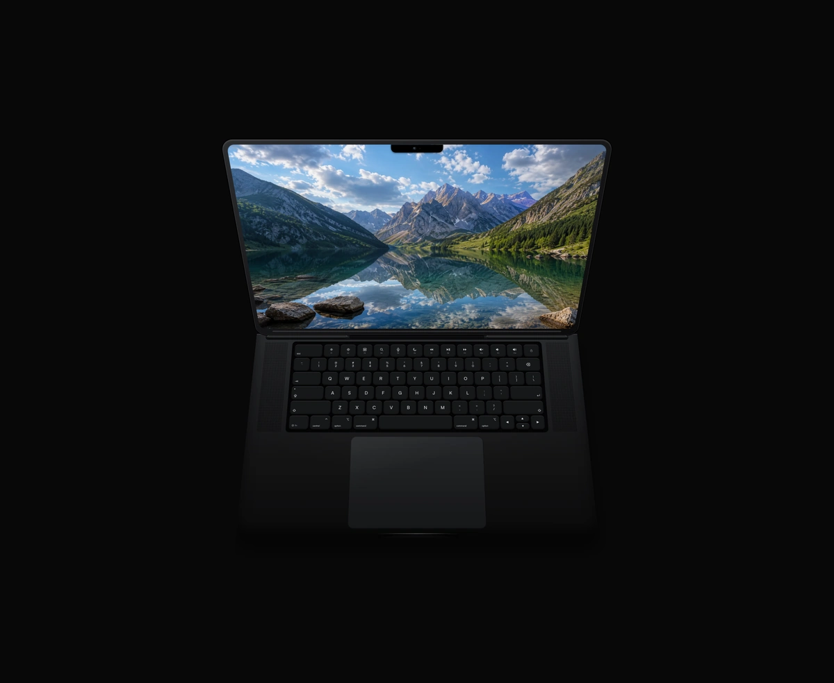 Animated MacBookA closed MacBook that hinges open and powers on when you hover, in ten finishes.
 iPhone MockupA thick, extruded iPhone with a machined side rail, side buttons, and lock screen.
 Tactile KeyboardA 65% QWERTY board with real key travel, live shift legends, and five colorways.
 Refraction Glass ContainerReal refraction, where feDisplacementMap warps the actual pixels sitting behind the card instead of blurring them.
 Cover Flow CarouselA 3D Cover Flow album carousel where side cards swing into the center and a mini player below follows the track.
3D components built with WebGL
These load a renderer and compile shaders before their first frame. Worth the weight when the effect is the point, and worth checking on a mid range phone.
 Interactive 3D GlobeA 3D Earth lit day and night from the real sun position, wrapped in a soft atmosphere, with smooth drag-to-orbit controls.
 ChatGPT OrbLow-power WebGL fractal noise that blooms white ink inside a soft circular mask.
 Siri OrbA glassy WebGL sphere with a prism ribbon sweeping a full spectrum through it.
 Glass StripesDiagonal glass stripes refract a slow, glowing light that follows your pointer.
 AI OrbA near-black glass sphere with a violet rim that drifts while a model generates.
 SVG FireReal fire simulated on the GPU, rising from any SVG's edges, with embers and glow.
 iPhone SiriTap the Dynamic Island and it swells into a live WebGL Siri orb of folded light.
 Particle ImageA photo rebuilt as halftone dots on springs that scatter from the pointer.
 Chrome TextLiquid chrome text effect: inflated metal letters with sliding glints and sparkles.
 Liquid Glass OrbA draggable soap-bubble orb you swipe upward to enter the page, where it settles as a compact, still glass anchor.
 Liquid Metal ButtonA pill or icon button ringed in flowing liquid metal, for light and dark pages.
 Gradient GrainLight leaks on film: saturated colour that burns to white under fine grain.
 SVG Liquid AnimationAny SVG as a body of water: ripples, drips, and a surface that follows the pointer.
 Fluted GlassAny photo seen through fluted glass, sliced into soft ribs that follow the pointer.
 Gradient StripesA brand gradient sliced into glowing stripes that rise toward the pointer.
CSS 3D or WebGL, and how to tell which you need
Most things people call a 3D component in React are not running a 3D engine at all. A card that tilts toward the cursor, a book that opens, a stack that fans out: all of that is CSS transforms with a perspective value set on the parent and transform-style set to preserve-3d on the child. The browser composites it on the GPU, it costs nothing to load, and it degrades to a flat layout if transforms are unsupported. Reach for this first, because it covers more cases than people expect.
You need actual WebGL when the surface itself has to be computed per pixel. A globe with an atmosphere, a fluid orb, refraction that bends whatever sits behind the element: none of those can be expressed as a transform on a rectangle, because they depend on lighting and distortion across the whole surface. That is the line. If you can describe the effect as moving and rotating flat panels, CSS will do it. If you have to describe it as light behaving a certain way, you need a renderer.
The cost difference is not subtle. A CSS 3D component ships as one file and animates the moment the stylesheet parses. A WebGL component pulls in a renderer, compiles its shaders, and only then paints its first frame, which on a mid range Android phone is a visible pause. That pause is fine three screens down the page and a real problem if the component is the largest thing above the fold, where it becomes the element Google times for Largest Contentful Paint.
Perspective value is the setting that most often makes a CSS 3D effect look wrong. It is the distance from the viewer to the z equals zero plane, so a small number like 400px gives a strong, almost fisheye distortion, and a large number like 2000px flattens the effect until it barely reads. Set it on the container rather than the transformed element, otherwise each child gets its own vanishing point and the group stops looking like one scene.
Whatever you pick, check it against reduced motion. A component that rotates continuously is exactly the kind of thing that triggers motion sickness, and the browser already tells you when someone has asked for less of it. Everything here respects the prefers-reduced-motion media query by settling into a static state rather than disabling itself, so the component still communicates what it is without moving.