Show Off

Set-piece components for hero sections and demo decks. Confetti cannons, refraction glass, retro terminals, ambient aurora. Used sparingly, felt instantly.

21 components
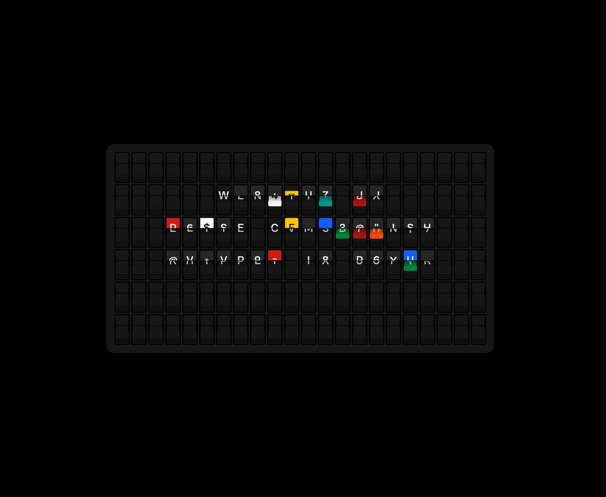
Split-Flap Vestaboard Display component preview

Split-Flap Vestaboard Display

A mechanical character cascade in pure CSS 3D, running 80 cells at a solid 60fps.
Interactive 3D Globe component preview

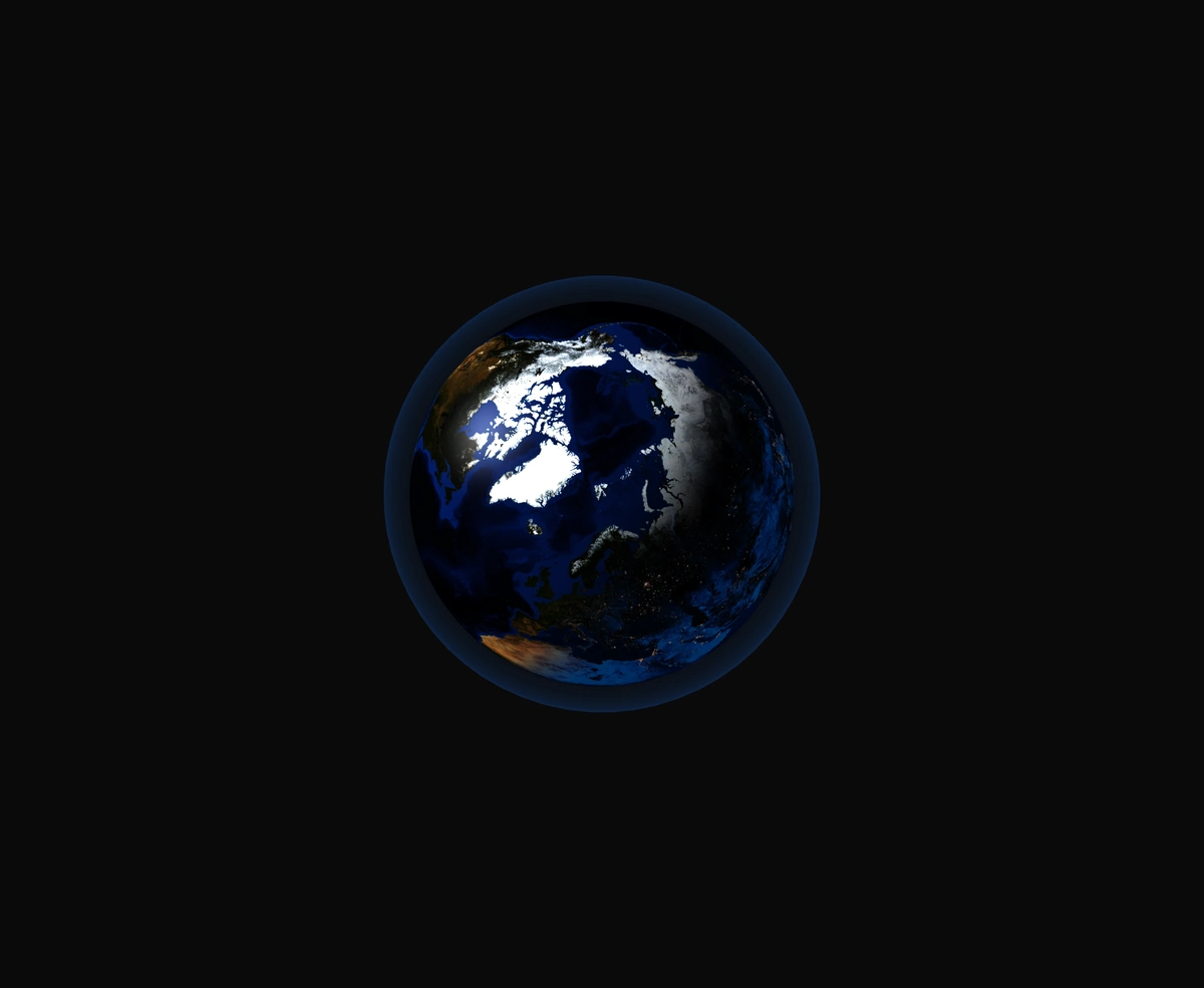
Interactive 3D Globe

A photo-real Earth carrying animated avatar pins, a soft atmosphere shader, and smooth drag-to-orbit controls.
Animated Code Diff Viewer component preview

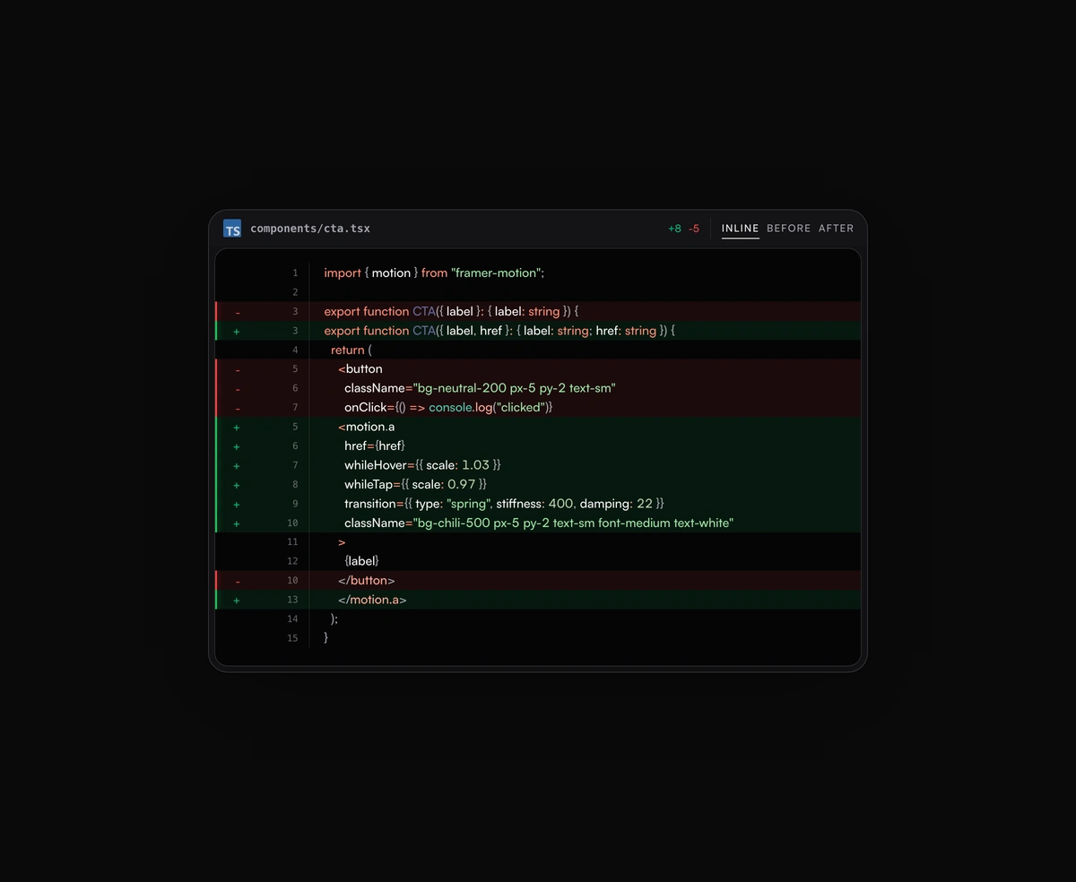
Animated Code Diff Viewer

Inline or toggled code diffs rendered inside the same polished code block frame, flipping between before and after.
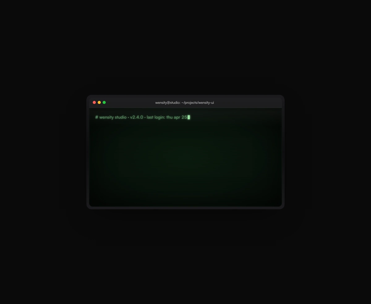
Retro Terminal Emulator component preview

Retro Terminal Emulator

CRT phosphor glow, scanlines, and a 240 char/sec typer that never re-renders a single line of output mid-stream.
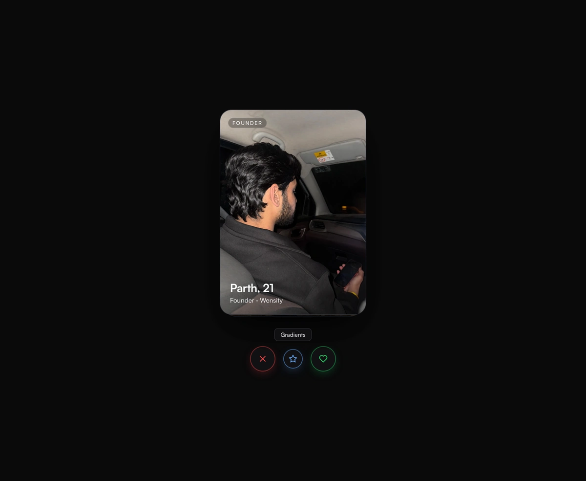
Stacked Tinder-Swipe Cards component preview

Stacked Tinder-Swipe Cards

A real deck where the top card flicks off under your thumb and the one underneath physically rises in real time.
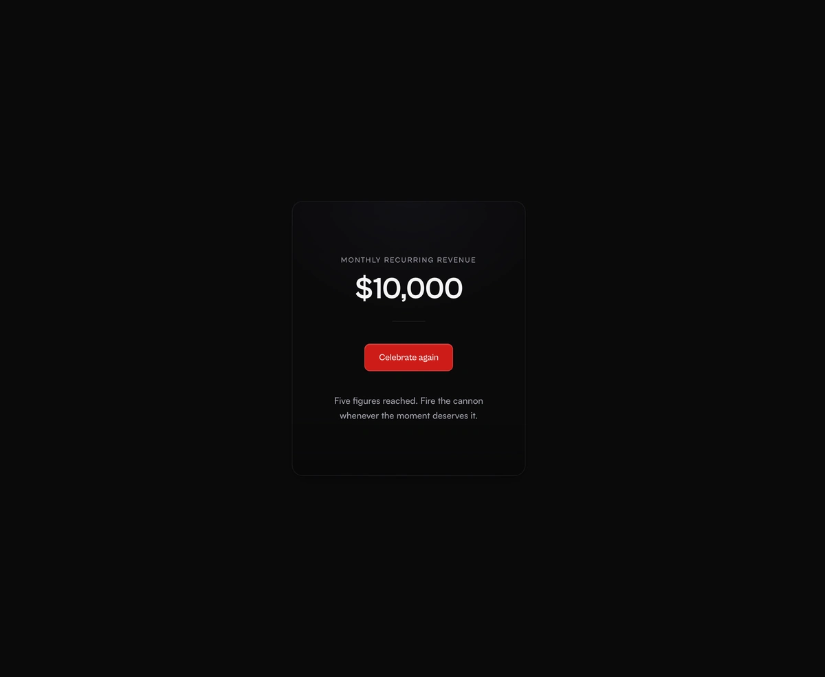
Physics-Based Confetti Cannon component preview

Physics-Based Confetti Cannon

Hand-rolled canvas particles with gravity, drag, terminal velocity, and paper ribbons that flutter on the way down.
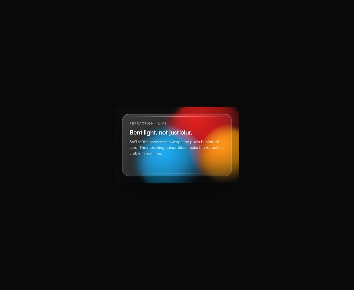
Refraction Glass Container component preview

Refraction Glass Container

Real refraction, where feDisplacementMap warps the actual pixels sitting behind the card instead of blurring them.
iPhone Siri component preview

iPhone Siri

Tap the Dynamic Island and a live WebGL glass surface blooms out of it.

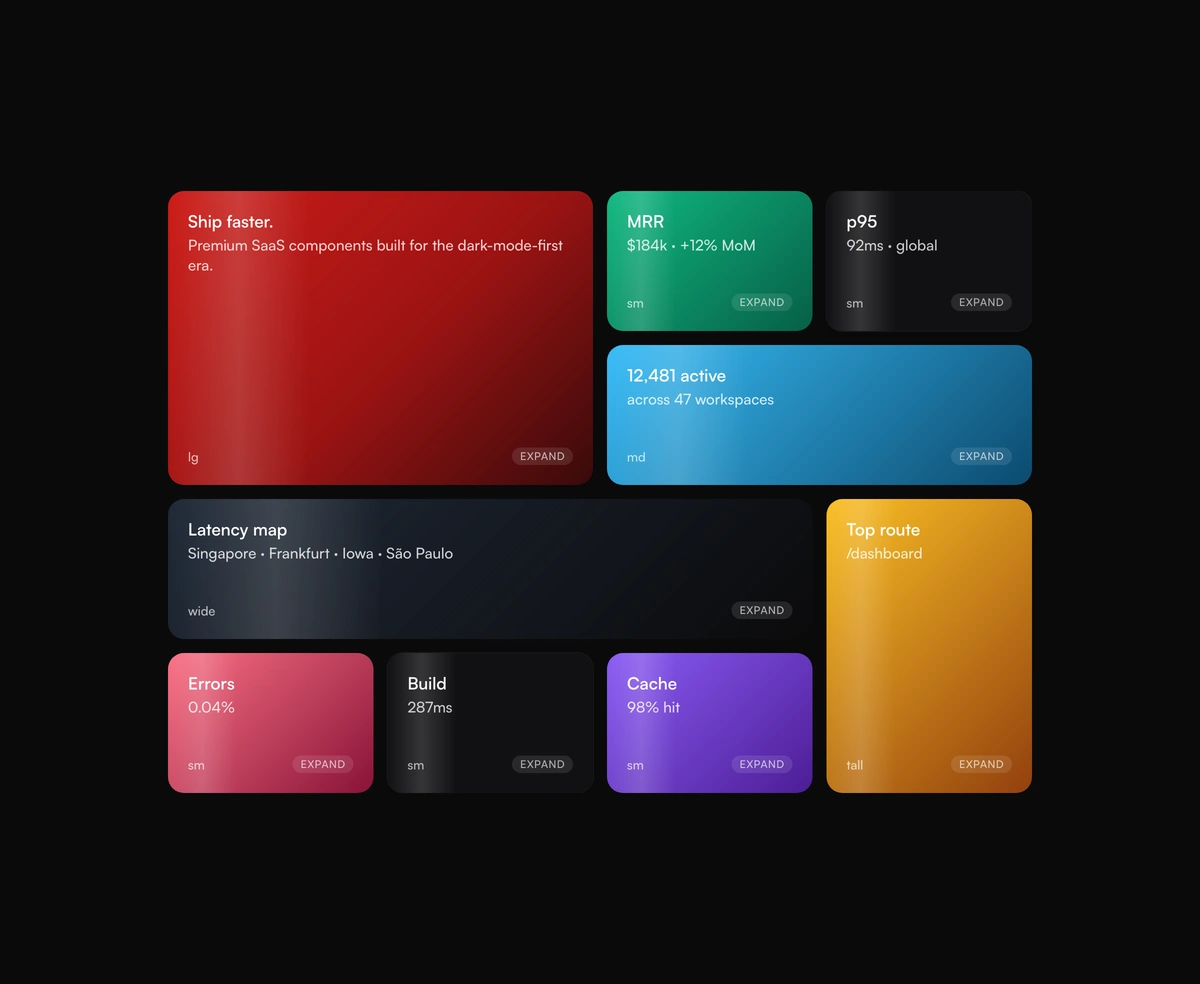
Bento Box Grid Layout component preview

Bento Box Grid Layout

Responsive dashboard tiles with a click-to-expand focus mode that re-composes the grid around whatever you promote.
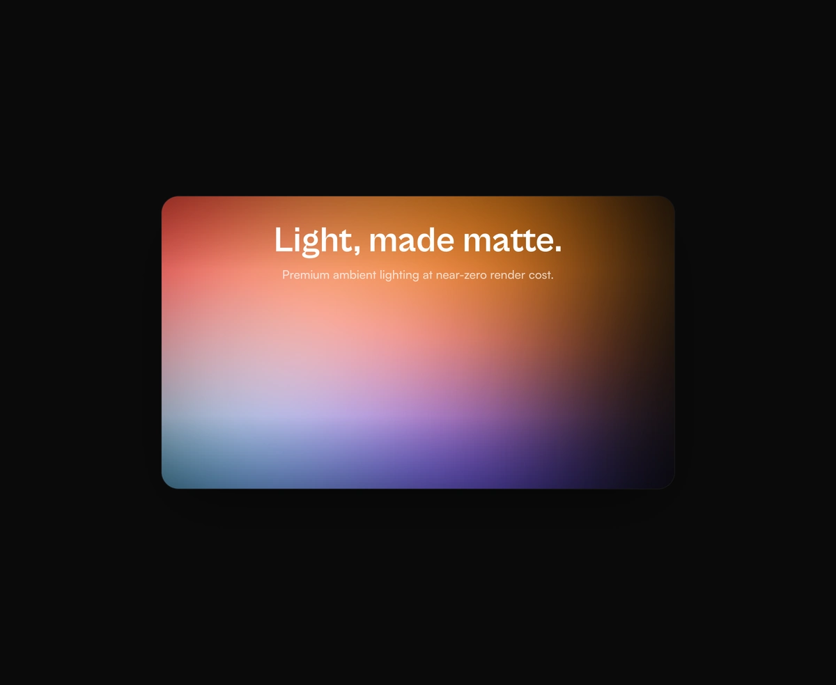
Ambient Aurora Canvas component preview

Ambient Aurora Canvas

Pure-CSS atmospheric lighting with heavy blur and a noise overlay that kills banding.

Scroll Stack component preview

Scroll Stack

Cards that pin, tilt, and stack into a tidy deck as you scroll, with zero scroll hijacking anywhere in the sequence.
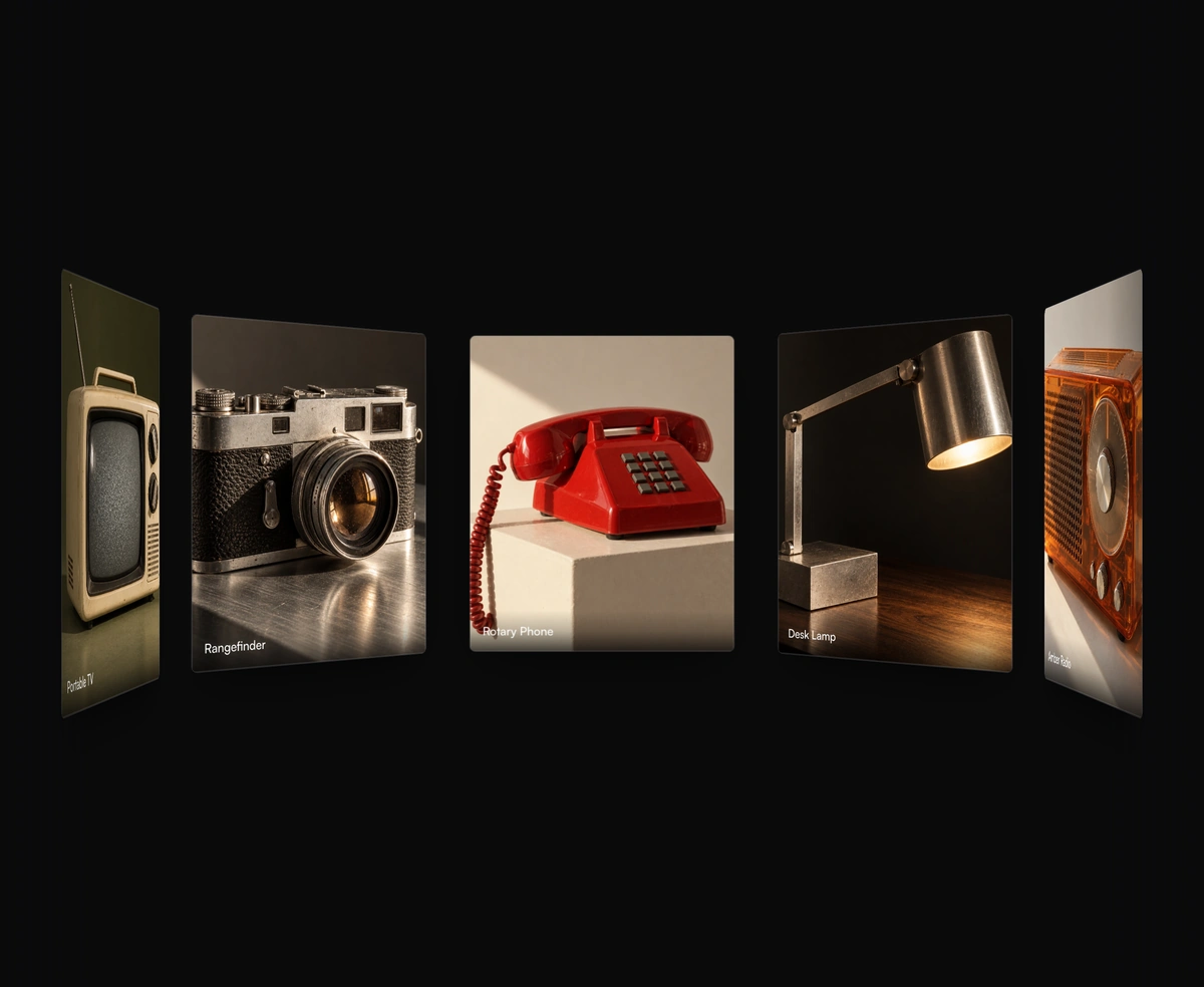
Orbital Image Carousel component preview

Orbital Image Carousel

Drag a cylindrical photo rail with snapped inertia, keyboard stepping, and depth-aware parallax on every face.
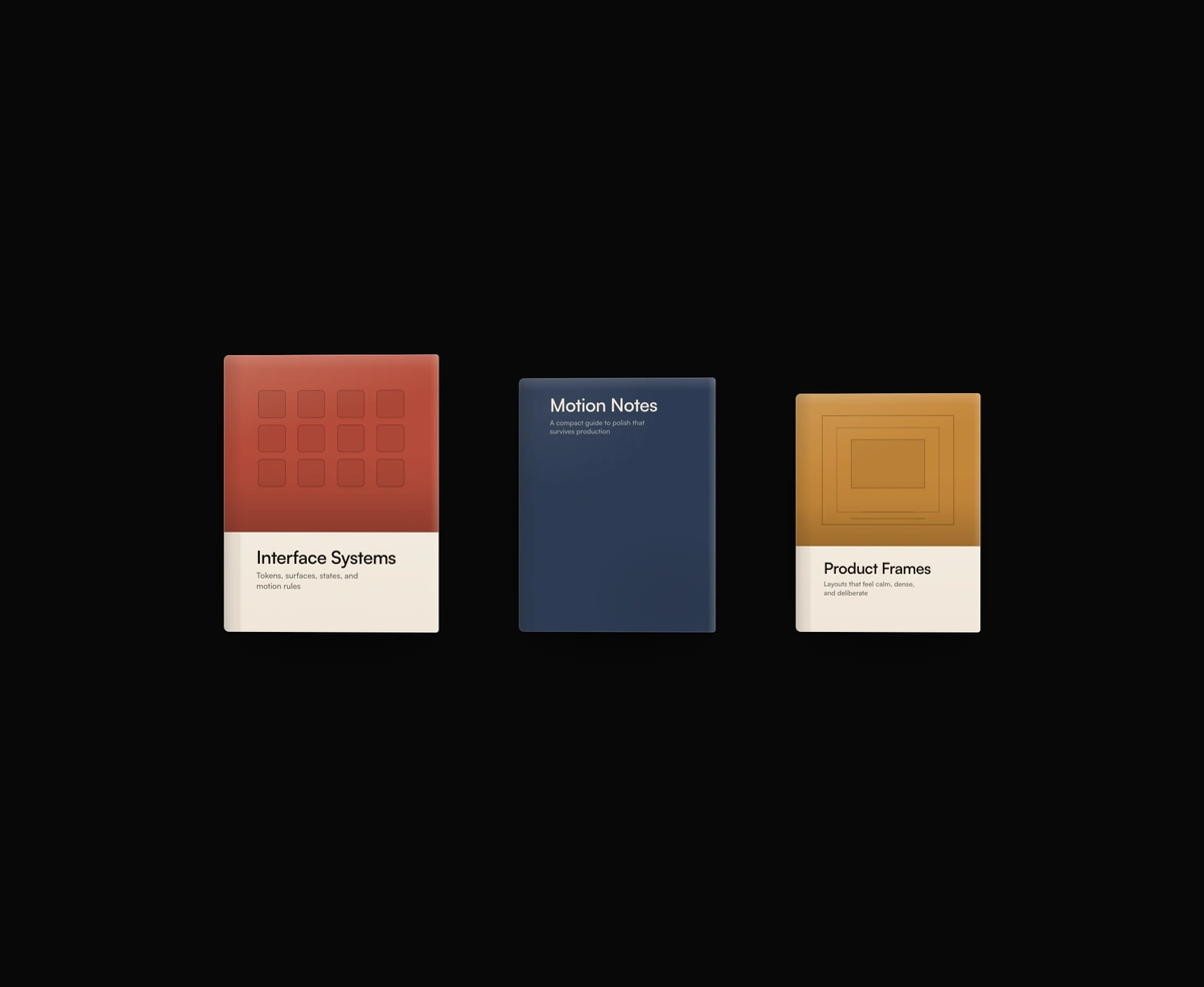
Dimensional Book Cover component preview

Dimensional Book Cover

A tactile 3D book cover that opens on click with real matte depth, then turns each page on a weighted hinged flip.

Lifted Archive Folder component preview

Lifted Archive Folder

A tactile archive folder that peels open on click and fans its documents out while the flap hinges away in 3D.
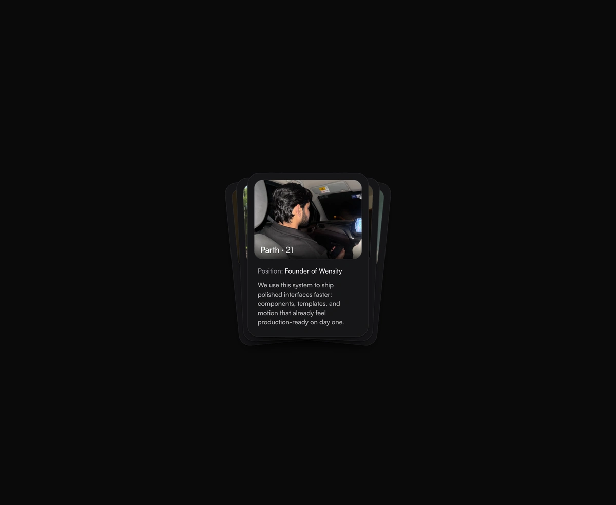
Fan Hover Card Stack component preview

Fan Hover Card Stack

Hover a stacked profile deck and watch the cards fan outward in sequence while the active one lifts to the front.
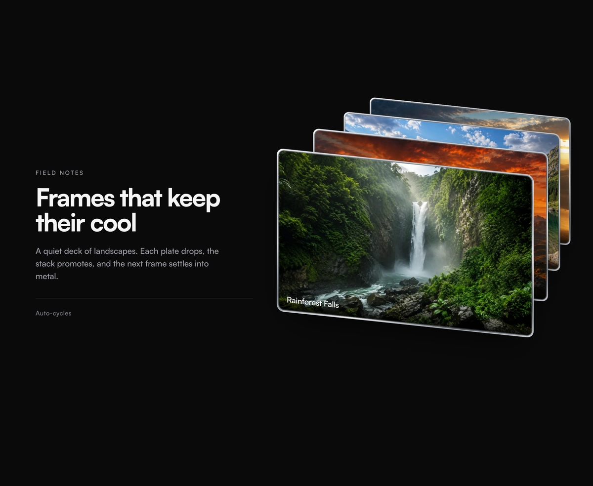
Stack Reveal component preview

Stack Reveal

A React 3D card stack built on Framer Motion where the front card drops away, the deck promotes, then it returns.

Gradient Stripes component preview

Gradient Stripes

Raycast-inspired WebGL stripes with a mouse-tracked spotlight and fine film grain.

Tactile Keyboard component preview

Tactile Keyboard

A 65% QWERTY board with real key travel, live shift legends, and five colorways.

Particle Image component preview

Particle Image

Half a million GPU particles lift off a photo, drift on noise, and smear on hover.

Expanding Cards component preview

Expanding Cards

Hover a tall editorial strip and it opens wide, the rest of the row holding as tight vertical slivers of the same image.

Liquid Ripple Image component preview

Liquid Ripple Image

Pointer trails bloom into concentric ripples that refract a photo in WebGL.

Which show off component should I use?

Backdrops

Sits behind your content and never asks for attention directly.

Ambient Aurora Canvas
You want soft coloured light behind a hero section. Pure CSS with a noise overlay to kill banding, so it stays cheap on a long page.
Gradient Stripes
The background should answer the cursor. WebGL stripes with a mouse-tracked spotlight and film grain, noticeably heavier than the aurora.
Particle Image
You already have the photograph and want it to come apart. Half a million GPU particles drift off it on a noise field and smear where the cursor passes.
Liquid Ripple Image
The photograph should stay whole and move like water. Ripples bloom along the pointer trail, refract what is under them, and the loop parks itself once they fade.

Showing a set of cards or images

Six decks, separated by how a visitor moves through them.

Orbital Image Carousel
People should browse photos by dragging. A cylindrical rail with snapped inertia and keyboard stepping, so it still works without a mouse.
Stacked Tinder-Swipe Cards
You want one decision at a time. The top card flicks away under a thumb and the next rises, which reads as native on a phone.
Scroll Stack
Scroll position is the control. Cards pin and tilt into a deck as the page moves, with no scroll hijacking anywhere in the sequence.
Fan Hover Card Stack
A short set of profile or team cards that fans out on hover. Shows everything at once, and does nothing at all on touch.
Expanding Cards
A row of tall editorial frames that open on hover. One stays wide, the rest collapse into vertical slivers of the same photograph.
Stack Reveal
The deck should cycle on click, front card dropping away and the rest promoting. Right when there is nothing for the visitor to decide.

Framing content on the page

Bento Box Grid Layout
A feature grid where one tile should take over when clicked. The layout re-composes around whatever you promote.
Refraction Glass Container
Glass that genuinely bends what sits behind it instead of blurring it. Costs more than a backdrop filter, so spend it on one card.

Text and data that changes

Split-Flap Vestaboard Display
Short strings or live counters that update on a schedule. The mechanical flip makes a change land as an announcement.
Retro Terminal Emulator
Command output or a scripted install walkthrough. Types itself at speed without re-rendering the lines already on screen.
Animated Code Diff Viewer
Showing what your tool changed in someone else's code. Additions and removals inline, or a flip between before and after.

Three-dimensional objects

Heavier than the rest of this category. One to a page.

Interactive 3D Globe
Customers, servers, or offices spread across the world. Drag to orbit, with pins you can point at real coordinates.
Dimensional Book Cover
A publication, changelog, or case study that should feel like an object. Opens on click, then turns pages on a weighted hinge.
Lifted Archive Folder
A document set that should read as physical. The flap peels back on click and the contents fan out behind it.
Tactile Keyboard
Shortcuts or typing are the product itself. Real key travel with synthesized switch sound, which needs audio permission to land fully.
iPhone Siri
Your product is an app and the mockup should do something. Tapping the Dynamic Island blooms a glass sheet that keeps refracting the wallpaper and widgets beneath it.

Marking a moment

Physics-Based Confetti Cannon
A signup, purchase, or milestone worth celebrating. Canvas particles with real gravity and drag, so ribbons flutter rather than drop.

More categories

Browse other categories

All components

Agentic AI Interfaces

6 components

Inputs, threads, tool calls, and conversation surfaces tuned for AI products. Every component is keyboard-first, streaming-aware, and dark-mode native.

Explore category

Cinematic Interactions

13 components

Big-feeling motion: parallax, scrub-scroll sequences, sticky storytelling, page transitions. The components that make a marketing site feel alive.

Explore category

Heavy SaaS Blocks

5 components

Command palettes, kanban boards, data tables, pricing toggles, RBAC controls - the dense product surfaces real apps need on day one.

Explore category