File Uploader
A bold red dropzone for any file, with gallery tiles and progress after upload.
Overview
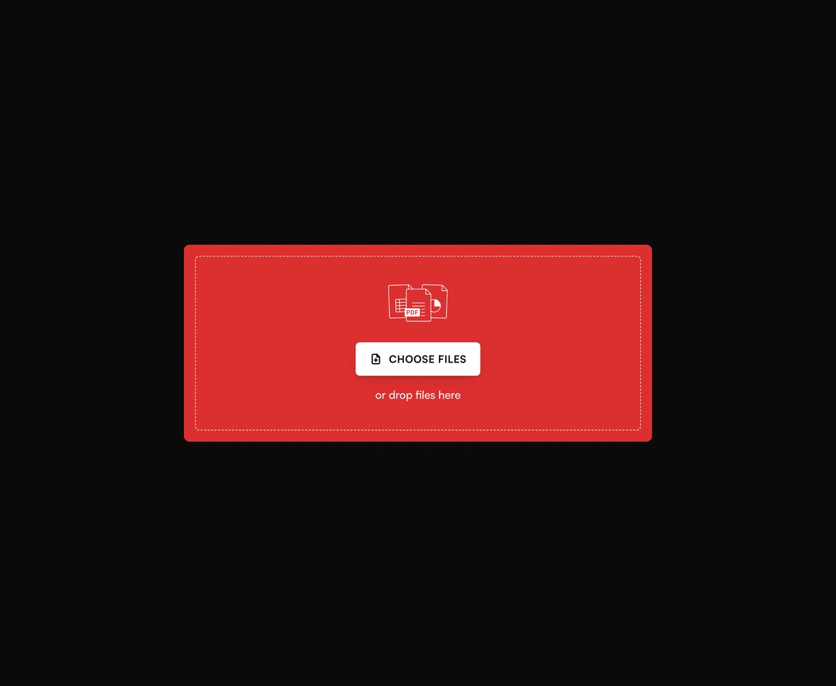
File Uploader is a React and Tailwind CSS drag and drop file upload component, in Next.js or any React app, with a bold dropzone and a choose files button. Images land as preview tiles and documents as cards with a circular progress ring, while files that break accept or maxSize show an error instead of uploading. Pass onUpload to send each file to S3, UploadThing, or your own API and report progress through the callback, and thrown errors appear on the card. Without onUpload the progress is simulated, and maxSize defaults to 10 MB.
Installation
Run the following command
pnpm dlx wensity@latest add file-uploader
Usage
Import FileUploader from @/components/wensity/file-uploader and render it anywhere in your React or Next.js app. The source lands in your own repo, so every prop, class and animation below is yours to edit.
"use client";import { FileUploader, type UploadFile } from "@/components/wensity/file-uploader";export default function Example() {return (<FileUploadercolor="#DC2F2F"buttonLabel="Choose files"description="or drop files here"maxFiles={6}onChange={(files: UploadFile[]) => console.log(files)}onUpload={async (file, onProgress) => {// Replace with your API upload — call onProgress(0..100)onProgress(100);}}/>);}
Props
| Prop | Type | Default | Description |
|---|---|---|---|
value | UploadFile[] | - | Controlled file list. |
defaultValue | UploadFile[] | - | Seed files for uncontrolled usage. |
onChange | (files: UploadFile[]) => void | - | Fired whenever the file list changes. |
onUpload | (file: File, onProgress: (percent: number) => void) => Promise<void> | - | Custom upload handler. When omitted, progress is simulated locally. |
onRemove | (file: UploadFile) => void | - | Fired when a file is removed from the list. |
accept | string | - | HTML accept string. Omit to allow all file types. |
maxFiles | number | 8 | Maximum number of files. Extra picks are ignored. |
maxSize | number | 10485760 | Maximum bytes per file. Oversized files land as errors. |
buttonLabel | string | "Choose files" | Label inside the solid choose button. |
description | string | "or drop files here" | Supporting line under the button. |
color | string | "#DC2F2F" | Dropzone accent color. Hover/drag uses a darker mix. |
multiple | boolean | true | Allow selecting multiple files. |
disabled | boolean | false | Disable interaction. |