Gooey Dock
ProA dock of icons in a solid pill. The active capsule stretches to the item you pick and flips its icon and label inside.
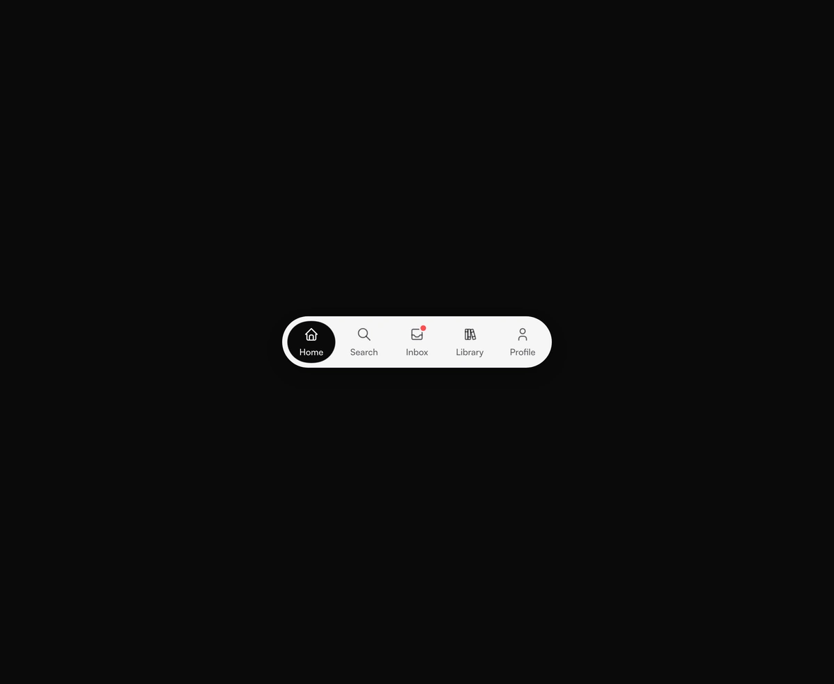
Overview
Gooey Dock is a React and Tailwind CSS app dock and tab bar, in Next.js or any React app, where the active capsule stretches like liquid to the item you pick. A faint capsule previews the item under the pointer, and the selected icon and label flip to the dock color inside the capsule. Badges add an unread dot, it works controlled or uncontrolled, and arrow keys, Home, and End move the selection, while reduced motion snaps it into place. Labels hide below a 480px viewport, not container, so check it inside narrow desktop sidebars.
Installation
Run the following command
pnpm dlx wensity@latest add gooey-dock
Usage
Import GooeyDock from @/components/wensity/gooey-dock and render it anywhere in your React or Next.js app. The source lands in your own repo, so every prop, class and animation below is yours to edit.
import { IconBooks, IconHome, IconInbox, IconSearch, IconUser } from "@tabler/icons-react";import { GooeyDock } from "@/components/wensity/gooey-dock";export default function Example() {return (<GooeyDockitems={[{ id: "home", label: "Home", icon: <IconHome size={22} stroke={1.75} /> },{ id: "search", label: "Search", icon: <IconSearch size={22} stroke={1.75} /> },{ id: "inbox", label: "Inbox", icon: <IconInbox size={22} stroke={1.75} />, badge: true },{ id: "library", label: "Library", icon: <IconBooks size={22} stroke={1.75} /> },{ id: "profile", label: "Profile", icon: <IconUser size={22} stroke={1.75} /> },]}/>);}
Props
| Prop | Type | Default | Description |
|---|---|---|---|
items | GooeyDockItem[] | 5 app sections | Items in order. Each needs an id, a label shown under the icon, and an icon. badge adds an unread dot. |
defaultValue | string | first icon | Icon id selected on first render when value is not set. |
value | string | - | Controlled selected icon id. Pair it with onValueChange. |
onValueChange | (id: string) => void | - | Called with the next icon id after a click or an arrow key. |
viscosity | number | 8 | How far the blend spreads while the capsule stretches. 0 keeps hard edges. |
fill | string | theme foreground | Color of the dock body. Leave it unset and it follows the active theme. |
ink | string | theme background | Color of the icons and the active capsule, where the icon flips to the body color. Leave it unset and it uses the inverse theme color. |