Image Comparison Slider
Drag the handle to wipe between before and after images with absolutely zero lag.
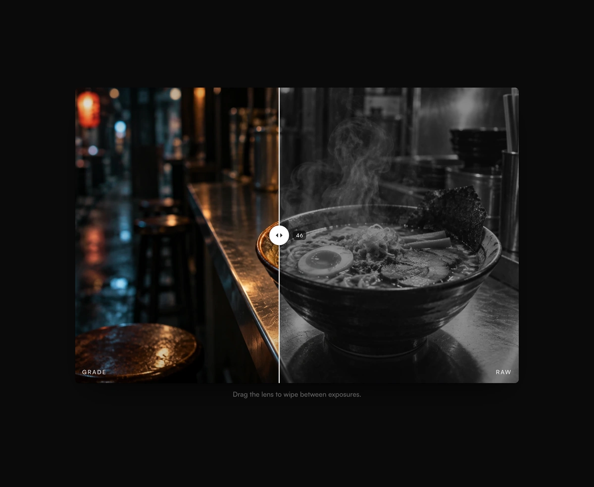
Overview
Image Comparison Slider is a React and Tailwind CSS before and after slider for photo edits, redesigns, and retouching, in Next.js or any React app. Dragging moves a clip path driven by a motion value, so the wipe follows the pointer with no React re-render. It works horizontally or vertically, shows a live percent, and is a full ARIA slider with arrow keys, Home, and End. Leave out beforeSrc and the after image appears desaturated as the before. One idle scrub plays on mount unless reduced motion is on. Both images use object cover, so match their aspect ratios.
Installation
Run the following command
pnpm dlx wensity@latest add before-after-card
Usage
Import BeforeAfterCard from @/components/wensity/before-after-card and render it anywhere in your React or Next.js app. The source lands in your own repo, so every prop, class and animation below is yours to edit.
"use client";import { BeforeAfterCard } from "@/components/wensity/before-after-card";export default function Example() {return (<BeforeAfterCardafterSrc="/after.jpg"beforeSrc="/before.jpg"defaultPosition={48}/>);}
Props
| Prop | Type | Default | Description |
|---|---|---|---|
afterSrc | string | - | Fully revealed after image URL. |
beforeSrc | string | - | Optional before image. When omitted, afterSrc is shown desaturated. |
beforeLabel | string | "Before" | Corner label on the before side. |
afterLabel | string | "After" | Corner label on the after side. |
caption | string | - | Optional line under the frame. |
orientation | "horizontal" | "vertical" | "horizontal" | Wipe axis. |
defaultPosition | number | 50 | Uncontrolled start position, 0–100. |
position | number | - | Controlled position, 0–100. |
onPositionChange | (position: number) => void | - | Fired when the wipe position changes. |
showPercent | boolean | true | Show a live percent near the handle. |
autoDemo | boolean | true | One-shot idle scrub on first mount. |
Featured in React carousel components.