
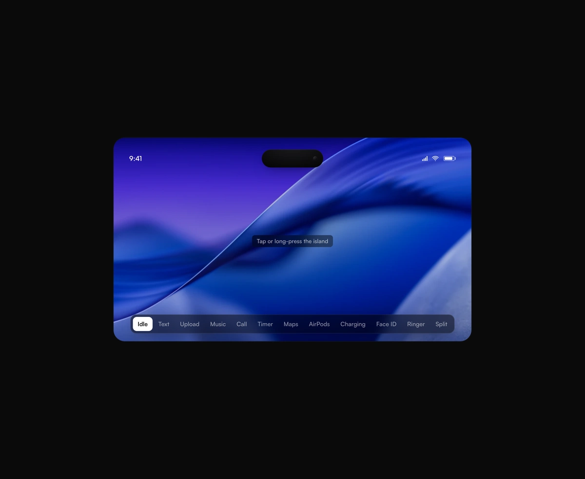
Dynamic Island Toast
A pixel-faithful Apple Dynamic Island that morphs, splits, and breathes while it hosts live activities inside your app.
Grab any corner and peel the sheet back. It curls, catches the light, and springs shut with the weight of paper.
Peel Effect is a React and Tailwind CSS page curl effect that lets you grab any corner of a card and peel the cover back, in Next.js or any React app, with no dependencies. The cover rolls over a cylinder, catches the light, then springs home or peels clear past the commit point. Cover and reveal take an image, an SVG, or any presentational node, kept sharp because the curl is clipped from the live element. Enter or Space peels it, and reduced motion skips the spring. Keep cover free of state, since it is cloned per strip.
Run the following command
pnpm dlx wensity@latest add peel-effect
npx wensity@latest add peel-effect
yarn dlx wensity@latest add peel-effect
bunx wensity@latest add peel-effect
Import PeelEffect from @/components/wensity/peel-effect and render it anywhere in your React or Next.js app. The source lands in your own repo, so every prop, class and animation below is yours to edit.
import { PeelEffect } from "@/components/wensity/peel-effect";export default function Example() {return (<PeelEffectwidth={320}height={440}cover="https://assets.wensity.com/photos/objects-still-life/vintage-film-camera.webp"reveal={null}/>);}
| Prop | Type | Default | Description |
|---|---|---|---|
cover | React.ReactNode | - | The sheet being peeled. An image URL, an img, an svg, or any presentational node. It is cloned into the curl, so keep it free of effects and state. |
reveal | React.ReactNode | - | What sits underneath. Same contract as cover. |
width | number | string | "100%" | Card width. A number is pixels. |
height | number | string | 420 | Card height. A number is pixels. |
rounded | number | 22 | Corner radius in pixels. |
curl | number | - | Cylinder radius in pixels. Omit it and the roll thickens as the peel grows. |
commit | number | 0.46 | Fraction of the diagonal a release must pass before the sheet peels off instead of springing shut. A fast flick commits below this. |
initialPeel | { corner: PeelEffectCorner; amount: number } | - | Pose drawn before the first grab. Amount is 0 to 1 along the diagonal. Useful when a still should show the curl. |
defaultOpen | boolean | false | Start with the cover already peeled off. |
onOpenChange | (open: boolean) => void | - | Fires when the cover peels clear, and again when it springs back on. |
hints | boolean | true | Dog-ears at the corners so the sheet looks grabbable. |
backing | string | "#f3ece3" | Paper colour on the underside of the sheet. |
label | string | "Peelable card. Drag any corner, or press Enter, to peel the cover back." | Accessible name for the card. |
A pixel-faithful Apple Dynamic Island that morphs, splits, and breathes while it hosts live activities inside your app.
A seamless, GPU-only logo strip that never stutters or snaps at the loop point.
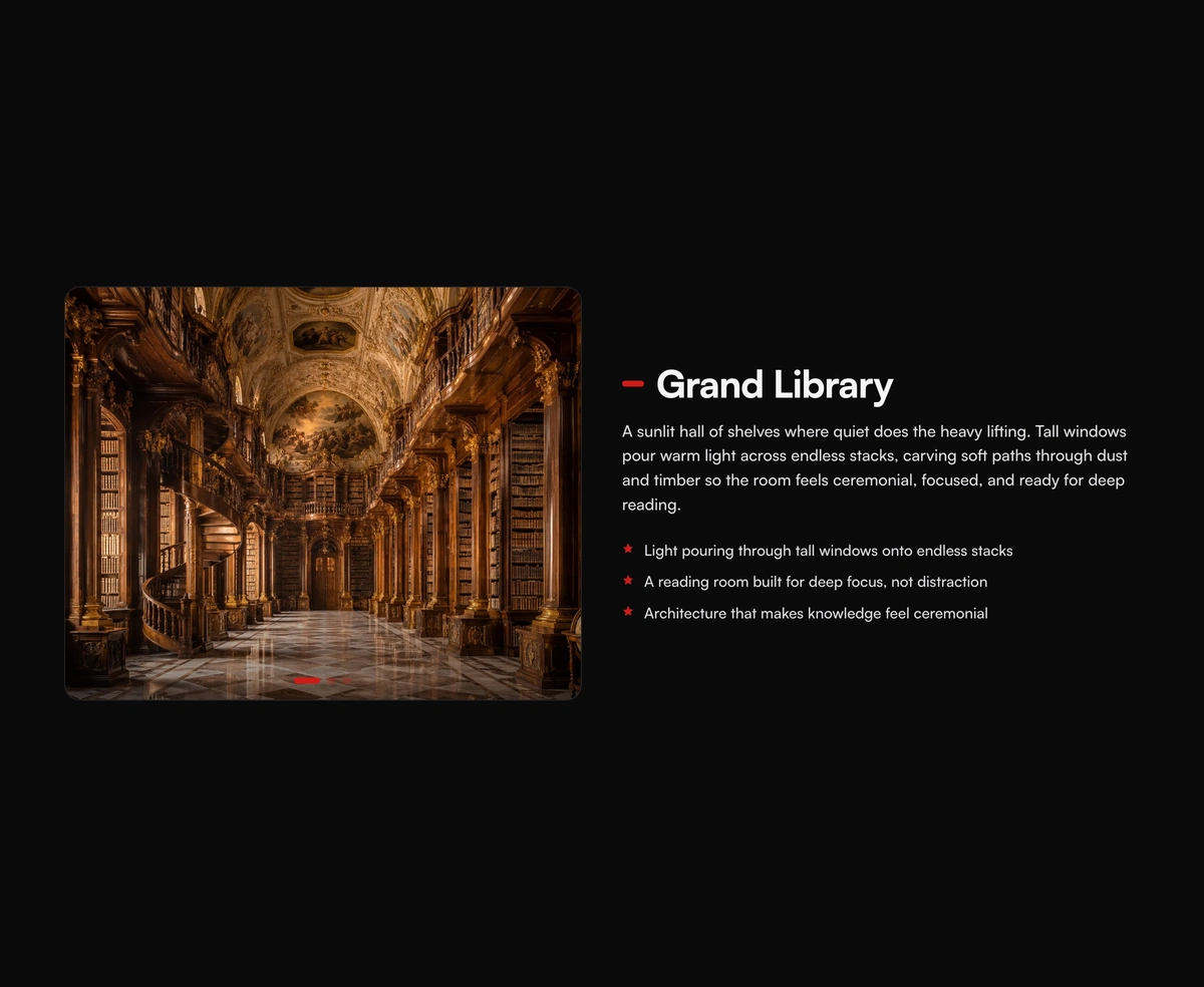
A pinned cinematic section that morphs in lock-step with scroll, staying perfectly in sync whichever way you travel.
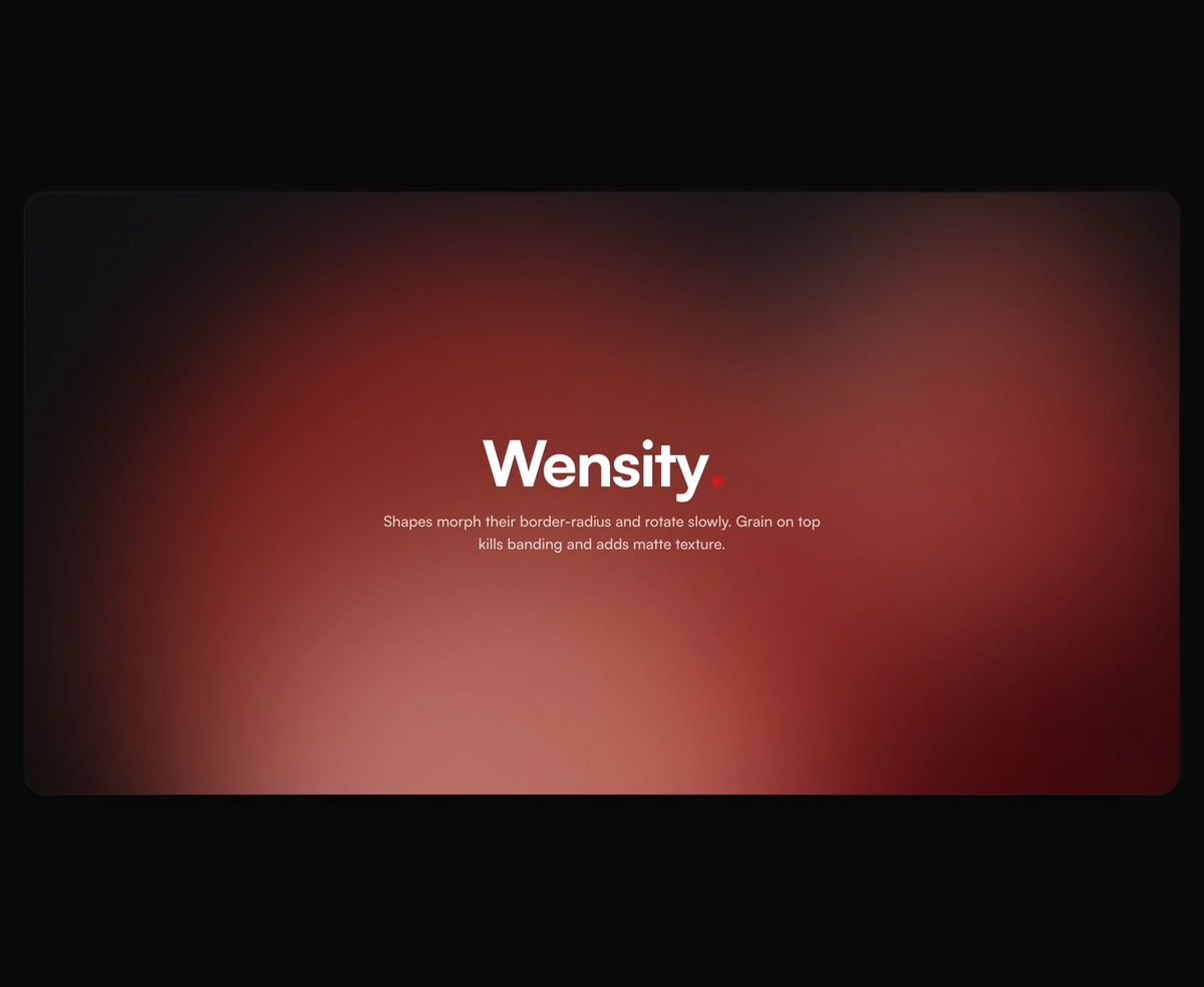
Lava lamp background for React heroes: soft gradient shapes that drift and melt.