iPhone Siri
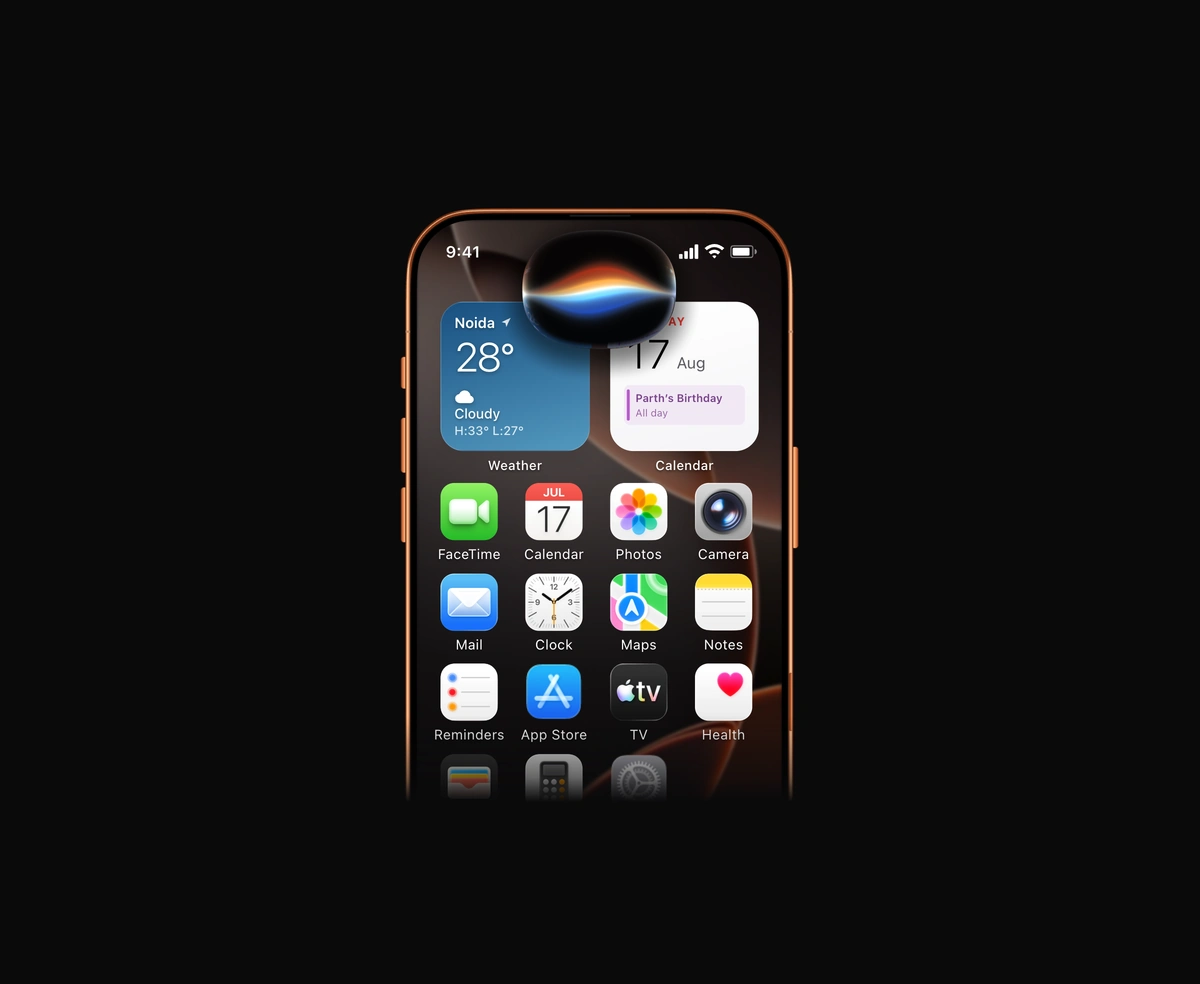
Tap the Dynamic Island and it swells into a live WebGL Siri orb of folded light.
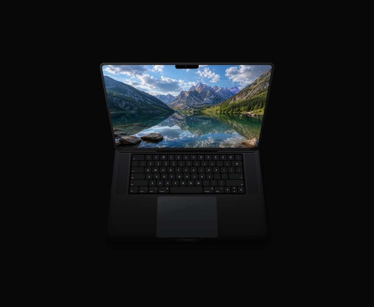
A closed MacBook that hinges open and powers on when you hover, in ten finishes.
Animated MacBook is a React and Tailwind CSS laptop mockup that opens when hovered, in Next.js or any React app. It is pure CSS 3D with no dependencies: a full keyboard with function row and Touch ID, a notched display showing your screenshot, and a glass trackpad. Hover swings the lid up, tilts the deck toward the viewer, and powers on the screen. Ten finishes, hinge angle, and view tilt are props, and it scales with its container. Reduced motion shows it already open, and touch screens have no hover, so set position to open on mobile.
Run the following command
pnpm dlx wensity@latest add macbook
npx wensity@latest add macbook
yarn dlx wensity@latest add macbook
bunx wensity@latest add macbook
Import Macbook from @/components/wensity/macbook and render it anywhere in your React or Next.js app. The source lands in your own repo, so every prop, class and animation below is yours to edit.
import { Macbook } from "@/components/wensity/macbook";export default function Example() {return (<Macbooktheme="space-black"position="hover"src="/screenshot.webp"className="w-full max-w-lg"/>);}
| Prop | Type | Default | Description |
|---|---|---|---|
theme | "space-black" | "black" | "midnight" | "space-gray" | "silver" | "starlight" | "sky-blue" | "gold" | "yellow" | "wensity-red" | "space-black" | Chassis finish: Space Black, Black, Midnight, Space Gray, Silver, Starlight, Sky Blue, Gold, Yellow, or Wensity Red. |
position | "hover" | "open" | "closed" | "hover" | Pose: hover to open, stay open, or stay closed. |
openAngle | number | 138 | Lid hinge angle in degrees (90 ≈ upright, 180 ≈ folded flat back). Larger reclines the screen further. |
baseTilt | number | 16 | Tilt of the bottom body / keyboard deck toward the viewer, in degrees. Independent of the lid. |
tilt | number | 6 | Overall camera/view tilt of the open deck in degrees. Lower reads head-on, higher tips toward a top-down view. |
src | string | - | Image shown on the screen (fills the display, object-cover). |
screenAlt | string | "Screen" | Alt text for the screen image. |
label | string | "MacBook illustration" | Accessible label announced for the illustration. |
Tap the Dynamic Island and it swells into a live WebGL Siri orb of folded light.
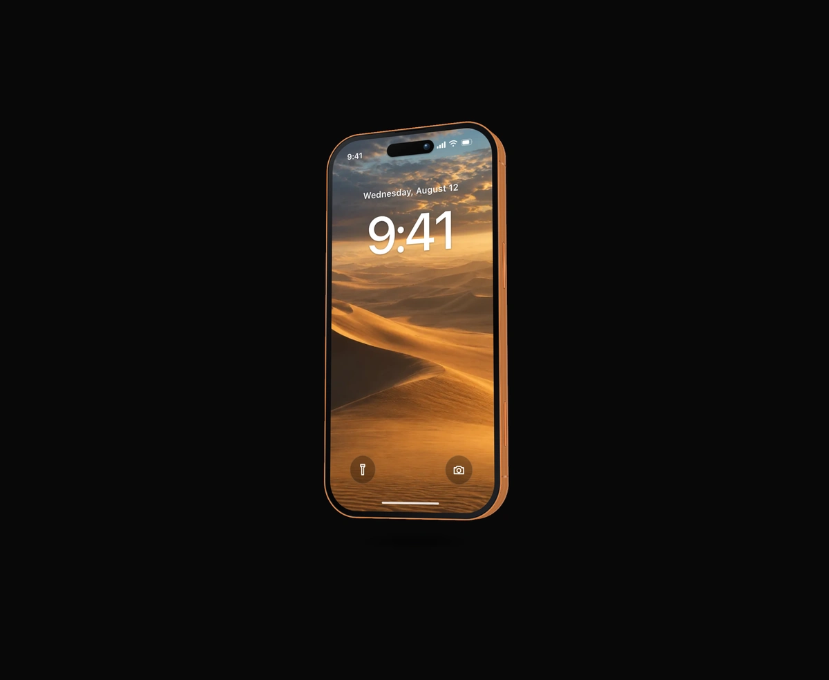
A thick, extruded iPhone with a machined side rail, side buttons, and lock screen.
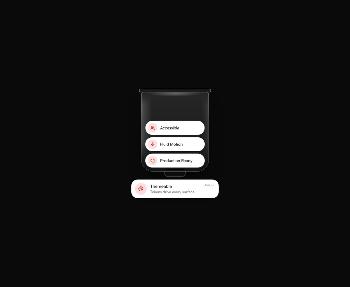
A frosted glass tube that stacks feature chips and drops the oldest into a card.
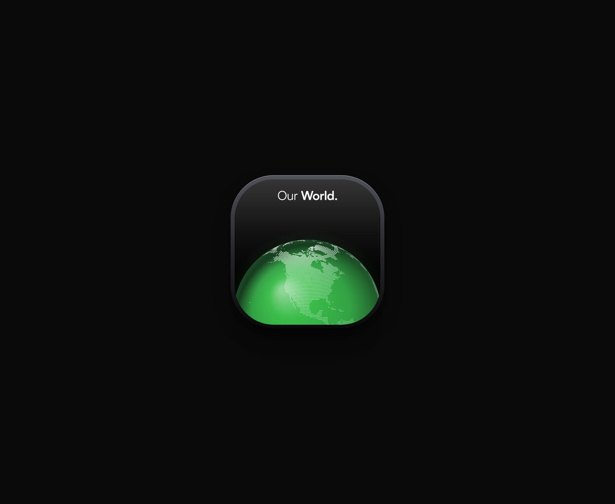
A dark icon card holding a dotted globe that slowly spins on its own axis.
Featured in React 3D components.