 Black Friday is here 🔥 Get

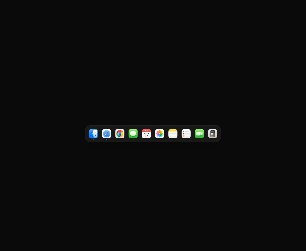
macOS Floating Dock
A magnetic dock where icons inflate near the cursor and push their siblings aside.
React cookie banner with accept, reject and per-category switches, a saved choice and a cookie that takes a bite.
Cookie Banner is a React and Tailwind CSS cookie consent banner with accept, reject and per-category choices, in Next.js or any React app. It ships as a corner card or a bottom bar, with Reject all beside Accept all. Customize opens a switch for each category, and Necessary stays locked on. The choice is saved to localStorage with a version and a 180 day expiry, so returning visitors see no flash. The banner records consent but blocks nothing itself: start analytics inside onConsent, or read useCookieConsent. It is a non-modal dialog, and reduced motion removes the slide.
Run the following command
pnpm dlx wensity@latest add cookie-banner
npx wensity@latest add cookie-banner
yarn dlx wensity@latest add cookie-banner
bunx wensity@latest add cookie-banner
Import CookieBanner from @/components/wensity/cookie-banner and render it anywhere in your React or Next.js app. The source lands in your own repo, so every prop, class and animation below is yours to edit.
import { CookieBanner, useCookieConsent } from "@/components/wensity/cookie-banner";// Once, in your root layout.export function Consent() {return (<CookieBannerpolicyHref="/cookies"onConsent={(consent) => {if (consent.analytics) startAnalytics();}}/>);}// Anywhere else: read the choice, or bring the banner back.export function CookieSettingsLink() {const { reset } = useCookieConsent();return <button onClick={reset}>Cookie settings</button>;}
| Prop | Type | Default | Description |
|---|---|---|---|
variant | "card" | "bar" | "card" | A compact corner card or a wide strip along the bottom. |
position | "bottom-left" | "bottom-center" | "bottom-right" | "bottom-left" | Corner the card sits in. The bar is always centred. |
placement | "fixed" | "inline" | "fixed" | Pin it to the viewport, or render it in the page flow. |
tone | "neutral" | "blue" | "emerald" | "orange" | "neutral" | Colour of the main button and the switches. |
title | string | "We use cookies" | Heading of the banner. |
description | ReactNode | - | Text under the heading. |
policyHref | string | - | Adds a link to your cookie policy after the description. |
categories | CookieCategory[] | 4 built in | Rows in the options panel: id, label, description, required and defaultValue. |
onConsent | (consent, action: "accept" | "reject" | "save") => void | - | Runs once the visitor has chosen, with each category id mapped to true or false. |
storageKey | string | null | "cookie-consent" | localStorage key for the saved choice. Pass null to keep nothing. |
version | string | - | Change it to ask every visitor again. |
expiresDays | number | 180 | Days before the saved choice expires and the banner returns. |
open | boolean | - | Control visibility yourself. Leave unset to follow the saved choice. |
onOpenChange | (open: boolean) => void | - | Called when the banner closes after a choice. |
bite | boolean | true | The cookie loses a bite when the pointer rests on Accept and two more as the banner leaves. |
acceptLabel | string | "Accept all" | Button text. rejectLabel, customizeLabel, saveLabel and requiredLabel work the same way. |
A magnetic dock where icons inflate near the cursor and push their siblings aside.
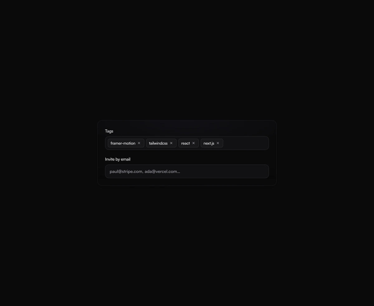
A tag input where pills pop in as you add them and slide out on remove, closing the gap without snapping the layout.
One angled GPU sweep that travels across any placeholder geometry you wrap, never a separate shimmer stuttering per row.
A dual-layer orbit glow that soft-spins around the edge of any button or link you wrap it around, at zero layout cost.