Liquid Metal Button
ProA pill or icon button ringed in flowing liquid metal, for light and dark pages.
Overview
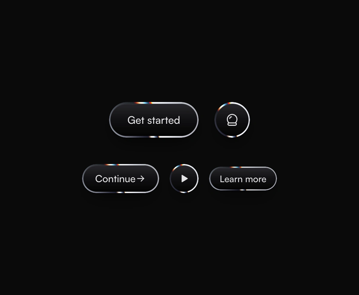
Liquid Metal Button is a React and Tailwind CSS button with a flowing chrome ring, in Next.js or any React app. Paper's liquid metal WebGL shader draws bright stripes that pour around the button, with a thin rainbow sheen where they meet. Hover speeds the flow, and a press gives it a short surge. The label sits on a light or dark face that follows your theme. The shader pauses off screen, reduced motion holds it still, and without WebGL a CSS chrome ring stands in.
Installation
Run the following command
pnpm dlx wensity@latest add liquid-metal-button
Usage
Import LiquidMetalButton from @/components/wensity/liquid-metal-button and render it anywhere in your React or Next.js app. The source lands in your own repo, so every prop, class and animation below is yours to edit.
import { IconCrystalBall } from "@tabler/icons-react";import { LiquidMetalButton } from "@/components/wensity/liquid-metal-button";export default function Example() {return (<div className="flex items-center gap-5"><LiquidMetalButton size="lg">Get started</LiquidMetalButton><LiquidMetalButton size="lg" shape="circle" aria-label="Ask AI"><IconCrystalBall size={22} /></LiquidMetalButton></div>);}
Props
| Prop | Type | Default | Description |
|---|---|---|---|
size | "sm" | "md" | "lg" | "md" | Height and type size: 36, 44, or 54 pixels tall. |
shape | "pill" | "circle" | "pill" | A pill for labels, a circle for a single icon. Give icon buttons an aria-label. |
theme | "auto" | "light" | "dark" | "auto" | Light or dark face and shadows. Auto follows the dark class on the html element. |
tint | string | - | Hex color the metal is tinted with, such as gold or rose. White keeps it neutral silver. |
speed | number | 1 | How fast the reflections flow around the ring, from 0 for still metal to 3. |
iridescence | number | 0.6 | Strength of the rainbow sheen along the stripe edges, from 0 for plain metal to 1. |
rim | number | - | Ring thickness in pixels, from 1 to 6. Defaults to 1.75, 2, or 2.25 by size. |
Featured in React 3D components.