Text Shimmer
A CSS shimmer sweep for headlines, one single element and entirely GPU-friendly.
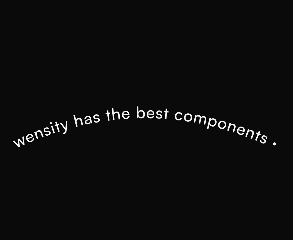
SVG text riding a curved wave, arc, or circle path on a seamless, light loop.
Text Path is a React and Tailwind CSS curved text component that runs a phrase along an SVG wave, arc, or circle as a seamless loop, in Next.js or any React app, with no dependencies. Circle mode measures the string and sizes the ring to fit, so spacing stays even with proportional fonts, while wave and arc scroll like a curved marquee. Pass any path to follow your own shape, and set speed, direction, separator, and font. It pauses off screen, stops for reduced motion, and announces the text once. Custom paths need a matching viewBox.
Run the following command
pnpm dlx wensity@latest add text-path
npx wensity@latest add text-path
yarn dlx wensity@latest add text-path
bunx wensity@latest add text-path
Import TextPath from @/components/wensity/text-path and render it anywhere in your React or Next.js app. The source lands in your own repo, so every prop, class and animation below is yours to edit.
import { TextPath } from "@/components/wensity/text-path";export default function Example() {return (<TextPathtext="I think wensity has the best components"curve="arc"duration={14}letterSpacing={0.05}className="font-display max-w-3xl text-zinc-900 dark:text-zinc-100"/>);}
| Prop | Type | Default | Description |
|---|---|---|---|
text | string | - | The string to tile along the path. |
curve | "wave" | "arc" | "circle" | "arc" | Built-in curve. Circle sizes the ring to the text; wave/arc use open path marquees. Ignored when path is set. |
path | string | - | Custom SVG path d. Wins over curve (open path marquee). |
viewBox | string | - | Custom SVG viewBox when using a custom path. |
duration | number | 14 | Seconds for one seamless loop. Lower = faster. |
direction | "forward" | "reverse" | "forward" | Travel / spin direction. |
separator | string | " · " | Separator between tiled copies. |
repeats | number | 3 | Tiles the string. Wave/arc: along the path. Circle: copies around the ring (radius grows to fit — no stacking). |
fontSize | number | 28 | Font size in CSS pixels. |
fontWeight | number | string | 500 | Font weight for the path text. |
letterSpacing | number | 0.05 | Letter spacing in em. |
fill | string | currentColor | Text fill. Omit to inherit currentColor. |
showPath | boolean | false | Draw the underlying path stroke. |
pathColor | string | theme | Path stroke color. Omit for soft theme line. |
pathWidth | number | 1 | Path stroke width in CSS pixels. |
paused | boolean | - | Force the loop paused. When omitted, auto-pauses off-screen or when the tab is hidden. |
A CSS shimmer sweep for headlines, one single element and entirely GPU-friendly.
A 3D character flip on hover, staggered and springy across every single letter.
Blur-morphing headlines that cycle phrases with a gooey, seamless crossfade.
A per-character slide-left cascade with a cleanly staggered entrance timing.
Featured in React text animations.