 Starting your winter arc? 🥶 Get

Why teams choose Wensity UI
104 components57 primitives77 blocks92 free
A React component library for teams shipping real products in Next.js and Tailwind CSS. Typed source you own, built for production rather than a demo reel, and written so the next developer, or the next AI coding agent, can change it with confidence.
Works with
- React
- Next.js
- TypeScript
- Tailwind CSS
What is Wensity UI?
Wensity UI is a React and Tailwind CSS component library that installs production ready, fully typed source into Next.js, Vite, Remix or Astro apps. It covers animated components, the everyday UI primitives an app needs, and full page blocks, in one consistent design language.
There is no runtime package to keep updated. The CLI, the shadcn CLI or the MCP server copies a real .tsx file into your components folder, and from then on it is your code. It is used by developers at large companies and at web development agencies who want the polish of a premium library without handing their front end to someone else's abstraction.
- Built with
- React 19, TypeScript, Tailwind CSS v4, Framer Motion
- Works in
- Next.js (App and Pages Router), Vite, Remix, Astro
- Library
- 104 components, 57 primitives, 77 blocks, 3 templates, across 9 categories
- Install
- Wensity CLI, shadcn CLI registry, or the Wensity MCP server
- You get
- Source files in your repo, no runtime dependency on Wensity
- Price
- 92 free items. Pro is $169 a year or $199 once
A React UI library built for production apps, not demos
A component is production ready when it survives real data, real users and real devices, not just a screenshot.
Plenty of animated components look perfect in a preview with three hand-picked items and fall apart with forty, a long name, a slow phone or a keyboard. Wensity components are built for the screens behind a login as much as for the landing page in front of it: task boards, dashboards, AI chat inputs, pricing and settings.
Typed end to end
Props, variants and callbacks are TypeScript types you can read, extend and autocomplete.
Controlled or not
Pass a value and onChange to own the state, or let the component manage it.
Responsive
Designed at phone width first, adapts to the space it gets, keeps touch targets usable.
Composable
className and native attributes pass through, so it fits your layout and tokens.
How Wensity keeps components fast and the client bundle small
Motion should cost nothing until someone sees it. Wensity keeps JavaScript to the part of a component that has to move or respond, and stops work the moment it is not visible.
Server rendered
Rendered on the server where they can. The client boundary covers only the piece that animates or handles input.
Paused unseen
WebGL and canvas effects stop off screen or in a hidden tab, cap pixel ratio, and free the GPU on unmount.
Nothing global
No provider, no runtime package, no shared state. Each component is one file you can delete cleanly.
CSS first
Hover and simple transitions are CSS. Framer Motion for springs, GSAP or three.js only when nothing lighter works.
Because the client boundary is small, a page built with Wensity stays a server page. Here is the pattern in a Next.js App Router route:
Accessible animated components that respect reduced motion
Every animated Wensity component checks prefers-reduced-motion and, when it is set, shows a calm finished state instead of the movement, while staying fully usable.
Reduced motion
Framer Motion reads useReducedMotion, CSS animation sits behind the media query, WebGL renders a still frame.
Keyboard and focus
Primitives are built on Base UI for focus management, keyboard navigation and correct ARIA roles.
Screen readers
Decorative layers are hidden from assistive technology, so a reader hears the content, not the effect.
That is the difference between motion as decoration and motion that respects the person using the page. Turning off animation in the operating system should never break a layout, hide content or leave a component stuck halfway through a transition.
Source code written for developers and AI coding agents
Every Wensity file opens with a comment that explains how the component works, and every prop carries a line saying what it does and its default.
This matters twice over now that much of the editing is done by Cursor, Claude Code, Codex and Copilot. An agent works from the text in front of it. A component with one file, predictable prop names, written down intent and no hidden layers is one an agent can modify correctly on the first try, instead of guessing at what an undocumented abstraction was meant to do.
How it works
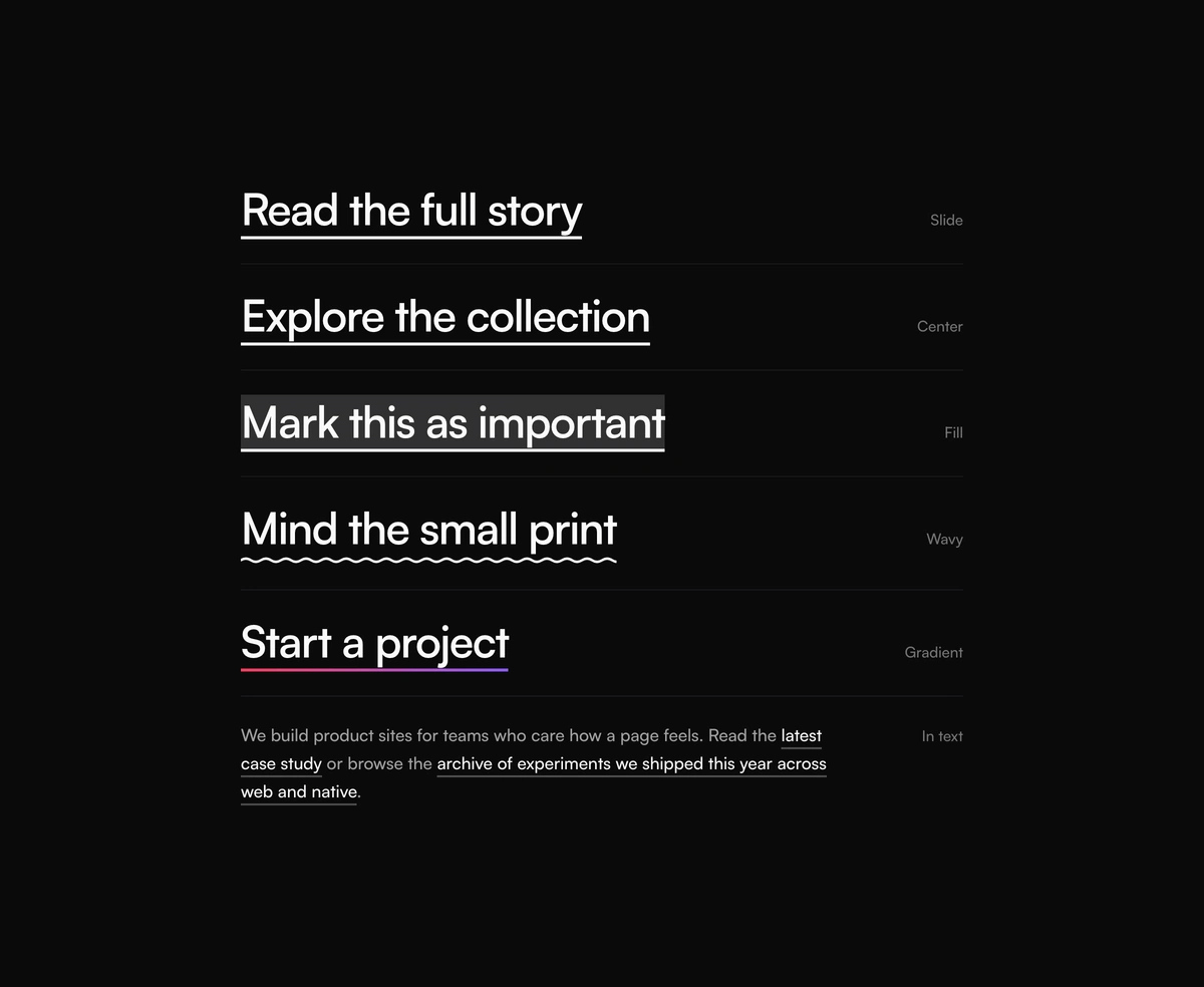
The line is a background on the inline element, not a pseudo-element, so it follows text across line breaks.
Each variant
Five variants, each described in a sentence, so choosing one does not require reading the CSS.
The defaults
Thickness, offset and duration state their defaults next to the prop, the first thing anyone changes.
Accessibility
Keyboard focus shows the line and reduced motion shows it at once, written down rather than rediscovered.
Install with the Wensity CLI, the shadcn registry or the MCP server
Three ways in, one result: a typed source file in your project that you own.
Wensity CLI
Resolves dependencies, writes files where your project keeps components, and applies a saved brand preset.
shadcn registry
Free components are in a public shadcn registry under @wensity, so an existing shadcn/ui project adds them with the CLI it already uses.
MCP server
Your coding agent searches, explains props, shows the files it would write, and installs after you approve. Separate from the shadcn MCP. MCP guide
whoami confirms the Pro token, then init, add, and the documented header of the file it just installed.# Wensity CLI. Once per project: writes wensity.json and the class helpernpx wensity@latest initnpx wensity@latest add underline-animationnpx wensity@latest add hero-section-with-radial-glow --type block# shadcn CLI. Free components, through the CLI you already usenpx shadcn@latest add @wensity/underline-animation# MCP server for Claude Code. Cursor, VS Code and Codex: see /docs/mcpclaude mcp add --transport stdio --scope project wensity \-- npx -y @wensity/mcp@0.1.1
Dependency policy: what a component adds to your package.json
56 of 161 components and primitives need no npm package beyond React and the shared class helper.
Declared, not hidden
Every package a component imports is listed in its registry entry, and the CLI installs exactly that list.
No chains
Components never import each other, so adding one never drags in another.
One small helper
A single class helper file, written once, built on clsx and tailwind-merge.
Components, primitives, blocks and templates
161 installable items in 9 categories, plus 77 full page sections, built to look like one product when you use them together.
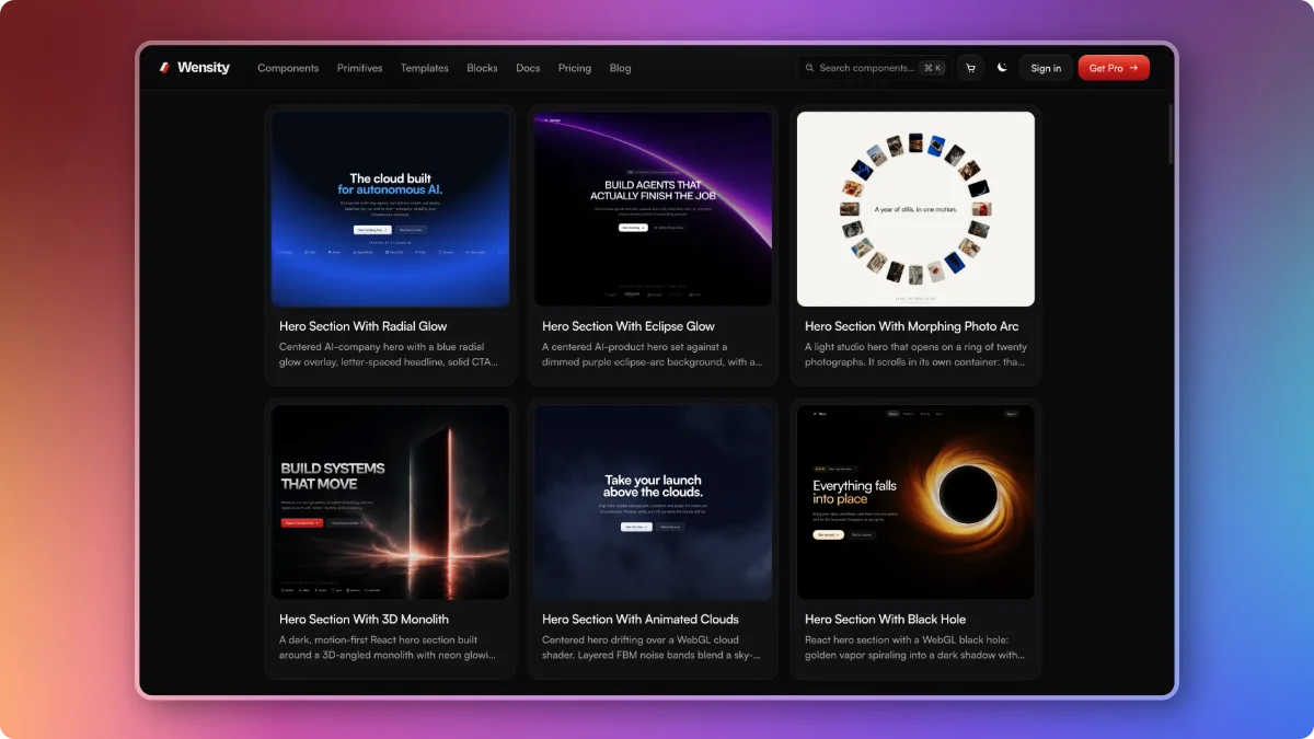
Components cover agentic AI interfaces, SaaS dashboards, text animation, cinematic interactions and micro interactions. Primitives are the 57 everyday controls an app needs: buttons, inputs, dialogs, menus, tables and date pickers. Blocks are complete hero, pricing, FAQ, contact and footer sections you drop into a page. A small set of templates rounds it out, and the library grows every week.
How Wensity compares with other React UI libraries
The best React component library is the one that matches what you are building. Each row links to a full, dated comparison checked against the other library's own site.
| Library | Best for | Full comparison |
|---|---|---|
| Wensity UI | Production apps and landing pages in one design language, with source you own and agent friendly code | This page |
| shadcn/ui | Free, open code parts to build your own design system | shadcn/ui vs Wensity |
| React Bits | The largest free set of animated effects | React Bits vs Wensity |
| Aceternity UI | Bold, attention grabbing landing page effects | Aceternity UI vs Wensity |
| Magic UI | Free animated effects for launch pages | Magic UI vs Wensity |
| Motion Primitives | A small open source motion toolkit | Motion Primitives vs Wensity |
| Tailwind Plus | Static Tailwind blocks, now closed to new customers | Tailwind Plus vs Wensity |
If you only need unstyled behaviour and want to design every pixel yourself, a headless library is the better fit. Wensity is for teams who want the finished, polished component and full control of its source.
Is Wensity UI worth paying for?
Start free: 92 items install with no account and no card. Pay when the premium components and blocks would save you more than a few days of building them yourself.
Free
$0
92 components and primitives, with CLI, shadcn and MCP installs.
Pro Annual
$169a year
Every premium component and block, and new releases while active.
Pro Lifetime
$199once
Everything in Pro, forever, including all future updates.
Whichever plan you choose, installed code is yours. There is no licence check inside your app, so components keep working if a yearly plan ends. Private download, lifetime updates on the lifetime plan, and all purchases are final. Full details on the pricing page.
Who builds Wensity UI?
Wensity is a design engineering studio. The same team designs and builds websites and web apps for startups and brands at wensity.com, and the components come out of that client work.
That is why the library leans toward what ships: components get tested on real projects with real content before they are published, and the details that only show up in production, such as long text, slow devices and keyboard users, are already handled. Read more about the company.