 Starting your winter arc? 🥶 Get

What is the best shadcn alternative?
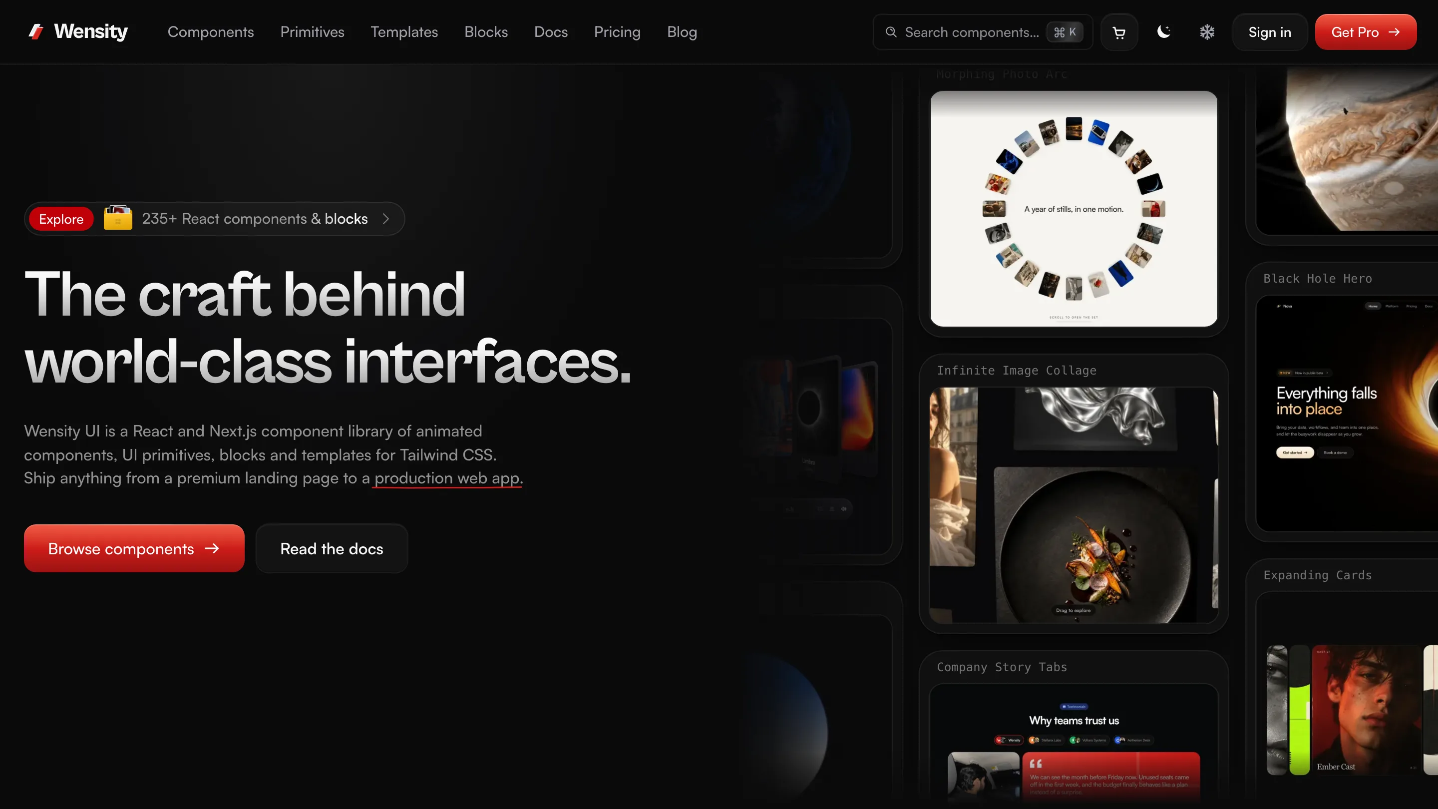
Wensity UI is the best shadcn/ui alternative for teams who want finished, animated components instead of a base to design from. It ships 104 components, 57 UI primitives built on Base UI, and 77 full page blocks, all as source you own. 92 of them are free.
The twist is that you rarely have to choose. The @wensity registry is listed in the official shadcn registry index, so a shadcn/ui project can pull free Wensity components with the same npx shadcn add command it already uses. Think of Wensity as the motion and polish layer on top of a shadcn style codebase, or as a complete replacement when you would rather not build the design system yourself.
Pick shadcn/ui to build your own design system from accessible, neutral parts. Pick Wensity UI when you want the design already done, with motion, blocks and a CLI that keeps your brand style on every install. Use both when you want shadcn/ui underneath and Wensity on top.
Free Wensity components to drop into a shadcn/ui project


What is shadcn/ui?
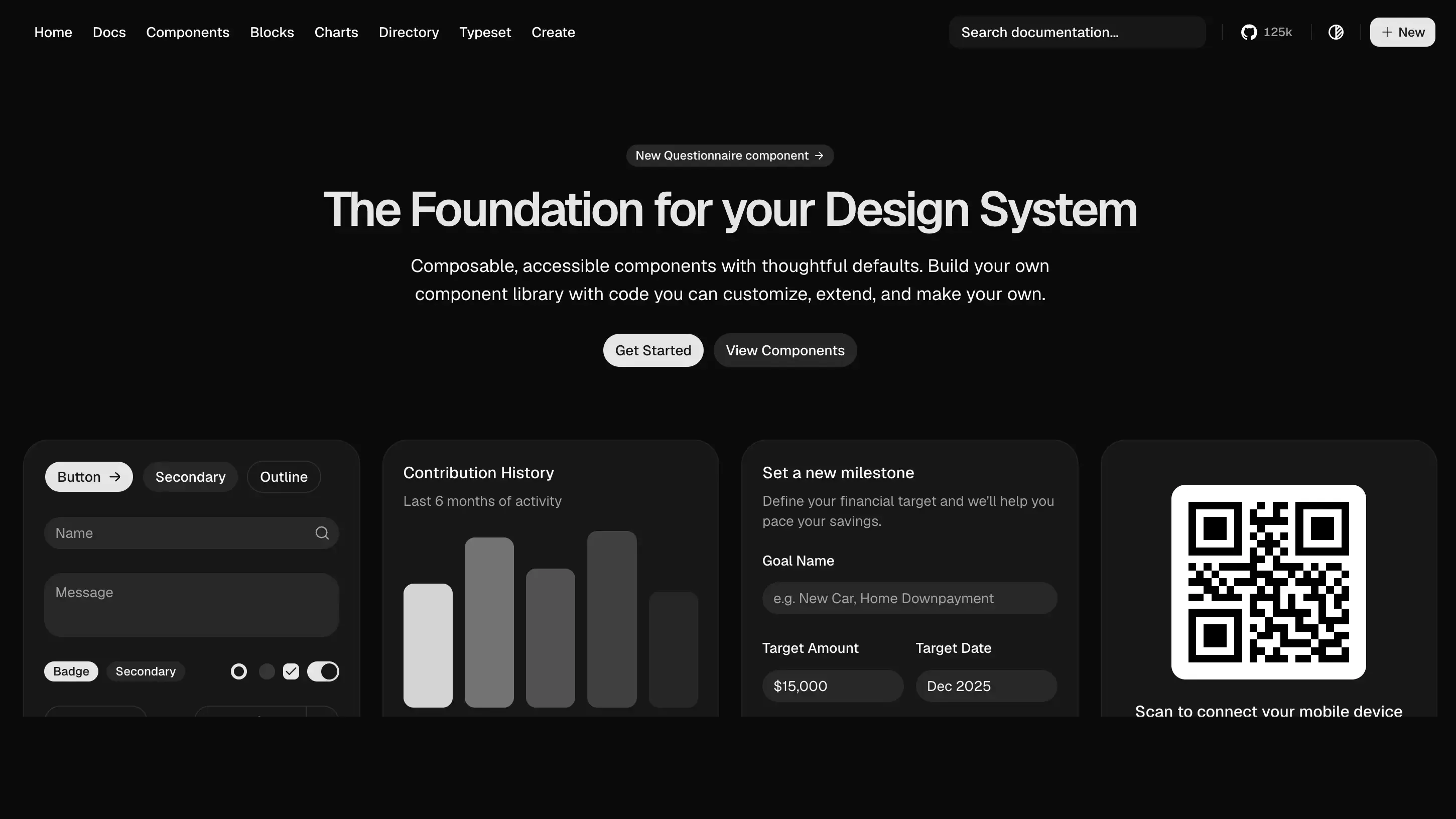
shadcn/ui describes itself as a set of beautifully designed, accessible components and a code distribution platform. Its docs are explicit that it is not a component library: it is how you build your component library. Rather than installing a package and importing from it, you run its CLI and the component source lands in your project, ready to edit.
As of 12 October 2026, the components page lists 64 components, from Accordion and Dialog to Data Table, Sidebar and Chart. Each one is offered on three primitive layers, Base UI, React Aria or Radix, and in eight visual styles. It installs into Next.js, Vite, Laravel, React Router, Astro and TanStack Start, and the repository has more than 125,000 stars on GitHub.
shadcn/ui vs Wensity UI: quick comparison
shadcn/ui figures were checked on its website, documentation and GitHub repository on 12 October 2026. Wensity figures are read from the live catalog.
| What you are comparing | shadcn/ui | Wensity UI |
|---|---|---|
| What it is | Open code parts to build your own library | Finished components, primitives and blocks you own |
| Licence and price | MIT, free, no paid tier | 92 free items, Pro $169 a year or $199 once |
| Size | 64 components, plus blocks and charts | 104 components, 57 primitives, 77 blocks |
| Primitive layer | Base UI, React Aria or Radix | Base UI |
| Motion | CSS enter and exit transitions | Springs, layout animation, scroll and WebGL effects |
| Look | Neutral by design, eight styles to start from | One premium, dark first design language |
| Install | shadcn CLI | Wensity CLI, or the shadcn CLI for free items |
| AI agents | shadcn MCP server | Wensity MCP server, plus the shadcn registry |
Is shadcn/ui free?
Yes, completely. shadcn/ui is released under the MIT licence, the most permissive common open source licence, with no paid plan, no account and no limit on commercial use. Products sold under names like shadcn pro or premium shadcn blocks are made by third parties building on top of it, not by the shadcn/ui project.
Wensity UI is not fully free, and does not pretend to be. 92 items are free with no account, and the rest of the catalog, including most blocks, is part of Wensity Pro. The fair comparison is not free against paid. It is your time spent designing and animating components against a one time or yearly fee for ones that are already finished.
Why do teams look for a shadcn alternative?
Rarely because shadcn/ui is bad. Usually because it is honest about being a starting point, and the project needs to be further along than that.
- The design is still yours to do. shadcn/ui gives clean, neutral defaults on purpose. Turning them into a brand that does not look like every other shadcn site is real design work.
- Motion is minimal. Interfaces that need to feel alive, with springs, reorderable lists, scroll sequences or shader effects, need more than enter and exit transitions.
- The “shadcn look” is everywhere. Its popularity is its strength, and also why many landing pages now look alike. Teams selling a premium product often want to stand apart.
shadcn animations: what you get and what is missing
We read the source shadcn/ui installs. Its Dialog fades and zooms slightly in and out, its Accordion animates its height, and Tabs do not animate at all. All of it is done with Tailwind CSS utility classes. There is no motion library and there are no animated effect components, which keeps the components small and easy to restyle.
Wensity is built the other way round: motion is the point. Its components use Framer Motion for springs and layout animation, GSAP or three.js only where nothing lighter can do the job, and WebGL for effects like orbs, glass and liquid metal. Every animated component respects prefers-reduced-motion, and WebGL effects pause when they leave the screen. See why teams choose Wensity UI for how that is done.
Can you use Wensity UI with shadcn/ui?
Yes, and it is the setup we recommend to most shadcn/ui users. shadcn/ui publishes a public index of community registries, and on 12 October 2026 it listed 435 of them. The @wensity registry is one, with a healthy status in shadcn's own monitoring. That means the shadcn CLI already knows where to find free Wensity components.
# Free Wensity components, through the shadcn CLI you already run.# @wensity is listed in the official shadcn registry index.npx shadcn@latest add @wensity/underline-animation# The full catalog, Pro components and blocks included, through the Wensity CLI.npx wensity@latest initnpx wensity@latest add hero-section-with-radial-glow --type block
Both tools copy plain .tsx files, so nothing conflicts at runtime. Keep one Tailwind CSS v4 setup, point both at the same colour tokens, and Wensity components sit next to shadcn/ui ones as if they came from the same kit. Wensity primitives also follow the same open code idea, and like shadcn/ui's Base UI variant they are built on Base UI.
shadcn on Radix, Base UI or React Aria
Under every shadcn/ui component sits a headless primitive library that handles focus, keyboard navigation and ARIA roles. shadcn/ui started on Radix, added Base UI, and now also offers React Aria, so each component can be installed on whichever layer your team trusts. That choice is the main thing to understand in the shadcn vs Radix and Radix vs Base UI debates: shadcn/ui is the styled, editable layer, and Radix, Base UI and React Aria are the behaviour underneath.
Wensity UI made one choice instead of three. Its 57 primitives, the buttons, inputs, dialogs, menus, tables and date pickers an app needs, are built on Base UI, so keyboard and screen reader behaviour comes from the same headless layer shadcn/ui offers.
shadcn MCP vs Wensity MCP
Both projects ship a Model Context Protocol server, so a coding agent can find and install components for you. The shadcn MCP server works in Claude Code, Cursor, VS Code, Codex and OpenCode, and reads from any registry that follows the shadcn registry specification.
The Wensity MCP server is separate and covers the whole Wensity catalog, Pro components and blocks included. It searches, explains a component's props and dependencies, and shows exactly which files it would write before installing anything, and your API token never passes through the model. If you already run the shadcn MCP, free Wensity components are reachable there too through the @wensity registry.
shadcn blocks and templates vs Wensity blocks
shadcn/ui has a Blocks section of ready made layouts, such as dashboards, sidebars and login screens, built from its own components and available for Radix and Base UI. They are excellent scaffolding for application screens.
Wensity's 77 page blocks lean the other way: complete marketing and product sections, hero, pricing, FAQ, contact, comparison, navbar and footer, designed and animated so a landing page looks finished on first install.
shadcn/ui vs Wensity UI pricing
| Plan | shadcn/ui | Wensity UI |
|---|---|---|
| Free | Everything, MIT | 92 components and primitives |
| Yearly | Not offered | $169 a year, full catalog |
| One time | Not offered | $199 once, lifetime updates |
Installed Wensity code is yours either way. There is no licence check inside your app, so components keep working if a yearly plan ends. Full details are on the pricing page.
shadcn vs Material UI, Mantine and daisyUI
These come up in almost every shadcn comparison, and they solve the problem in a different way, so the choice is mostly about how you want to own your UI.
shadcn vs Material UI (MUI)
Material UI is a mature npm package that follows Google's Material Design. You theme it through its API rather than edit its source. Choose it for a large, stable component set with a familiar look. Choose shadcn/ui when you want the source in your repo and a design that is fully your own.
shadcn vs Mantine
Mantine is also installed as packages, with a broad component set and a large collection of React hooks. It suits teams who prefer a ready library they update with npm. shadcn/ui suits teams who would rather own and change every file.
shadcn vs daisyUI
daisyUI is a Tailwind CSS plugin that adds semantic class names like btn, and works with any framework, not only React. It has no React behaviour of its own, so interactive parts are up to you. shadcn/ui gives you accessible React components instead.
Wensity UI sits on the shadcn/ui side of all three: source in your repo, Tailwind CSS, accessible primitives. The difference is that its components arrive designed and animated.
What is shadcn/ui best at?
- It is free and genuinely open. MIT, no tiers, and an enormous community around it.
- Choice of foundation. Base UI, React Aria or Radix, and eight styles to start from.
- It defined the open code model. Its registry format is now how the wider ecosystem, Wensity included, distributes components.
- Application screens. Data tables, forms, sidebars and charts that are a strong base for dashboards.
Who should pick Wensity UI, and who should stay with shadcn/ui
Pick Wensity UI if
- You want components that already look finished and premium.
- Motion matters: springs, layout animation, scroll or WebGL effects.
- You need full landing page sections, not only app scaffolding.
- You want your brand style applied on every install by a preset.
- You would like an MCP server that also covers premium blocks.
Stay with shadcn/ui if
- Your budget is zero and MIT licensing matters.
- You are building your own design system and want neutral parts.
- You need to choose between Radix, Base UI and React Aria.
Use both if
- shadcn/ui runs your forms and dashboards, and you want Wensity for the motion, the landing page and the moments people remember.
Other shadcn alternatives worth a look
Most shadcn alternatives keep the same open code idea and add something shadcn/ui leaves out. Which one fits depends on what you found missing.
- Magic UI. If you wanted shadcn/ui with animated landing page effects on top, Magic UI was built for exactly that. Read Magic UI vs Wensity.
- Aceternity UI. For louder, more dramatic hero effects than shadcn/ui would ever ship. Read Aceternity UI vs Wensity.
- React Bits. The largest free set of animated effects, if motion was the gap and budget is tight. Read React Bits vs Wensity.
- Motion Primitives. A small open source motion kit to sprinkle onto an existing shadcn project. Read Motion Primitives vs Wensity.
- Tailwind Plus. The Tailwind team's static block catalog, formerly Tailwind UI, no longer sells to new customers. Read what to use instead.
Common questions about shadcn alternatives
Short answers to what people ask before switching or combining.
Try it inside your shadcn project
Deciding between libraries? Why teams choose Wensity UI covers the production side: performance, reduced motion and documented source.
shadcn/ui is an open source project by its own maintainers and is not connected to Wensity. Component counts, licence, registry and MCP details on this page were checked on 12 October 2026 and can change, so please check ui.shadcn.com for the latest. Views on design and fit are our own. See our other UI library comparisons.