Best Tailwind Plus alternative.
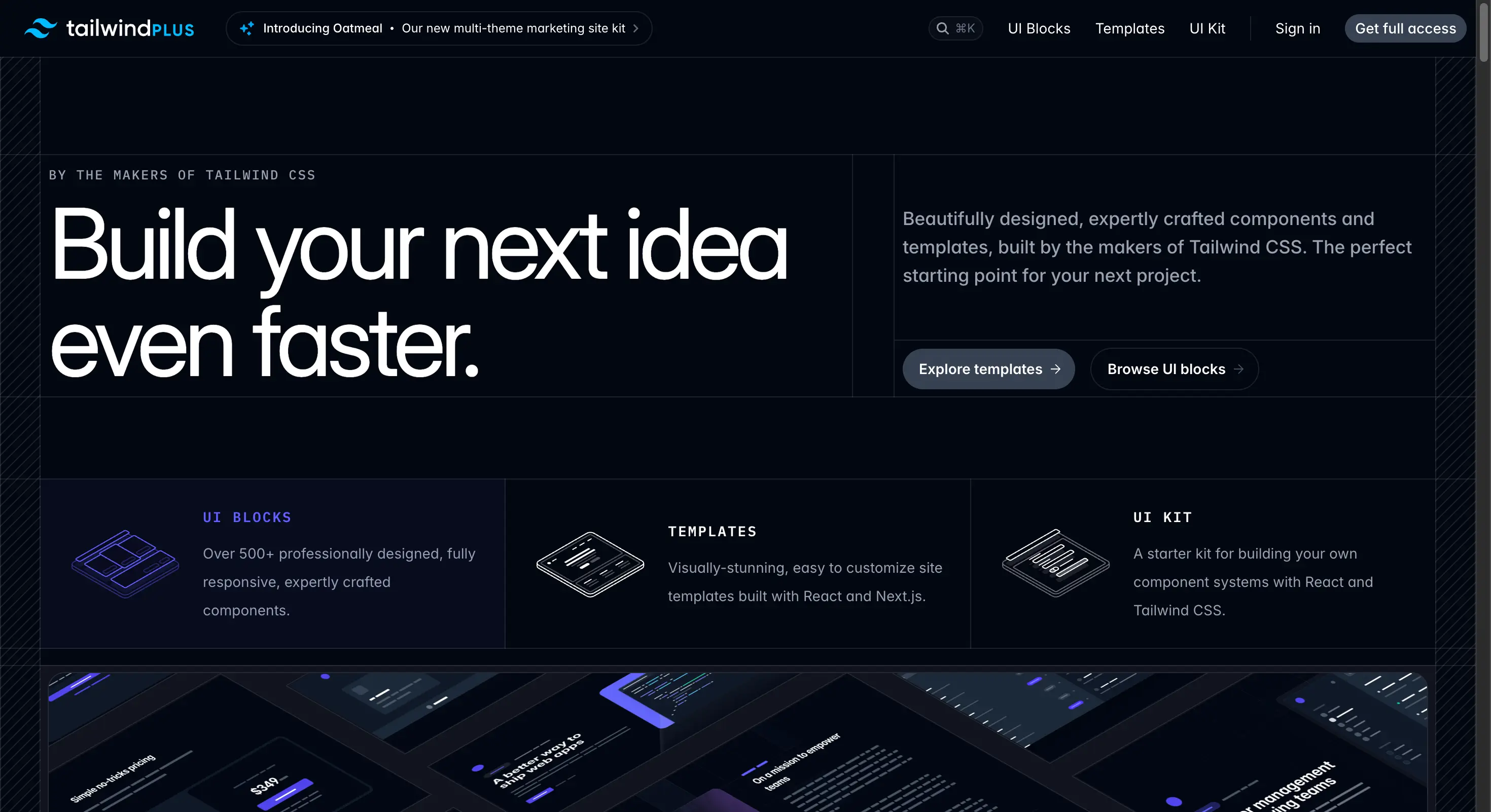
Screenshot of tailwindcss.com/plus, taken 7 August 2026. Tailwind Plus is made by Tailwind Labs and is not connected to Wensity.
If you are looking for a Tailwind Plus alternative, or a free Tailwind UI alternative, this guide compares Wensity UI with the official Tailwind collection. You will find real prices, what each one covers, and where motion and tooling change the answer.
What is the best Tailwind Plus alternative?
Wensity UI is the best Tailwind Plus alternative for teams who want motion and a free way to start. It ships 161 React components, 92 of them free with no card, including 57UI building blocks, dashboard sections, AI chat components, and its own command line tool.
Let us be straight about this one. Tailwind Plus is made by the people who made Tailwind CSS, and the quality is not in question. It is the broadest and safest collection on this list. The reasons to look elsewhere are specific: there is no free tier, the components are mostly static, and there is no command line tool to install them.
Choose Tailwind Plus if you want the widest set of dependable, static layouts and you also need Vue or plain HTML. Choose Wensity UI if you want animation built in, a premium dark first look, real tooling, and 92 components you can try before paying anything.
Tailwind Plus vs Wensity UI: quick comparison
Everything below was checked on the Tailwind Plus website on 7 August 2026. Prices and counts change, so please confirm before you buy.
| What you are comparing | Tailwind Plus | Wensity UI |
|---|---|---|
| Free plan | None, you pay before you use it | 92 free components, no card or account |
| Price | About 299 dollars personal, 849 dollars for teams | 199 dollars once, or 169 dollars a year |
| Library size | 500 plus UI blocks, 13 plus templates | 161 components, plus blocks and templates |
| Animation | Minimal, mostly static | Motion built into the components |
| Default look | Light first, neutral, very widely used | Dark first, premium, distinctive |
| Install method | Copy and paste from the website | Own CLI: npx wensity add, blocks and presets |
| Languages | React, Vue and plain HTML | React only |
| AI and chat UI | Not covered | A dedicated Agentic AI group |
Is there a free Tailwind Plus alternative?
Yes, and this is the single biggest practical difference between the two. Tailwind Plus has no free tier. You pay first, then find out whether it suits your project. There is a 30 day refund policy, which helps, but you still have to commit money to look inside.
Wensity UI gives you 92 components free, with no credit card and no account. You can browse every live preview, install them with the command line tool, and ship them in commercial work. If you never upgrade, that is fine.
If your only requirement is zero cost, React Bits and Motion Primitives are worth a look too. Both are free and open source, though both are animation focused rather than full interface libraries.
Which one looks more premium?
This section is our opinion, so please read it as one. Tailwind Plus is beautifully made. The difference is not craft, it is character.
Neutral by design, familiar by result
Tailwind Plus is intentionally neutral so it can suit any business. That is the correct choice for the official collection, and it is also why so many sites now look alike. When a component set is this widely used, a visitor starts to recognise it, and recognition is the opposite of a distinctive brand.
Dark first, not dark added later
Wensity is designed dark first, so the dark version is the real design rather than a light design with colours swapped. Surfaces, shadows and borders were all chosen for a dark background. If your product is a developer tool, an AI product, or anything with a premium feel, that starting point saves a lot of work.
Tested against real content
Both libraries handle real data well, and it would be unfair to say otherwise. Where Wensity adds something is in the harder states: streaming text, long names in tight columns, and empty screens that still need to look considered rather than broken.
Which one feels more alive?
Wensity, clearly, and this is the widest gap on the whole page.
Tailwind Plus is built around static, responsive layouts. It uses small transitions for things like dropdowns and modals, and that is about it. If you want a page that moves, you add an animation library and build the effects yourself.
Wensity ships the motion inside the component. There are 19 text animation components, a Cinematic Interactions group, and an Elite Micro-Interactions group. The motion follows one set of rules, so timings never drift apart between screens, and nothing scales or jumps under your cursor.
Main differences between Tailwind Plus and Wensity UI
- Pay first versus try first. Tailwind Plus asks for money before you can use anything. Wensity gives you 92 components at no cost.
- Static versus animated. One gives you dependable layouts. The other gives you layouts that already move.
- Copy paste versus real tooling. Wensity installs components and sections with one command and remembers your brand style between installs.
- Breadth versus focus. Tailwind Plus covers more ground and more languages. Wensity covers the modern product surface, including AI and dashboard screens, which Tailwind Plus does not.
Tailwind Plus pricing vs Wensity UI pricing
This is the one comparison on our site where the price gap is large enough to matter on its own.
| Plan | Price | What you get |
|---|---|---|
| Tailwind Plus Personal | About 299 dollars once | All blocks, templates and the UI Kit, one person |
| Tailwind Plus Teams | About 849 dollars once | The same, for up to 25 people |
| Wensity free | 0 dollars | 92 components, CLI installs, no card |
| Wensity Pro Annual | 169 dollars a year | Every premium component while the plan is active |
| Wensity Pro Lifetime | 199 dollars once | The full library forever, including updates |
| Wensity Teams | Contact us | Company seats, custom builds and support |
Tailwind Plus offers regional pricing in some countries, so your price may be lower than the figures above. It is also worth saying that 299 dollars for 500 plus blocks is fair value. The question is whether you need that much breadth, or whether you would rather spend less and get motion and tooling instead.
Which one helps you build faster?
Wensity UI, because of the command line tool. Tailwind Plus is copied and pasted from its website, which is fine at first and slow once you are doing it twenty times.
# Set up once. Writes wensity.json and a small helper file.npx wensity@latest init# Store your brand colours, radius, fonts and icon set as a preset.npx wensity@latest init --preset <your-preset-code># Add any component. It arrives already matching your style.npx wensity@latest add liquid-multimodal-input# Full page sections install the same way.npx wensity@latest add hero-section-with-radial-glow --type block
The preset step matters most. Save your colours, corner radius, fonts and icon set once, and every component you install afterwards already matches your brand. That removes the restyling step entirely, and restyling is where most of the hidden hours in any component library actually go.
Which has better integrations?
This one is split, and it depends on your stack.
Tailwind Plus wins on languages. It gives you React, Vue and plain HTML. If your project is Vue or server rendered HTML, Wensity is not an option for you at all, and you should stop reading here.
Wensity wins on React tooling. It works with Next.js on either router, plus Vite, Remix and Astro. It is published in a shadcn friendly format, so an existing shadcn project can pull components in without moving folders. It also supports API tokens, so a build pipeline can fetch component source automatically instead of a person copying files by hand.
What does Tailwind Plus do well?
More than any other product on this list, and it deserves saying plainly.
- Unmatched breadth. Over 500 blocks covering marketing pages, application screens and ecommerce. Nothing here competes on volume.
- Made by the Tailwind CSS team. The patterns are the reference implementation, and they will not fall behind the framework.
- React, Vue and HTML. A real advantage that most rivals, including us, simply do not offer.
Who should pick Wensity UI, and who should stay
Pick Wensity UI if
- You want to try real components before spending anything.
- You want animation built in rather than added later.
- You want a dark first, premium look out of the box.
- You are building AI, chat or agent screens.
- You want a command line tool that remembers your brand style.
Stay with Tailwind Plus if
- You need Vue or plain HTML as well as React.
- You want the widest possible set of standard layouts.
- You are building ecommerce screens, which it covers well.
- You value official support from the Tailwind CSS team.
Other Tailwind Plus alternatives worth a look
Wensity UI is not the only option. The right pick depends on what made you look past Tailwind Plus.
- React Bits. If the price was the blocker, this is free and gives you 165 plus components, including plain CSS versions for projects that do not use Tailwind.
- Magic UI. If you wanted the same dependable feel with more movement, Magic UI adds animated effects and its core library is free and MIT licensed.
- Aceternity UI. If Tailwind Plus felt too plain for a launch page, Aceternity is the loudest option available, with spotlights, beams and 3D cards.
- Motion Primitives. If you like Tailwind Plus and only want to add movement on top, this small open source kit is designed to sit alongside an existing design system.
We compare each of these on our UI library comparisons page.
Common questions about Tailwind Plus alternatives
Short answers to what people ask most before choosing.
Try 92 components free
No card, no account, no trial period. Browse every live preview and install what you like with one command.
Tailwind Plus is made by Tailwind Labs and is not connected to Wensity. Prices, licence terms and counts on this page were checked on 7 August 2026 and can change at any time, so please check tailwindcss.com/plus before you buy. Views on polish and feel are our own. See our other UI library comparisons.