Best React Bits alternative.
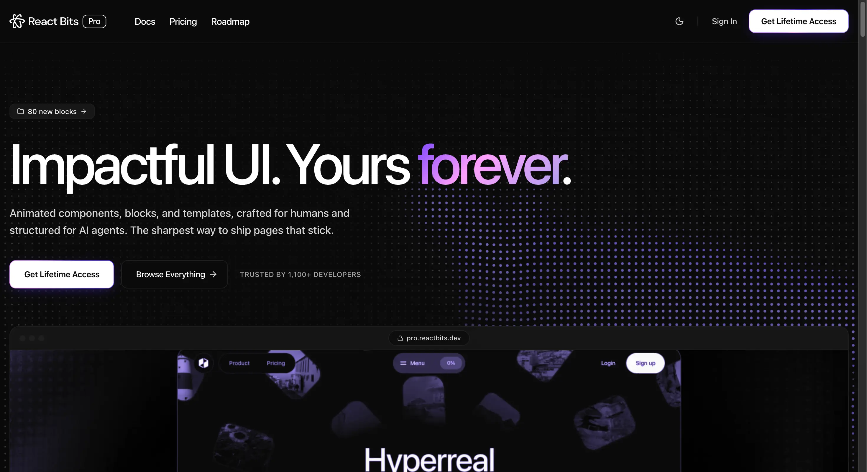
Screenshot of pro.reactbits.dev, the paid React Bits product, taken 7 August 2026. React Bits is a separate product and is not connected to Wensity.
If you are looking for a React Bits alternative, this guide compares Wensity UI with both the free React Bits library and the paid React Bits Pro product. You will find the licence details, real pricing, and which one suits a full product rather than a page of effects.
What is the best React Bits alternative?
Wensity UI is the best React Bits alternative in 2026 for product teams. It ships 161 React components, 92 of them free, including 57 UI building blocks for forms, tables, dialogs and menus. It adds a Heavy SaaS Blocks group for dashboards and an Agentic AI group for chat screens, and it comes with its own command line tool.
React Bits is impressive at what it sets out to do. It has one of the largest free collections of animated effects anywhere, with 165 plus components and four versions of each one. The gap appears when you need the ordinary parts of an app rather than the eye catching parts of a page.
Choose React Bits if you want the widest free set of animated effects and you enjoy assembling things yourself. Choose Wensity UI if you want one polished look, real app components, and tooling that keeps your brand style consistent as you build.
React Bits vs Wensity UI: quick comparison
Every figure below was checked on the React Bits website, its public code repository, and the React Bits Pro pricing page on 7 August 2026. Numbers move quickly in this market, so please confirm before you buy.
| What you are comparing | React Bits | Wensity UI |
|---|---|---|
| Free library | 165 plus components, four versions of each | 92 free components, no card or account |
| Licence | MIT plus Commons Clause, source available | Free tier, then a paid licence |
| Paid price | 99, 199 or 299 dollars, one time | 199 dollars once, or 169 dollars a year |
| Main strength | Volume of animated effects | One consistent premium design |
| Forms, tables, menus | Not the focus | 57 UI building blocks |
| Dashboards and AI screens | Not covered | Two dedicated component groups |
| Brand presets | Not available | Saved once, applied to every later install |
| Frameworks | React | Next.js, Vite, Remix, Astro, shadcn friendly |
Is React Bits really open source?
This comes up often, and the honest answer has a small catch worth understanding before you commit.
React Bits uses an MIT licence combined with the Commons Clause. You can use it freely in personal and commercial work, which covers almost every normal use. What you may not do is sell, sublicense or redistribute the components themselves, whether alone, bundled, or ported to another framework.
The Commons Clause is not approved by the Open Source Initiative, so the accurate description is source available and free to use, rather than fully open source. For most teams this changes nothing at all. It only matters if you planned to repackage the components into something you sell, which is exactly what the clause exists to stop.
Which one looks and feels more premium?
This section is our opinion, so please read it as one. We think Wensity UI is the more polished library, and the reason is mostly about consistency rather than any single component.
Curation beats volume
React Bits offers 165 plus components with four versions of each, which is a very large surface to keep visually consistent. Wensity keeps a smaller, curated set of 161 built to one design language. When you place six Wensity components on a page they look like they came from the same studio, because they did.
Motion that belongs to a system
Effect libraries tend to grow one animation at a time, so timings and easing drift apart. Wensity components share the same motion rules: short distances, quick settling, and no scaling or jumping on hover. The page still feels rich and alive, but it never feels like several different animations competing for attention.
Built for real data, not demos
Demos look great with three short words in them. Real screens have long names, empty states, loading states, and numbers that change. Wensity components are made and checked against that kind of content, so spacing holds and text does not clip when the data turns messy.
Your brand in one file
Wensity reads all of its colours from a single theme file using CSS variables and Tailwind CSS v4. Change that one file and the entire library takes your palette. No searching and replacing class names, and no risk of your site looking like every other site built on the same library.
Main differences between React Bits and Wensity UI
- Effects versus a full product. React Bits gives you striking pieces. Wensity gives you the striking pieces plus the ordinary parts every app needs.
- Many versions versus one opinion. React Bits ships four versions of each component so you can pick. Wensity ships one carefully made version, which means less choosing and less drift over time.
- Manual styling versus saved presets. Wensity remembers your brand colours, radius, fonts and icon set, then applies them to every component you install later.
- React only versus many frameworks. Wensity works with Next.js, Vite, Remix and Astro, and publishes in a shadcn friendly format for projects you already have.
React Bits Pro pricing vs Wensity UI pricing
React Bits splits its paid product into three tiers. Wensity keeps one paid level and lets you choose how to pay for it.
| Plan | Price | What you get |
|---|---|---|
| React Bits free | 0 dollars | 165 plus components, four versions of each |
| Pro Starter | 99 dollars once | Premium animated components only |
| Pro | 199 dollars once | Components plus UI blocks |
| Pro Ultimate | 299 dollars once | Everything plus templates and priority support |
| Wensity free | 0 dollars | 92 components, CLI installs, no card |
| Wensity Pro Lifetime | 199 dollars once | Every premium component and block, forever |
At 199 dollars the two products cost the same, so the question is what you need. React Bits at that tier gives you more landing page blocks. Wensity at that tier gives you app components, dashboard blocks, AI screens, and the preset tooling. Wensity also offers a yearly option at 169 dollars, which React Bits does not.
Which one helps you build faster?
Wensity UI, and the reason is the preset system rather than the install command itself.
# Set up once. Writes wensity.json and a small helper file.npx wensity@latest init# Save your brand colours, radius, fonts and icon set as a preset.npx wensity@latest init --preset <your-preset-code># Every component you add from now on already matches that style.npx wensity@latest add liquid-multimodal-input# Section blocks install the same way.npx wensity@latest add hero-section-with-radial-glow --type block
Most of the hidden time in any component library is not installing things. It is restyling each piece afterwards so it matches your brand. Save a preset once and that step disappears. With four versions of every component to choose from, React Bits asks you to make that decision again on every install.
Which has better integrations?
Wensity UI fits into more places. React Bits is a React library. Wensity works with React in Next.js using either router, and also with Vite, Remix and Astro.
It is styled with Tailwind CSS v4 through plain CSS variables, so it sits on top of a setup you very likely already have. Components are published in a shadcn friendly format too, so an existing shadcn project can pull them in without moving any folders around.
For teams there is one more piece. Wensity supports API tokens, so a build pipeline can fetch component source automatically instead of a person copying files by hand. That starts to matter as soon as more than two people share the same design system.
What is React Bits good at?
React Bits deserves real credit, and three things stand out.
- The free library is exceptional value. Very few projects give away this much, and it is genuinely free for commercial work.
- Four versions of everything. JavaScript or TypeScript, plain CSS or Tailwind. If your project does not use Tailwind, React Bits still works, and most rivals here would not.
- Creative range. For backgrounds, text effects and unusual animations, the catalogue is one of the widest anywhere.
Who should pick Wensity UI, and who should stay
Pick Wensity UI if
- You are building a product with screens behind a login.
- You want one consistent premium look with no visual drift.
- You need forms, tables, dialogs, menus or AI chat screens.
- You want your brand style applied automatically on every install.
- You are on Vite, Remix or Astro rather than only React.
Stay with React Bits if
- Your budget is zero and you want the largest free set available.
- Your project does not use Tailwind CSS and you need plain CSS.
- You mainly want backgrounds and creative text effects.
Other React Bits alternatives worth a look
Wensity UI is not the only option. The right pick depends on what brought you to React Bits first.
- Magic UI. If the free animated effects were the draw but you want a tidier and more consistent set, Magic UI is smaller and its core library carries a plain MIT licence with no extra clause.
- Aceternity UI. If you want fewer components but far more visual drama in each one, Aceternity pushes harder on spotlights, beams and 3D effects.
- Motion Primitives. If 165 components felt like too much to sort through, this is a deliberately small and restrained open source set.
- Tailwind Plus. If you would trade every animation for a large library of plain, dependable components, this is the official Tailwind collection. There is no free plan.
We compare each of these on our UI library comparisons page.
Common questions about React Bits alternatives
Short answers to what people ask most before choosing.
Compare them yourself
Every Wensity component has a live preview you can click. 92 are free right now, with no card and no account needed.
React Bits is owned by its own maintainers and is not connected to Wensity. Prices, licence terms and component counts on this page were checked on 7 August 2026 and can change at any time, so please check reactbits.dev before you buy. Views on polish and feel are our own. See our other UI library comparisons.