Black Friday is here 🔥 Get Wensity Pro for 20% less with

SVG icon library for React and Next.js

1,000 iconsOutline, duotone and solid50 free

Free and Pro SVG icons drawn on one 24px grid with a 1.5px stroke, smoothed corners and round ends, so a sidebar, a toolbar and a settings page read as one consistent icon set. Copy any icon as SVG or JSX, add it with the CLI, or ask your AI agent.

Free icons copy with no account. Works in React, Next.js, Tailwind CSS and shadcn/ui projects.
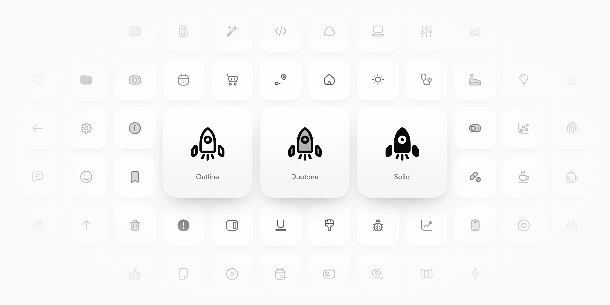
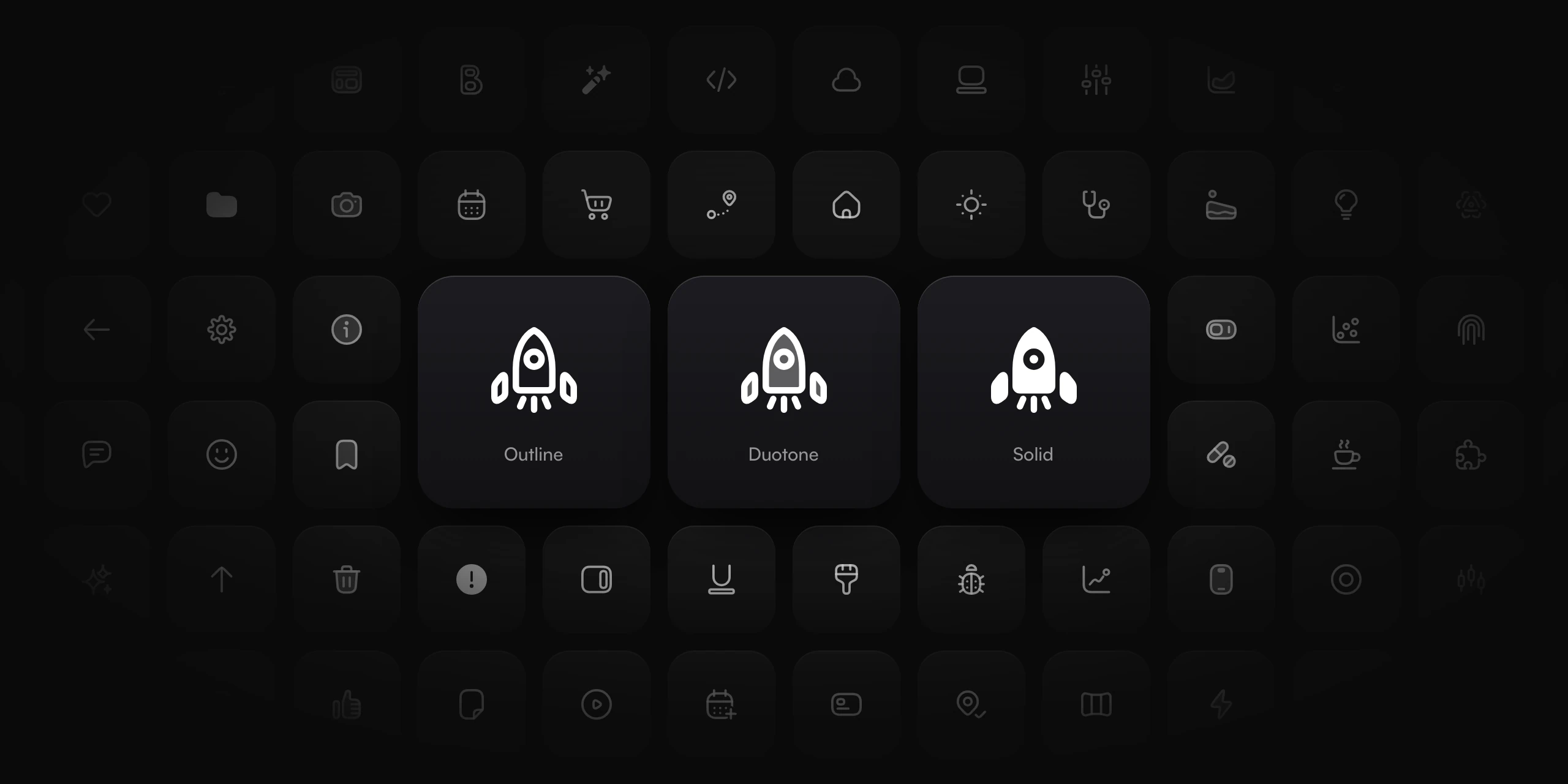
Wensity SVG icons on white tiles, fading out toward the edges, with a rocket icon in outline, duotone and solid on three large tiles in the middle.
One icon drawn in outline, duotone and solid, surrounded by icons from every category in the set.

Outline, duotone and solid icons from one drawing

Every icon comes in all three styles, drawn from the same shape, so you can switch style per state without the icon moving.

Outline

1.5px line icons with no fill. For navigation, toolbars and most interface text.

Duotone

The outline over a 30% fill of the same color. For feature lists and empty states.

Solid

Filled, with inner lines cut out. For selected states, tab bars and small sizes.

Try a free icon in all three styles

Pick an icon, change its color, and copy the outline, duotone or solid version as SVG or JSX. No signup.

Outline
Duotone
Solid

Copies are 24px and keep currentColor, so they take your text color.

50 free SVG icons for commercial use

Free for personal, commercial and client work, with no account and no attribution. Click an icon to copy it as SVG or JSX.

A consistent icon set on one 24px grid

Every icon follows the same grid, stroke and corner rules, so icons from different corners of the set sit side by side without one looking heavier.

calendar · 24px grid
clock · 2px paddingKeyline: circle
mail, top left corner · red: a plain arc
mail · solid cutKeyline: landscape
The same icons at 16, 20, 24 and 32 pixels
16px
20px
24px
32px

Outline at rest, solid when selected

Tap a tab. The selected icon fills in place, because both styles share one shape.

One grid

24px canvas, 2px padding, and a circle, square, portrait or landscape keyline so shapes carry the same weight.

1.5px stroke

Round ends and joins everywhere. Clear at 16px and 20px, and crisp at 24px, the size it is drawn for.

Smoothed corners

A corner starts its curve 40% further along each edge than a plain arc, so the edge eases into the bend.

Checked by script

Each icon is measured for centring, and symmetric ones for mirror error, instead of being judged by eye.

Add icons with your AI agent or the CLI

Connect the Wensity MCP server and one sentence is enough: your agent picks the icons, shows you the files first, and writes each one into your project. In the terminal, npx wensity@latest icons add home search does the same.

Add the Wensity home, search, bell and settings icons to my navbar

Five files written to components/wensity/icons

  • Claude Code
  • Cursor
  • Codex
  • VS Code

UI icons for every screen of your app

1,000 interface icons in 29 categories, from arrows, files and charts to commerce, devices and developer tools, for websites, dashboards and mobile apps.

Every icon, every style, with Pro

All 1,000 premium icons, plus the whole set as one ZIP.

$169a year, or $199 once

Wensity Pro icons on light tiles in outline, duotone and solid, with the palette and gift icons selected.

Questions about Wensity icons

What people ask before they pick an icon library: commercial use, attribution, formats, Figma, Tailwind CSS and what is free.

Yes. The 50 free icons and every Pro icon can go into personal, commercial and client projects: apps, websites, dashboards, products you sell and work you deliver to a client.

No. No credit, link or attribution is needed anywhere, on free or Pro icons.

No. They are free to use but not MIT licensed: you may not pass them on as icons, for example in an icon pack, icon font, design-tool library, package or public repository. Section 9 of the Wensity license has the full terms.

50 icons are free with no account, covering navigation, actions, status, account, messages, files, media, shop and everyday. The other 950 come with Wensity Pro, $169 a year or $199 once.

Yes. Copy any icon as SVG and paste it into Figma, where it lands as an editable vector you can resize and recolor. Use them in your own designs and products; the license only rules out publishing them as an icon library, such as a Figma Community file.

Yes. Each icon is a plain SVG or a small React component that draws with currentColor, so Tailwind CSS classes set its size and color, and it sits next to shadcn/ui components like any other icon. You add icons by name, one file each, rather than importing them from a package.

Lucide and Heroicons are free, open source sets you install as an npm package. Wensity icons come in outline, duotone and solid from one drawing, with smoothed corners, and copy into your project as files, so there is no package to keep updated. The trade-off: most of the set needs Pro, and the license does not let you pass the icons on as your own icon set.

No, and on purpose. The Wensity CLI or your AI agent writes each icon into your project as its own file, so there is no package to install, no version to keep up with, and a page only carries the icons it uses.

Pro Lifetime is a one-time $199 with every update that comes later. Pro Annual is $169 a year. Both include every icon, plus every Pro component, block, template and design skill.

Yes. Free and Pro icons can go into unlimited personal, commercial, internal, SaaS and client projects. A Pro plan covers one developer, and that developer can use the icons in as many projects as they like.

Every icon copies as plain SVG or as JSX for React, so there is no SVG to JSX step. The CLI writes each icon as its own typed React component, or as an .svg file with --format svg. With Pro, the dashboard has the whole set as one ZIP: SVG files in every style, an SVG sprite per style and the React components.

Copy them from the icon browser, run npx wensity@latest icons add home search with the Wensity CLI, or ask your AI agent with the Wensity MCP server connected.

No. The SVG works anywhere: plain HTML, Vue, Svelte, Astro, Figma or a static file. The JSX copy and the CLI's components are for React and Next.js.

Icons draw with currentColor, so they take the text color around them. Size them with width and height or a Tailwind CSS class such as size-5, and color them with a class such as text-neutral-500.

Pro icons already in your projects stay licensed to you and keep working. Copying, installing and downloading new Pro icons stops until you renew.

Parth

Founder, Wensity

Still have a question?

Ask about the icons, the license or Pro, and you will hear back from me directly.

Email hey@wensity.com