Contact Sections
Contact form sections with three column layouts, centered form cards, split support actions, help forms with quote cards, dashed grid forms, 2D map previews, and sales and phone details.
Every contact section here is included with Wensity Pro.
How to choose a contact section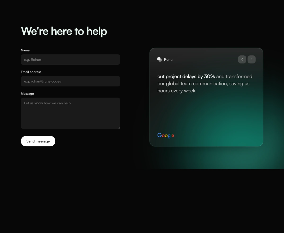
Which contact section should I use?
Take a message beside a result
- Contact Section With Help Form Quote
- Mint help headline, boxed name email and message, a send pill, and a quote carousel with a client mark. Use it when the form has to sit next to a named outcome. Follows light and dark.
Write the desk in a dashed frame
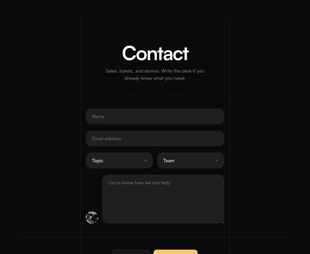
- Contact Section With Dashed Grid Form
- Full bleed dashed window that fades at the edges, pill name and email, topic and team dropdowns, a portrait beside the message box, and a yellow send button. Use it when contact should look like a form, not a chat FAQ.
Book a call or send a note
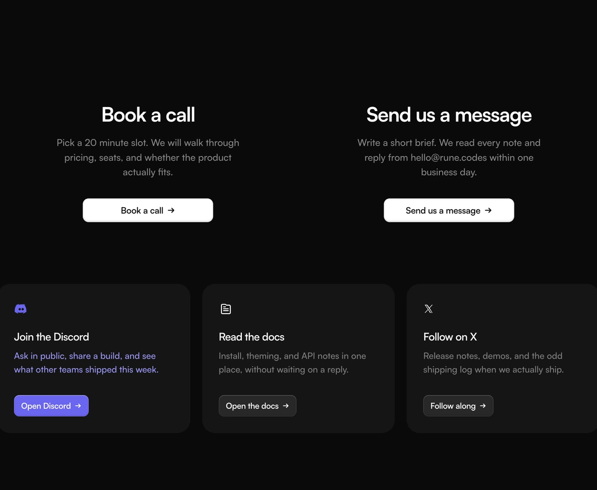
- Contact Section With Split Support Grid
- Book a call on the left, Send us a message on the right, then Discord, docs, and X as cards. Use it when the next step is a slot or a mailbox, not a form.
Put the form in the middle
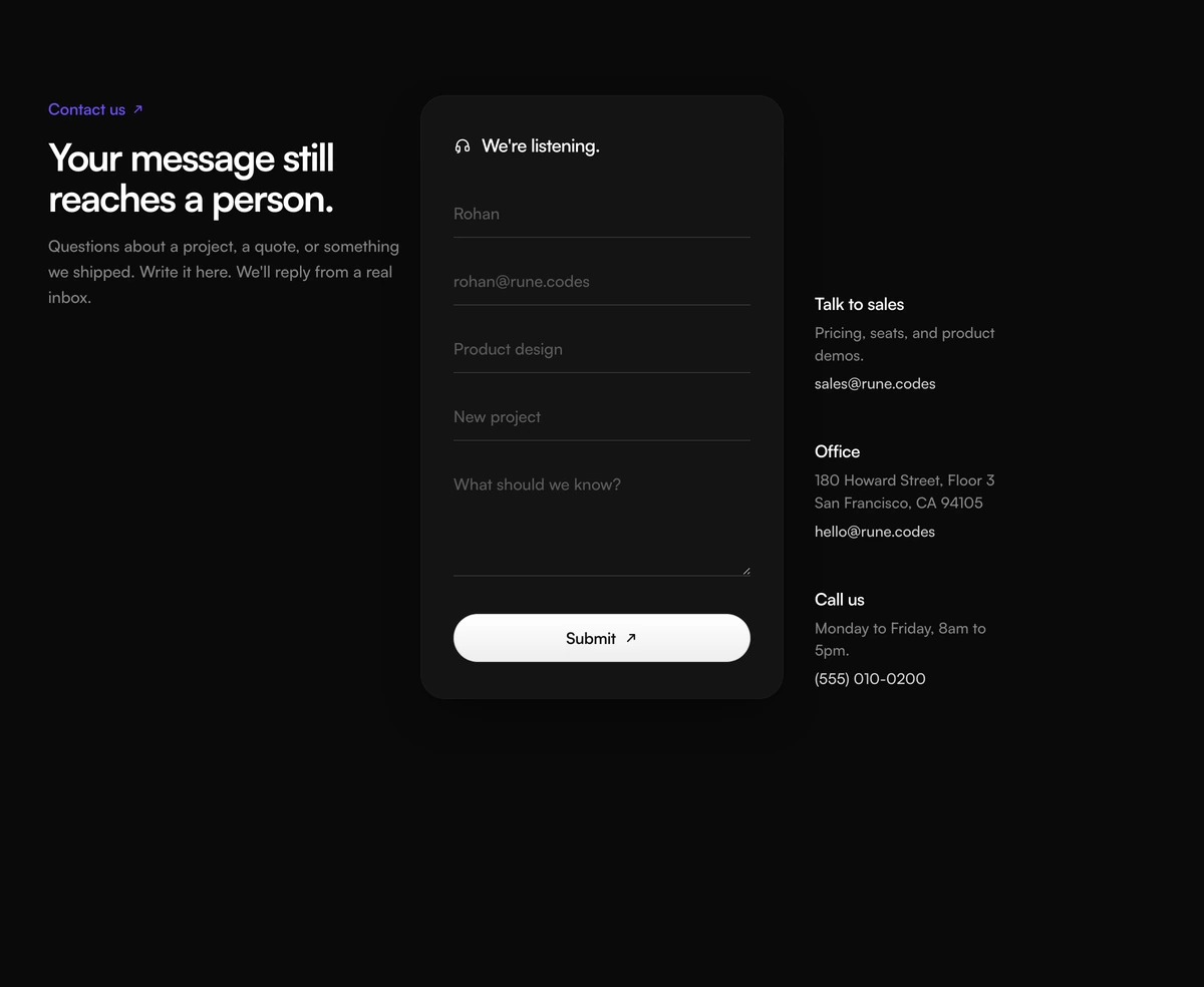
- Contact Section With Three Column Form
- Intro on the left, underline form card in the center, sales, office, and phone against the card. Use it when a message and a human path have to sit in one band.
Show where to walk in
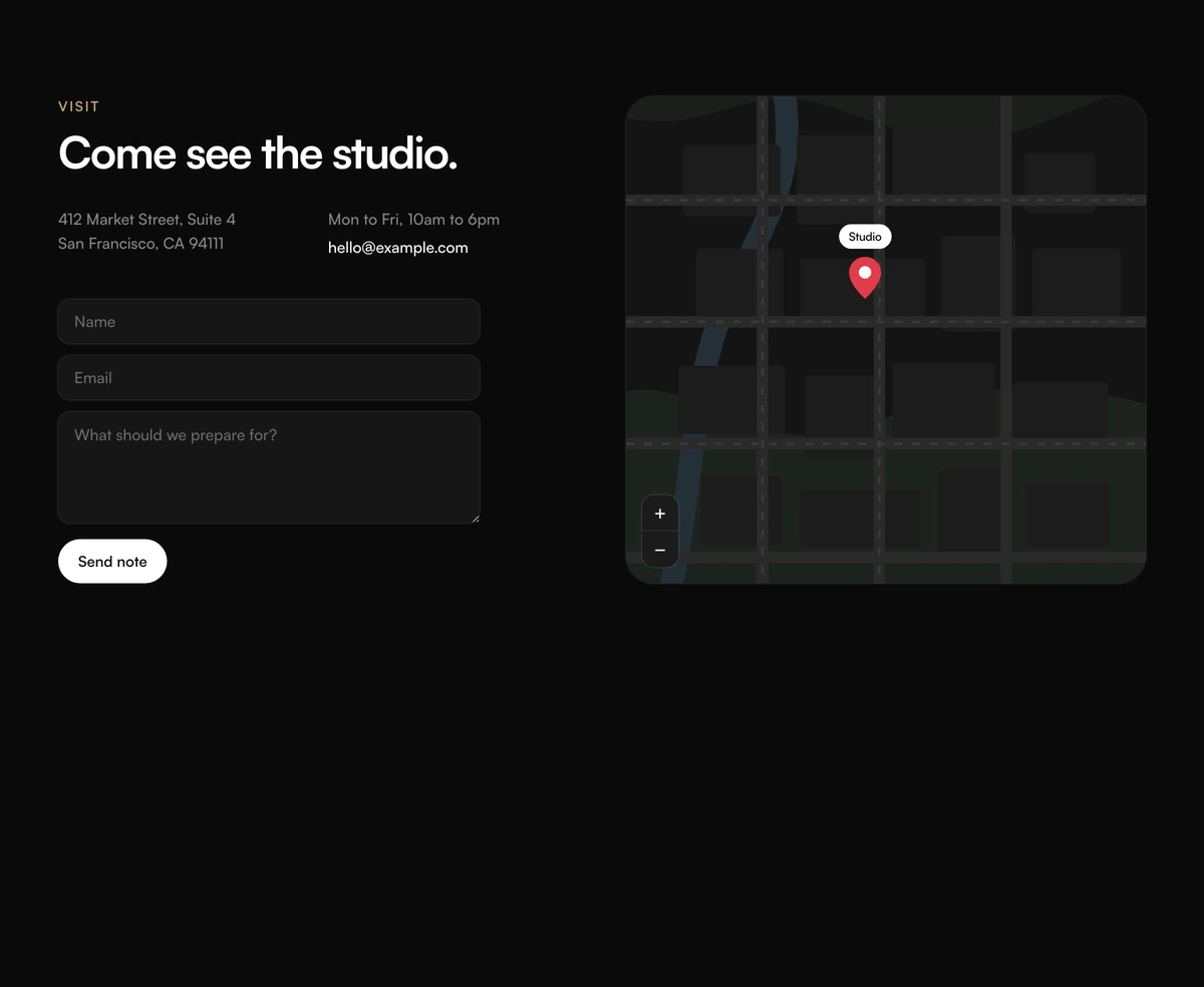
- Contact Section With Map Preview
- Studio address and a short note form beside a 2D map mockup with a pin. Use it when visit hours matter more than a live maps embed.