React contact section components
5 contact section componentsLive previewFull source in your repo
A contact section has to take a message and still name a person. These contact forms put the fields, the inbox and the phone number in one band, so the visitor is never left with a dead submit button.
Works with
- React
- Next.js
- TypeScript
- Tailwind CSS
Contact form sections you can copy
Each contact section is one file covering the intro, the form and the human paths beside it. Preview it live, then copy the source into your project.
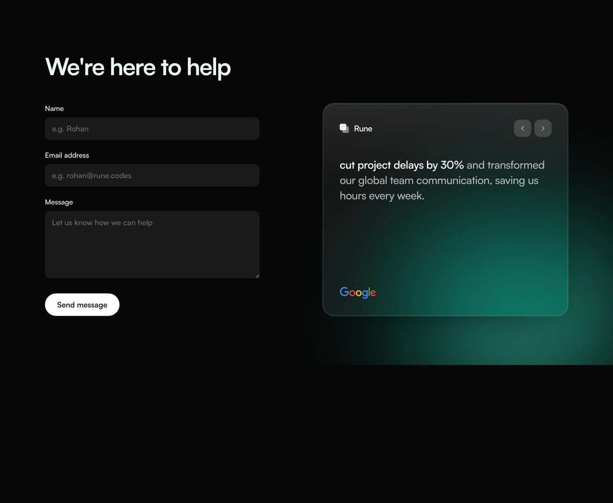 Contact Section With Help Form QuoteHelp contact section with a mint headline, stacked name email and message fields, a send pill, and a quote card with vendor mark, carousel arrows, and a client logo. Teal corner glow. Follows light and dark.
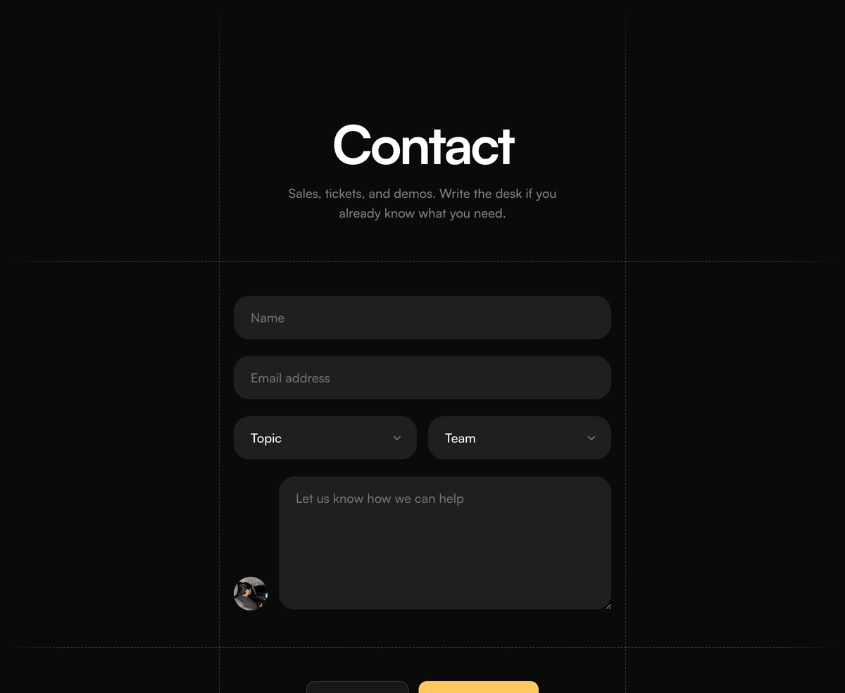 Contact Section With Dashed Grid FormDashed frame contact form with pill name and email fields, topic and team dropdowns, a desk portrait beside the message box, a docs link, and a yellow send action. Follows light and dark.
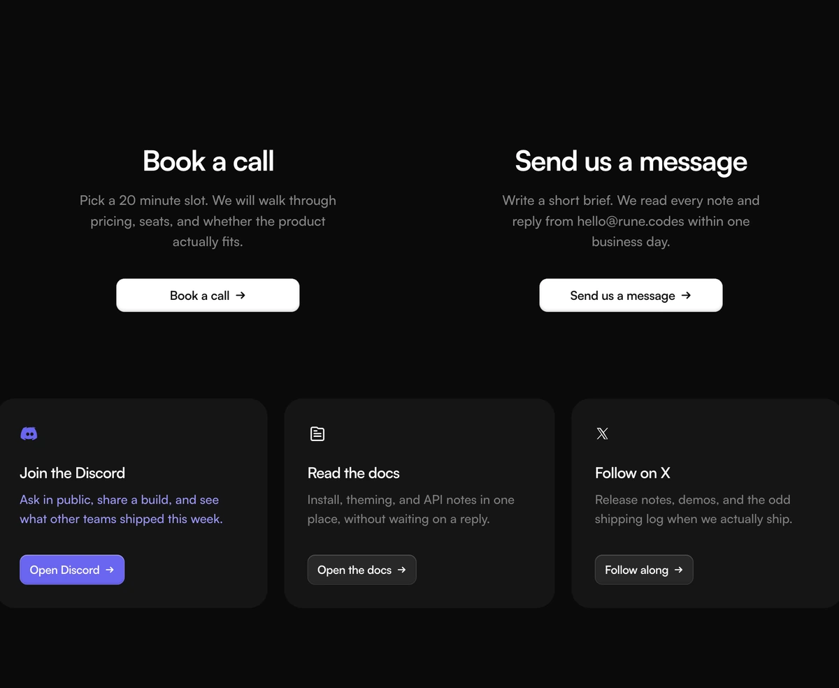 Contact Section With Split Support GridSplit contact section with Book a call and Send us a message as matched columns, plus Discord, docs, and X cards. Follows light and dark.
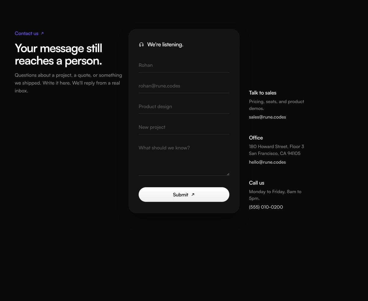 Contact Section With Three Column FormContact section with intro copy on the left, a centered underline form card, and stacked sales, office, and phone links. Follows light and dark.
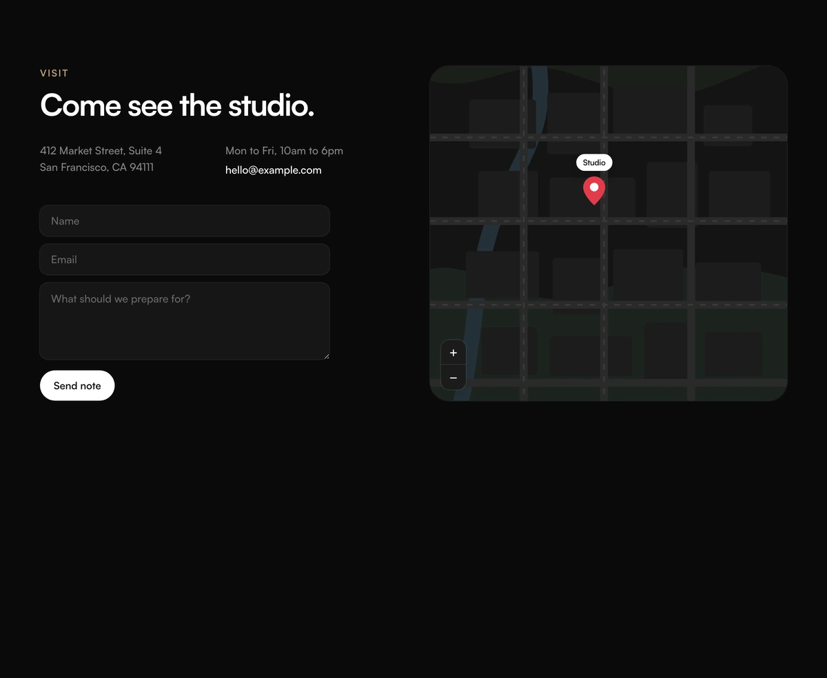 Contact Section With Map PreviewVisit contact section with studio address and hours, a short note form, and a 2D map mockup with streets, a pin, and fake zoom chrome. Follows light and dark.
FAQ sections to place above a contact form
FAQ blocks from the same library, for the page that should answer the common questions before anyone writes a message.
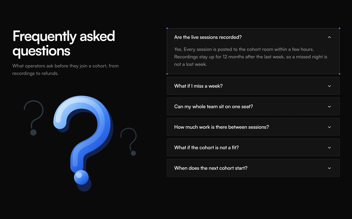
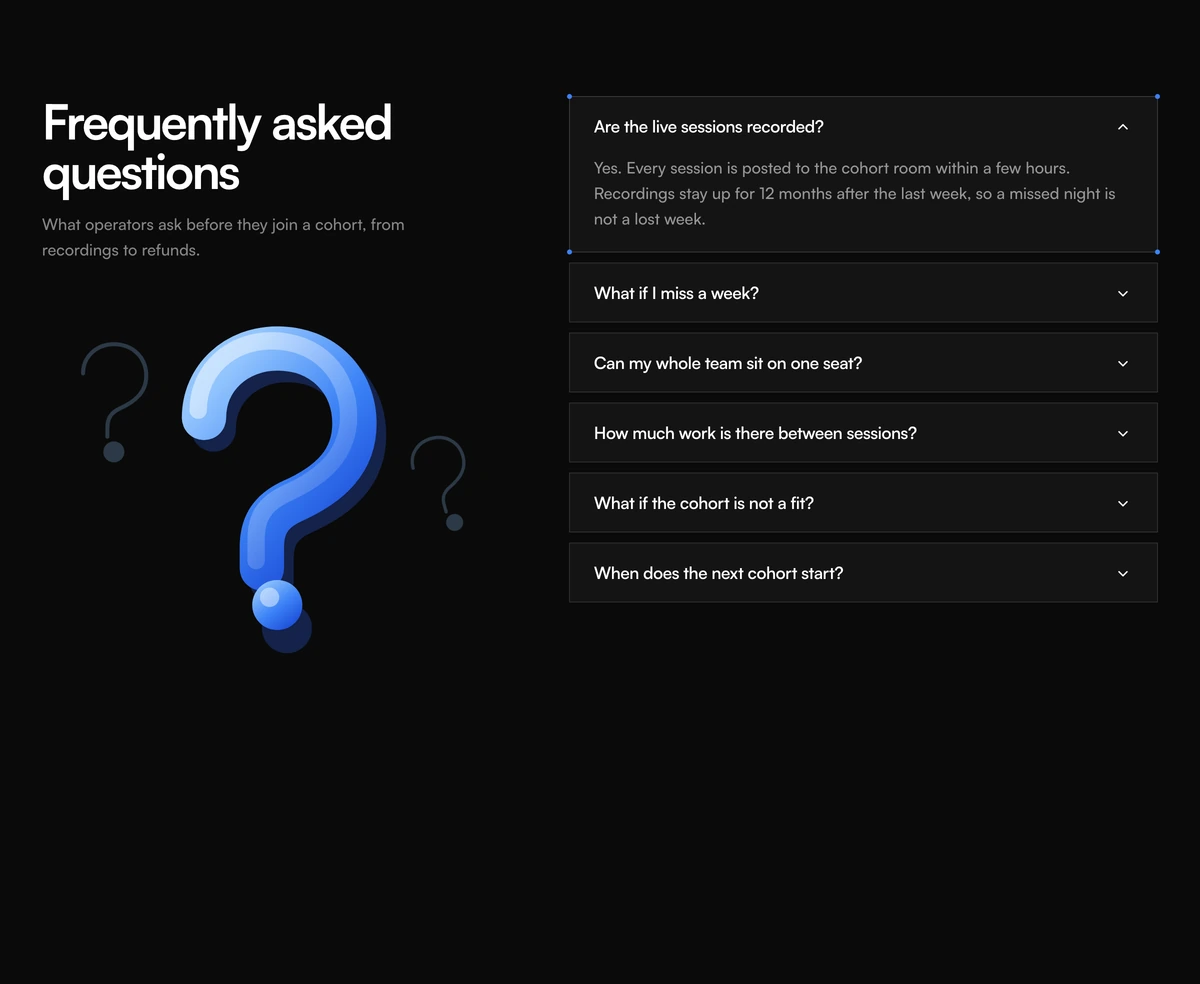 FAQ Section With Illustration AccordionSplit FAQ accordion with a question mark illustration, isolated question cards, chevron toggles, and a partner questions list. Follows light and dark.
 FAQ Section With Split Headline AccordionLeft-aligned two-line headline over a hairline FAQ accordion. Plus rotates to a close mark and the answer unfolds in height. Follows light and dark.
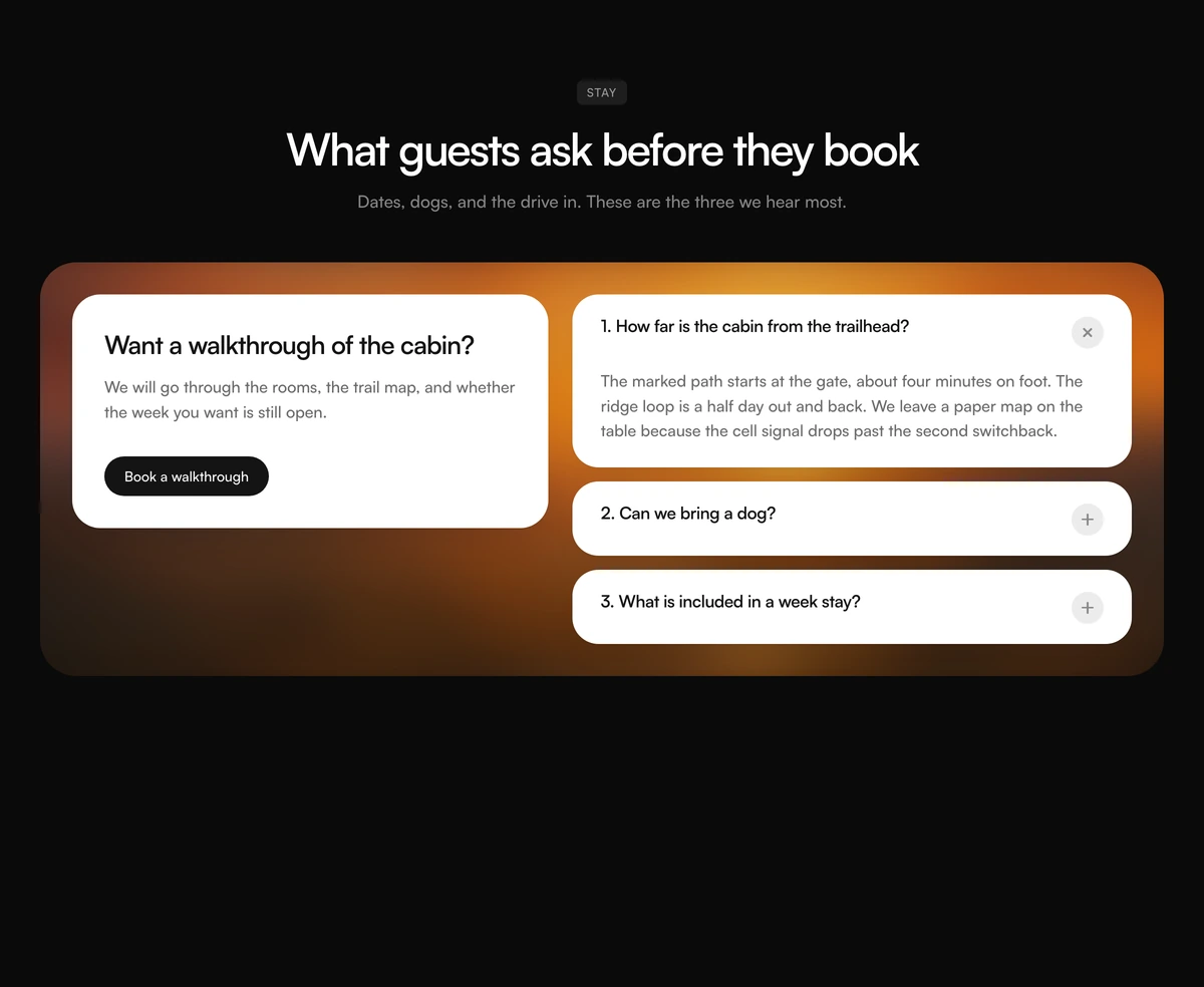 FAQ Section With Photo Consult PanelCentered FAQ badge and heading over a blurred photo panel, with a consult card on the left and numbered question cards on the right. Follows light and dark.
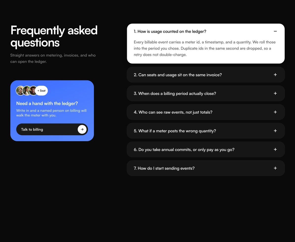 FAQ Section With Numbered Support CardNumbered FAQ accordion with an inverted open row, a blue still have questions card, overlapping faces, and a talk to our team action. Follows light and dark.
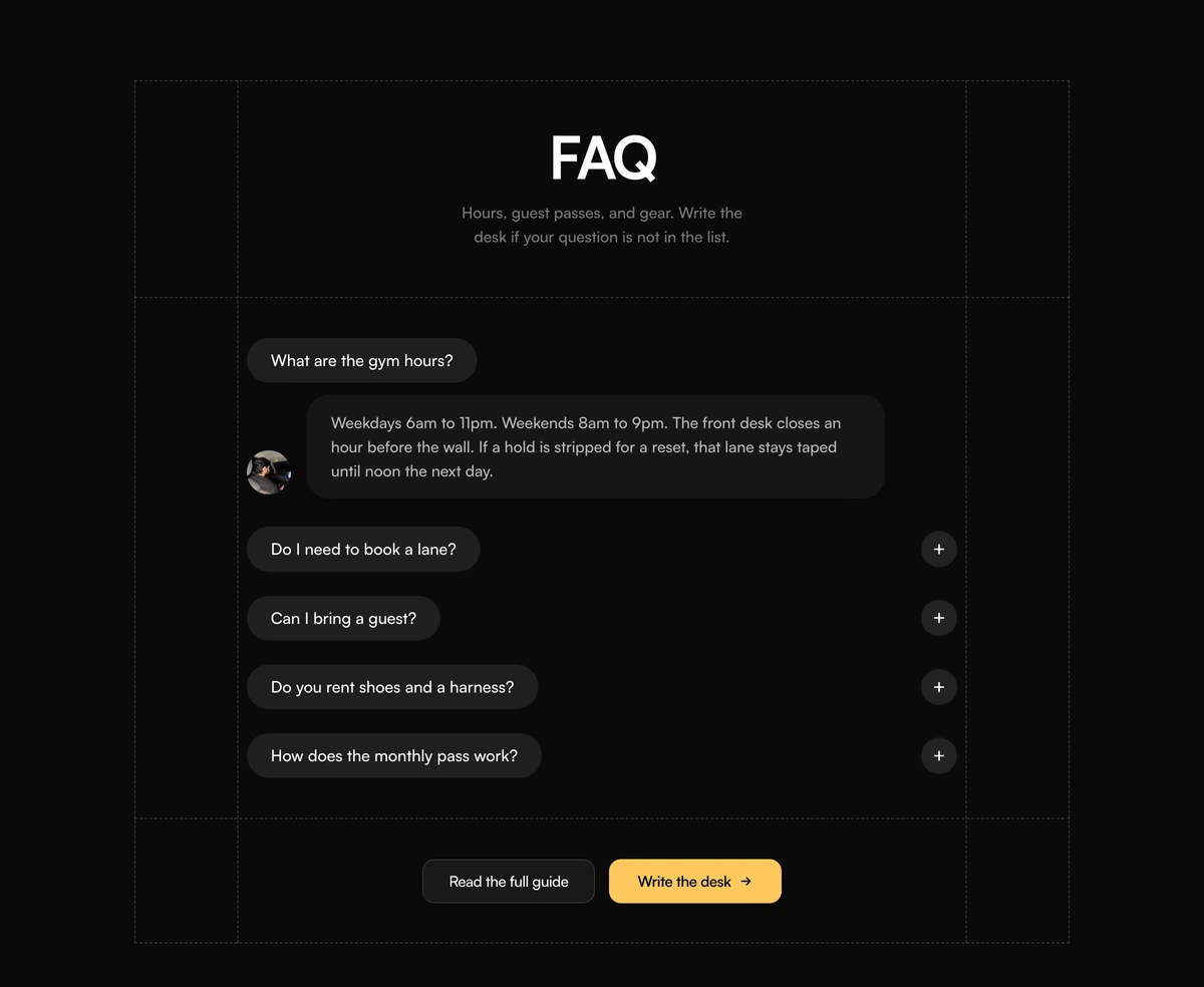 FAQ Section With Dashed Grid PillsCentered FAQ accordion with a dashed layout grid, charcoal question pills, a portrait beside the open answer, and contact actions. Follows light and dark.
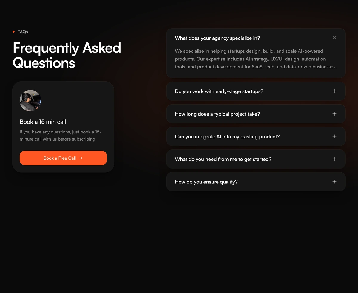 FAQ Section With Accordion Call CardSplit FAQ accordion with a sidebar book-a-call card, stacked question rows, plus and close icons, and a peach glow behind the answers. Follows light and dark.
Contact form fields and inputs
The parts a React contact form is built from: a multi step form wizard, a file uploader, a tag picker for topics, and labelled fields with error states.
 Multi-Step Form WizardA multi-step form wizard whose card physically reshapes to wrap each new step as the content slides in behind it.
 File UploaderA bold red dropzone for any file, with gallery tiles and progress after upload.
 Multi-Select Tag InputA tag input where pills pop in as you add them and slide out on remove, closing the gap without snapping the layout.
- InputInputA React text input with a built in label, hint, and inline error wired to screen readers, plus leading and trailing icons and a one tap clear button.
- TextareaTextareaA React textarea that auto resizes between min and max rows, with a live character count that warns near the limit and default, filled, or ghost styles.
- SelectSelectA React select component on Base UI with grouped options, descriptions, icons, four trigger styles, keyboard navigation, and native form submission.
- FieldFieldA React field for form validation messages, linking a label, help text, and an error or success line to the input, in stacked or side by side layout.
- ToastToastReact toast notifications on Base UI in info, success, warning, error, and action styles, with swipe to dismiss, six positions, and a hook to fire them.
Contact us page design: a form, a booking split or a map
A contact section is not a second footer. By the time someone reaches it they have already seen the product. The job is to take a named message and leave a path to a person if the form is the wrong tool. If the only action is Submit, and Submit goes nowhere, the block is a brochure.
Contact Section With Three Column Form is for a page that wants the form as the object, not a thin strip under the footer. The left column holds the ask. The middle is a white card with underline fields for name, email, industry, subject, and a longer message. Headphones sit beside We're listening. Submit is a black pill. Sales, the office, and a phone number sit against the card.
Contact Section With Split Support Grid is for a team that takes both calls and written questions. Book a call and Send us a message sit side by side as matched columns, and Discord, docs, and X cards sit under them. Use it when half your visitors want a meeting and half want an answer by email.
Contact Section With Help Form Quote is a help desk page. A mint headline sits over stacked name, email, and message fields and a send pill, and a quote card beside the form carries a vendor mark, carousel arrows, and a client logo. It suits support pages where a customer quote reassures people before they write in.
Contact Section With Dashed Grid Form is for routing. Pill name and email fields sit inside a dashed frame with topic and team dropdowns, so a message arrives already sorted. A desk portrait sits beside the message box, and a docs link gives people a way out before they send. Cut the team dropdown if every message lands in one inbox.
Good contact form design is mostly about removing friction. Ask only for what the next reply needs, usually a name, an email and a message. Put labels above the fields rather than inside them, label the button with what happens, such as Send message, and confirm on screen that the message arrived. Add a honeypot field or a CAPTCHA against spam, and link your privacy policy beside the button if you store what people send.
Wire the form to a real endpoint before you ship. The demo prevents the default submit so the preview does not POST. Your handler, your spam rules, your confirmation. An empty onSubmit that only toasts Success is worse than a mailto on the right.
Keep the three human paths honest. Talk to sales belongs here only if that inbox is staffed. The Howard Street address is demo copy. The (555) number is a placeholder. Replace every href. A tel link that rings a disconnected line is worse than no Call us block.
The next section should be the footer, or a map if the office is a place people actually visit. Contact Section With Map Preview pairs the studio address and hours with a short note form, beside a 2D street mockup with a pin, not a live maps embed. Keep Google Maps out of the file. A second form titled still have questions usually means the first list of fields was not edited.
The three column demo uses rune.codes mailboxes and a Howard Street office. Replace the heading, the placeholders, the address, and the emails before this goes to production. Keep the underlines. Boxed inputs turn the card into a generic form, which is not why this layout exists.