React pricing section components
8 pricing section componentsLive previewFull source in your repo
A pricing section is a decision, not a brochure. These blocks cover pricing cards with a monthly or yearly switch, a four column comparison table, and a usage receipt whose sliders reprint the total.
Works with
- React
- Next.js
- TypeScript
- Tailwind CSS
Pricing cards and pricing tables you can copy
Each pricing section is one file covering the plans, the billing switch and the responsive rules. Preview it live, then copy the source into your project.
 Pricing Section With Animated CloudsThree glass plan cards on a drifting cloud sky, with a yearly or monthly toggle and a highlighted middle seat.
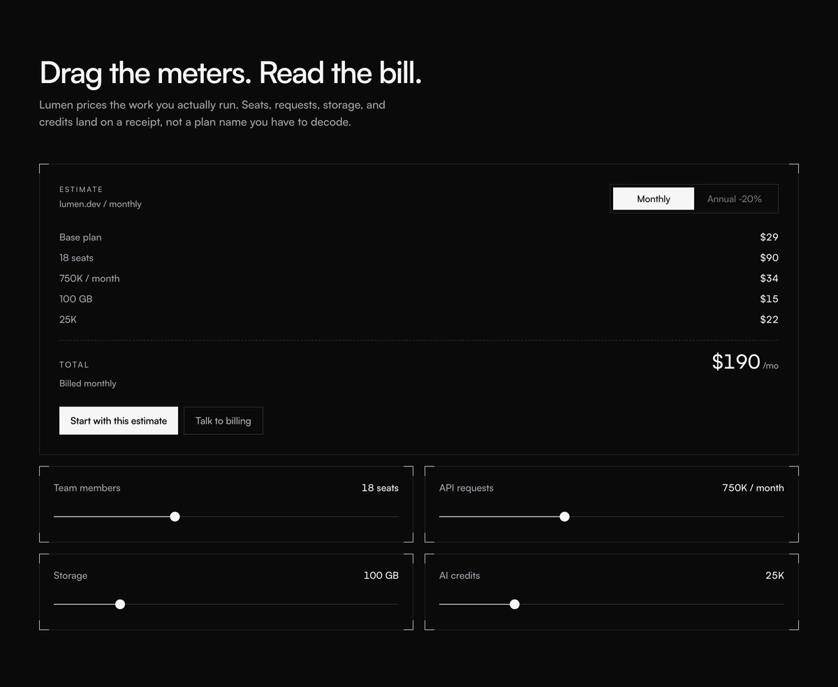 Pricing Section With Usage ReceiptInteractive pricing section with usage sliders for seats, requests, storage, and credits, plus a live receipt and a monthly or annual cycle.
 Pricing Section With Soft GradientThree plan cards on a blue to peach wash, with a yearly switch and a handwritten save scribble beside the popular middle seat.
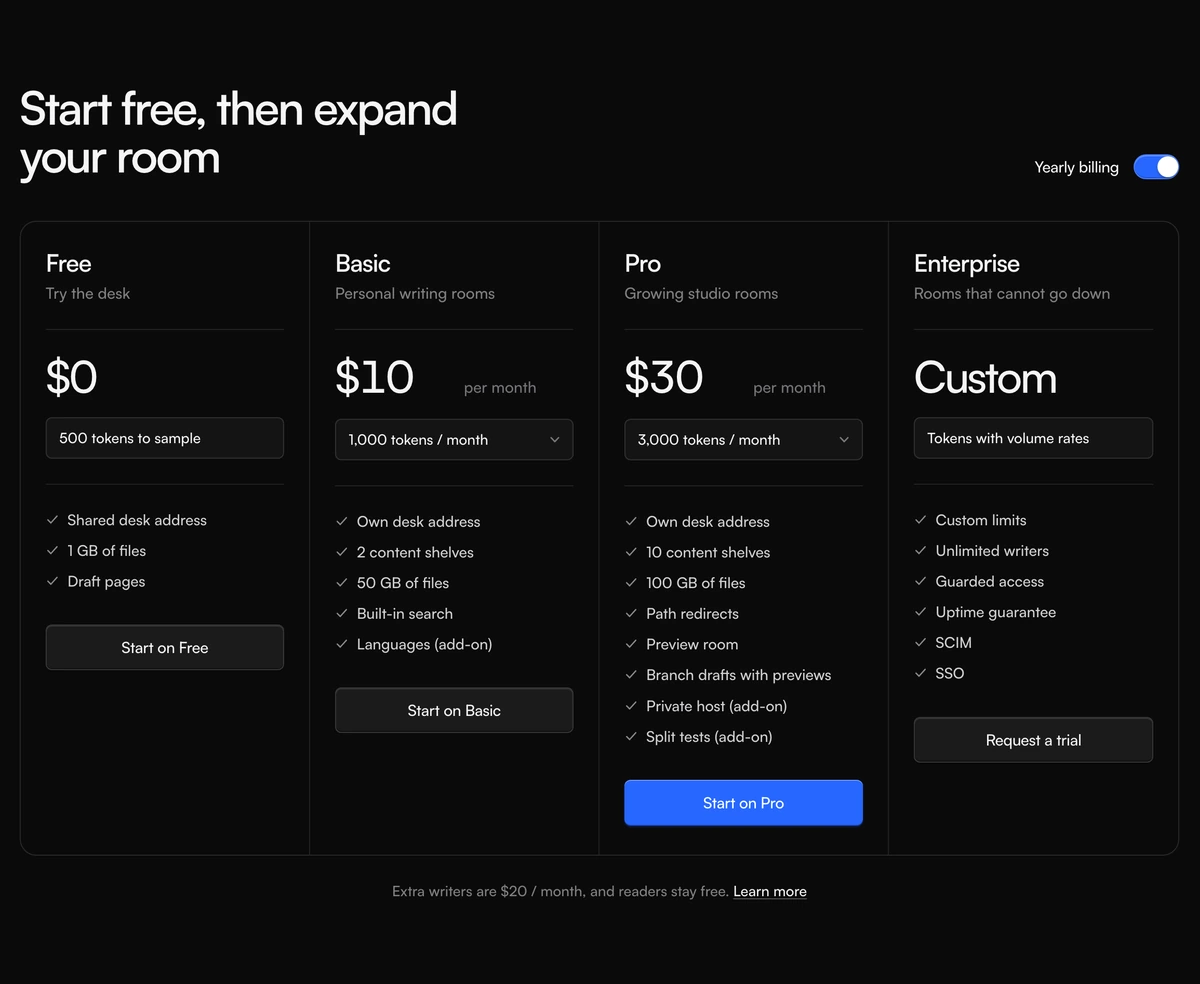 Pricing Section With Credit Plan ColumnsFour plan columns in one bordered shell, with a yearly billing switch, credit menus, and a highlighted Pro action.
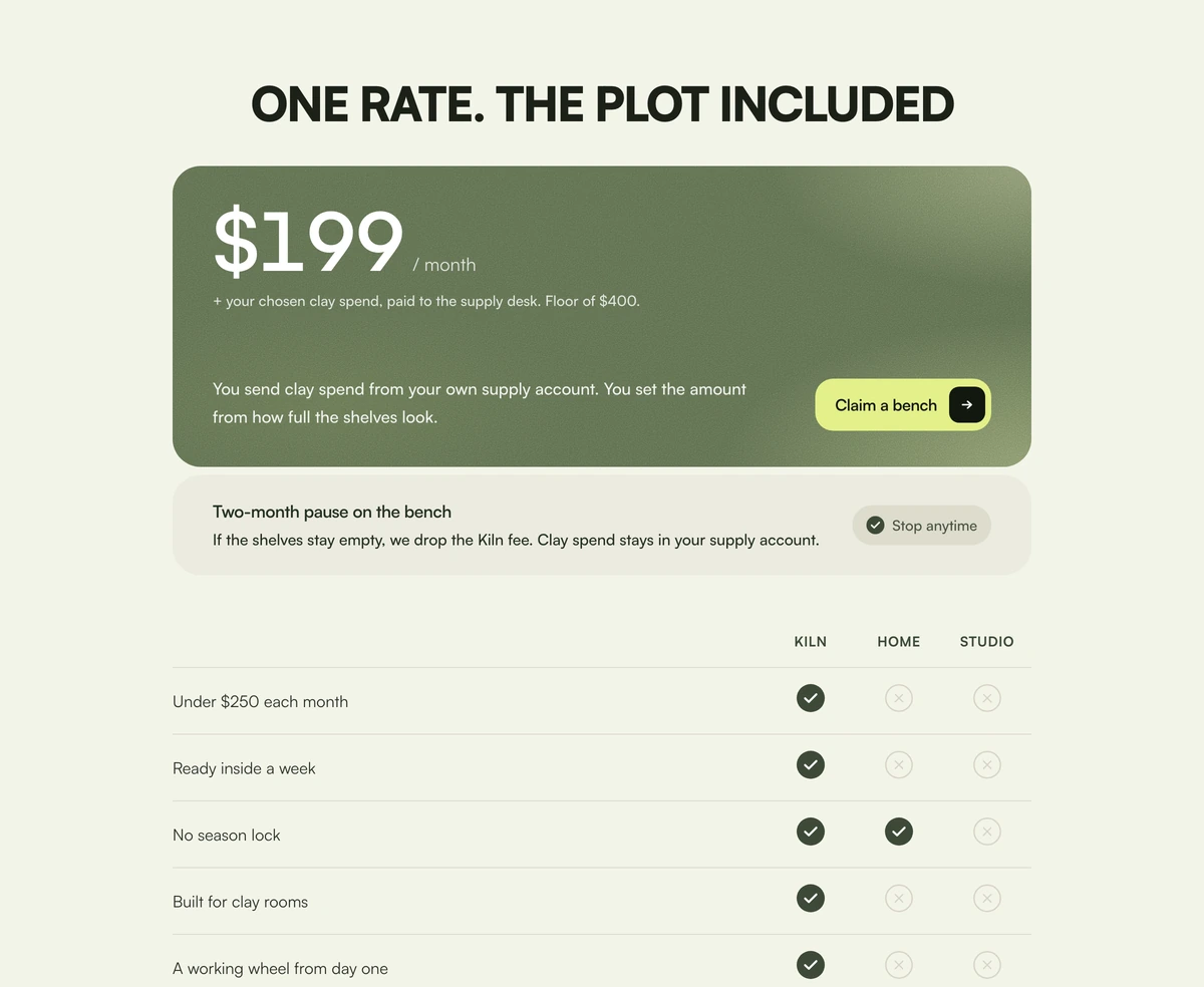 Pricing Section With Included PriceOne moss price card with a grain wash, a pause footer, and a three-column check table against home and studio.
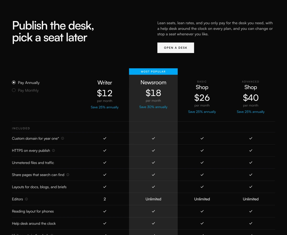 Pricing Section With Comparison TableFour-column pricing comparison with annual or monthly radios, a most popular column, feature checks, and a core matrix.
 Pricing Section With Nested Feature ListsFour warm plan cards with a gliding monthly or annual toggle, three highlight rows, and a nested extras list under each card.
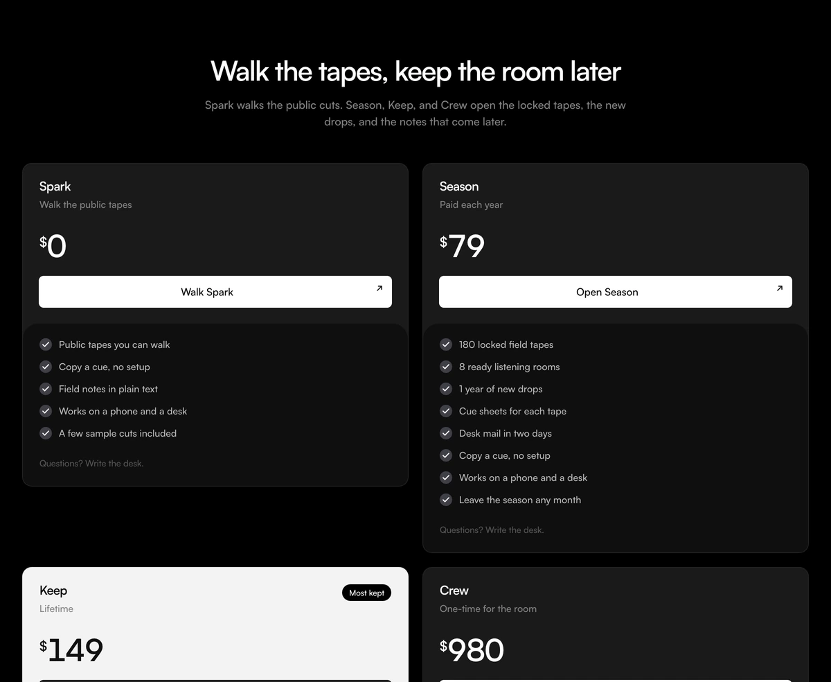 Pricing Section With Lifetime HighlightFour access cards with live prices, an inverted Keep highlight, and a plus rule for stacked includes. Follows light and dark.
SaaS UI to show before the price
Feature proof and heavy product UI from the same library, for the page that has to earn the quote before it asks for a card.
 Subscription Tier CardPricing cards with a monthly and annual toggle, prices that spring to new values, and a highlighted plan in a brand glow.
 Fluid Drag-and-Drop KanbanA Trello-grade board running real pointer physics, where every card tilts toward the velocity you throw it across at.
 Multi-Step Form WizardA multi-step form wizard whose card physically reshapes to wrap each new step as the content slides in behind it.
 KPI Card with SparklineDashboard KPI cards with a smooth SVG sparkline chart and a glowing dot that snaps to whichever value you scrub across.
 GitHub-Style Activity Grid365 squares sharing one tooltip that flies between days on rails, with a reveal that ripples backward from today.
Pricing comparison tables
Comparison blocks from the same library, for buyers who need every limit on one grid before they pick a plan.
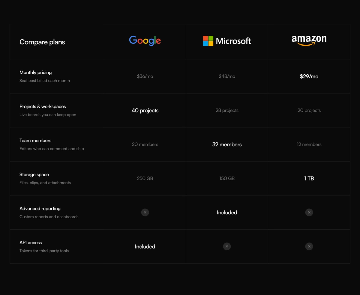 Comparison Section With Features MatrixDark comparison section with a four column features matrix, Google Microsoft and Amazon wordmarks, and circular missing marks. Winning values read brighter than the rest.
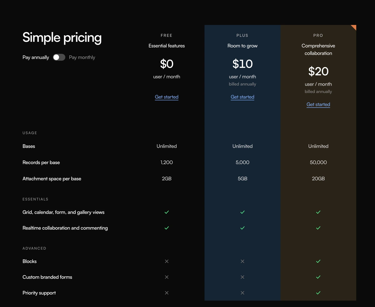 Comparison Section With Simple PricingComparison section with a Simple pricing heading, an annual or monthly switch, three tinted plan columns, grouped feature rows, and green checks. Follows light and dark.
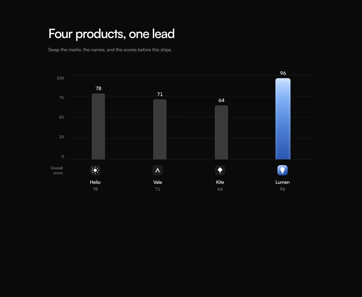 Comparison Section With Leader GraphComparison section with one bar chart, four product logos under the plot, and a blue gradient bar for the lead product. Follows light and dark.
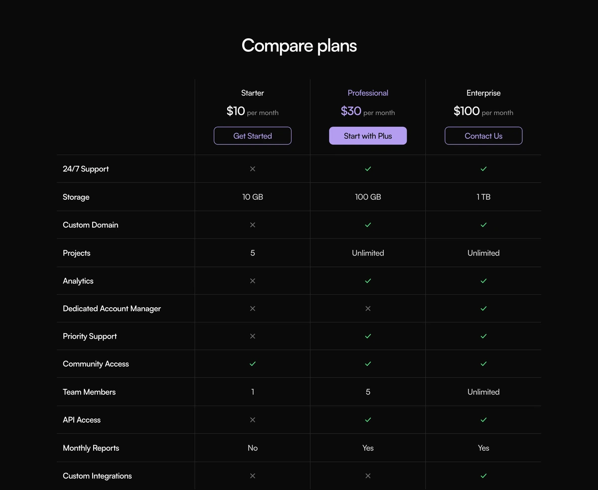 Comparison Section With Compare PlansComparison section with a compact three plan table, prices and CTAs in the header, purple type on the featured seat, and checks or crosses on the rows. Follows light and dark.
 Comparison Section With Benchmark MatrixComparison section with a boxed model score matrix, a blue featured column, nested benchmark captions, and highlighted winning cells. Follows light and dark.
Pricing page design: plan cards, a pricing table or a usage slider
A pricing section is not a second feature grid. The visitor already knows what the product claims to do. This block has to answer a narrower question: what the invoice will look like for the work they actually run. Pick the layout from how your price is built, not from which pricing card design looks best in a screenshot.
Good pricing page design comes down to a few habits. Show three tiers or fewer above the fold, name each plan for the buyer it serves rather than a metal, put the price and the billing period in the same line, and mark one plan as the recommended choice. Show the yearly saving as a number, not just a percentage, and keep the feature list to the rows that actually differ between plans.
Plan cards suit a product with two to four fixed tiers. Pricing Section With Soft Gradient sets three cards on a blue to peach wash, with a yearly switch and a handwritten save note beside the popular middle plan. Pricing Section With Animated Clouds puts three glass cards on a drifting cloud sky with a yearly or monthly toggle. Pricing Section With Nested Feature Lists runs four serif cards with three highlight rows each and a nested list of extras under every plan, which suits tiers that differ in add ons rather than in limits.
A pricing table earns its width when buyers compare limits line by line. Pricing Section With Comparison Table is four columns with annual and monthly radios, a most popular column, and a core matrix of checks under the prices. Pricing Section With Credit Plan Columns keeps four plans inside one bordered shell with a yearly billing switch and a credit menu per plan, for a product sold in usage credits.
Some products have one price rather than a ladder. Pricing Section With Included Price is a single moss card with a grain wash and a three column check table that sets the offer against two alternatives. Pricing Section With Lifetime Highlight shows four access cards with live prices, an inverted highlight on the plan you want chosen, and a plus rule that stacks what each tier adds.
Pricing Section With Usage Receipt is for a metered product. The receipt sits above four slider boxes: team members, API requests, storage, and AI credits. Drag a meter and the matching line reprints. Monthly and annual sit on the receipt. Annual takes twenty percent off the monthly figure and names the yearly charge. Put every line in the DOM.
Start from the units, not from the vendor names. Seats, requests, gigabytes, and credits are answers a buyer can give without reading your SKU sheet. Base plan is a line on the receipt, not a mystery tier. If you lead with Gold, Silver, and Bronze, you are asking the visitor to reverse engineer a catalog they do not care about yet.
The usage receipt demo is a fictional API floor called Lumen, and the plan names, prices and feature rows in every other block are samples too. Replace the meters, the rates, the base plan, and the receipt labels before this goes to production. Keep the coupling. Changing a slider has to change a line. If the meters cannot change the total, you have built a toy.
Keep every line a number a finance lead could stand behind on a call. Eighteen seats at five dollars is a claim. Best for growing teams is not. The receipt is the audit trail of the quote. Soft adjectives belong in a blog post, not on a pricing section that will be screenshotted into a procurement packet.
Do not follow this block with another pricing wall on the same page. One receipt is already a decision. The next section should be a FAQ, a comparison of what is included, or the checkout itself. A second grid of three cards after a usage receipt usually means the team could not agree which pattern to ship.
Keep the buttons honest. Start with this estimate and Talk to billing belong here because some buyers will self serve and some will not. An empty button that jumps to a hash is worse than no button. If the estimate cannot actually be purchased from that click, change the label until it can.