React Comparison Bar Chart Against Competitors in Pure CSS
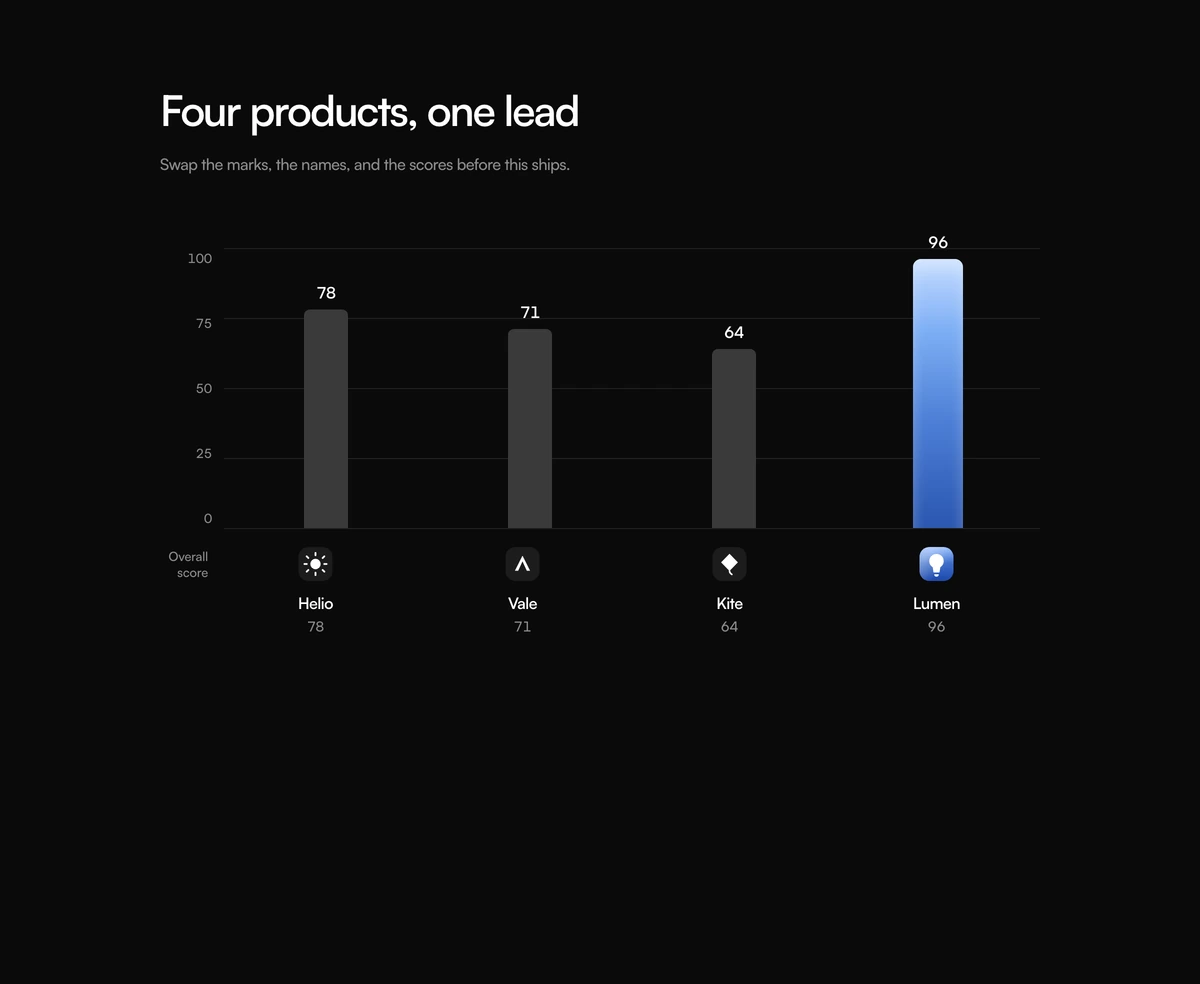
ProA simple vertical bar chart that answers one question: who leads. Four products stand side by side on a 0 to 100 scale with gridlines, each bar topped with its score. The winning bar is wider and filled with a blue gradient, the rest are grey, and every product's mark and name sit on the axis below.
A chart that needs no chart library
Comparison Section with Leader Graph is a React and Tailwind CSS comparison chart that ranks your product against competitors with a vertical bar chart built entirely from HTML and CSS: no canvas, no SVG chart and no charting package. It is a server component for Next.js and works in any React app.
Most comparison sections are tables, which are thorough but slow to read. When you have one headline metric, a benchmark score, an uptime figure or a customer rating, a bar chart makes the gap visible before anyone reads a number. That is all this block tries to do, and doing only that keeps it small.
Because it is plain markup, every score is real text in the page. It ships zero JavaScript, renders on the server, and inherits your fonts and colours like any other element.
Parts of the graph
Scale and gridlines
A y axis with ticks at 100, 75, 50, 25 and 0 and faint horizontal lines across the plot.
Bars
One bar per product, its height set as a percentage of 100 from the score. The score sits above each bar.
Leader treatment
The product flagged winner gets a wider bar with a blue gradient; the others are grey.
Axis labels
Under each bar, the product mark, name and score. An axis label such as Overall score sits at the left.
Heading and lede
A heading and one sentence above the chart.
Phone handling
The chart keeps a 640px minimum width and scrolls sideways on narrower screens.
When one bar chart is enough
Use it when
- You win on one clear, measurable figure and can cite where it comes from.
- A landing page or comparison page that needs a fast visual before a detailed table.
- You want zero client JavaScript for the section.
- Three to five products, which keep the bars wide and readable.
Skip it when
- Your advantage is spread across many features; use a matrix instead.
- You cannot source the scores. A chart with invented numbers misleads more than a sentence would.
- Competitors' real logos are required and you cannot add them to the file.
- You need interactive tooltips, filtering or animation.
Scores, marks and the lede
products takes an id, name, score from 0 to 100, an optional caption and a winner flag. Normalise your metric to 100 if it is not already a percentage, and say in the lede or caption how it was measured and when.
The default lede is a note to the developer, Swap the marks, the names, and the scores before this ships, so it must be replaced. Product marks come from a small built in set keyed by id; any other id falls back to one of them, so add your own marks to the map in the file for the products you compare.
npx wensity@latest add comparison-section-with-leader-graph --type block
import { LeaderGraphComparison } from "@/components/wensity/blocks/comparison-section-with-leader-graph";export function Benchmark() {return (<LeaderGraphComparisonheading="Cold start time, lower is better, scored out of 100"lede="Median of 1,000 cold starts per platform, measured in September 2026. Method on our blog."axisLabel="Speed score"products={[{ id: "ours", name: "Fastlane", score: 92, winner: true },{ id: "a", name: "Platform A", score: 71 },{ id: "b", name: "Platform B", score: 64 },]}/>);}
Props
| Prop | Type | Default | Description |
|---|---|---|---|
products | { id; name; score: number; caption?; winner? }[] | 4 sample products | Bars in order. Mark one as winner to widen it and colour it blue. |
lede | string | - | The sentence under the heading. Replace the default developer note and cite your source. |
axisLabel | string | "Overall score" | Names what the bars measure. |
heading | string | "Four products, one lead" | Section heading above the chart. |
Accessibility and honesty
Text you can read
Scores and names are text, so they are announced and indexed. There is no table or description that ties them together, though; add a short sentence summarising the result for screen reader users.
No JavaScript
A server component with only clsx and tailwind-merge. Nothing ships to the browser for it beyond HTML and CSS.
Fair comparisons
Name competitors only when you can back the numbers. Generic labels such as Platform A are safer when a method is not public.
Narrow screens
The 640px minimum width means phones scroll the chart sideways. Four bars fit; more will make that worse.
No motion
Bars render at their final height with no animation, so nothing needs a reduced motion check.
Block details
- Category
- Comparison Sections
- Renders
- CSS only. Paints as soon as the stylesheet arrives
- Theme
- Follows the site theme in light and dark
- Dependencies
clsxtailwind-merge- Source
- 196 lines, 8 KB in one file
- Install
wensity add comparison-section-with-leader-graph --type block- Tags
- light, dark, comparison, graph, bars, logos
- Last updated