React comparison section components
5 comparison section componentsLive previewFull source in your repo
A comparison section has to put two products on the same rows. These comparison tables print the limits, the prices and the missing marks in one grid, so the visitor is not left rebuilding a spreadsheet.
Works with
- React
- Next.js
- TypeScript
- Tailwind CSS
Comparison table blocks you can copy
Each block is one file covering the columns, the feature rows and the responsive rules. Preview it live, then copy the source into your project.
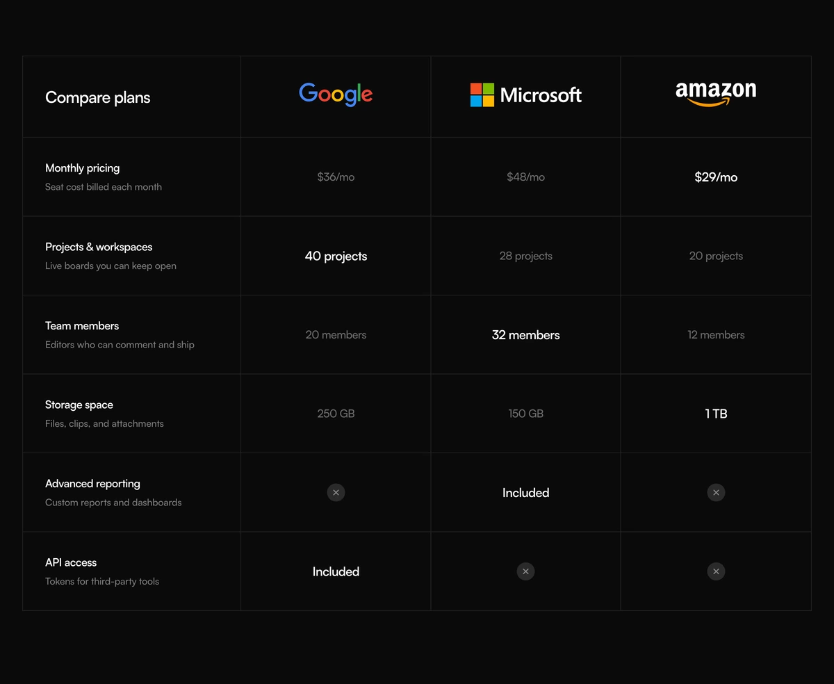 Comparison Section With Features MatrixDark comparison section with a four column features matrix, Google Microsoft and Amazon wordmarks, and circular missing marks. Winning values read brighter than the rest.
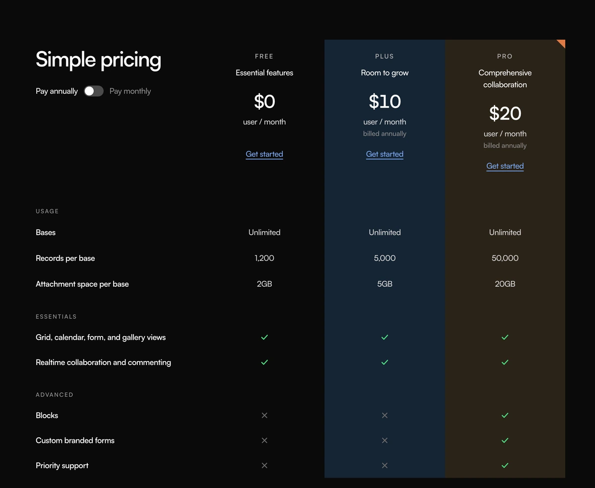 Comparison Section With Simple PricingComparison section with a Simple pricing heading, an annual or monthly switch, three tinted plan columns, grouped feature rows, and green checks. Follows light and dark.
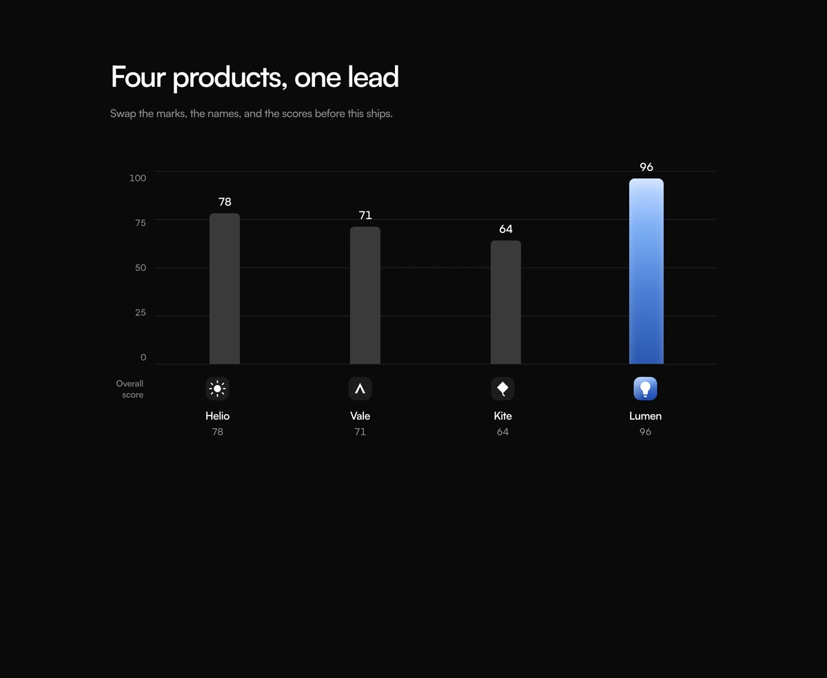 Comparison Section With Leader GraphComparison section with one bar chart, four product logos under the plot, and a blue gradient bar for the lead product. Follows light and dark.
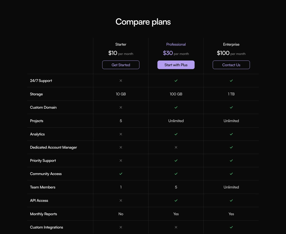 Comparison Section With Compare PlansComparison section with a compact three plan table, prices and CTAs in the header, purple type on the featured seat, and checks or crosses on the rows. Follows light and dark.
 Comparison Section With Benchmark MatrixComparison section with a boxed model score matrix, a blue featured column, nested benchmark captions, and highlighted winning cells. Follows light and dark.
Pricing tables to place after a comparison
Pricing sections from the same library, for the page that has already named the competitor and now has to print the price.
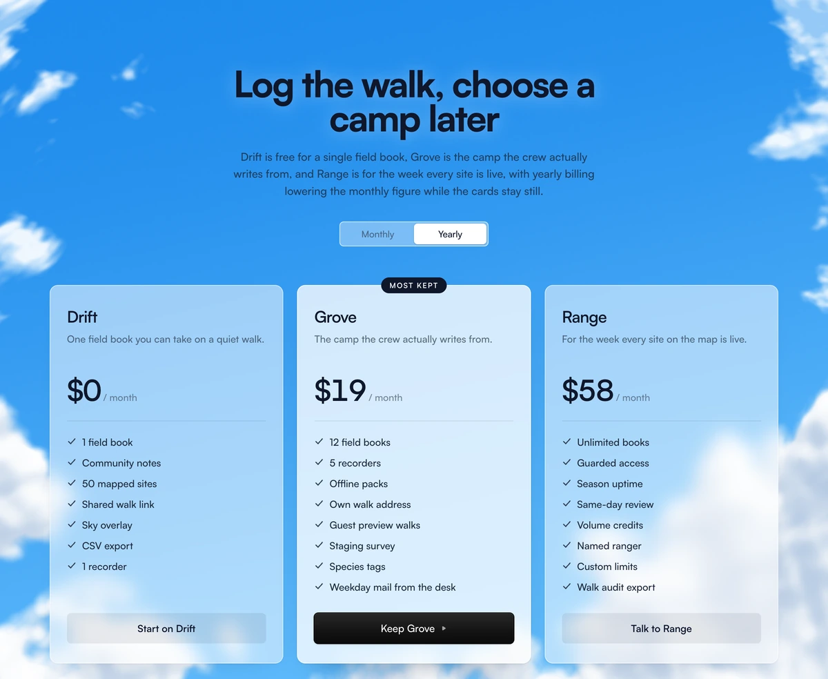
 Pricing Section With Animated CloudsThree glass plan cards on a drifting cloud sky, with a yearly or monthly toggle and a highlighted middle seat.
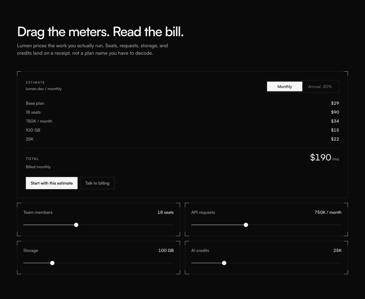 Pricing Section With Usage ReceiptInteractive pricing section with usage sliders for seats, requests, storage, and credits, plus a live receipt and a monthly or annual cycle.
 Pricing Section With Soft GradientThree plan cards on a blue to peach wash, with a yearly switch and a handwritten save scribble beside the popular middle seat.
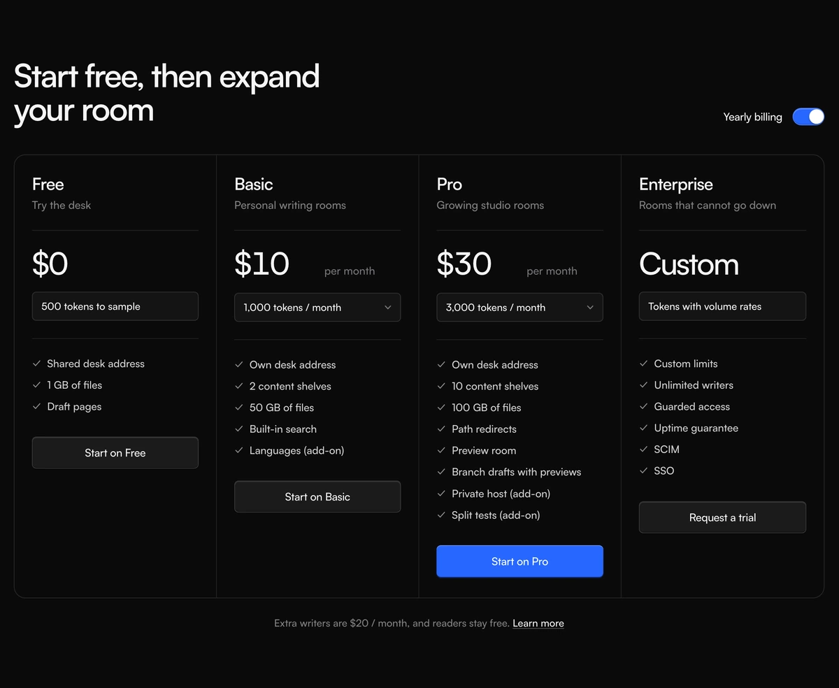 Pricing Section With Credit Plan ColumnsFour plan columns in one bordered shell, with a yearly billing switch, credit menus, and a highlighted Pro action.
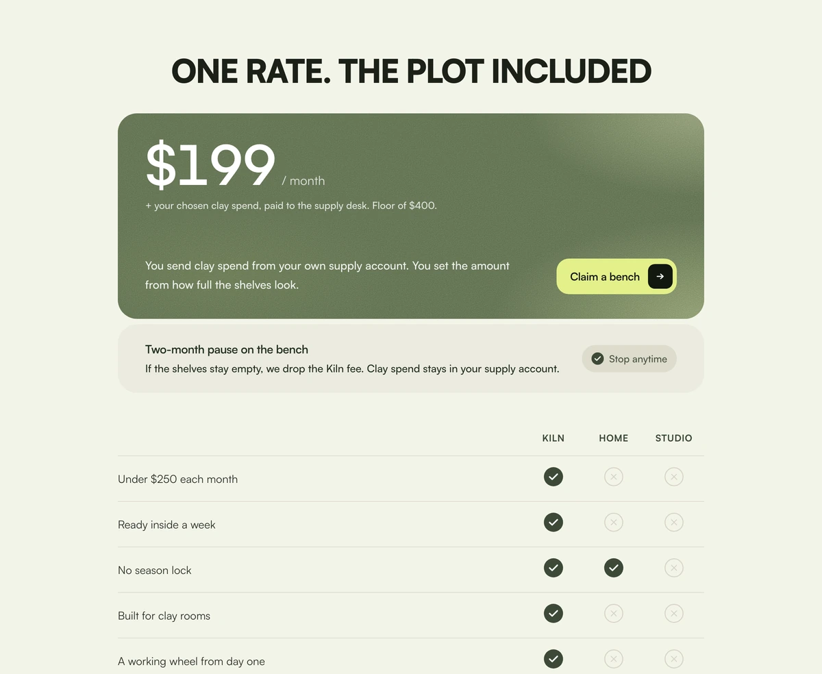 Pricing Section With Included PriceOne moss price card with a grain wash, a pause footer, and a three-column check table against home and studio.
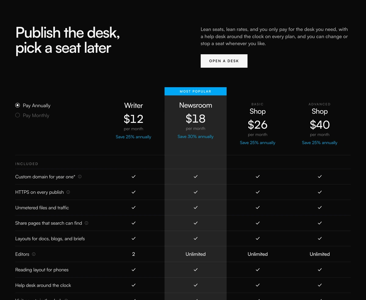 Pricing Section With Comparison TableFour-column pricing comparison with annual or monthly radios, a most popular column, feature checks, and a core matrix.
 Pricing Section With Nested Feature ListsFour warm plan cards with a gliding monthly or annual toggle, three highlight rows, and a nested extras list under each card.
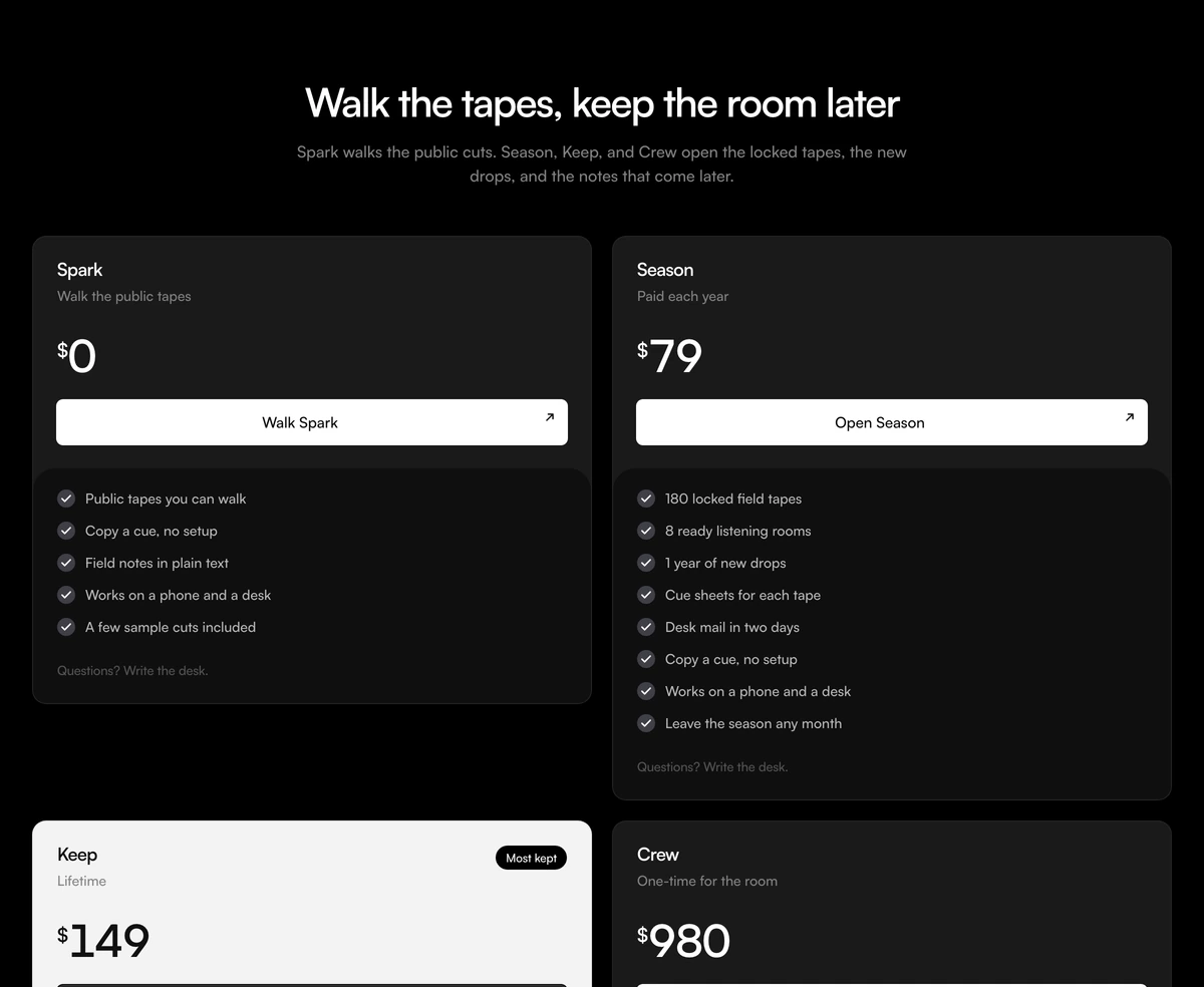 Pricing Section With Lifetime HighlightFour access cards with live prices, an inverted Keep highlight, and a plus rule for stacked includes. Follows light and dark.
Comparison sliders, metric cards and table components
For comparisons a matrix cannot show: a before and after image slider, a KPI card with a sparkline, and the table and chart primitives for a custom grid.
 Image Comparison SliderDrag the handle to wipe between before and after images with absolutely zero lag.
 KPI Card with SparklineDashboard KPI cards with a smooth SVG sparkline chart and a glowing dot that snaps to whichever value you scrub across.
- TableTableA semantic React table with sortable headers, selectable and expandable rows, a sticky header, three densities, and rows that glide into place on sort.
- Data TableData TableA React data table with debounced search, sorting, row selection, pagination, and expandable rows from one columns array, without TanStack.
- ChartChartReact charts on Recharts with line, bar, area, pie, and radar views plus an interactive bar chart, themed through CSS variables with matching tooltips.
Comparison table design: your plans, rival products or benchmarks
A comparison table puts products in columns and the things buyers care about in rows, so the differences can be read across a single line. On a landing page it does one of three jobs: comparing your own plans, comparing your product against named rivals, or comparing scores on a benchmark. Each job needs a different table, and mixing two in one grid is the most common way a comparison section fails.
Your own plans call for a pricing comparison table. Comparison Section With Simple Pricing groups the rows under Usage, Essentials and Advanced, puts an annual or monthly switch in the header, and tints each of its three plan columns so the seats read as separate offers. Comparison Section With Compare Plans is the compact version: three plans, prices and buttons in the header, purple type on the featured plan, and checks or crosses on every row.
Rival products call for a product comparison table. Comparison Section With Features Matrix sets three named products as wordmarks across the top, prints a value in every cell, and sets the stronger value in brighter type, with a circular mark where a product lacks the row. Comparison Section With Leader Graph makes the same argument as a bar chart, with four logos under the plot and a blue gradient bar on the leader, which suits a single headline number rather than a list of limits.
Scores call for a benchmark table. Comparison Section With Benchmark Matrix frames four models in a square box, runs a blue column for the featured model from header to last row, and fills every winning cell in blue, including wins outside that column. A reasoning row can stack two captions in one cell, so a with tools score and a without tools score sit together.
A few comparison table design rules hold across all five. Use hairlines rather than thick borders, so the table reads as a document rather than a dashboard widget. Let the winning value read first through weight or colour, not through an extra badge. Write row labels in the words a buyer would use on a call. Prefer a value to a checkmark wherever a limit exists, because twenty users says more than a tick.
Keep it to three or four columns. A features matrix tops out at three products and a benchmark matrix at four models. Past that the table turns into a spreadsheet, the eye loses the row, and the visitor stops comparing. On a phone the matrix keeps its columns and scrolls sideways so the row labels stay readable.
Naming a competitor raises the bar on accuracy. Every value in a rival's column has to be true today and checkable from their public pages, because the first person to verify it may be their sales team. Plan prices, wordmarks, model names and eval figures in these blocks are samples. Replace them with numbers you can stand behind, and hide a row rather than printing Custom in a cell you cannot fill.
Place the comparison after the product has proved itself, under a feature section or a short pricing band, and follow it with a decision rather than another grid. One matrix is already an argument. The next section should be pricing, a FAQ or the checkout.