React FAQ section components
6 FAQ section componentsLive previewFull source in your repo
A FAQ section has to answer the objection that would stop a signup. These FAQ accordions keep every answer in real DOM text, and several pair the list with a booking card so the visitor has a next step.
Works with
- React
- Next.js
- TypeScript
- Tailwind CSS
FAQ accordion sections you can copy
Each FAQ section is one file covering the questions, the accordion and the card beside it. Preview it live, then copy the source into your project.
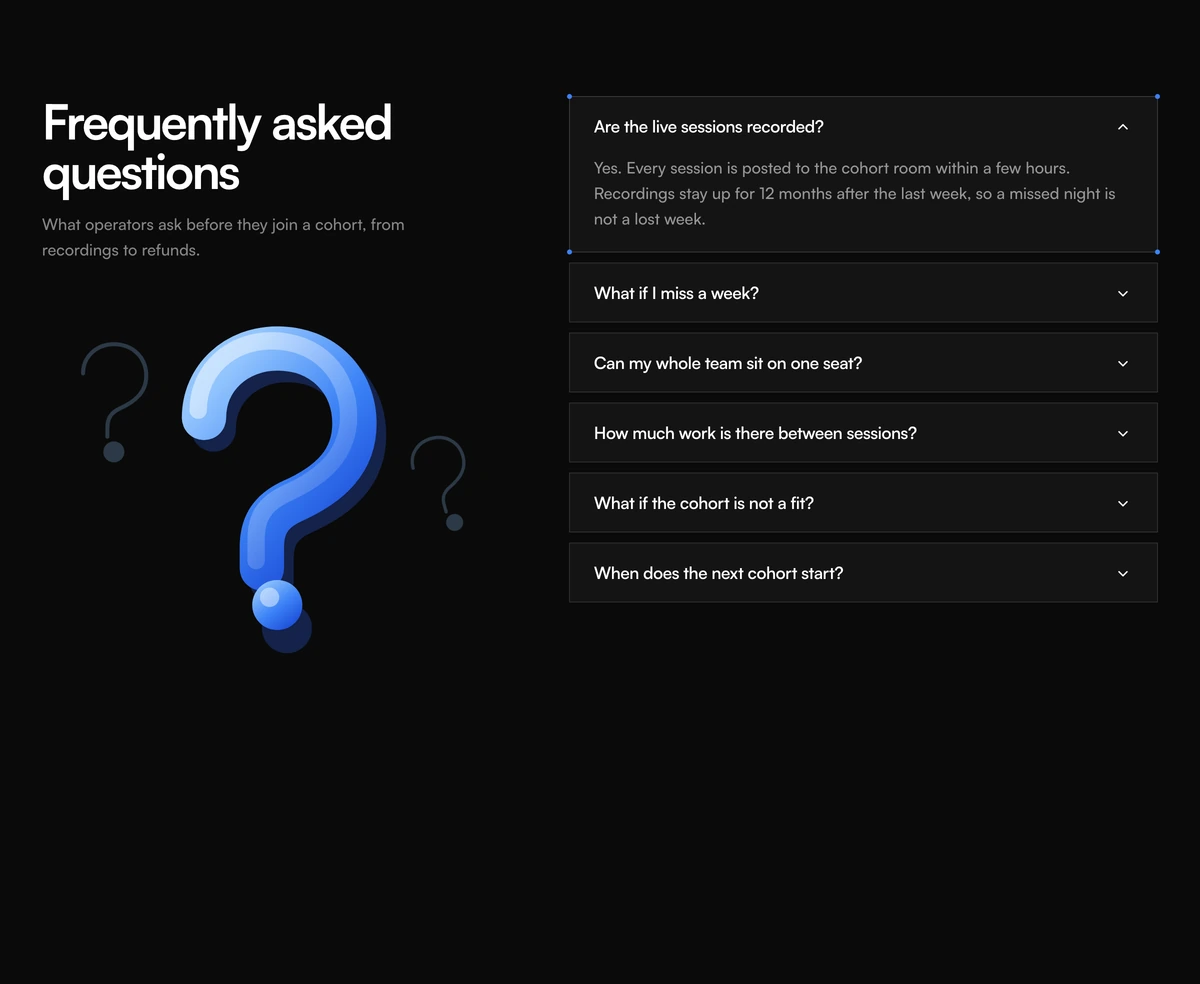 FAQ Section With Illustration AccordionSplit FAQ accordion with a question mark illustration, isolated question cards, chevron toggles, and a partner questions list. Follows light and dark.
 FAQ Section With Split Headline AccordionLeft-aligned two-line headline over a hairline FAQ accordion. Plus rotates to a close mark and the answer unfolds in height. Follows light and dark.
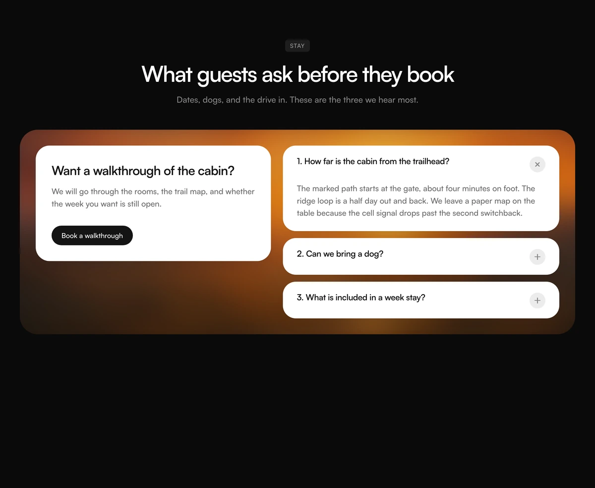 FAQ Section With Photo Consult PanelCentered FAQ badge and heading over a blurred photo panel, with a consult card on the left and numbered question cards on the right. Follows light and dark.
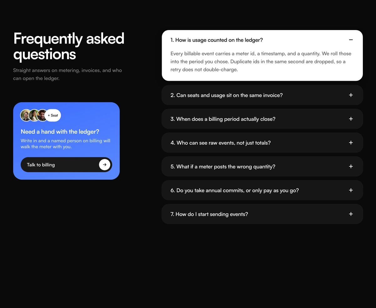 FAQ Section With Numbered Support CardNumbered FAQ accordion with an inverted open row, a blue still have questions card, overlapping faces, and a talk to our team action. Follows light and dark.
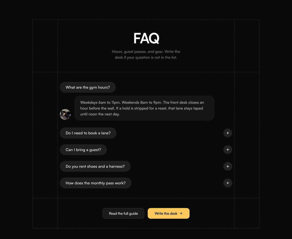 FAQ Section With Dashed Grid PillsCentered FAQ accordion with a dashed layout grid, charcoal question pills, a portrait beside the open answer, and contact actions. Follows light and dark.
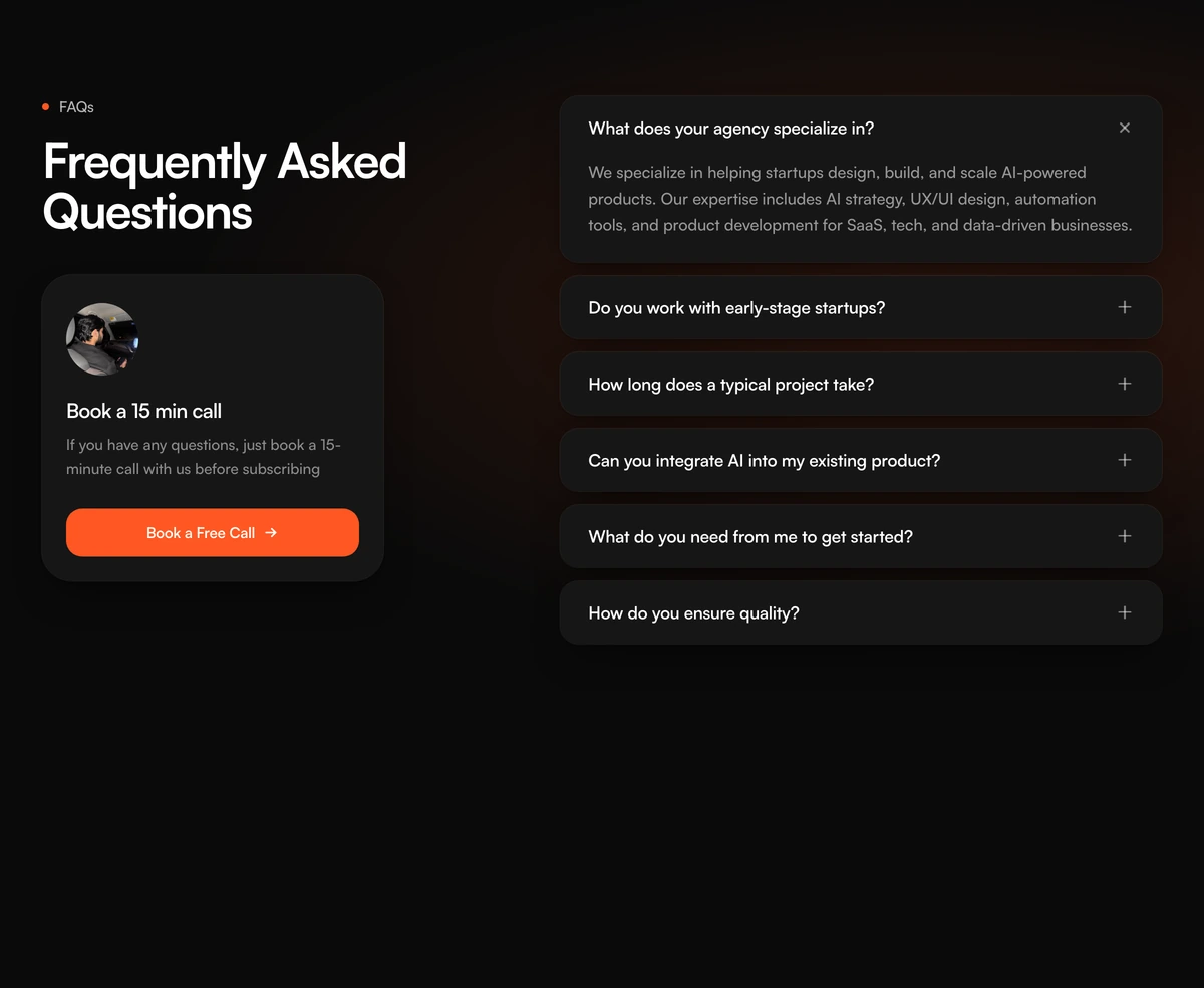 FAQ Section With Accordion Call CardSplit FAQ accordion with a sidebar book-a-call card, stacked question rows, plus and close icons, and a peach glow behind the answers. Follows light and dark.
Pricing sections to place before the FAQ
A FAQ usually answers what the price raised. These pricing blocks from the same library sit directly above it, so the questions follow the numbers.
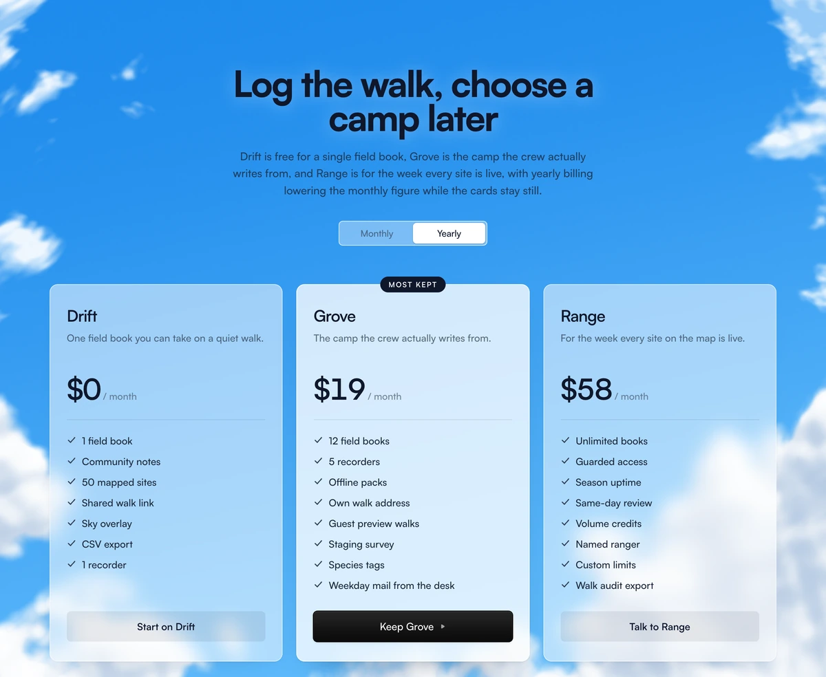
 Pricing Section With Animated CloudsThree glass plan cards on a drifting cloud sky, with a yearly or monthly toggle and a highlighted middle seat.
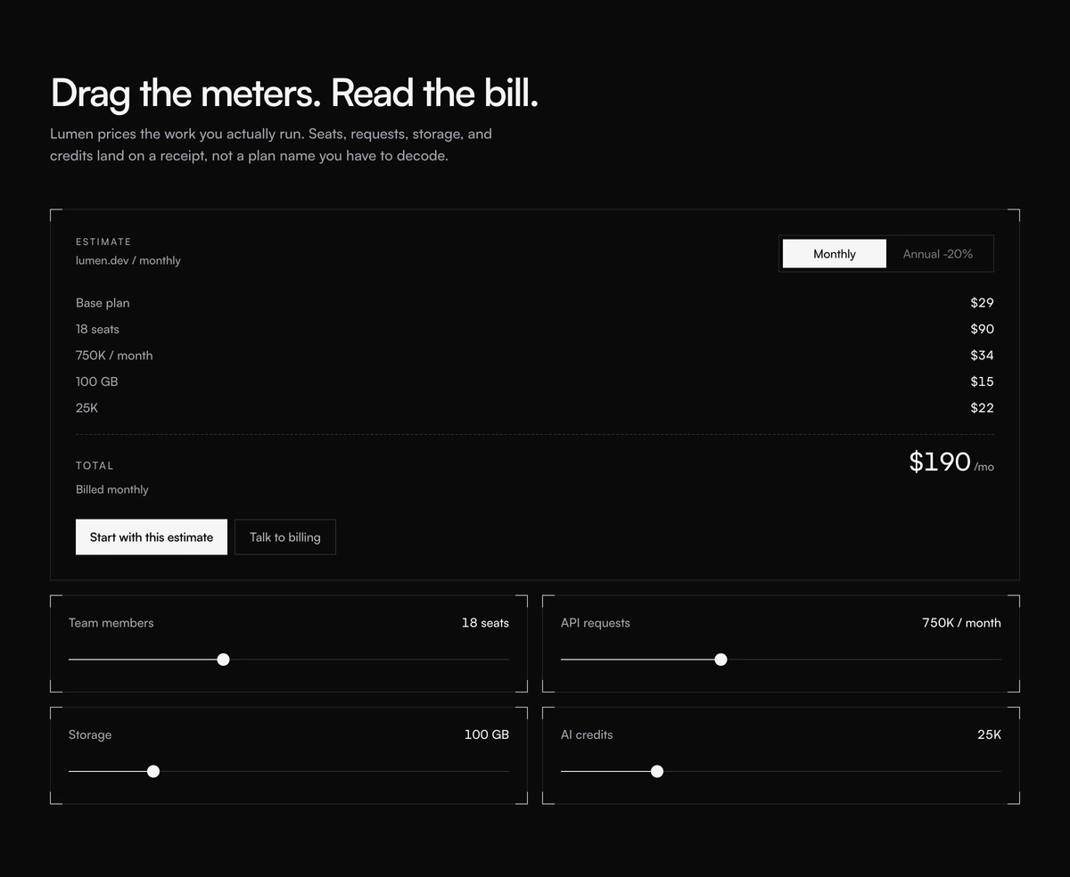 Pricing Section With Usage ReceiptInteractive pricing section with usage sliders for seats, requests, storage, and credits, plus a live receipt and a monthly or annual cycle.
 Pricing Section With Soft GradientThree plan cards on a blue to peach wash, with a yearly switch and a handwritten save scribble beside the popular middle seat.
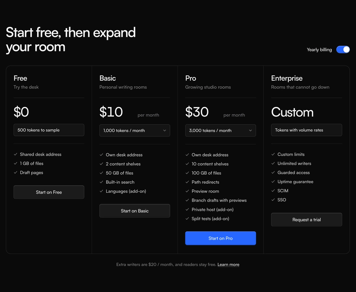 Pricing Section With Credit Plan ColumnsFour plan columns in one bordered shell, with a yearly billing switch, credit menus, and a highlighted Pro action.
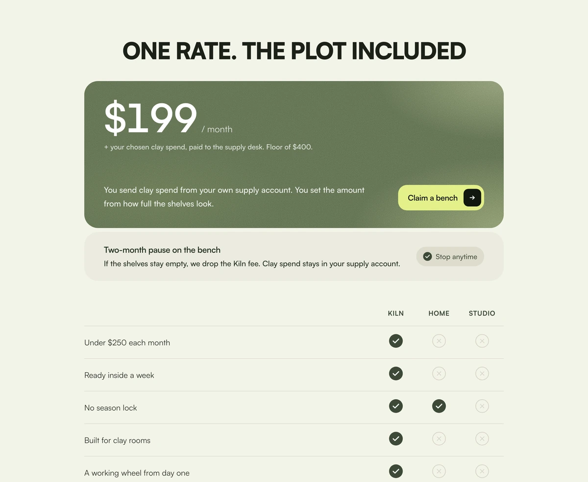 Pricing Section With Included PriceOne moss price card with a grain wash, a pause footer, and a three-column check table against home and studio.
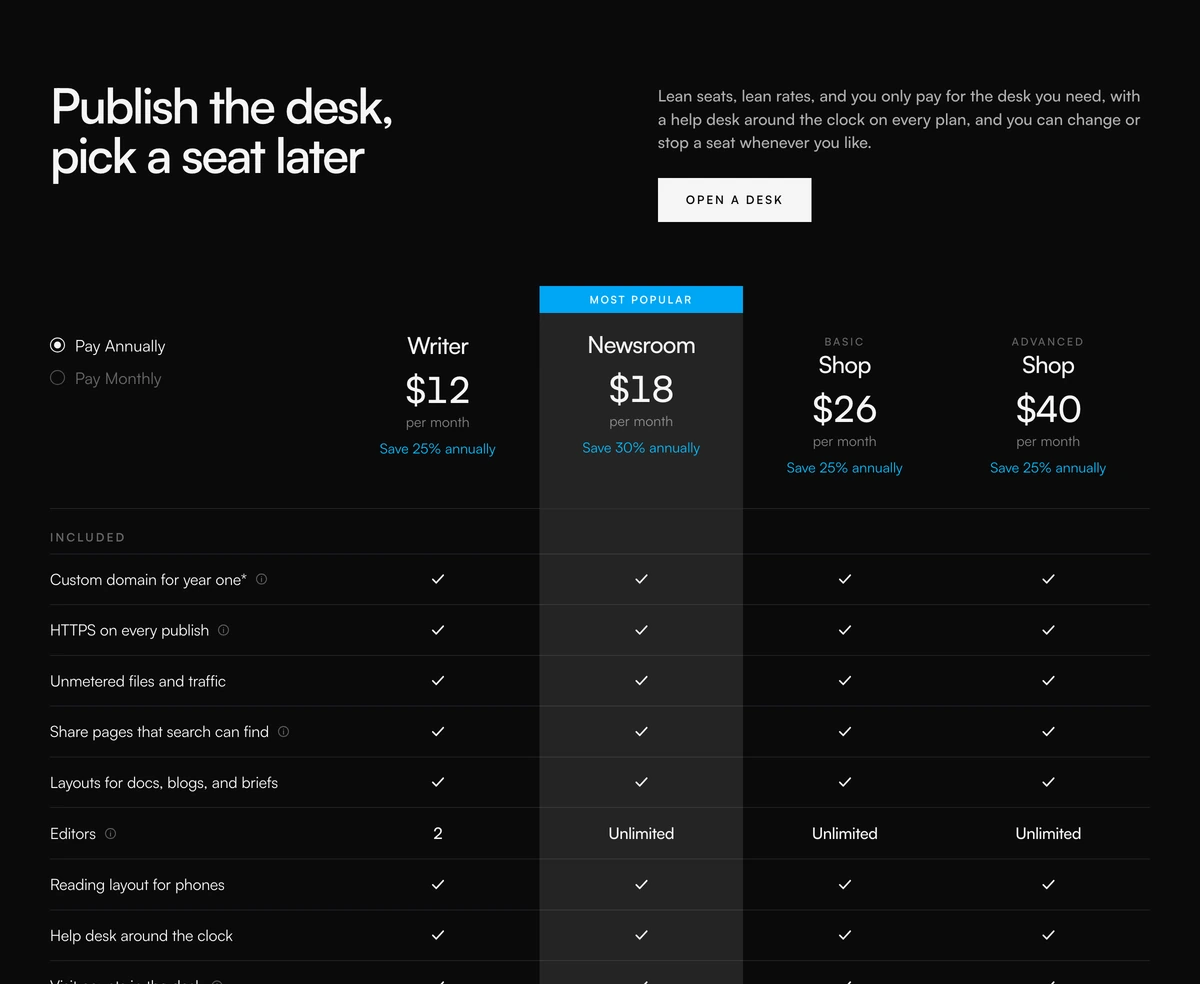 Pricing Section With Comparison TableFour-column pricing comparison with annual or monthly radios, a most popular column, feature checks, and a core matrix.
 Pricing Section With Nested Feature ListsFour warm plan cards with a gliding monthly or annual toggle, three highlight rows, and a nested extras list under each card.
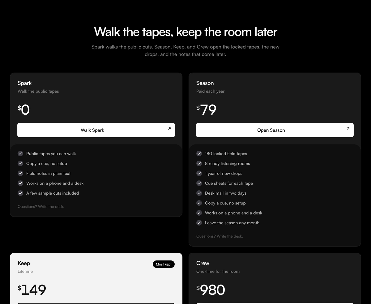 Pricing Section With Lifetime HighlightFour access cards with live prices, an inverted Keep highlight, and a plus rule for stacked includes. Follows light and dark.
React accordion and collapsible components
The accessible primitives under every FAQ: an accordion with single or multiple open rows, a collapsible for one disclosure, and tabs for grouped questions, led by cards that expand on hover.
 Expanding CardsHover a tall editorial strip and it opens wide, the rest of the row holding as tight vertical slivers of the same image.
- AccordionAccordionA React accordion on Base UI for FAQ sections and settings, with single or multiple open items in bordered, separated, minimal, and FAQ styles.
- CollapsibleCollapsibleA React collapsible on Base UI for expand and collapse sections, sidebar groups, and show more previews that fade long content until opened.
- TabsTabsReact tabs on Base UI with an indicator that slides between tabs, in pill, underline, rounded, segmented, and vertical styles, with arrow key support.
FAQ section design: accordion, numbered list or chat style
A FAQ section answers the questions that would otherwise stop a signup or turn into a sales call. It is not a second blog post. By the time someone opens it they have seen the product and usually the price, so each question should name a real objection: who it is for, how long it takes, what the buyer has to bring, and what happens if it goes wrong.
Good FAQ design starts with the wording. Write each question the way a customer would type it, not the way your team talks about the product, and answer in two or three sentences that stand on their own. Put the questions that block a purchase first. If an answer needs a page, link to the page rather than stretching the accordion.
An accordion is the right container when the answers are long enough that six of them would bury everything below. Each row should be a real button that announces whether it is open, so screen readers hear the state. All six FAQ sections here set aria-expanded on their rows and keep the answer text in the DOM rather than in an image, which keeps it readable by assistive technology and by search engines.
Pair the list with a next step when the product is sold through conversation. FAQ Section With Accordion Call Card puts a booking card with a face and a fifteen minute promise beside the questions. FAQ Section With Numbered Support Card numbers every row, inverts the open one so the active question is obvious, and closes with a blue talk to our team card. FAQ Section With Photo Consult Panel sets a consult card and three numbered questions on a blurred photograph, which suits a local service page.
Let the questions stand alone when the page has already made its ask. FAQ Section With Split Headline Accordion is a two line heading over hairline rows, with no card at all. FAQ Section With Illustration Accordion adds a drawn question mark beside bordered question cards. FAQ Section With Dashed Grid Pills frames charcoal question pills in a dashed grid and opens each answer beside a portrait, so the FAQ reads like a short chat.
Four to six questions is the range that still reads as one section on a laptop. Twelve is a help centre and belongs on its own page. If a question cannot change a buying decision, cut it, and if two answers say the same thing, merge them. An empty plus icon in front of a filler question costs more trust than a shorter list.
Use one FAQ section per page and place it after pricing, or after social proof if the price is not public. The section that follows should be the checkout, a contact path or the footer. A second accordion titled still have questions usually means the first list was never edited.
Replace the demo before shipping. The questions, answers, portraits and booking links in these blocks describe sample businesses. Point every booking button at a real calendar, and if the fifteen minute promise cannot be kept, change the label until it can.