React social proof section components
6 social proof section componentsLive previewFull source in your repo
A social proof section has to name a result a buyer can check. These blocks put the metric, the quote and the person in one view, or line up the logos of the companies that already use you.
Works with
- React
- Next.js
- TypeScript
- Tailwind CSS
Testimonial and logo wall blocks you can copy
Each block is one file covering the quotes or logos, the layout and the responsive rules. Preview it live, then copy the source into your project.
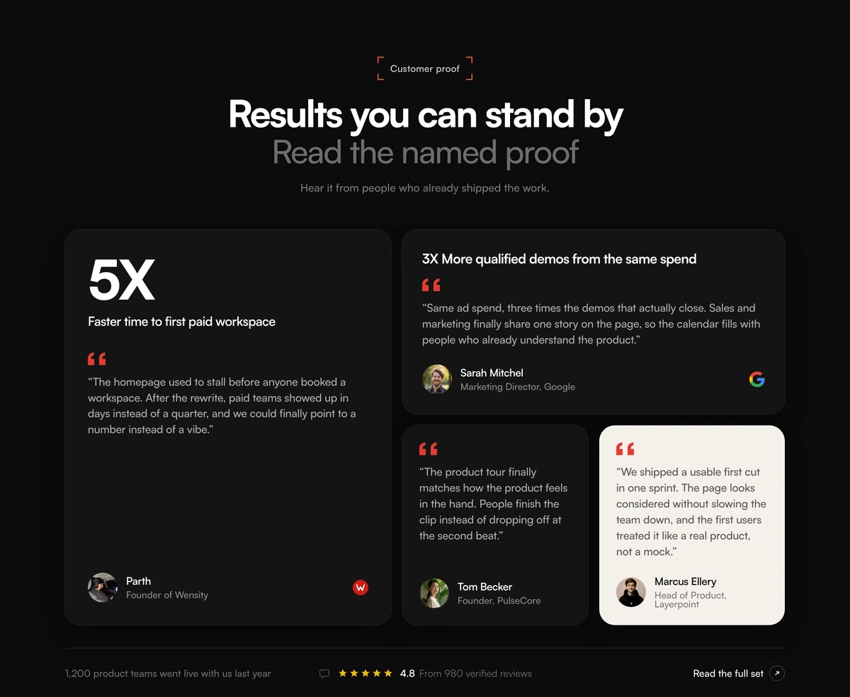 Social Proof Section With Metric Bento GridBento grid testimonials section with a tall conversion metric card, mixed light and dark quote cards, company marks, avatars, and a star rating strip.
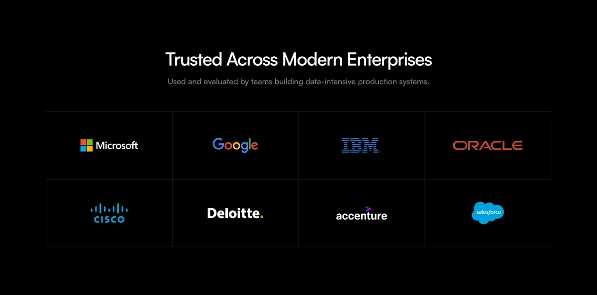 Social Proof Section With Morphing Logo GridEnterprise logo lattice with a centered trust headline and staggered morphing marks that swap inside each cell.
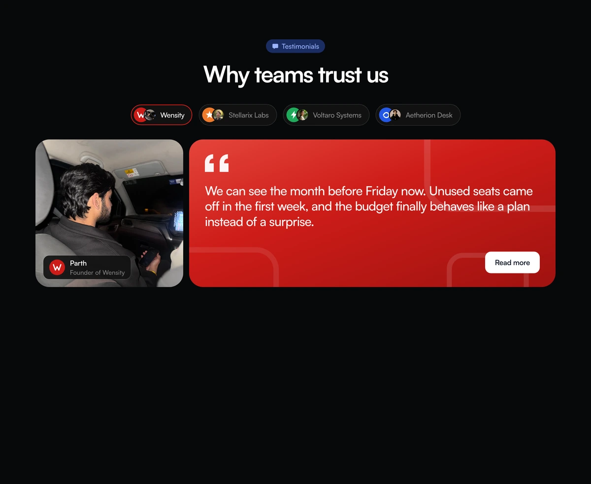 Social Proof Section With Company Story TabsTabbed social proof section with company pills, a portrait, a blue quote panel, and a read more action that swaps the featured customer story.
 Social Proof Section With Morphing WordmarksOpen wordmark cloud with real company names, no cell borders, and staggered morphs between optically matched marks.
 Social Proof Section With Feedback GalleryEditorial social proof section with a split CLIENT FEEDBACK heading, an all-caps quote, square prev next controls, and a portrait gallery whose active frame is larger and orange-tinted.
 Social Proof Section With Inline Avatar QuotesInline social proof paragraph with circular avatars in the copy, hover blur on the rest of the lines, and a floating name and role label.
SaaS UI to show beside your testimonials
Feature proof and heavy product UI from the same library, for the page that has to earn trust before it asks for a card.
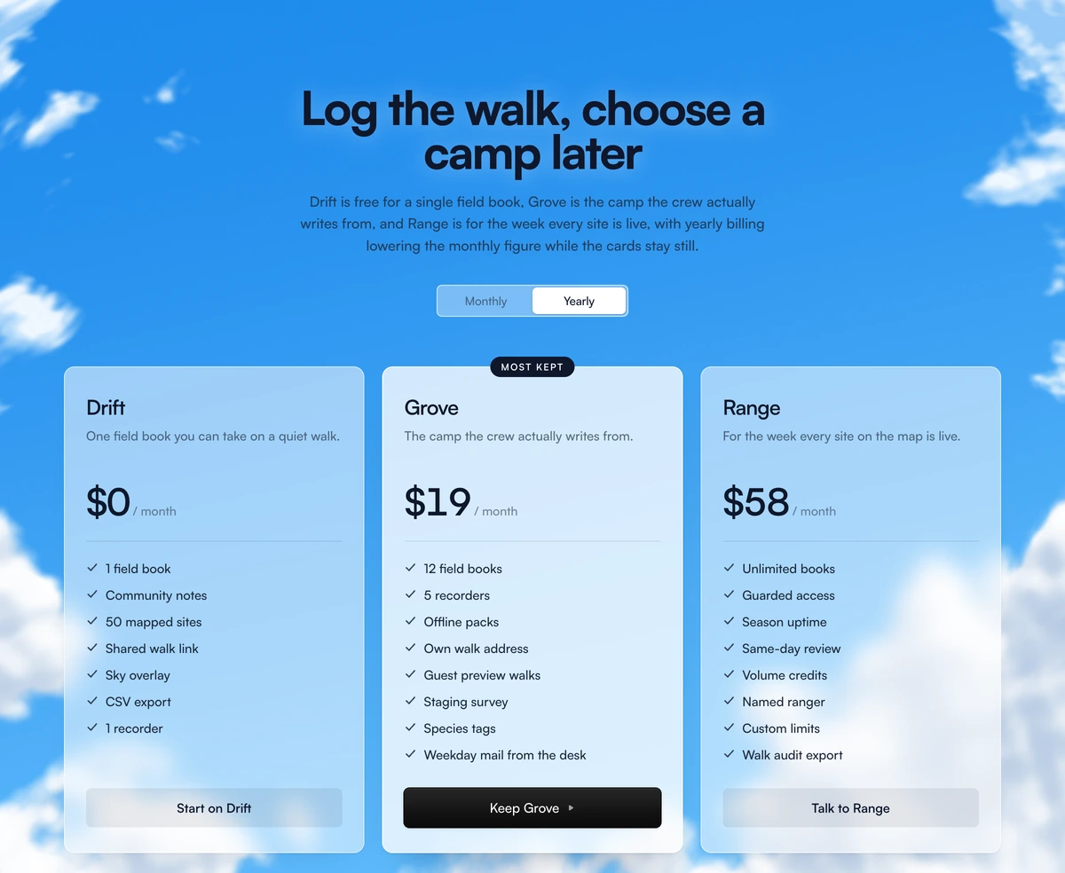
 Subscription Tier CardPricing cards with a monthly and annual toggle, prices that spring to new values, and a highlighted plan in a brand glow.
 Fluid Drag-and-Drop KanbanA Trello-grade board running real pointer physics, where every card tilts toward the velocity you throw it across at.
 Multi-Step Form WizardA multi-step form wizard whose card physically reshapes to wrap each new step as the content slides in behind it.
 KPI Card with SparklineDashboard KPI cards with a smooth SVG sparkline chart and a glowing dot that snaps to whichever value you scrub across.
 GitHub-Style Activity Grid365 squares sharing one tooltip that flies between days on rails, with a reveal that ripples backward from today.
Testimonial carousels, logo marquees and avatars
Smaller parts for proof inside other sections: a logo marquee under the hero, a testimonial carousel, and avatars with hover cards.
 Infinite MarqueeA seamless, GPU-only logo strip that never stutters or snaps at the loop point.
 Perspective MarqueeA 3D tilted image grid with alternating rows scrolling infinitely in both directions.
- CarouselCarouselA React carousel with swipe, arrow keys, looping, and autoplay that pauses on hover, plus dots, thumbnails, and a progress bar for each slide.
- AvatarAvatarA React avatar on Base UI that falls back to colored initials, with status dots, overlapping avatar groups with a +N chip, tooltips, and upload previews.
- Hover CardHover CardA React hover card on Base UI that previews a profile or link after a short hover delay, with header, body, and footer parts and four widths.
Testimonial section design: metrics, stories or a logo wall
A social proof section is not a second hero. The hero already spent the first look. This block has to survive a slower read: someone who wants a named person, a named result, and a way to see more reviews. If the copy would also work as a five logo marquee, it is too thin for this slot.
Social Proof Section With Metric Bento Grid is for a page that can stand behind conversion numbers. The left card holds a large 8X and a full quote. The right column stacks a lead generation result, a shorter quote, and an inverted charcoal card. The strip under the grid names a client count, a 4.9 rating, and a reviews link. Put every line in the DOM.
Social Proof Section With Company Story Tabs is for customers whose story needs more than one line. Company pills sit above a portrait and a blue quote panel, and a read more action swaps in the next featured story. Use it when three or four customers each have a case study worth linking to.
Social Proof Section With Feedback Gallery is the testimonial carousel. A split CLIENT FEEDBACK heading sits beside an all caps quote, square previous and next controls step through the set, and the active portrait grows and takes an orange tint. It suits a run of quotes of similar weight, where no single customer has to carry the page.
Social Proof Section With Inline Avatar Quotes reads as one paragraph. Circular avatars sit inside the sentence, hovering a line blurs the rest, and a floating label names the person and their role. It works where a grid of cards would feel heavy, such as a portfolio or a studio page.
The two logo walls answer a different question: who already uses you, rather than what they got. Social Proof Section With Morphing Logo Grid is an enterprise lattice under a centred trust headline, with marks that morph inside each cell on a stagger. Social Proof Section With Morphing Wordmarks drops the cell borders for an open cloud of wordmarks. Ship either one only with the logos of companies that are actually your customers, and pair it with one named quote so the wall has a result behind it.
Good testimonial design follows a short checklist. Name the person, their role and their company, show a real photo, and quote a specific outcome rather than general praise. Keep each quote short enough to read at a glance and trim it without changing its meaning. Ask permission before printing a customer name or logo, and keep the written approval somewhere you can find it.
Start from the claim you can defend. Eight times conversion is a sentence a sales lead can repeat. Loved by thousands of happy teams is not. If you cannot name the person, the role, and the number, you do not have a metric bento. You have decoration.
The shipped demos use fictional studios and sample customers. Replace the metrics, the quotes, the names, the avatars, and the company marks before this goes to production. Keep the coupling. The tall card should carry the strongest number. The inverted card should break the grid so four quotes do not read as wallpaper.
Do not follow this block with another wall of praise on the same page. Four cards and a rating strip are already a full argument. The next section should be pricing, a FAQ, or the checkout. A logo marquee after a metric bento usually means the team could not agree which proof to ship.
Keep the review link honest. View all reviews belongs here only if it opens a real review surface. An empty hash is worse than no link. If the 4.9 cannot be shown from that click, change the label until it can.