React feature section components
11 feature section componentsLive previewFull source in your repo
The features section is where a landing page has to prove the product. These blocks do it with a six cell control grid, a row of product cards, a prompt on a blurred still, or an empty upload tray.
Works with
- React
- Next.js
- TypeScript
- Tailwind CSS
Features section blocks you can copy
Each features section is one file covering the headline, the proof layout and the responsive Tailwind rules. Preview it live, then copy the source into your project.
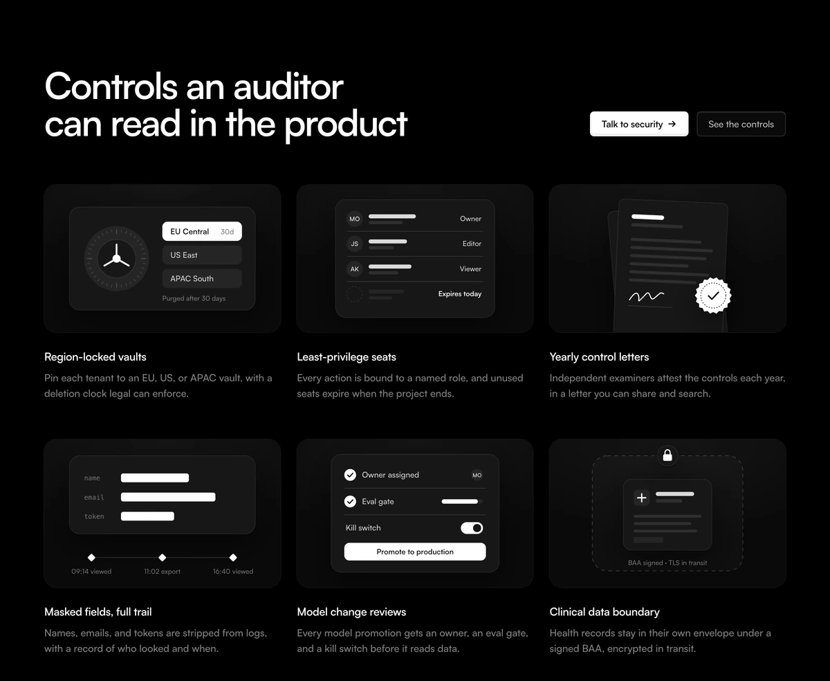 Feature Section With Security GridAdaptive security feature section with a split headline and two CTAs above six controls, each drawn as a static SVG product mockup: region vaults, expiring seats, a sealed letter, redacted logs, a release gate and a data boundary.
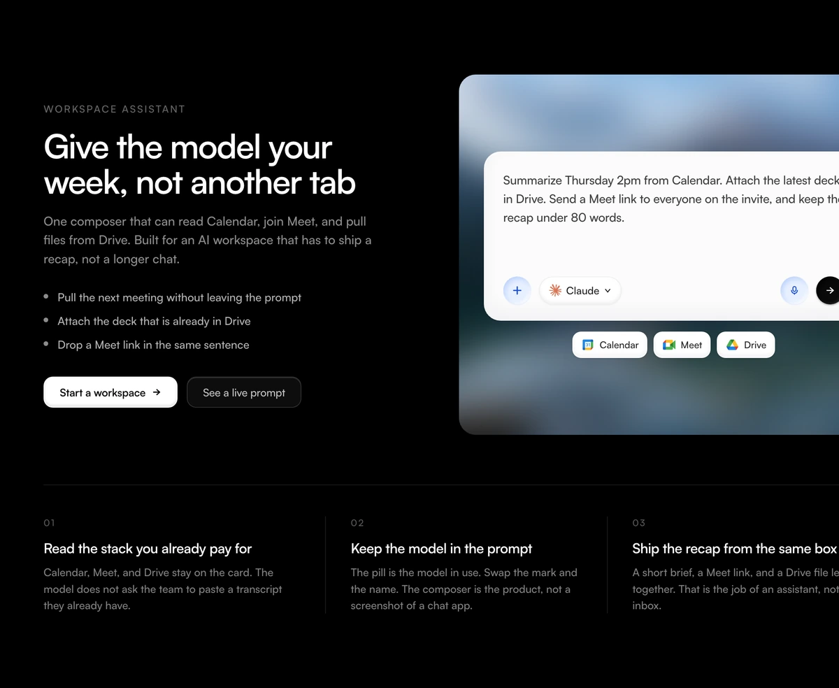 Feature Section With Workspace ComposerAdaptive AI workspace feature with copy and bullets on the left, a chat composer on one blurred still with Calendar Meet and Drive chips, and three product claims below.
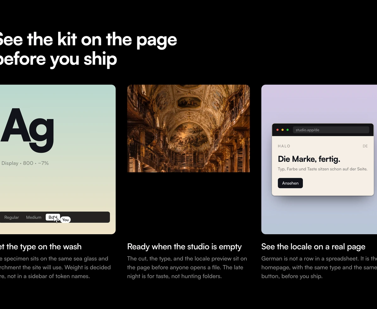 Feature Section With Gradient Product CardsAdaptive three card feature section with a left aligned headline, sea glass and lilac gradient panels of coded product UI, and a full bleed photograph in the middle card.
 Feature Section With Media Upload StageStacked ingest feature: compact empty dropzone on a blurred still, then three proof mockups for page read, plate hold, and cut index. Heading, CTAs, and claims sit around the tray.
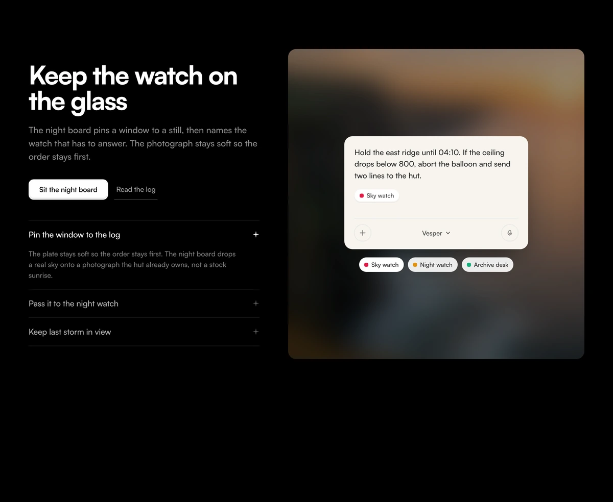 Feature Section With Blurred Prompt StageAdaptive split feature section with a bold headline, a one-open accordion of desks, and a tall blurred photograph carrying a live prompt card.
Bento grid feature sections
A bento grid gives one feature the large tile and the rest smaller ones. Use these when a features section needs depth rather than six equal cells.
 Bento Grid With Portfolio ProfileSix tile personal profile bento grid in neutral tiles and one vivid blue: photo and call button, quote cards, a copyable email, your local time beside the visitor's, availability and an activity heatmap.
 Bento Grid With Analytics DashboardSix tile analytics dashboard bento grid linked to one selected period: a scrubbable visitors bar chart with a day, week, month and year switch drives revenue, sources, conversion, revenue by channel and top pages.
 Bento Grid With Launch SpecsKeynote style product launch bento grid for a pair of headphones: a hero tile with price and pre-order, spec numbers that count up once in view, an exploded view, a macro and a finish picker that dims the pairs you are not looking at.
 Bento Grid With Linked Product TilesMonochrome five tile bento grid for a SaaS features section where one event travels the whole grid: a 3D key press, a router fan out, an app grid, a retry loop and unread counts.
 Bento Grid With Product CollectionShop collection bento grid for a design object store: full bleed product photos with name, price and a quick add button that opens into a stepper and counts up a bag in the header, plus a collection tile with a shop button.
 Bento Grid LayoutA responsive bento grid of dashboard tiles where clicking one moves it to the front and the rest glide into place.
SaaS UI to show beside your features
Dashboards, usage panels and dense product UI from the same library, for a features page that needs more than a six cell grid.
 Subscription Tier CardPricing cards with a monthly and annual toggle, prices that spring to new values, and a highlighted plan in a brand glow.
 Fluid Drag-and-Drop KanbanA Trello-grade board running real pointer physics, where every card tilts toward the velocity you throw it across at.
 Multi-Step Form WizardA multi-step form wizard whose card physically reshapes to wrap each new step as the content slides in behind it.
 KPI Card with SparklineDashboard KPI cards with a smooth SVG sparkline chart and a glowing dot that snaps to whichever value you scrub across.
 GitHub-Style Activity Grid365 squares sharing one tooltip that flies between days on rails, with a reveal that ripples backward from today.
Feature card components
Single cards to drop into a features grid of your own: panels that expand on hover, a spinning globe, a glass envelope and the plain Card primitive.
 Expanding CardsHover a tall editorial strip and it opens wide, the rest of the row holding as tight vertical slivers of the same image.
 Globe CardA dark icon card holding a dotted globe that slowly spins on its own axis.
 Glass EnvelopeA frosted glass envelope with stacked photo cards that fan on hover, then lift from the frame when opened with a click.
- CardCardA React card built from header, title, description, content, and footer parts, plus media frames, stat trends, sparklines, and a feature link row.
How to design a features section that proves the product
A features section is the part of a landing page that explains what the product does, usually straight after the hero. The hero spent the visitor's first attention on one promise. This section has to back that promise up for someone reading more slowly, who wants to know whether the product can be trusted, operated or measured. If a line here would also work on a pricing card, it is too thin for the slot.
Most features section designs use one of three layouts. A grid of cells, each with an icon, a title and one sentence, for claims a buyer already understands. A row of product cards, for a product people need to see before they believe it. A split or a stage, with copy on one side and a working interface on the other, for one workflow told in detail. Pick the layout from the claim you are making rather than from whichever feature section example looks best.
Feature Section With Security Grid is the grid case. Six equal cells name vaults, seats, review letters and other controls, each with a hairline icon, and two buttons sit above the matrix. No cell is a screenshot, because a compliance claim that lives only in an image is the first thing a legal review deletes. Keep the claims in the DOM where a buyer can select and quote them.
Feature Section With Gradient Product Cards and Feature Section With Workspace Composer are the cards case. The first sets coded interface panels on sea glass and lilac gradients with a photograph in the middle card. The second puts a chat composer with Calendar, Meet and Drive chips on a blurred still, with three product claims below. Replace every photograph and every panel before you ship: a photo unrelated to the product makes the interfaces read as decoration.
Feature Section With Blurred Prompt Stage and Feature Section With Media Upload Stage are the stage case. The prompt stage pairs a serif headline and a one open accordion with a tall blurred photograph carrying a live prompt card, and opening a row rewrites that card. The upload stage sets an empty dropzone on a blurred still, then follows it with three proof mockups. Both work when the product is a single action worth watching rather than a list of capabilities.
Three to six features is the range that still reads as one section on a laptop. Past six, the second row is the part most people skip, and a claim nobody reads costs attention from the ones they do. If a cell is a synonym of its neighbour, cut it and let the remaining cells breathe. Overflow belongs in documentation, linked from a single cell.
Write every cell as a claim you could defend in a security review or a sales call. Region locked storage and least privilege seats are claims. Powerful and seamless are not. A thinner icon stroke does not make a weak policy look finished, and the visitor scanning this section is usually looking for the one line that disqualifies you.
Do not follow one features section with another. One proof section is already a full argument, and the next block on the page should ask for a decision: pricing, a FAQ, or a walkthrough of how it works. Keep the buttons honest too. Talk to security belongs on a grid for buyers who will not self serve, and an empty button that jumps to a hash is worse than no button.