 Starting your winter arc? 🥶 Get

React Interactive Bento Grid Where One Event Moves Through Every Tile
ProA monochrome features section for an automation or integrations product. Five tiles tell one story: a field of 3D keys where a webhook, a cron job or a form fires an event, a hub that routes it to one of seven apps, an app grid where the destination lights up, a slowly turning loop of beads for retries, and unread counts that tick up when the delivery lands.
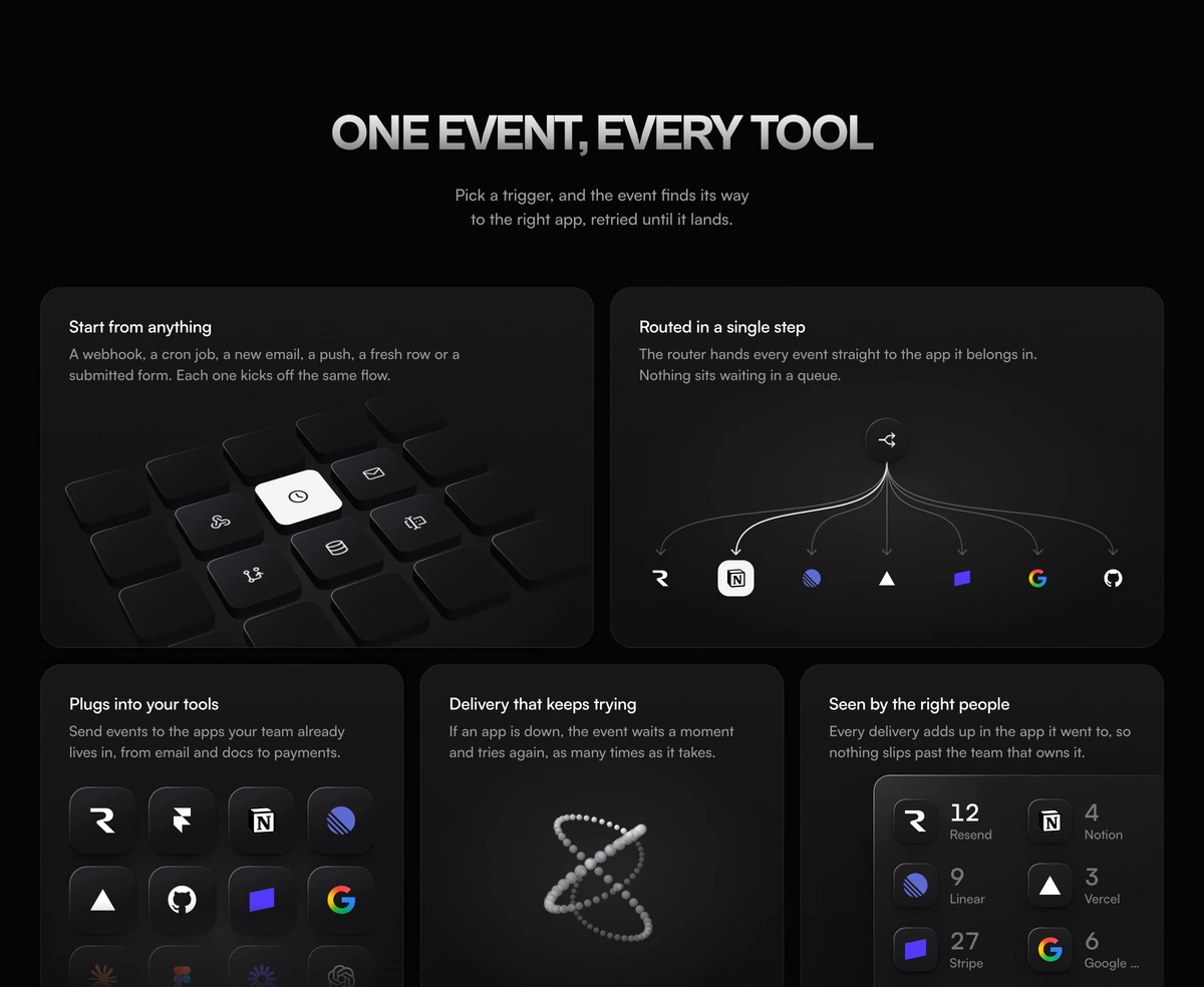
An animated bento grid with one story across five tiles
Bento Grid With Linked Product Tiles is a React and Tailwind CSS interactive bento grid for a SaaS features section, in which a single event travels through five linked tiles in order, and visitors can fire their own event by pressing one of six source keys, in Next.js or any React app.
A typical features bento is five unrelated pictures of five features. This one is a sequence. The key you press in the first tile is the event that leaves the hub in the second, lights an app in the third and adds one to that app's count in the fifth, so the section explains how the product works rather than listing what it has.
One clock drives the whole grid. Each cycle lasts 7.2 seconds: the key is pressed as the cycle starts and released at 420ms, the pulse leaves the hub at 900ms, lands at 1.7 seconds, the app lights at 3.1 seconds and the count rolls at 3.9 seconds, then the finished state holds before the next source fires. The retry loop is the exception on purpose: it turns at its own steady pace so there is nothing to track.
What each linked tile does
Desktop is six columns: the keys and the hub share the top row at three columns each, and the app grid, the retry loop and the counts share the second row at two each.
Start from anything
A five by four field of keys seen from above and in front, tilted in CSS 3D. Six keys in the middle carry Tabler icons for a webhook, a schedule, an inbox, a git push, a database and a form; the rest are blank and fade into a vignette. Each key's walls are fourteen stacked 1px slices so the sides follow the rounded corners.
Routed in a single step
A hub at the top with seven curved branches that share one trunk before they flare out. A dot travels the chosen branch on an eased Bezier path and the destination tile fills in as it arrives.
Plugs into your tools
Twelve app marks in a four column grid that fades out toward the bottom. While one app takes the event the other eleven step back to half opacity.
Delivery that keeps trying
A trefoil knot of 96 shaded beads turning in 3D, about 16 seconds a turn, with a lit trail of 22 beads that laps it every 7 seconds.
Seen by the right people
A panel of six apps with unread counts. When an event lands, its app's count rolls up by one, the old digit lifting out as the new one rises in.
Products this interactive bento grid explains
Use it when
- Your product moves data or events between other tools: automation, webhooks, notifications, sync.
- You want the features section to show cause and effect rather than five separate claims.
- The page has room for a section that rewards a visitor who stops and presses something.
- Your design is quiet and monochrome, so a grid of black, white and grey fits better than gradients.
Skip it when
- Your features are unrelated to each other. A linked story with nothing linking it is decoration.
- You cannot show the logos of the twelve apps in the sample. Replace them with integrations you really support.
- Your audience includes many people on low power devices and the page already runs other continuous animation.
- You need the tile copy as props. The titles, descriptions, sources and apps live in the file.
Map the story onto your product
Start with the data near the top of the file. APPS lists twelve marks loaded from assets.wensity.com: Resend, Notion, Linear, Vercel, Stripe, Google Sheets, GitHub, Figma, Framer, Loom, Claude and ChatGPT. The first seven are the hub's branches. Replace them with integrations your product actually has, and check each company's brand guidelines before a logo goes on your marketing site.
SOURCES defines the six keys: a label, an event name such as order.paid, a Tabler icon and dest, the index of the app the event is routed to. Change these together, since dest decides which branch, which grid tile and which count respond. The five tile titles and descriptions are written inline in the main component; rewrite them in your product's voice.
Timing lives in one object, T, in milliseconds. Stretch the cycle if the sequence feels hurried on your page, but keep the steps in order, because each tile reads its state from the same phase. BASE_COUNTS sets the unread numbers each app starts from.
npx wensity@latest add bento-grid-with-linked-product-tiles --type block
import { BentoGridLinkedProductTiles } from "@/components/wensity/blocks/bento-grid-with-linked-product-tiles";export function HowItConnects() {return (<BentoGridLinkedProductTilesheadline={"Every trigger,\nthe right app"}subheadline="Press a source and follow one event from the moment it fires to the moment it lands."/>);}
Props
| Prop | Type | Default | Description |
|---|---|---|---|
headline | string | "One event, every tool" | Uppercased above the grid. Name the outcome of the whole chain, not one tile. |
subheadline | string | - | Invite the press: the default tells visitors to pick a trigger. |
headingAs | "h1" | "h2" | "h3" | "h2" | Keep h2 under a hero; the five tile titles are h3. |
className | string | - | Set the section background when the page is not near white or near black. |
Keeping continuous motion polite
Runs only when seen
The clock ticks only while at least 20 percent of the section is on screen, the tab is visible and the visitor has not asked for reduced motion. Off screen it costs nothing.
Frames outside React
The pulse, the 96 beads and the rolling digits are written to the DOM from one requestAnimationFrame loop. React re-renders only when the phase changes, a handful of times per cycle.
Keyboard control
Each source key is a button labelled with its event, such as Send a test order.paid event from the webhook. Keyboard focus inside the grid pauses autoplay so the chain can be read, and pressing a key plays its chain once. A polite live region names where the event was routed.
Reduced motion
The first paint is already a finished cycle, so the static state is complete. Pressing a key jumps straight to its finished state with the right app lit and its count raised.
Dependencies
@tabler/icons-react for the six source icons and the hub glyph, plus clsx and tailwind-merge. The 3D is CSS transforms, not WebGL.
Block details
- Category
- Bento Grids
- Renders
- JavaScript animation. Paints first, then animates
- Theme
- Follows the site theme in light and dark
- Dependencies
@tabler/icons-reactclsxtailwind-merge- Source
- 1,235 lines, 47 KB in one file
- Install
wensity add bento-grid-with-linked-product-tiles --type block- Tags
- light, dark, bento, saas, features
- Last updated