Liquid Glass Button
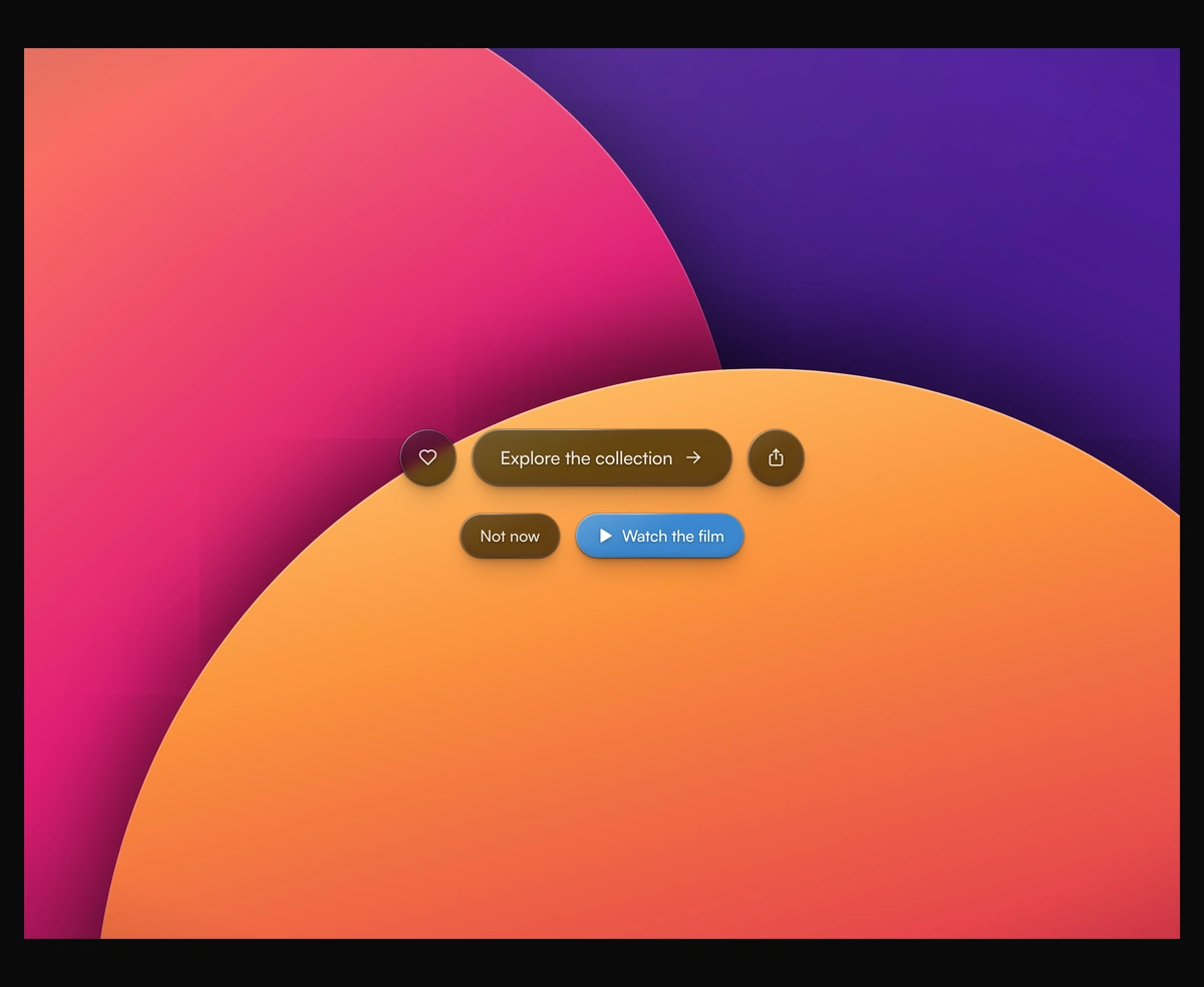
ProFrosted glass that bends the page at its edge, with a rim that catches the light.
Overview
Liquid Glass Button is a React and Tailwind CSS glass button in the style of Apple's Liquid Glass, in Next.js or any React app, with no dependencies. A frosted body keeps the label readable on any photo, while a lens map sized to the button bends the page behind its rim through an SVG displacement filter. A rim lit from the top left and stacked soft shadows give it depth. On hover the lens swells, an optional pointer light follows the cursor, and a press stretches the glass without overshoot. Refraction needs Chromium; Safari and Firefox show frosted glass instead.
Installation
Run the following command
pnpm dlx wensity@latest add liquid-glass-button
Usage
Import LiquidGlassButton from @/components/wensity/liquid-glass-button and render it anywhere in your React or Next.js app. The source lands in your own repo, so every prop, class and animation below is yours to edit.
import { IconArrowRight } from "@tabler/icons-react";import { LiquidGlassButton } from "@/components/wensity/liquid-glass-button";export default function Example() {return (<divclassName="flex min-h-[420px] items-center justify-center gap-4 bg-cover bg-center"style={{ backgroundImage: "url(https://assets.wensity.com/photos/portrait/lavender-fields.webp)" }}><LiquidGlassButton size="lg">Explore the collection<IconArrowRight size={20} /></LiquidGlassButton><LiquidGlassButton size="lg" tint="#0a84ff">Get started</LiquidGlassButton></div>);}
Props
| Prop | Type | Default | Description |
|---|---|---|---|
size | "sm" | "md" | "lg" | "md" | Height and type size: 36, 44, or 56 pixels tall. |
shape | "pill" | "circle" | "pill" | A pill for labels, a circle for a single icon. Give icon buttons an aria-label. |
tone | "dark" | "light" | "dark" | Smoky glass with a white label for photos and dark pages, or brighter glass with a dark label. |
tint | string | - | Colors the glass for a primary action. Any CSS color. The label turns white. |
refraction | number | 0.6 | How hard the rim bends the backdrop, from 0 for flat glass to 1. |
frost | number | 0.35 | Blur over the backdrop, from 0 for crystal clear to 1. |
swell | number | 0.5 | How much the lens swells and bends harder under the pointer, from 0 to 1. |
pointerLight | boolean | false | Adds a light that follows the cursor on hover: a soft pool inside and a glint on the nearest rim. Without it, hover is the lens swell and a gentle lift. |
href | string | - | Renders a link instead of a button. target and rel pass through. |