Card Stack Carousel
ProA React 3D card stack built on Framer Motion where the front card drops away, the deck promotes, then it returns.
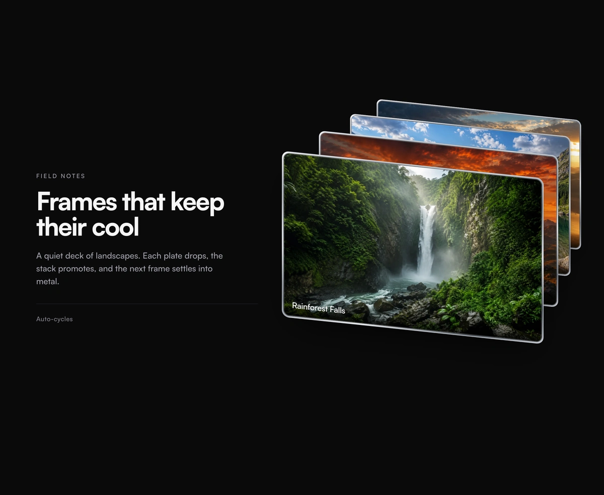
Overview
Card Stack Carousel is a React and Tailwind CSS 3D card stack section with a headline and copy beside a skewed deck of photo cards, in Next.js or any React app, built on Framer Motion. On a timer the front card drops away, the rest of the deck moves forward, and the dropped card returns to the back. Set the delay, card offsets, skew, and elastic or linear easing, pause on hover, and handle clicks with onCardClick. Pass image cards or your own StackRevealItem children. Reduced motion stops the automatic swaps and holds the deck in place.
Installation
Run the following command
pnpm dlx wensity@latest add stack-reveal
Usage
Import StackReveal from @/components/wensity/stack-reveal and render it anywhere in your React or Next.js app. The source lands in your own repo, so every prop, class and animation below is yours to edit.
import {StackReveal,type StackRevealCard,} from "@/components/wensity/stack-reveal";const cards: StackRevealCard[] = [{id: "alpine-lake",src: "https://assets.wensity.com/photos/landscape/alpine-lake-reflection.webp",alt: "Mountain range mirrored in a still alpine lake",label: "Alpine Lake",},{id: "dune-sunset",src: "https://assets.wensity.com/photos/landscape/dune-sunset.webp",alt: "Wind-carved sand dunes glowing at sunset",label: "Dune Sunset",},{id: "rainforest-falls",src: "https://assets.wensity.com/photos/landscape/rainforest-falls.webp",alt: "A waterfall cutting through dense rainforest canopy",label: "Rainforest Falls",},];export default function Example() {return (<StackRevealcards={cards}width={520}height={330}eyebrow="Field notes"title="Frames that keep their cool"description="A quiet deck of landscapes. Each plate drops, the stack promotes, and the next frame settles into metal."easing="elastic"/>);}
Props
| Prop | Type | Default | Description |
|---|---|---|---|
cards | StackRevealCard[] | - | Photo cards in the stack. Defaults to curated Cloudflare landscapes. |
eyebrow | string | "Field notes" | Small uppercase label above the title. |
title | string | "Frames that keep their cool" | Primary headline shown to the left of the deck. |
description | string | - | Supporting copy under the title. |
aside | string | "Auto-cycles" | Optional footer line under the description. |
width | number | 520 | Width of each card in pixels. |
height | number | 330 | Height of each card in pixels. |
cardDistance | number | 56 | Horizontal offset between stacked cards in pixels. |
verticalDistance | number | 62 | Vertical offset between stacked cards in pixels. |
delay | number | 5000 | Milliseconds between automatic swaps. |
pauseOnHover | boolean | false | Optional. Pause automatic swaps while hovered. |
skewAmount | number | 6 | Y-axis skew applied to every card, in degrees. |
easing | "elastic" | "linear" | "elastic" | Motion style. elastic = spring overshoot; linear = tighter ease-in-out. |
onCardClick | (idx: number) => void | - | Fires when a card is clicked. |
Featured in React 3D components and React carousel components.