Gooey Navigation Menu
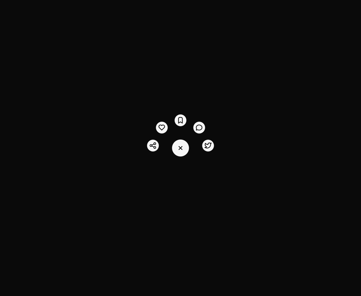
A liquid FAB whose child actions stretch out of the trigger like molten metal.
elite micro interactionsgooeynavigationmenuframer motiontabler icons react
Installation
Run the following command
~/your-project
pnpm dlx wensity@latest add gooey-navigation-menu
Usage
Import GooeyNavigationMenu from @/components/wensity/gooey-navigation-menu and render it anywhere in your React or Next.js app. The source lands in your own repo, so every prop, class and animation below is yours to edit.
app/example.tsx
"use client";import { GooeyNavigationMenu } from "@/components/wensity/gooey-navigation-menu";import { IconShare, IconHeart, IconBookmark, IconMessageCircle } from "@tabler/icons-react";const items = [{ id: "share", label: "Share", icon: <IconShare /> },{ id: "like", label: "Like", icon: <IconHeart /> },{ id: "save", label: "Save", icon: <IconBookmark /> },{ id: "reply", label: "Reply", icon: <IconMessageCircle /> },];export function GooeyNavigationMenuDemo() {return (// Blobs default to the theme foreground — white on dark, near-black on// light. Recolor with blobClassName / iconClassName:// blobClassName="bg-chili-500" iconClassName="text-white"<GooeyNavigationMenu direction="up" arc={170} radius={92} items={items} />);}
Props
| Prop | Type | Default | Description |
|---|---|---|---|
items | GooeyMenuItem[] | - | Child items that pop out of the FAB. 3–6 looks best. |
radius | number | 96 | Distance in pixels the children travel from the trigger center. |
arc | number | 180 | Arc in degrees the children fan across. 90 is a quarter, 180 a half. |
direction | "up" | "down" | "left" | "right" | "up" | Direction the arc opens toward. |
size | number | 60 | Diameter of the trigger button in pixels. |
childSize | number | 44 | Diameter of each child button in pixels. |
defaultOpen | boolean | false | Render with the menu already fanned open. Uncontrolled. |
blobClassName | string | "bg-[var(--foreground)]" | Classes for the trigger and petal blobs. Defaults to the theme foreground — white on dark, near-black on light. Pass any background utility to recolor, e.g. bg-chili-500. |
iconClassName | string | "text-[var(--background)]" | Classes for the glyphs riding on the blobs. Defaults to the theme background, i.e. whatever the blobs are not. |
className | string | - | Classes for the wrapper that reserves the menu's square stage. |