React navbar components
Navigation bars with the mobile menu, the scroll behaviour and the keyboard handling already finished. One command copies the source into your repository.
Built with the stack you already ship
Navbar blocks you can copy
Each navbar is a single file covering the desktop bar, the mobile drawer and the scroll transition. Preview it live, then copy the source into your project.
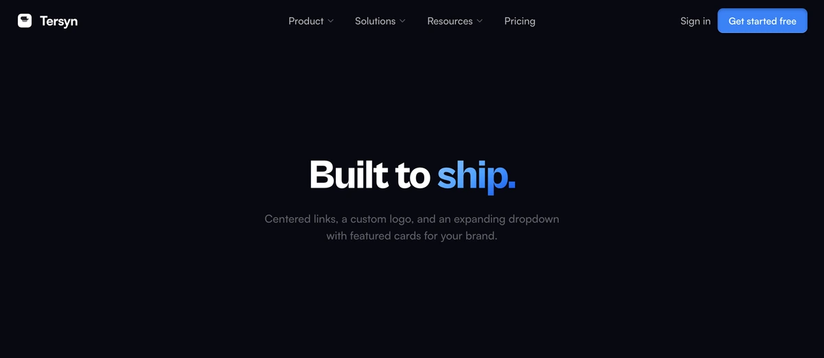 Navbar With Centered LinksCentered-link navbar with a custom geometric logo mark (replaceable via props), spring-loaded dropdown, and staggered item reveals. Clean, ship-ready, and premium. Adapts to light and dark mode.
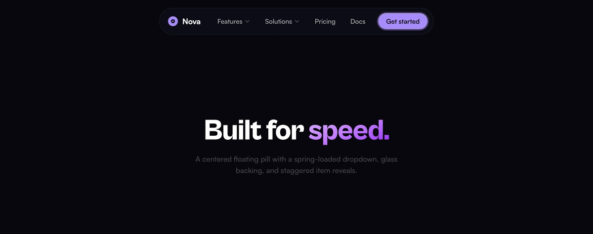 Navbar With Floating Pill MenuCentered floating pill navbar with a spring-loaded dropdown, glass backing, and staggered item reveals. Compact, premium, and adapts to light and dark mode.
 Navbar With Hover Pill LinksClean sticky navbar with smooth hover pill animations, sign-in link, CTA button, and a mobile drawer. Adapts to light and dark mode automatically.
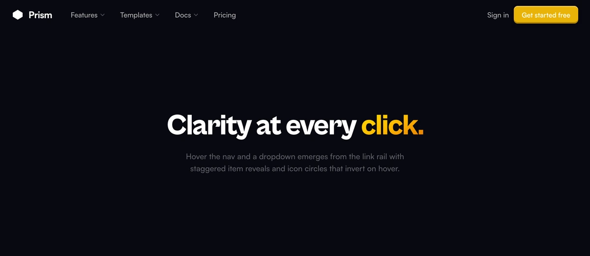 Navbar With Mega Menu DropdownRefined navbar with a left-aligned floating card dropdown, staggered item reveals, icon circles that invert on hover, and deep shadow depth for a premium product aesthetic. Adapts to light and dark mode.
 Navbar With Floating PillDark floating pill that centers at the top of the viewport with backdrop blur, gradient CTA, and hover spring animations. Adapts to light and dark mode automatically.
 Navbar With Frosted GlassSticky frosted-glass navigation with adaptive blur on scroll, animated link underlines, and an integrated mobile drawer.
Navigation primitives
The accessible building blocks underneath: dropdown panels, command search, breadcrumbs and app sidebars. Use them to extend a navbar or build one from scratch.
- Navigation MenuNavigation MenuPrimary navigation with dropdown panels, mega menus, nested links, and full keyboard accessibility for headers.
- Dropdown MenuDropdown MenuCompact actions from any trigger, with grouped sections, nested submenus, checkbox and radio items, and shortcuts.
- CommandCommandA command palette with fuzzy search, grouped actions, keyboard shortcuts, and fast navigation built on top of cmdk.
- BreadcrumbBreadcrumbA wayfinding trail with smart collapsing, dropdown overflow menus, custom separators, and animated hover states.
- TabsTabsTabbed navigation with a sliding indicator, segmented control styling, vertical layouts, and smooth state changes.
- SidebarSidebarApp sidebars with collapsible rails, grouped sections, badge counts, resizable widths, and keyboard shortcut support.
- SheetSheetEdge-mounted panels that slide in from any side, with an optional persistent mode for inspectors and navigation.
- KbdKbdKeyboard key styling for shortcuts, hotkey hints, documentation, and inline command labels anywhere in your app.
How to choose a navbar
A navbar has one job that matters: tell people where they are and where else they can go, without taking up room the content needs. Most of the difficulty is not visual. It is deciding what earns a top level slot. Five or six items is the practical ceiling before people stop reading and start scanning, so anything past that belongs in a dropdown or in the footer.
The first real decision is whether the bar sticks. A sticky navbar keeps navigation one click away on a long page, which suits documentation and marketing sites where people jump around. It also permanently costs you sixty or so pixels of vertical space, which matters more on a phone than a laptop. Navbar With Frosted Glass and Navbar With Hover Pill Links both stick and both shrink their padding once you scroll past the fold, which gets most of the benefit back.
Floating bars are the other pattern. Navbar With Floating Pill Menu and Navbar With Floating Pill detach from the top edge and sit on the page as a rounded pill, which reads as lighter and modern but leaves the page background visible behind them. That works over a solid or gently animated hero and falls apart over a busy photograph, where the contrast behind the links changes as you scroll. Check it against your actual hero before committing.
Mobile is where navbars usually break, and it is worth testing before you pick. Every navbar here opens a full drawer rather than a cramped dropdown, traps focus while it is open, closes on Escape, and returns focus to the trigger. Those four behaviours are what separate a working menu from one that leaves keyboard and screen reader users stranded, and they are tedious enough to build that most hand rolled navbars skip at least one.
If the site has more than a couple of dozen destinations, add search rather than more links. Command gives you a palette on the standard shortcut, which regular visitors will reach for before they read the bar at all. Pair it with a compact navbar instead of trying to express the whole information architecture across the top of the screen.