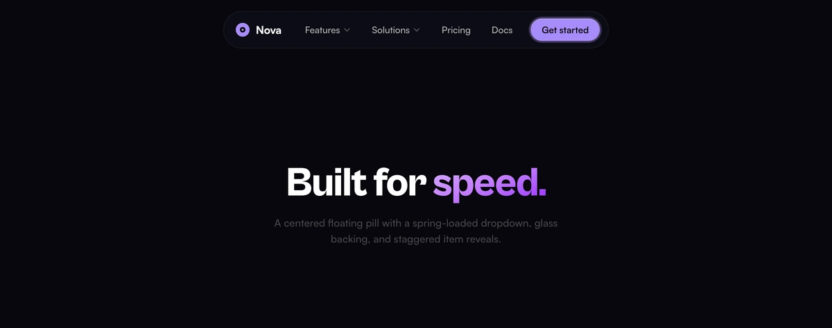
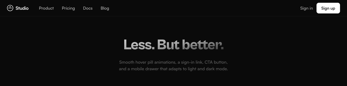
Navbar With Centered Links
ProCentered-link navbar with a custom geometric logo mark (replaceable via props), spring-loaded dropdown, and staggered item reveals. Clean, ship-ready, and premium. Adapts to light and dark mode.
When to use Navbar With Centered Links
Links in the centre, logo hard against the left edge. That arrangement reads as a product you log into rather than a page you were sent, mostly because it is the arrangement every serious application uses. The dropdown opens on a spring and its items arrive a few milliseconds apart, which is enough to feel deliberate and not enough to make anyone wait.
The logo is a prop rather than baked markup, so putting your own mark in takes a line at the call site instead of a fork of the file. That matters more than it sounds: a navbar is the one block you will touch on every page, and one you have edited is one you have to re-edit every time this file changes. Best paired with a hero that starts below it, since the bar owns a solid surface and does not overlay artwork.
Block details
- Category
- Navbars
- Renders
- JavaScript animation. Paints first, then animates
- Theme
- Follows the site theme in light and dark
- Responsive
- Mobile, tablet and desktop breakpoints are already set
- Dependencies
clsxframer-motiontailwind-merge- Source
- 636 lines, 35 KB in one file
- Install
wensity add navbar-with-centered-links --type block- Stack
- React, Next.js, TypeScript and Tailwind CSS v4
- Licence
- Included with Wensity Pro. The CLI copies the file into your repository and you own it from there
- Tags
- light, dark, centered, custom-logo, spring, premium
- Last updated