
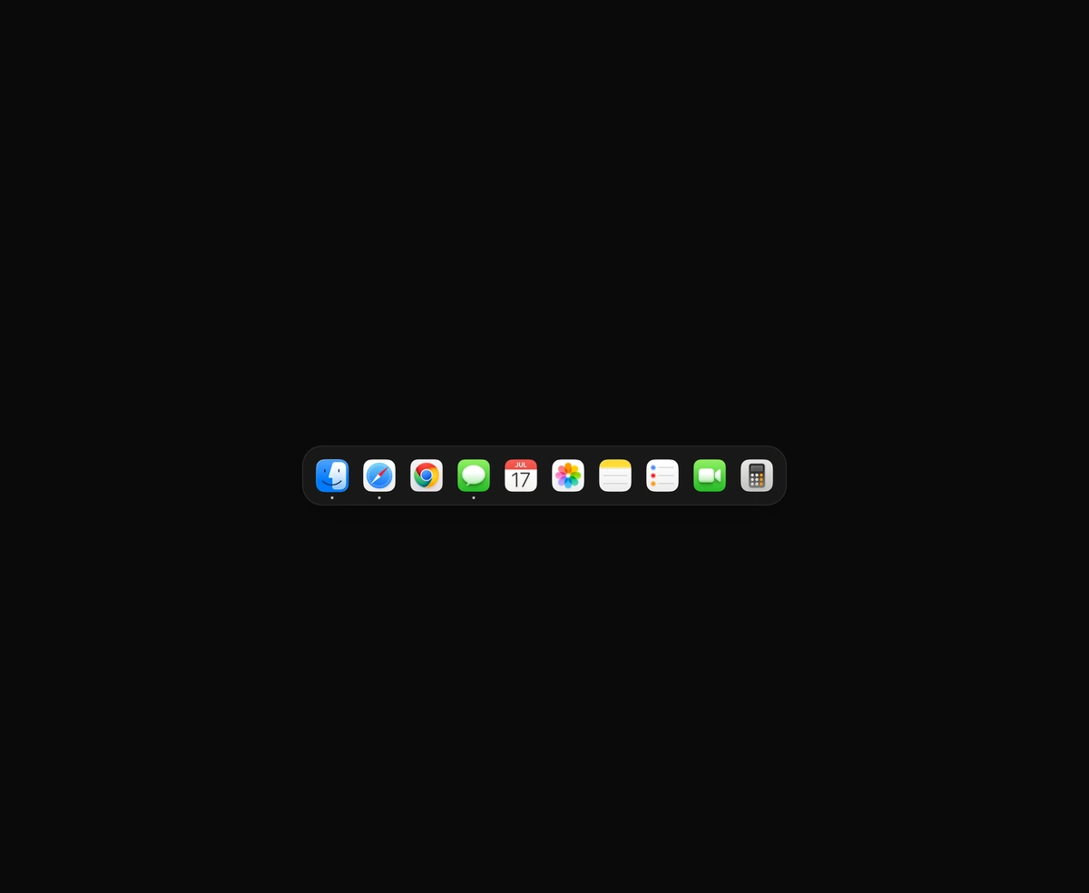
macOS Floating Dock
A magnetic dock where icons inflate near the cursor and push their siblings aside.
Slide to unlock button with a light sweep, swipe to confirm and a loading step.
Slide to Unlock is a React and Tailwind CSS swipe button that asks for a drag before an action runs, in Next.js or any React app. The handle tracks the pointer one to one inside a carved track while a light sweeps through the label, and letting go short of the 90 percent threshold springs it home without bounce. Return a promise from onComplete and the handle waits with a spinner, then shows a check; a rejection sends it back. Keyboard users press Enter or step with the arrow keys, and reduced motion removes the travel.
Run the following command
pnpm dlx wensity@latest add slide-to-unlock
npx wensity@latest add slide-to-unlock
yarn dlx wensity@latest add slide-to-unlock
bunx wensity@latest add slide-to-unlock
Import SlideToUnlock from @/components/wensity/slide-to-unlock and render it anywhere in your React or Next.js app. The source lands in your own repo, so every prop, class and animation below is yours to edit.
import { SlideToUnlock } from "@/components/wensity/slide-to-unlock";export function CheckoutFooter({ pay }: { pay: () => Promise<void> }) {return (<SlideToUnlockvariant="payment"label="Slide to pay $49.00"onComplete={pay}/>);}
| Prop | Type | Default | Description |
|---|---|---|---|
variant | "unlock" | "payment" | "delete" | "unlock" | Sets the default label, handle icon and colour. |
label | string | - | Text inside the track before the slide. |
loadingLabel | string | - | Text shown while onComplete is pending. |
completedLabel | string | - | Text shown once the action is done. |
onComplete | () => void | Promise<unknown> | - | Runs when the slide completes. Return a promise to show a loading step; a rejected promise sends the handle back. |
tone | "neutral" | "emerald" | "red" | - | Handle colour. Defaults to the variant's. |
size | "sm" | "md" | "lg" | "md" | Track height: 44, 56 or 64px. |
shape | "rounded" | "pill" | "rounded" | Rounded corners or a full pill. |
threshold | number | 0.9 | Share of the track the handle must pass to complete. A fast flick completes a little earlier. |
resetAfter | number | - | Return to the start this many milliseconds after completing. |
onProgressChange | (progress: number) => void | - | Called with progress from 0 to 1 while the handle moves. |
shimmer | boolean | true | A light sweeping through the label at rest, left to right. Off with reduced motion. |
icon | ReactNode | - | Replaces the handle icon. |
disabled | boolean | false | Dims the control and ignores input. |
A magnetic dock where icons inflate near the cursor and push their siblings aside.
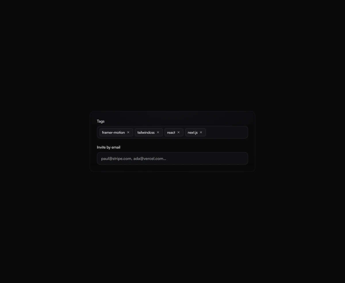
A tag input where pills pop in as you add them and slide out on remove, closing the gap without snapping the layout.
One angled GPU sweep that travels across any placeholder geometry you wrap, never a separate shimmer stuttering per row.
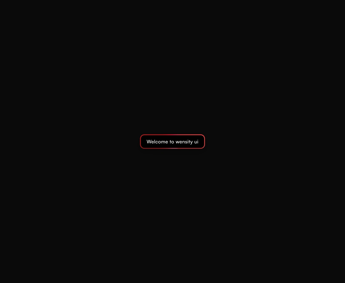
A dual-layer orbit glow that soft-spins around the edge of any button or link you wrap it around, at zero layout cost.