3D Image Carousel
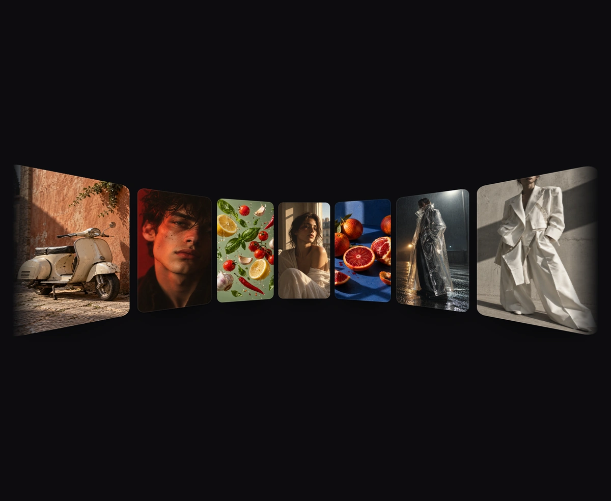
ProPortrait cards line the inside of a curved wall, smallest at the center and larger toward each side. Drag or hover to turn.
Overview
3D Image Carousel is a React and Tailwind CSS 3D carousel that lines the inside of a cylinder with portrait cards, in Next.js or any React app, built on Framer Motion. A real perspective projection makes the center card the smallest and farthest while side cards grow and turn toward you, at any width. The ring drifts on its own, and you can drag to spin it, hover a side to steer, or use the arrow keys. Reduced motion stops the drift and steering but keeps drag and keys. The set repeats, so the loop never gaps.
Installation
Run the following command
pnpm dlx wensity@latest add image-carousel-3d
Usage
Import ImageCarousel3d from @/components/wensity/image-carousel-3d and render it anywhere in your React or Next.js app. The source lands in your own repo, so every prop, class and animation below is yours to edit.
import { ImageCarousel3D } from "@/components/wensity/image-carousel-3d";export default function Example() {return (<ImageCarousel3Ditems={[{id: "window",image: "https://assets.wensity.com/photos/editorial-portrait/paris-window-portrait.webp",alt: "Person in warm window light",},]}/>);}
Props
| Prop | Type | Default | Description |
|---|---|---|---|
items | PortraitRingCard[] | 9 photographs | Cards on the wall. Each needs an image and alt text. The set repeats so the loop never shows a gap. |
spacing | number | 17 | Degrees between neighbouring cards. Smaller values fit more cards on the stage. |
curve | number | 0.95 | How deep the wall bends, from 0 to 1. Higher values make the side cards grow faster than the center. |
aspectRatio | number | 0.54 | Card width divided by card height. |
speed | number | 3 | Idle drift in degrees per second. 0 keeps the wall still, and a throw then settles on a card. |
className | string | - | Extra classes for the stage. The default height follows a 16:5 ratio between 300px and 520px. |
Featured in React carousel components.