 Black Friday is here 🔥 Get

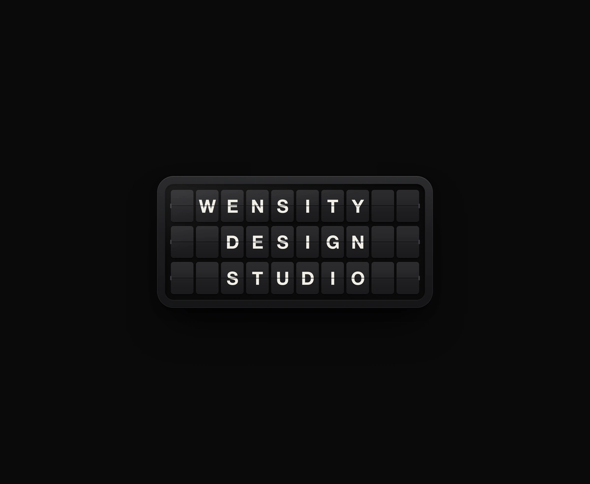
Split-Flap Display
A ceramic and graphite split-flap device that ripples each flap into your message.
A Pinterest-style React masonry grid on native CSS Grid Lanes, with a JS fallback.
Masonry Grid is a React and Tailwind CSS masonry layout that packs images of different heights into balanced columns, in Next.js or any React app. Browsers with CSS Grid Lanes place tiles natively; elsewhere a fallback drops each tile into the shortest column. Tiles stay in one list in source order, so keyboard focus and screen readers follow your data rather than the columns. minColumnWidth and maxColumns decide how many columns fit, caption puts titles under or over each photo, and only the images fade in. Pass every image's width and height so its tile holds space while loading.
Run the following command
pnpm dlx wensity@latest add masonry-grid
npx wensity@latest add masonry-grid
yarn dlx wensity@latest add masonry-grid
bunx wensity@latest add masonry-grid
Import MasonryGrid from @/components/wensity/masonry-grid and render it anywhere in your React or Next.js app. The source lands in your own repo, so every prop, class and animation below is yours to edit.
import { MasonryGrid } from "@/components/wensity/masonry-grid";export default function Example() {return (<MasonryGriditems={[{id: "turntable",src: "https://assets.wensity.com/photos/objects-still-life/vinyl-turntable-deck.webp",alt: "Vinyl record on a turntable",width: 1370,height: 1148,title: "Side B",meta: "Still life",href: "/pins/turntable",},]}/>);}
| Prop | Type | Default | Description |
|---|---|---|---|
items | MasonryGridItem[] | 18 photos | Image tiles in reading order. Each needs src, alt, width and height; title, meta, href and color are optional. |
children | ReactNode | - | Custom tiles instead of items. Each child becomes one tile, in order. |
minColumnWidth | number | 160 | Narrowest a column may get before the grid drops a column, in pixels. |
maxColumns | number | 4 | Most columns the grid will show on wide screens. |
columns | number | - | Fixed column count. Overrides minColumnWidth and maxColumns. |
gap | number | 16 (10 under 480px) | Space between tiles, in pixels. Leave it unset for the responsive default. |
radius | number | 14 | Corner radius of each image, in pixels. |
caption | "below" | "overlay" | "none" | "below" | Titles under the image, over it on hover and focus, or hidden. |
engine | "auto" | "native" | "js" | "auto" | auto uses CSS Grid Lanes when supported and the JS fallback otherwise. |
onItemClick | (item, index) => void | - | Makes image tiles buttons. Tiles with an href are links instead. |
emptyState | ReactNode | "Nothing here yet." | Shown when there are no tiles. |
A ceramic and graphite split-flap device that ripples each flap into your message.
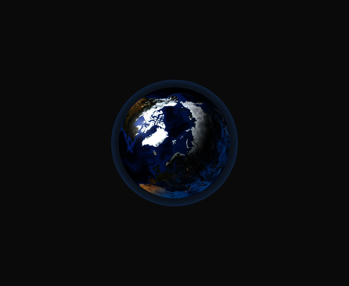
A 3D Earth lit day and night from the real sun position, wrapped in a soft atmosphere, with smooth drag-to-orbit controls.
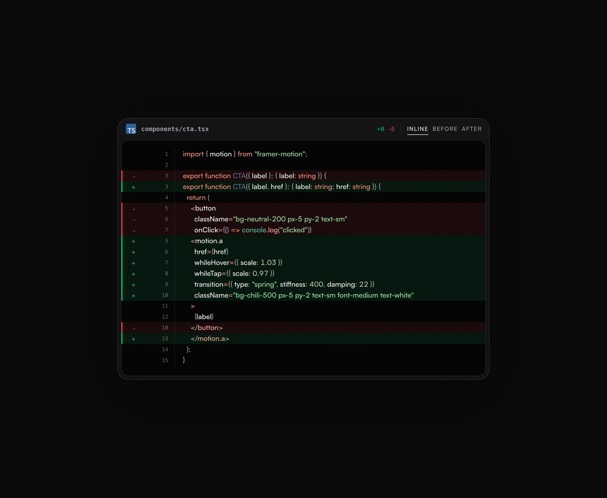
Inline or toggled code diffs rendered inside the same polished code block frame, flipping between before and after.
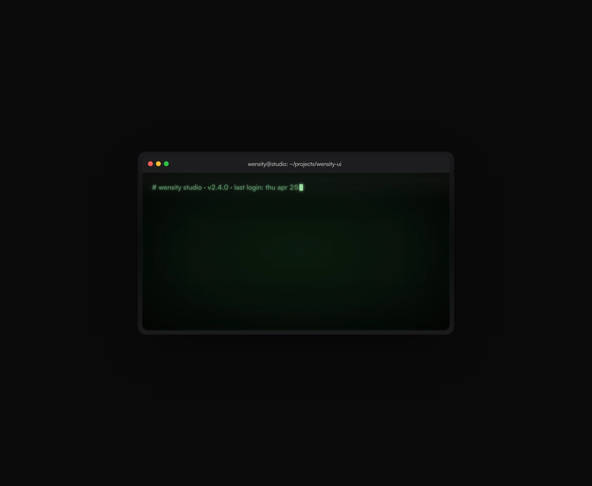
A terminal UI with self-typing commands, CRT phosphor glow and scanlines, streaming output that never re-renders a line.